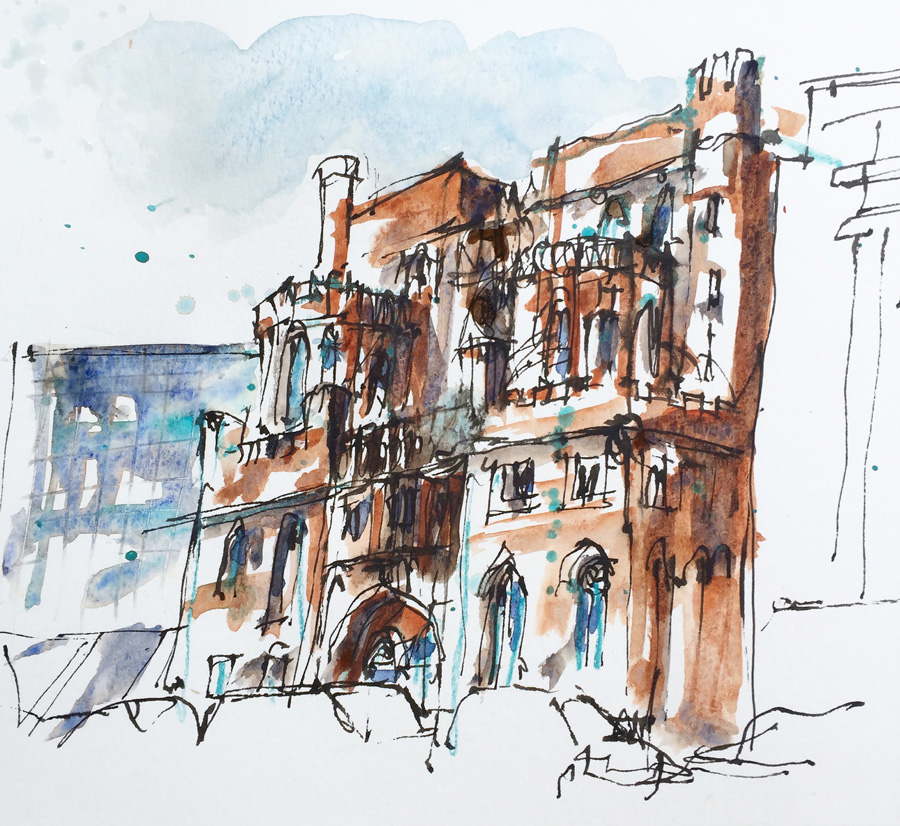
This year for my Urban Sketchers Symposium workshop I wanted to teach something experimental as I think sketching architecture should be fun and my two previous workshops were more technical. In Paraty I taught ways of thinking about buildings and how to sketch them in a structural way and last year in Singapore I taught Pointless Perspective and Coloured Shapes, a practical approach to perspective that involved basic observational skills rather than purely the technical aspects.
This year I wanted to share how I sketch architecture these days in a spontaneous way while still retaining a degree of accuracy and robustness. And more specifically I wanted to do this by showing how much fun it is to sketch a complex building starting with shapes.
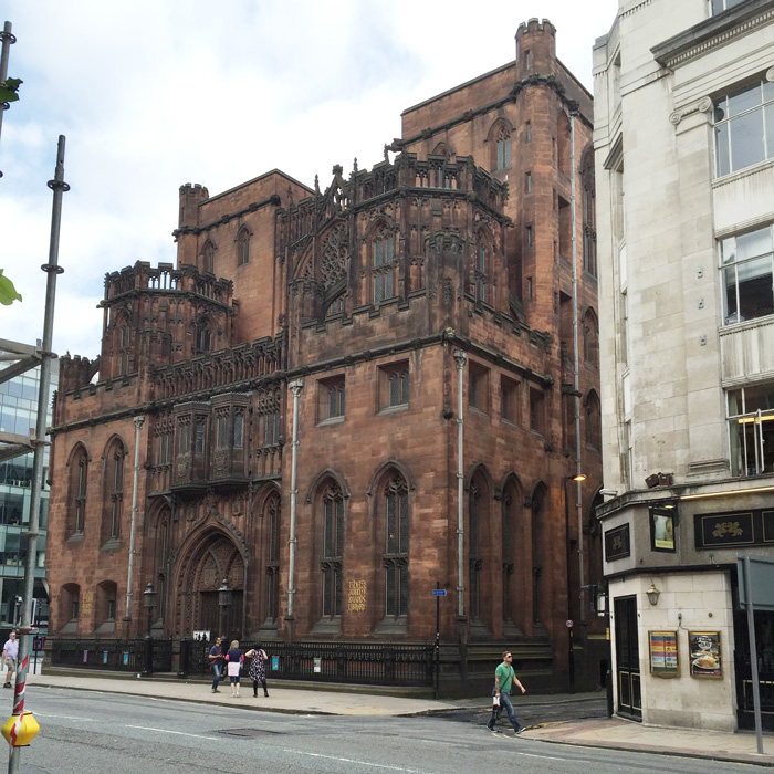
I had the most wonderful subject for the workshop – The John Rylands Library – a perfect (challenging) building for my exercises. But due to the weather, nearby scaffolding and strict security guards, the location was extra challenging. I will share my thoughts about what it’s like to be an USK instructor in a few days time, but today I will focus on the content.
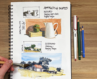
The basis for my workshop was the three ways of visual thinking which are the foundations for all my sketching. These are Feeling Edges, Abstracting Shapes and Constructing Volumes, and are explained in detail in my online class Foundations (a few overview articles can be found here). I believe that being able to alternate between edges, shapes or volumes is empowering – especially if you want to produce spontaneous and lively architecture sketches. But it can also help (over time) to make your architecture sketches become more solid and three-dimensional.
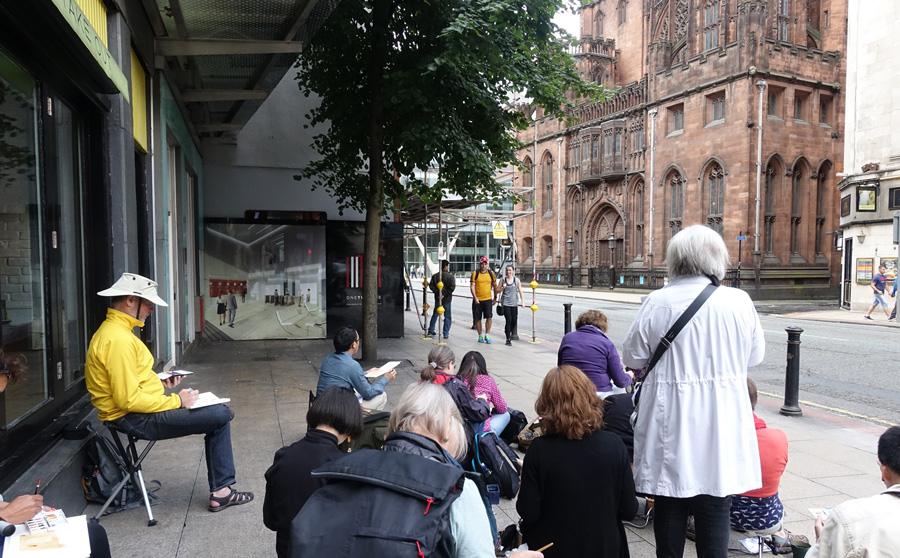
We started with feeling edges and the importance of carefully observing the relationships between different edges. If we slow down enough and do a little measuring we can get an accurate drawing of any building without any perspective. However we rarely check the relationships between edges carefully enough and often get overwhelmed by the scale and complexity of the whole building.

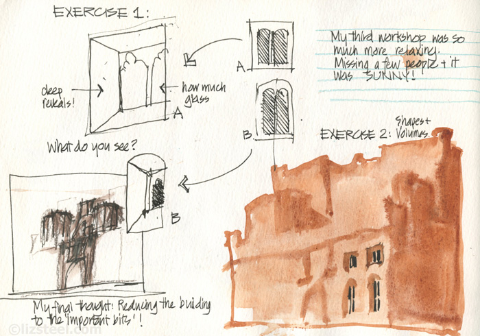
So to demonstrate this we focused on simply drawing a few windows. As we were sitting rather obliquely to the building (hiding under an awning) we had a range of different windows to sketch, the ones further away from us were much more foreshortened.

Oh! I almost forgot at the beginning of the last workshop on the Saturday morning (when it wasn’t raining) I made everyone in the group physically touch the building, run their hand along some of the edges of the building and feel how far back the windows were from the face of the building. Here (once again) is the photo of our group hug of the building!
To get back to Exercise 1… Despite the fancy Gothic tracery to each window I was more interested in drawing the overall shape (height vs width and the angles of the horizontal edges), the size of of glass and the amount of the thickness of the wall. Here is my page from the last workshop.
The second exercise (which due to our specific weather and location challenges was combined with the third exercise) was to zoom out and paint the whole building as a series of shapes. The first was simply the shape of the buildings’ silhouette. The purpose of looking at this shape was to train our visual brain to think in big blobs of colour rather than perspective.
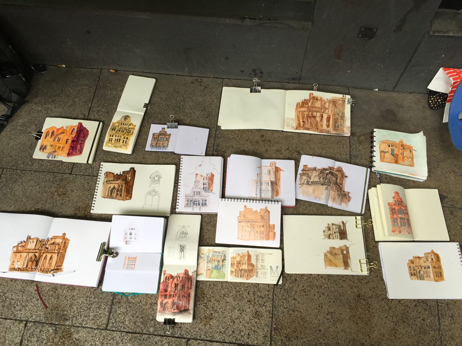
We then refined this shape by thinking about the underlying volumes (under all the fancy Gothic decorations) and adding darker shapes to one side of the volumes – only the group in the last workshop had a bit of sun to help with this.
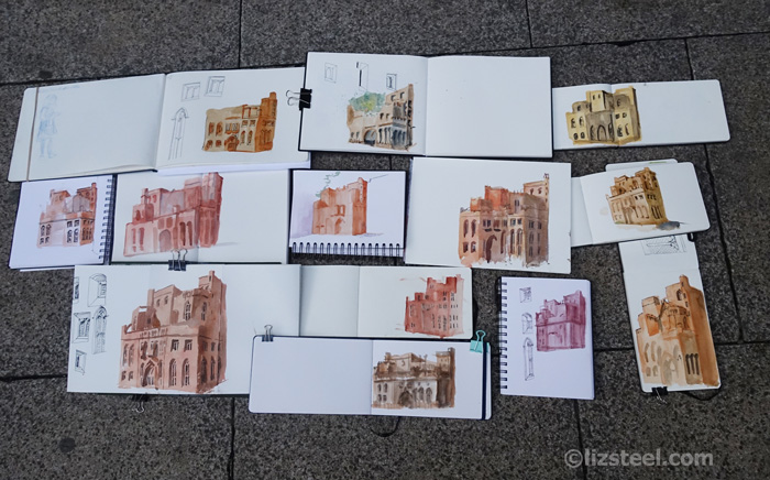
The result of this exercise was a collection of very robust sketches of this building – even though some of them had none of the Gothic trimmings. A few people started adding lines so we were able to see how little impact some minor shape inaccuracy had once the details were drawn over the top.
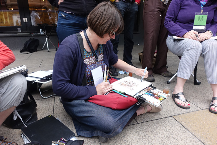
In the last part of the workshop I did a quick demo of the way that I like to work these days…
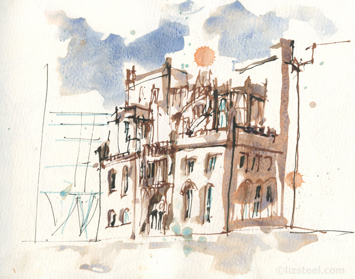
…mixing up line and colour in a purely spontaneous way but with a strong sense of volumes under-girding it.
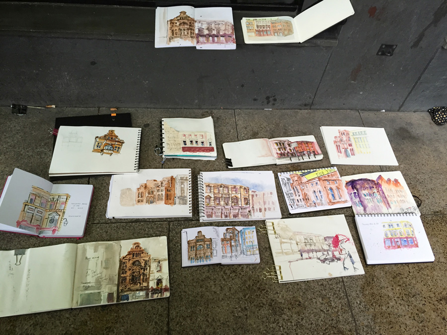
The group was then free to either try this approach on a final sketch of John Rylands (or another building opposite) or to add lines and finish off their sketch from Exercise 2.
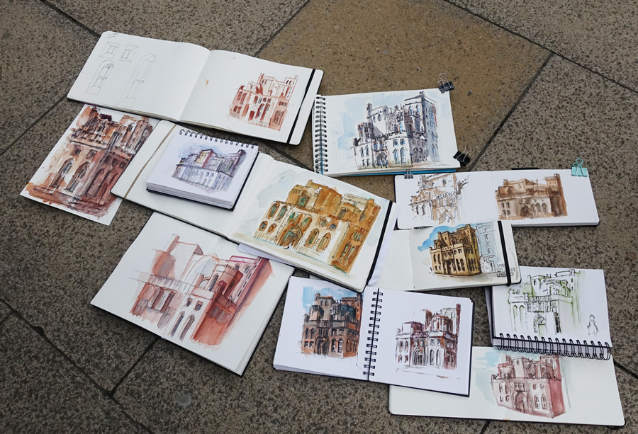
I was completely blown away by the work of the groups – especially those who struggled through tough external conditions. I really loved how different each sketch was (expressing everyone’s individual personality) and also how they all captured the essence of the John Ryland’s massive forms.
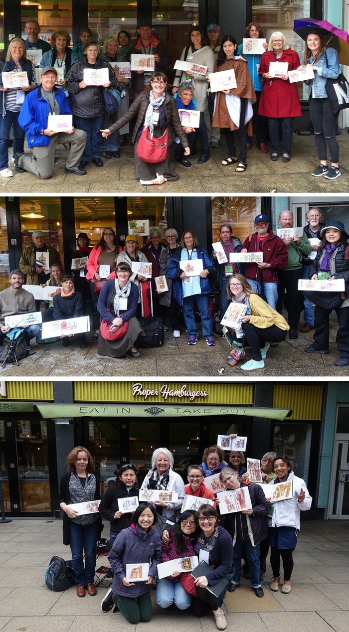
Thank you everyone for being such a joy to teach – I had a ball!
A few takeaways that I hoped people got from the workshop:
- get the big shapes right first and then add the complicated Gothic decoration over the top
- look for the thicknesses of the walls especially with windows and doors
- don’t over worry the shapes – the inaccuracy of the shapes of colour in relation to the lines creates an energy that makes the sketch look lively
- rain creates great watercolour effects
- architecture sketching doesn’t need to be so precise
- mix it up and have fun!
There were a lot of extra practical sketching architecture tips I shared with the group each time relating to aspects that came up in individual sketches and specifically relating to John Rylands building itself.
It was really wonderful to put my Foundations concepts together in a workshop like this with such an amazing building! It is massively encouraging to have seen such incredible results from a short 3 hour workshop and a summary of these ideas. I are currently putting the finishing touches on an in-depth version for Lesson 1 of SketchingNow Buildings course.
And last but not least, here is a downloadable version of my handout. It contains the summary of my presentation to the groups and not a detailed description of the exercises we did.
Download: Liz Steel Architecture in edges, shapes and volumes
If you want to find out more about this approach, plus heaps more specific tips for sketching buildings of any style and complexity, please check out my SketchingNow Buildings course which begins on 07 September 2016. This is the only time I will run it as a weekly class with lots of interaction from me – so don’t miss it!




5 Comments
Thanks for that really useful handout Liz! It gets your most important points across very well and serves as a really good reference. I’ve a question about brushes and picking up paint – you mentioned recently that your brush tips don’t wear down as much now you’ve adapted your picking up technique. Could you expand a bit on this? For round brushes and for the dagger? Any tips much appreciated!
Hi Deborah, In essence it is a sideways pickup and not drilling down with the point of your brush. A dagger forces you to pick up sideways
Wonderful and informative post, Liz!
thank you Serena
I can’t wait to have a go at this, I may use the John Ryland’s building as I find the prospect of drawing rather daunting!
NEWSLETTER
Subscribe for first notification of workshop + online classes and more.