A number of people asked me this question (Yellow Ochre or Raw Sienna) last week after I shared my new testing palette. It is something that I’ve addressed previously in the ‘Colours in my palette‘ series that I did in 2020. However, it is time for an update (and a separate article) as I’ve made a change.
Last year I wrote the following:
I prefer a raw sienna colour over a yellow ochre one as raw sienna (being slightly more orange) will create grey (rather than green) when mixed with blue. I use my raw sienna paint (in my case it’s actually Monte Amiata Natural Sienna – MANS) in a lot of grey washes and it also works well as a glow on the horizon when doing skies. If you only have yellow ochre in your palette it will be harder to use it for these purposes.
This is still 100% accurate…
If I only could have one earth yellow in my palette I would choose raw sienna (and specifically MANS) over yellow ochre without question. I’ve not found another raw sienna that has the same beautiful glow which I can get from MANS. It’s the most used paint in my palette so it’s definitely not a colour I can see myself swapping out with something else.
BTW, Another use for MANS that I didn’t specifically state last year, is that it’s super important for mixing warm shadow areas – either adding it to a mixed grey or dropping it into a wet wash.
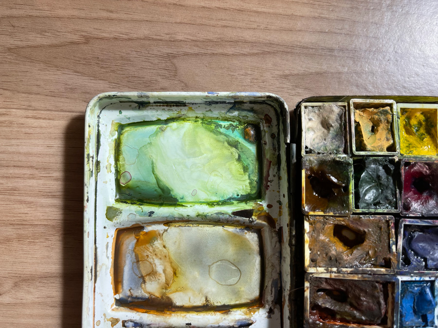
However, I now have Yellow Ochre as an important part of my palette!
And it’s not only in my testing palette, but also in my everyday palette as well. I squeeze a tiny dob of Yellow Ochre(YO) into the corner of my green mixing well – indicating my major use of it.
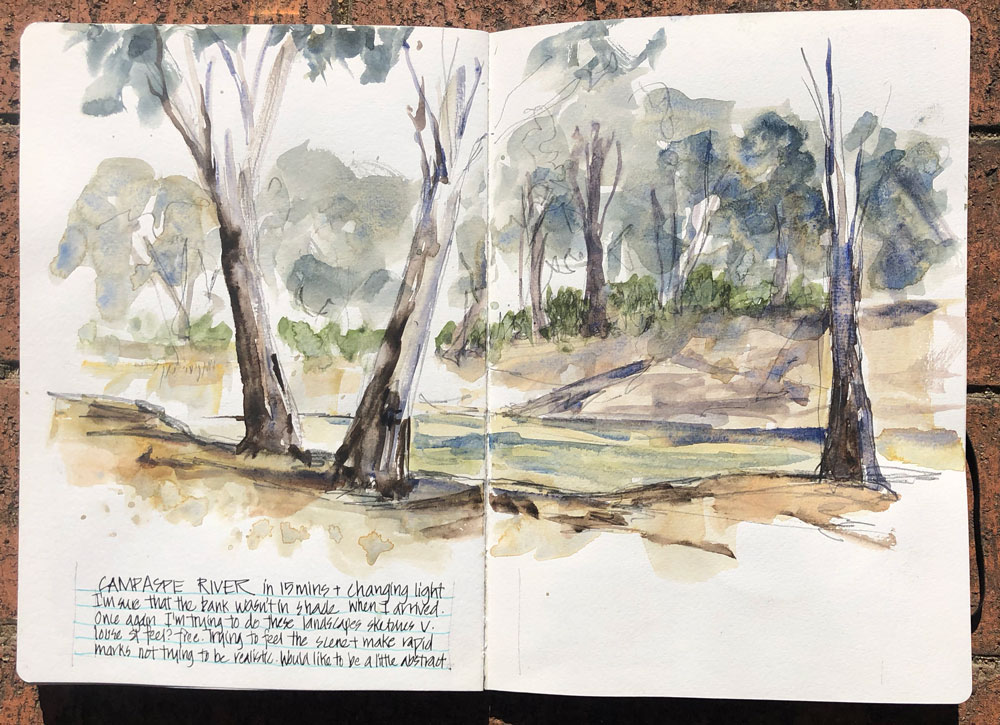
I started using YO during my recent road trip for the yellow grass and the eucalypt trees of western NSW, VIC and ACT.
At the end of the first week, Chris Haldane mentioned that she had been using her YO quite a lot so on the following Monday I visited an art store in Bathurst and bought a small tube of Winsor and Newton Yellow Ochre. This was the only brand available in the few stores I visited during my trip and loved using it with either SCH French Ultramarine or DS Indanthrone Blue.
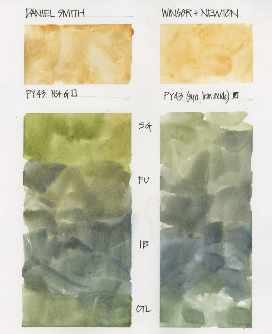
Last month I did this quick test of Daniel Smith YO vs Winsor & Newton YO and decided to stick with the WN version for the time being. I like that the W&N YO is more yellow and quite different from MANS. But I know that I’ll test out the DS YO more seriously down the track.
I’m sure that there are more uses for YO but at the moment I’m only using it if I’m after a specific hue of yellow or to mix greens!
BTW these colour charts were done inside my everyday sketchbook – a 8×10″ Stillman and Birn softcover Alpha. I love adding colour charts as an ‘element’ to my pages… something I explain inside my Sketchbook Design course – Group Run-through started 4 August – not too late to join!
What version of yellow earth colour do you use? I would love to hear from you – please share in the comment section below.
(If you are reading this via email, please click on the link below and add a comment on my blog – thanks!)



21 Comments
I’ve long struggled with getting a good grayish green for eucalyptus and many species of cactus, too, so I’m very excited to pull out my yellow ochre for that! Grateful for that tip! I have variations of color testing greens mixes all over the place in my sketchbook and clearly it will be my ongoing passion to revisit. The irony is when I was using yellow ochre in my regular palette I was looking for clear bright greens. Ha! Totally forgot about it when I wanted grayer greens, lol!
Hey Jamie – that’s similar to my experience but in terms of greys… want a neutral gray so YO is no good… but now I’m seeing grey greens everywhere I can’t live without it. Don’t you love colour and how there is always a reason to tweak our palettes:-)
I use Daniel Smith Monte Amiata Natural Sienna as it was one of your recommended colors, and also found it works well for skies that have a yellow to blue gradient. I also use it for sand, mixed with Potter’s Pink, and other colors like Piemonte and Transparent Red Oxide.
I didn’t know it was one of your most used colors, but MANS, Ultramarine Blue, Lemon Yellow, any cool or mid red, Transparent Red Oxide, Sap Green, Indanthrone Blue, and Potter’s pink can easily make entire paintings for me. I keep trying more colors and those are my staples.
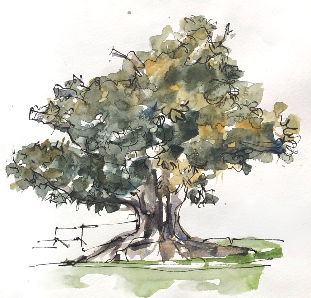
Your eucalyptus sketch is just lovely! Thanks for sharing it again.
I continue to learn so much about paints and pigments from you (particularly grateful you introduced me to Potter’s Pink – such a useful color, esp. for mixing).
Now that the wonderful Edges course with the group is coming to an end, I’ll be turning my efforts to learning better how to mix my local colors. Our landscape here in coastal New England changes dramatically with each of the 4 seasons. Perhaps I will conclude that I need seasonal palettes, or at least different ones for spring/summer vs fall/winter.
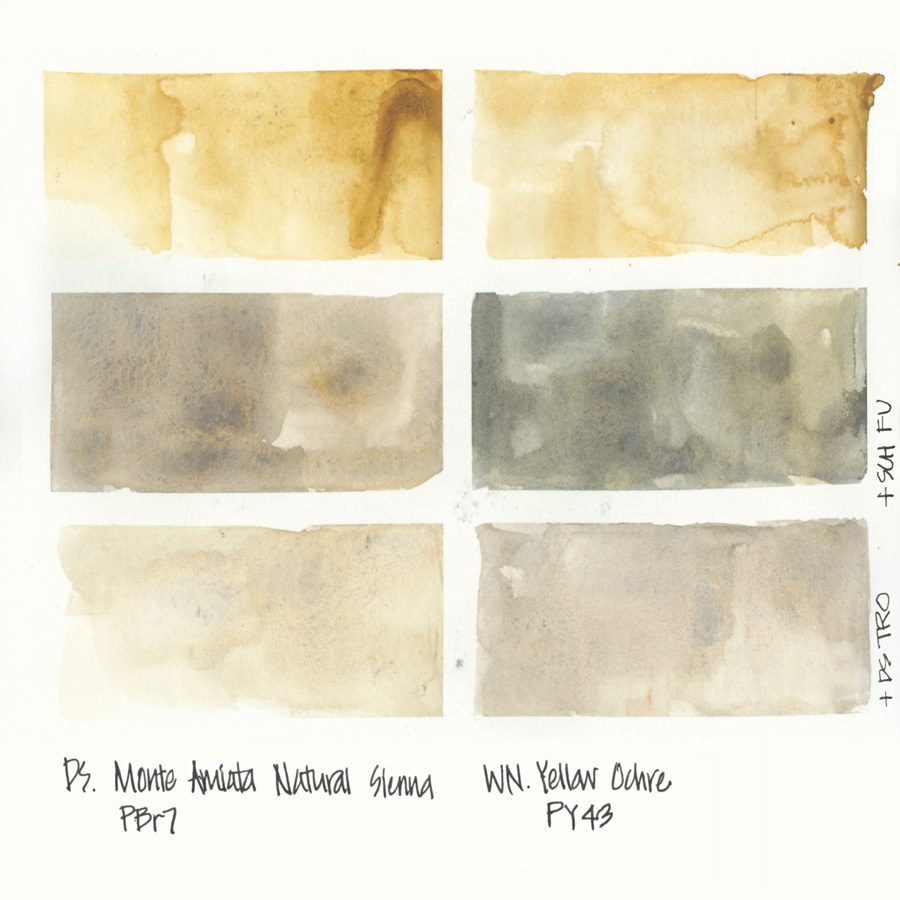
Great study Liz! I’ve had a “love-hate” relationship with yellow ochre for a few years. I tried using it for skies, close to the horizon line, like I see many artists do, but every time I do so, my sky turns green, so I ditched the color from my palette, as I have other yellows that I can use for “home made” greens. But, I was intrigued by your color swatch – the TPO+YO mixture on the bottom right looks very interesting. I see some blue in it. How did you get that blue to come thru? Was that an accidental dirty brush or truly just TPO+YO? I ask because I really like the yellowish gray you achieved, but I have never gotten anything close to it when mixing those 2 pigments. Thanks!!
Looking at the swatches above of the two colors, your pure MANS looks a lot like Quin gold, which is a staple in my palette. Do you prefer MANS for its earthiness vs the transparency of QG? I do love the idea that MANS and a blue go gray rather than green in a sky.
That’s a great question and one that I have had too! I don’t seem to use QG as often as i thought and I was wondering if I truly needed it in my palette.
Hi Liz! I too enjoy your color theory blogs. Have you used DS transparent yellow oxide yet? Because YO is semi-transparent, I have switched over to TYOx and find it to mix lovely greens and grays. I also agree with a previous comment about Quin gold. Lovely greens!
It’s true that Raw Sienna is generally more orange or brown than Yellow Ochre. Oddly enough, Winsor Newton’s Raw Sienna is more YELLOW and less orange or brown than their Yellow Ochre. The WN Raw Sienna is made of PY42 (synthetic iron oxide which is one of the two “Yellow Ochre” pigments) plus PR101. The WN Yellow Ochre is made of PY43 (naturally occurring Iron oxide). Go figure! The WN Raw Sienna is a very confusing color that I wish they had called some sort of ochre rather than Raw Sienna. Nevertheless, WN Raw Sienna is the brightest and most yellow of any other Ochre or Sienna in my swatchbook (DS, WN, Da Vinci, White Nights), and it’s worth consideration for a Yellow Ochre version. I learned about it from a British painter in Wales who uses it in skies so they don’t go green as with using most yellows. I like the WN Raw Sienna because of it’s transparency (WN rates their Raw Sienna as transparent, and their Yellow Ochre as opaque).
I was searching should I get Yellow Ochre for my palette, Oddly I found a lot of artist used both yellow Ochre and raw sienna, other would claim it was muddy the yellow Ochre but yet still incorporated into mixing and color choices and tutorials, honestly the more I searched more I got confused it was this weird love hate relationship, but once I read you article it convinced I just add other colors into raw sienna to get the desired Yellow Ochre or what it intended to be.
I like to have a fairly opaque yellow ochre in the palette for when I want to brush in dry grasses in the foreground, or just need some lighter color on top of something else. I especially like the Blue Ridge Yellow ochre from Rublev for this.
Thank you, Liz for this very clear and in-depth response to the differences between DS MANS and WN YO. From your article, I understand why and when you would choose one over the other. I now have both colours in my paintbox and am happy to experiment.
Thank you also to the rest of your followers, as a beginner, I truly appreciate all your observations and experiences too.
Happy painting!
My pleasure Mercedes! all the best
I use Goethite most, ad I love the granulation, but most of my palettes have yellow ochre, goethite and raw sienna. They all mix differently. I also have Quinacridone gold so can add more brightness to any of them if necessary.
Thanks Jane
I have a few warm earth yellows but they are all not transparent and also quite inert in water. I’m looking for an earth yellow with some flow — would you say MANS has good flow? Does MANS have any pigment properties that stand out to you? I’ve been on the fence on getting a tube (I live in Indonesia and DS is quite pricey here), would love to know how it behaves when you paint with it. I have WN Gold Ochre PY42 and WN Naples Yellow Deep PBr24 that seems like MANS would be somewhere in the same range as these two pigments, but I find them to be quite heavy. Thank you!
Hi Mel. Yes, MANS is transparent and as its a DS paint it has good flow. My favourite paint of all time!
Hi Liz, I love Burgundy yellow Ochre of Daniel Smith. It looks like the Winsor & Newton Yellow Ochre. It is much warmer then the normal yellow ochre. I also use Goethite, the brown Ochre because it has fantastic granulation. Jane Blundell introduced it to me.
Hi Frieda – I haven’t heard of Burgundy YO – will have to look it up… but know Goethite well.
MANS is THE man! Randomly bought a roman szmal full pan of MANS and have found many uses for it. I will probably never get through a full tube of M grahm yellow ochre now. Nice color and great value though
HI JJ – the Daniel Smith version is even nicer!!!!
NEWSLETTER
Subscribe for first notification of workshop + online classes and more.