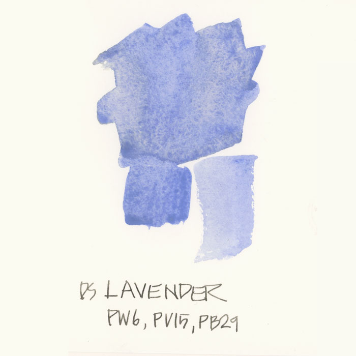
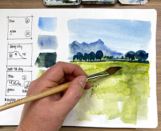
As I mentioned last week, I have added Daniel Smith Lavender to my palette for a bit of fun. I doubt this is a permanent change but it’s just a way to shake things up.
In the last number of months, I keep hearing people talk about this colour so I thought I should have a play with it. But I haven’t worked out how to use it yet… so I thought I would ask for suggestions!
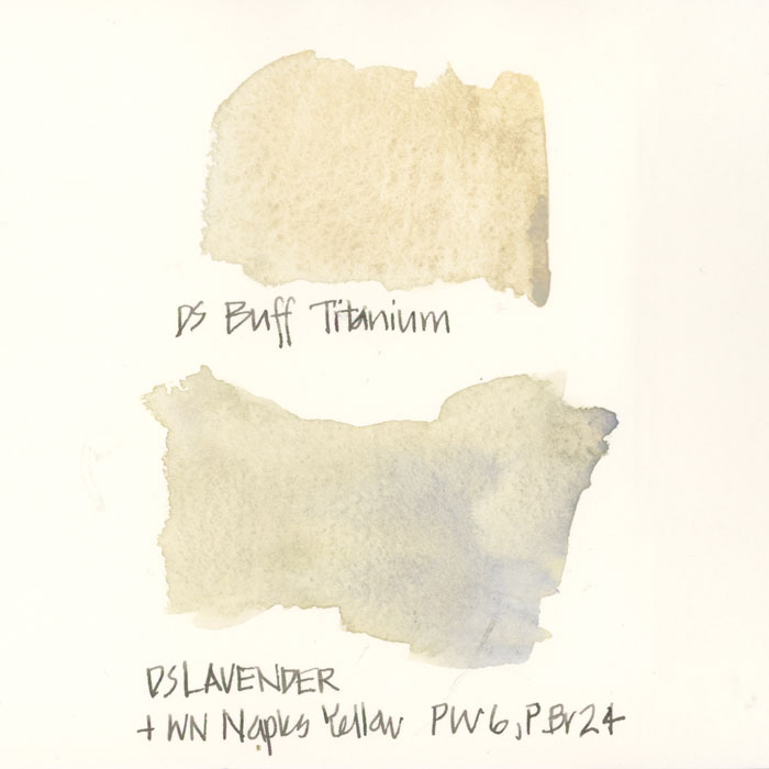
I did mention that I took out Buff Titanium at the same time but I wasn’t implying that Lavender was a substitute for it. Although when I mix it with Naples Yellow it does create an interesting buff-like wash – I think this was an idea I got from Shari Blaukopf who convinced me a few months ago to put Naples Yellow back in my palette. Of course both of these paints are opaque and contain white (PW6) so have to be used with intent to prevent murky washes.
So I would love to hear from you… Have you tried Lavender (in Daniel Smith or another brand)? What do you think of it? What do you use it for?

22 Comments
I saw this in the clouds the other evening.
This is going to be my cheeky answer : The question is not so much how to use it, but where to find a lavender tea cup. There you have a very valid reason to buy a new tea cup if you needed any. Seriously now, I don’t own anything near lavender, but I would try mixes for clouds, for those days when clouds are heavy, seem opaque and look like dark coton balls. More a European kind of weather, I’ll agree. I am wondering, how does it look mixed with Potter’s Pink, and also another mix intrigues me, that would be with VDB. Does your lavender granulates ? it does look like it on your photo, and if it does, it could be lovely with VDB as a grey for old churches.
Lavender and the whole purple spectrum is my favorite hue! I do have the Daniel Smith lavender and love to use it mixed for shadows, skies and my Tea Cups from my great grandmother! Keep it in your palette. It adds a special touch 🙂
Thanks Marilyn. I’ll give it a try. But I need to find some room for it..
It would look great for painting African Violets.
I use Lavender, Buff Titanium and Potters pink as mixers. None are strong pigments on their own but are great to grey off colours and mixes.
Thanks Amanda! Helpful!
I use a number of these colors because we have a lot of victorians in Lavender, Wisteria, etc. I have a small palette I take with me all the time that houses them. So much easier than mixing as they are nearly exact.
Because I have it — I would nto buy it for this — I’ve used it with Paynes Grey in shadows. Evening Prussian Blue skies.
I have used Cobalt Violet (mixed in small amounts) to reduce the intensity of other colors. I find that works best with transparent colors. It gives me an alternative to Burnt Sienna or other earth colors which I sometimes use for the same purpose.
Yes… I’m a relative beginner …..but I’ve just discovered how wonderful the blue violets are with and against yellowy greens .. or just about any greens. Lavender, and cobalt blue Violet in Australian landscapes are much easier to control than Diox Violet….
less staining and less intense.
It seems it might be perfect for shadows on yellow buildings, or other items. Since purples are the compliment of yellows, and also muting the yellow rather than making greens, as Blues would do. I love a granulating lavender. I have cobalt violet light by Holbein, but must confess i have not tried DS violet.
I love to charge into a sky with lavender:) I just love the look. Wet on wet with any of the blues I use. It’s terrific with phalo blue.
I tried it just because it was a free sample. It’s a beautiful color and I think that it can be useful for who paints the lavander fields in France or other flowers (you can find a lot of them of this color).
Personally I prefer to have only the main color in my pallet to compose the shades I need.
Last winter I’ve been using lavender (a bit more purple, not as blue as yours) for cast shadows on snow. Bluer, cooler. More violet, warmer.
Thanks for all the comments everyone!!!!
I have seen this colour used when painting figures in white shirts/blouses and the paper is left unpainted to show the white, the lavender is then used to indicate the shadows in the white clothing.
Good to know! I’ve tried it for shadows but haven’t experimented much with mixing it. Using it with a white background or for other shading (on draping cloth, for example), sounds like something good to try.
Lavender was in the Amesterdam USK bag!
I think everyone got different colours – I got transparent Red Oxide!
I’m commenting well after your initial discussion but I noticed at the online Watercolor Live event several of the artists including Joseph Zbukvic and Keiko Tanabe use Lavender as a mixing color. In fact your post came up as a reply to my google query as to why Lavender (and Wisteria) was being used more in watercolor. From what I can see they use it in mixes and not straight. With the white component it appears that it gives the wash some substance and it tones down the colors while giving it either a cool or warm tone. I would love to see more on this subject.
Hi, I also found this discussion while querying google about the use of lavender in watercolor. I recently did a domestika class with Daniel Pito Campos, who used lavender in a bit of sky . He didn’t quite say why, but that he liked it, and also used it for the shadow of some trees. He mentioned it is also useful for some cool blueish mountains in the background. So far I mixed mine from blue, rose and white, but I am definitely buying a tube of lavender next time I get a chance. I found the gradient to white very nice.
thanks for sharing Jutte!
NEWSLETTER
Subscribe for first notification of workshop + online classes and more.