This week we wrapped up the Live Version of my Watercolour course. It’s hard to find the right words to express how much I love going through a SketchingNow course with a group and hosting weekly livestreams. I always get so much out of revisiting the concepts explained in the lessons and seeing the successes and struggles of the group. So thanks to everyone who was part of it!
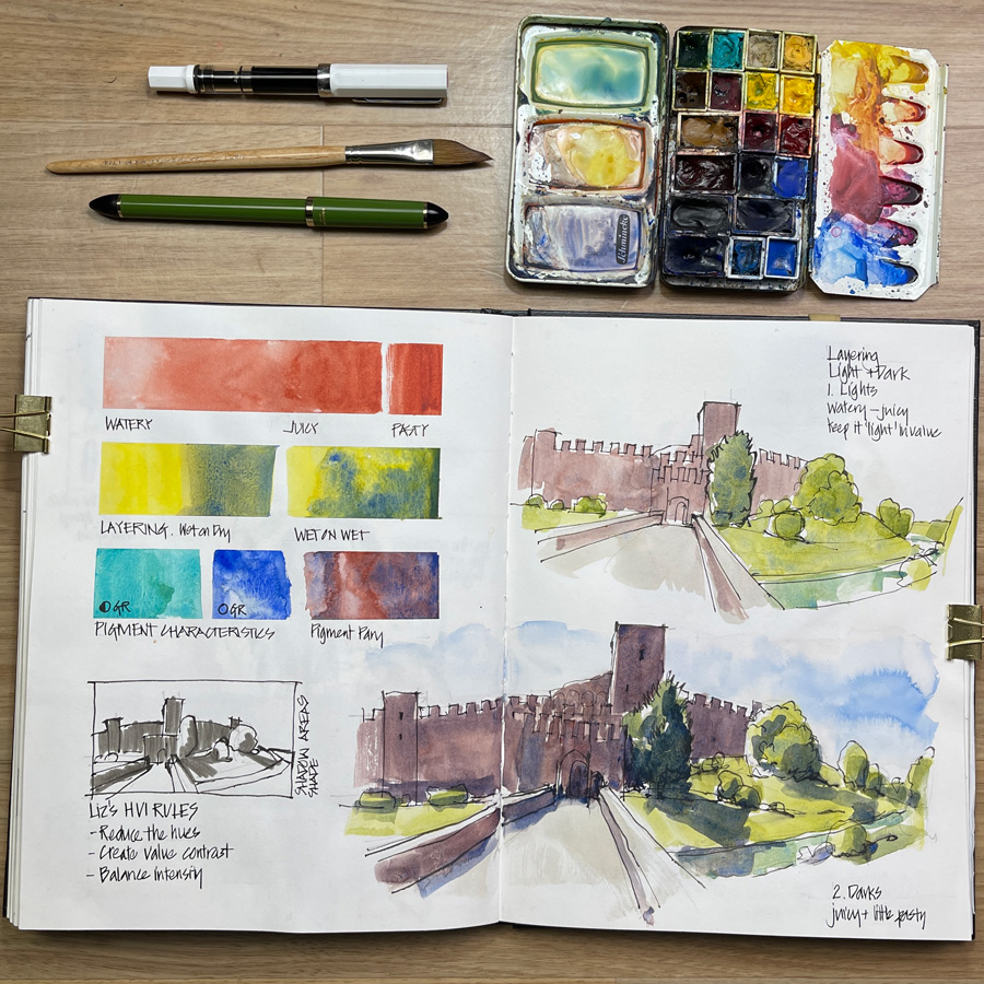
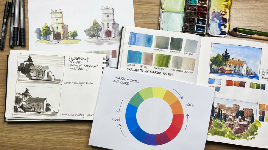
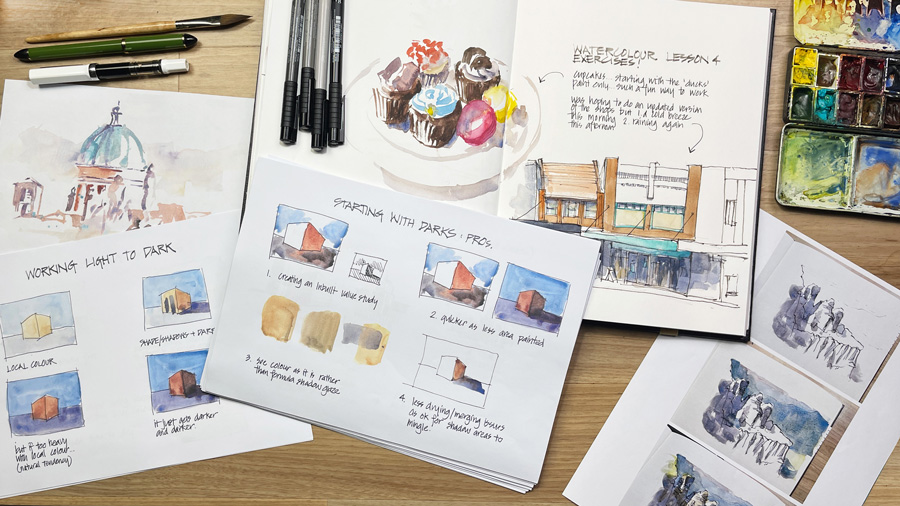
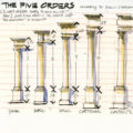
On Tuesday I created this one-page summary of the main themes in the course. This was really fun to put together and now all that I have to do to finish the course is the final exercise. This involves sharing my three takeaways from Watercolour. I have many thoughts going through my head at the moment, but these three are the ones that are standing out for me now.
I have a renewed appreciation of just how important it is to learn how to consistently mix washes with the right amount of water and pigment. Going through the course again, and doing all those live teaching sessions has made me even more aware when I’m mixing a wash in my palette that I have the right ratio for the particular situation I’m about to paint.
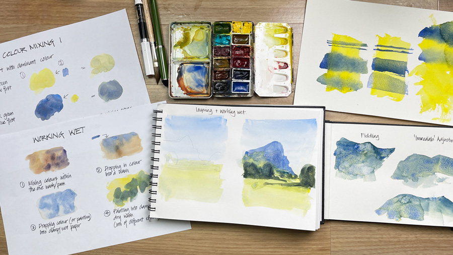
Reducing the scene to a few big shapes, loading the brush well and then applying the wash to the page in big continuous strokes makes watercolour painting so much easier. (No fiddling!) Reducing the hues and creating simple value contrast are also included in this thought.
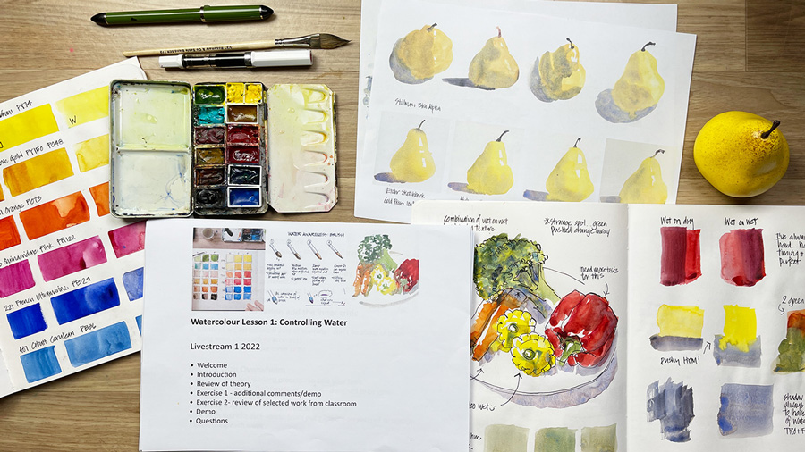
Some of you might know that I don’t generally like 100% cotton paper for quick urban sketching (see this article for more details). In Week 1 of the course, as I was doing some simple paintings of a yellow pear, I suddenly realised that there are subjects for which 100% cotton page works for me. 🙂 This is something to explore further.
As it was too hard to stick to 3 takeaways I have one more point…
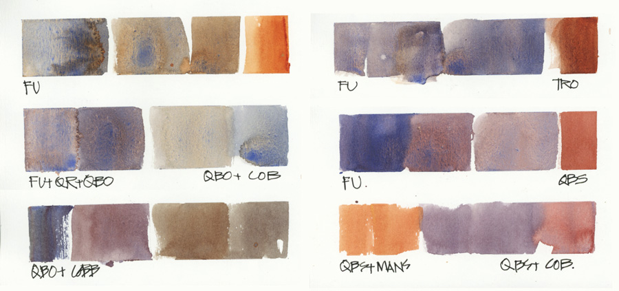
4. Too many granulating colours?
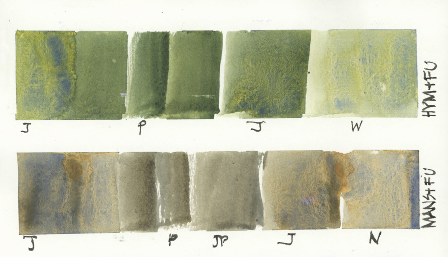
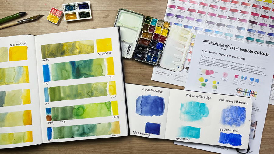
During the Pigment Lesson, I was reminded that mixing granulating colours can become murky and that led me to think about trying a non-granulating ‘burnt sienna’ type colour. As a result, I swapped out Transparent red Oxide for Quinacridone Burnt Scarlet and I’m loving the change.
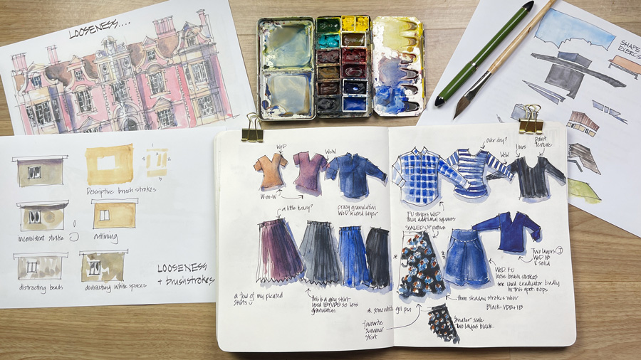
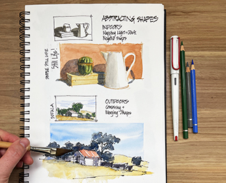
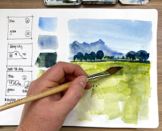
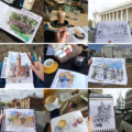
To complete my celebration of going through Watercolour again, I want to share with you all the thumbnail images that I created for the weekly livestreams. These are a good summary of the content of the course and all the bonus material I added this time. If you have purchased the Watercolour course at any time you can watch the replay of these inside the Watercolour classroom.
BTW the Watercolour course is available as a self-paced course so you can start at any time. Find out more here.
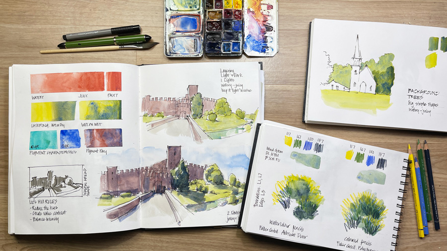
It’s a really colourful collection of photos, isn’t it?
Finally, another huge thank you to everyone who participated in the Watercolour Live Version. I hope that you enjoyed it as much as I did and have seen a significant improvement in your watercolour sketching.





8 Comments
A very big thanks. I have benefited enormously from you teaching in Foundations and Watercolour. Your huge enthusiasm and warm sharing of discoveries have helped me make very good progress as a low level beginner starting with bad habits and ignorant of basic drawing techniques. I have watched your Watercolour livestreams this time and was able to absorb much more from seeing it all again.
Please let others read this if it helps you. I am a devoted fan.
John Burman, Hackney, London.
Gratitude for all you share with us. Your teaching style and skills are so effective. Your obvious patience with yourself and with us students is a gift. Though my lack of internet capability prevents my sharing my own work, i appreciate everyone’s work being posted. I continue to benefit from being able to repeat the courses. What generosity you offer that we can keep coming back learning. Also you are unique in teaching us to go our own way—not just copying how you paint.
Hi Liz
What color is abbreviated as COB?
Thank you!
Hi Maria – sorry I missed replying to you – COB = cobalt blue – I use both Daniel Smith and Winsor and Newton.
I absolutely loved going through the watercolor course again! I’m really looking forward to doing the Edges course with the group, too! I learn so much!
Hi
Just wondering if you could share how to create the creamy colours of Spanish/Italian buildings if you only have a very limited palette – which earthy colours do you think would be best if you could only take two or three in addition to a cool and warm version of yellow, blue and red? Thanks for your insight.
Hi Rachael – check out this article
https://www.lizsteel.com/europe19-mixing-umbrian-stone/
Thanks Everyone!
NEWSLETTER
Subscribe for first notification of workshop + online classes and more.