
When people start sketching with watercolour they are normally obsessed with mixing the perfect colour matches for their subject and producing perfectly smooth washes. At the same time, they want to do this quickly because after all, that’s what sketching is all about.
These two goals (with a rushed technique) can lead to very disappointing results – over-mixed washes become murky and trying to tidy up a wash on the page leads to lots of nasty marks. I know this from experience because it’s exactly what I did when I first started using watercolour, a little over 11 years ago. I also created many flat sketches because I was simply not using enough water and enough pigment!
A lot of my frustration with using watercolour in the early days came from not really understanding the behaviour of pigment suspended in water. Once I really started focusing on learning about that, my painting improved dramatically because I was allowing watercolour to do what it does best – perform magic on the page.
Watercolour looks loose and free, but in fact, it requires deliberate strokes. These strokes need to be placed on the page with a consciousness of water – how wet the page is, how much water is in the brush and how much the new wash should interact with what has already been put down.
When I’m out urban sketching and there are a lot of things happening around me, I’m not always totally in control of the water in my brush and on the page, especially when I’m working fast. But I know that if I keep it simple, be bold and decisive (and not fiddle) then somehow watercolour will take care of the end result. If only I had known these things earlier in my creative journey!
So this is exactly why I created my SketchingNow Watercolour course!
Today I want to share with you a few thoughts about some European travel sketching that explains some aspects of my approach to watercolour.

Tempietto, Veneto
This is one of my all-time favourite sketches because of the circumstances in which I sketched it and how seemingly effortless it felt to do. I did this quick direct watercolour (paint-only) sketch while I was teaching a workshop as part of a Palladian Odyssey tour. All the participants were happy sketching so there was a momentary pause in my instruction. I picked up my paintbrush and tried to capture what I believed was the essence of the building in a few minutes.
This sketch contains a mix of watery, juicy and pasty washes plus a combination of clearly defined shapes and merged washes. These areas of merged washes (wet in wet) are fairly controlled as there is a lot of white space which was preserved on the page.
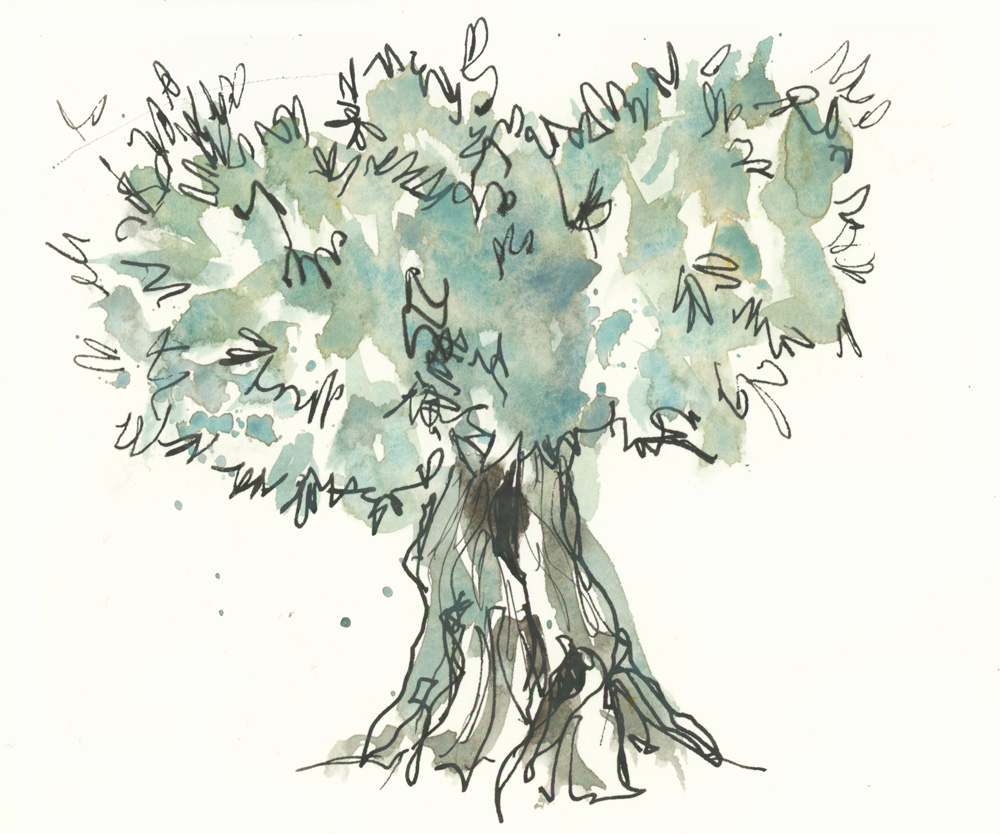
Olive tree, Umbria
Most of my favourite sketches are done when I start with a few watercolour washes as beginning with a big shape with lots of watercolour magic establishes the mood for the whole sketch. It’s much easier to get lively washes when you don’t have a lot of ink outlines that you are trying to fill in. But there are occasions when I get lots of pigment parties as I’m applying paint over an ink drawing. The secret is not to draw too much.
In this sketch of an olive tree, minimal lines give the various washes room to mingle and separate. This is another very quick sketch done as part of a Palladian Odyssey Tour – this time done during a tour of a winery.
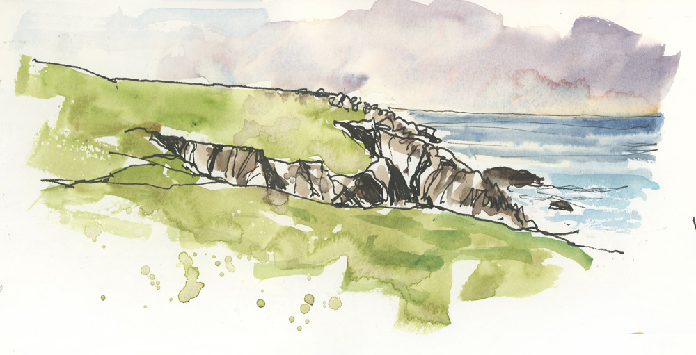
Edge Cafe, Isle of Lewis
Here is a simple landscape (all I could see out of a cafe window) which was also drawn first and then painted.
In terms of watercolour, there is a big blossom/ backrun in the sky (which I like), a mix of wet fuzzy edges and a bit of dry brush to the ocean and then textured washes and splashes to the grass. No neat flat washes for me!
This was a partial view from a very very remote cafe on the Isle of Lewis and done after a lovely meal at a communal table.

Pizza, Palladian Odyssey Dinner
Watercolour is the perfect medium to use when taking risks and sketching in challenging situations – such as documenting my food during a group dinner.
This was hard to do at the time as I was working quickly (the pizza was getting cold!) and the various coloured washes were merging a little more than I had hoped for. Less white space between the elements was a major reason for the loss of definition, but I just let the paint dry naturally and in the end, it looked fine!

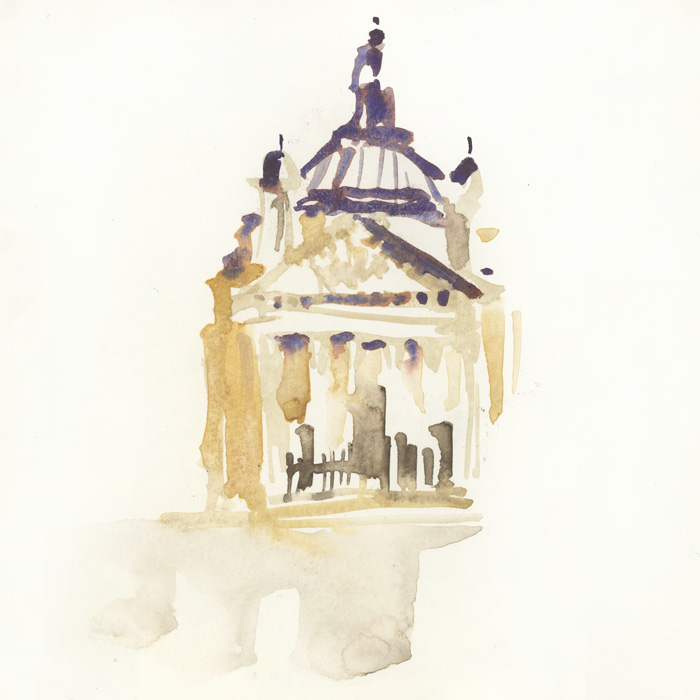
Duomo, Florence
To get back to examples of paint-only/direct watercolour…
This is a good example of finding the right subject matter to draw with a brush. Some scenes/subjects are more difficult to do without all drawn lines initially but the Duomo in Florence is one that IMHO is perfect for paint-only. Why?
I knew that if I worked from right to left (my natural way to work since I’m left-handed) then by the time I finished the ‘drawing’ component (drawing the main elements with my brush), the paint on the right side of the sketch would be in the perfect state of ‘almost dry’ for me to apply the shadow wash on the right side of the dome and tower.

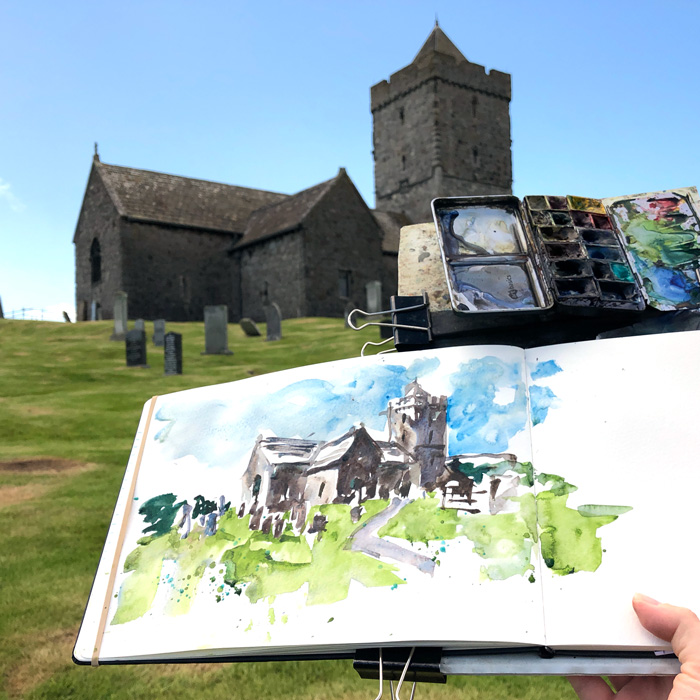
Rodel Chapel, Isle of Harris
Another great subject matter to do paint-only is one with good shadow shapes.
Strong juicy mixes ‘starting with darks’ on a sunny but very windy day. (If you are doing the Watercourse: this is the same building which I show in the gallery section of Lesson 1. How different is the colour of the stone in this sunny day version?)
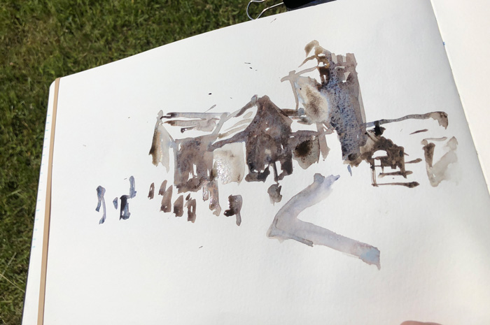
This photo shows how I started with the building and then added the grass around it. Once again the white is a very important element in this sketch. (Another SketchingNow Watercolour note: refer to Lesson 3 Theory 3: Intensity and White)

St Mary’s Basilica, Krakow
This is a very rare example (for me) of starting with a watery wash for the sky. I remember having to make a super extra conscious effort to wait for it to dry (I filled in the time with a little Instagram – replying to comments). In this sketch I drew in ink first as it was very complex and I was sketching with some locals (so I was a bit distracted).
I wasn’t happy with this sketch at the time, but now I like it. I see lots of fun watercolour effects in it, including the merged washes in the foreground.

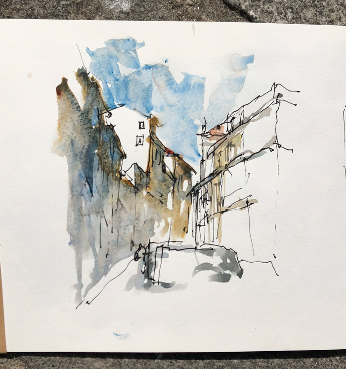
Street view, Porto
This is another example of starting with a shadow shape.
I put a varied wash down first and it was so beautiful that I didn’t need to do much more. This is not what I had planned to do, but I’m always trying to respond to what watercolour is doing on the page. If that means I only do half of what I thought I would do, then I’m very happy.

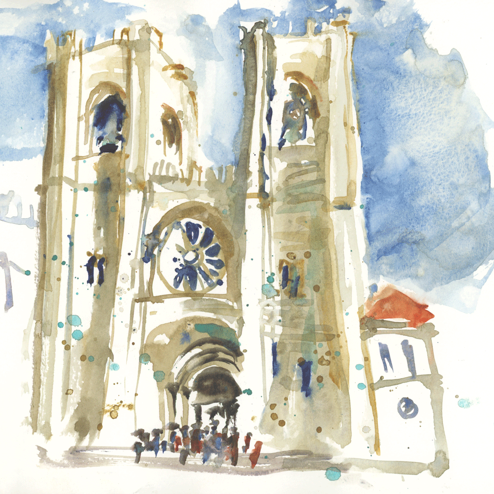
Se Cathedral, Lisbon
This is another good example of the power of leaving whites – ie. starting with the darks. It gives me such freedom with my strokes as it separates the washes.
Oh! I have so many other examples, but I hope this selection gives you a feel for the way I like to approach sketching quickly with watercolour.
I’ve scattered some of the main themes from my Watercolour course throughout so if you have done/are doing the course I hope that you’ll find these new examples interesting. Click here if you want to find out more about the course.
Do you use any of these techniques? Or are you more traditional in your approach? – ink first, then one wash (wait for it to dry) and then another wash.





6 Comments
Liz, thank you for sharing these images from your travels! Knowing your thought process for each one is incredibly helpful. You’ve also given ‘permission’ to change half way through, to not be frustrated by blooms or other unexpected outcomes, and to enjoy the process. Some of us need that! Thank you! ?
My pleasure Wendy – enjoy the permission!!!
A question, if I may – and do forgive me if this is answered elsewhere that I have not found – what do you do when you have made a quick sketch with a lot of water and must run immediately, before the page has had a chance to dry? Close the book on a sheet of blotting paper? Or – ? Many thanks!
Great question. Generally I don’t work that wet that it is a major problem. but there is normally one or two spots which are still wet. I simply walk the streets with a semi=opened sketchbook (my finger separating the pages)
NEWSLETTER
Subscribe for first notification of workshop + online classes and more.