Earlier this week I spend a few hours playing with my paints (something I haven’t done for ages) in order to investigate two issues in my current palette:
- A replacements for Quinacridone Gold (PO49) since it is no longer available. See more here.
- Alternatives for DS Sap Green as I am not 100% happy with it’s hue or the way that it aggressively disperses in water.
I thought it might be good to through my tests in order so that you can follow my thought process. I hope that this might be helpful if you want to do some similar explorations of your own. So here goes…
To start with I did a few quick gold tests, using ‘Old’ Quin Gold (PO49), ‘New’ Quin Gold (PO48, PY150) and Aussie Red Gold (PY83, PR101. PV19).
My main uses of Quin Gold are:
- on its own as gold,
- with Hansa Yellow Medium for a deep yellow (to match New Gamboge) and
- for greens (mainly with Ultramarine Blue and Indanthrone Blue).
So these are the swatches I painted.
This wasn’t a careful test – my water got dirty half way through – but it was good nough for me to discover a few things:
- New Quin Gold seems a bit flatter especially with the green mixes.
- Aussie Red Gold is a lovely colour (different hue – more red than gold) and mixed nice greens but they are more muted.
- New Quin Gold and Aussie Red Gold disperse more than Old Quin Gold.
Note: Before doing this test I knew that PY 150 – Nickel Azo Yellow is very ‘dispersive’. This is used in the New Quin Gold and also in Sap Green. But it is also good to test these things out for yourself. (Thanks to my friend Laurie Wigham for making me more aware of Nickel Azo.)
But the main takeaway wasn’t on paper. In preparing to do this test, I checked how many tubes of Old Quin Gold I still have – six tubes! As I don’t use much, this collection will last me for years. Therefore, I don’t need to make a change to my personal palette for a while and so I didn’t do any further tests to see how usable the New Quin Gold is. I’m sorry that I don’t have a definitive recommendation for anyone needing to buy a new tube.
If you want to find out more about Quin Gold here are two interesting articles:
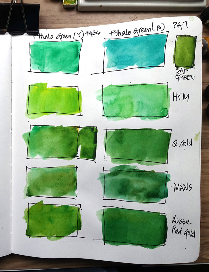
Next I wanted to explore some mixed greens. A lot of people (such as Jane Blundell and Shari Blaukopf) rave about using Pthalo Green (assuming blue shade) for mixing greens.
I understand this, but have never put it in my palette as I prefer to have colours that I can use straight out of the pan. This is particularly important because I work very quickly. I discussed this with Suhita Shirodkar (a fast sketcher like me) last year and she said this wasn’t an issue as she found it easy to tone it down – to dirty it in the palette!
So, I did some tests with the Blue Shade and the Yellow Shade of Pthalo Blue (both Daniel Smith). Most of these were too bright!
Note: DS Sap Green contains Pthalo Green and New Quin Gold (PO 48, PY 150, PG 7) but my mixes were much brighter than Sap Green straight out of the tube.
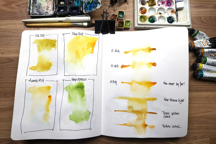
As one of the main purposes for this exploration was to find a mix which ‘stays put’ more than DS Sap Green, I wanted to revisit my dispersion test (dropping pigment onto wet paper). It’s hard to create exactly the same conditions for each test (ie. the same water to pigment ratio in the brush and the same wetness on the paper) so it’s important to observe how quickly the pigment moves through the water at the time.
I also tested some other earth yellows because I want to find a mixed green that behaved ‘better’ than Sap Green.
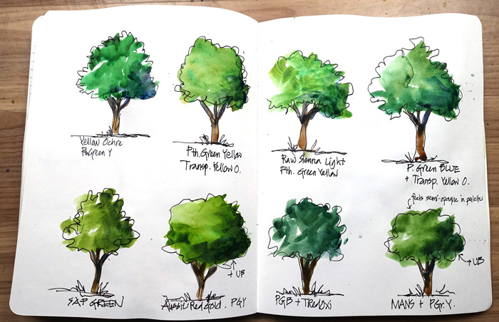
Next, it was time put some of these mixes into action in a ‘tree’ colour chart. I think that the only way to really get to know a colour mix is to try in a real situation and see how it behaves with my usual brush strokes.
The result was that I decided to focus on a mixed green of Monte Amiata Natural Sienna and Pthalo Green (yellow shade).
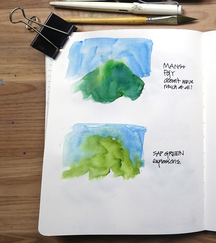
The next test involved putting down a blue sky wash (Cerulean Blue Chromium) and then painting a green hill next to it. (If you have done my SketchingNow Watercolour course, you will know all about this test!!!)
Wow! my new mixed green was impressive in the way it doesn’t move much into the blue and particularly in contrast the craziness of the Sap Green. Because my normal practice is ‘working wet’ with watercolour, Sap Green dispersion is something that I am very conscious of all the time, being very intentional with when and how I use it.
So this was another ‘real life’ test which was much more meaningful for me than just doing a few small colour swatches.
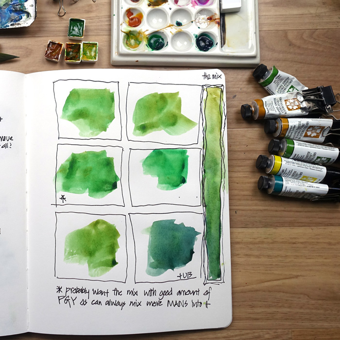
The final test was to play with the combination of Monte Amiata Natural Sienna and Pthalo Green (yellow shade) a little more and then create a half pan of the mix to test in my palette.
I’m not sure that this mix is the perfect answer, but I am going to use in the next few weeks and see how it goes.
I’m also thinking that I should explore these mixes:
- using Pthalo Blue instead of Pthalo Green (hmm, I used to have Pthalo Blue (red shade) in my palette 5 years ago.)
- a mix of Pthalo Green and Transparent Red Oxide.
Oh! there are so many possibilities!
I hope you enjoyed coming on the this little colour journey with me. I would love to hear from you whether you have a green in your palette, or not?




23 Comments
Great post! Testing the mixes on the hill-sky horizon is an especially good idea—I will use that in my next class.
I’m still fascinated by Nickel Azo Yellow, though. Something I figured out recently about NAY is that you can use its pushiness when you need to go into a wet dark green area and put in some lighter yellow-green highlights. It will push the other colors out of the way in attractive organic-looking foliage patterns, especially if they’re non-staining mineral colors (like the siennas and ochres).
It’s also a great glazing color for going over dry areas. Recently I wasn’t sure where I wanted the hill line to start, so I put a light blue wash over much of the painting, and then put the hills in over the blue with NAY when it was mostly dry.
wow, Laurie, I will have to try that: using the pushing-away aspect of NAY…as someone who paints quickly, i often wish I had more lights in my foliage moments after my darks go in: exploring colors that push back would work well for me, I think.
Oh and separately, with Phthalo green, Liz, I break my usual ‘get there in 2 mixes’ rule: it’s one color that needs either dirty water, or palette mud to truly tone it down, so I guess technically that means it needs a triad to get it to where it doesn’t hurt the eye? It’s a bit of a pain, but right now I’m willing to keep it because it’s so versatile and can be pushed to many different greens.
Thanks for the great piece!
Yes, Suhita, I agree with you about the three colours to mix greens. I don’t think that I will use my new mix on its own without adjusting it with a third colour.
Thanks Laurie! Yes, having a pushy yellow would have uses. A pushy yellow is much better than a pushy green – green does yucky things when it moves into other colours – especially red.
I didn’t used to have any greens in my palette, but recently added green apartite genuine (DS). On its own it creates a lovely range of greens, including quite dark and moody and has an amazing granulation effect which works well in trees and foliage. It also produces interesting and useful mixes with other colours. Thanks for the experiments Liz, I always glean a lot of useful tips from your posts.
Yes I am a big fan of GAG too, for the reasons you mention!
I started two years ago with WN Cotman Sap Green. Later I changed it for the artist quality, but I actually liked the Cotman color better (but the feel of the profi paint was better when working with it). But it wasn’t what I was looking for. I did a lot internetcomparison and decided to give DS Genuine Apatite Green a go. And I love this pigment. It is a very lively green that matches Dutch and I can lightem it with yellows, make it more mute with earth colors or darker with dark bllues like French Ultramarine and Paynes Grey.
Hi Ilse – I went through a GAG phase a few years ago. It would be fun to try it again. Thanks for reminding of it!
I’m a newbie, but have been obsessing over greens these few weeks. I’m pretty enamoured of some of the Primateks. Some folks could use Green Apatite for foliage, as is. But most of the Prim. greens are good bases for adding a dab of something else (an earth, a yellow, or another green).
I like Diopside as a strong middle green that isn’t as electric as the Phthalos. Just about anything you add to it, from turquoise through yellows to burnt orange is going to yield an interesting foliage colour – many of them quite useful. Tone it down to taste with PeryleneGrn, or liven it with PY129.
Every time I get these into my palette chaos, some interesting hue appears!
Btw, Diopside is lightfast, low staining, granulating (a bit), and… transparent!
Thanks Pbass Wil. I have never tried Diopside… sounds very interesting. thanks again!
Thanks for the tip! I currently used Green Apatite for its granulation, and also Jadeite, which came with the Primatek Basics set – another nice mixing green, similar to Phthalo Green BS but darker and less aggressive. Diopside will definitely be going on my wishlist, though!
`I have found sap green a bit tricky to incorporate into much of the Aussie landscape so in a limited travel palette I have stopped using it. I have used Yellow Ochre and pulled some Hookers Green into it. This can easily be executed out on location. I have recently tried mixing it with Monte Amiata Natural Sienna with good effect too. Hookers Green is quite versatile and mixed with burnt sienna or red also makes an interesting bush green.
Thanks Nola. I paint more overseas landscapes (scotland!) than Australian and also tend to use brighter colours. I haven’t really used Hookers Green – I will check it out! thanks
Coincidentally, Denise Soden (of the In Liquid Color Y’tube vlog)
just posted a vid about Indanthrone blue, in which she talks about her replacement for Sap Green!
She mixes Anthraquinone Blue (MGraham’s version of Indan.Blue, PB60) with NiAzYlw (NAY PY150), and likes the sappy green she gets. I don’t know about the ‘dispersal’ aspect of it. She speaks about it around 3:30 here:
https://www.youtube.com/watch?v=yVYnwUCqw2U
oh ah!thaks for sharing. Yes, I should test Indanthrone Blue greens. I normally only use it for dark greens, but that video shows beautiful sap and yellow greens as well.
I learned so much in this article! Thanks for showing ideas on evaluating mixtures of paints, and ideas of things to watch for. I swapped my DS Sap Green for DS PG36 (phthalo green yellow shade), and am trying out different mixtures with it. I want to be able to make an olive green also.
BTW – had to add a Handprint link to mixing greens (https://www.handprint.com/HP/WCL/tech34.html). He mentions that he finds that mixing greens takes three paints, and he finds that mixing lines on the green side of the color wheel are curved, not straight. No wonder it’s so hard!
Hi Lisa, I’m glad you found it helpful and thanks for the Handprint link!
amazon.com still has tubes of the old Quinacridone Gold. I just bought 6 of them since I love this color.
Did you check the pigment number?? Are you sure that is what you are getting? I have heard this ran out many years back. Maybe you got the newer tubes and now you have SIX!
I love DS Serpentine Genuine, but I can’t necessarily speak to how it mixes because I use it almost exclusively on its own. It gets the most interesting reddish granulation! May not be in the color range you’re looking for though. Obviously all paint is about personal preference, but I’ve always thought green was especially so.
Hi Liz!
This post is extremely interesting to me given a recent question I posed to Jane Blundell. I am copying that query and her answer here as it might be helpful to someone else. As a result of my query I did a premix of Hansa Yellow Medium and Transparent Red Oxide with Phthalo Green to use in my palette as a Sap Green.
” I have followed your blog for years. I have 2 questions driven by trying to decide on adding colors to my palette after taking Liz Steel’s recent watercolor class. I used your original recommendations for palette colors years ago so I still have a small amount of the PO 49 version of Quin Gold, so I was looking at what to replace it with.
1. You recommend DS Quin Gold (newer version). How does it compare when using it in an actual painting to the old formula? I know that you usually recommend single pigment paints to keep things from getting muddy, especially for those new to watercolor. One criticism I read was that it was not as luminous of a color. This is hard to tell on a paint swatch.
2. DS Sap Green has also changed since it was made with PO49. If you didn’t have the old formula Sap Green, what would your next choice be? I notice that you also like DaVinci and Sennieler. Looking at your swatches they look very different from DS.
As a result of taking Liz’s recent online watercolor class I considered getting a premixed green or mixing one with what I had like you did with Jane’s Grey. So I thought I could just mix Phthalo Green PG7 and the original Quin Gold PO49, but that is when I discovered that the original is no longer made. I have done a alot of color mixing since Liz’s class to determine the color mixes I would personally use the most. In order to do more plein air sketching and making it easier when doing it, I thought it made sense to get a premixed green or 2, then perhaps lighten it or darken it as needed. So this is what sent me down the rabbit hole. I also thought it might be a good choice for my cat’s eyes. I was trying to be judicious in the purchase of more paint (trying to use what I have and not add something I really won’t use.) I’m sure you know that comparing paint swatches without the knowledge of what the paint does is challenging.
I now live in Wilmington, NC. It is described as coastal plains. We live near the Atlantic coast beaches. There are alot of long leaf pines, coastal grass, and of course sand. There are alot of shore birds as well. We have a retention pond and a forested area behind our house which backs up to our yard. While the “pond” is there for the purpose of rainwater runoff it remains full, so we have all matter of wildlife visiting. I worked on mixes with my current watercolors to determine what I might use given the option of things to sketch that I enjoy and are in my surroundings. I love sketching the wildlife and the surrounding landscapes. I also regularly sketch my (green eyed, buff/pale rust to gold) kitty.
I’m sharing what I like to sketch and paint so that you might have a better idea of a recommendation.
Thank you for you time and a wonderful blog! ”
Janes reply
“Pat there is a gorgeous glow to the PO49 Quin Gold that is just lovely. Nearly every ‘hue’ uses PY150 as a base. The problem with that is that it is a pigment that explodes on the page, so the hues will also tend to behave a little differently, with the yellow glow spreading. If you are using Liz’ palette, (or my expanded palette) you may well have DS transparent red oxide – a stunning PR101 granulating burnt Sienna/burnt orange. You will also have hansa yellow medium. You can make your own lovely version of a quin gold hue with the hansa yellow medium with a little Transparent Red Oxide. Get it right so the undercolour is just warm, so it will take much more of the yellow and less of the red oxide. You can then use that mix to make your own greens. Yes they will be three pigment greens but they will be using colours already in your palette. You’d mix the first with a little phthalo green for a sap green and the second with ultramarine for a great undersea green.”
thanks for sharing that Pat. Yes, I was going to try TRO with Pthalo Green and would have added yellow. So a different route but similiar result. Great to have Jan – hey?
NEWSLETTER
Subscribe for first notification of workshop + online classes and more.