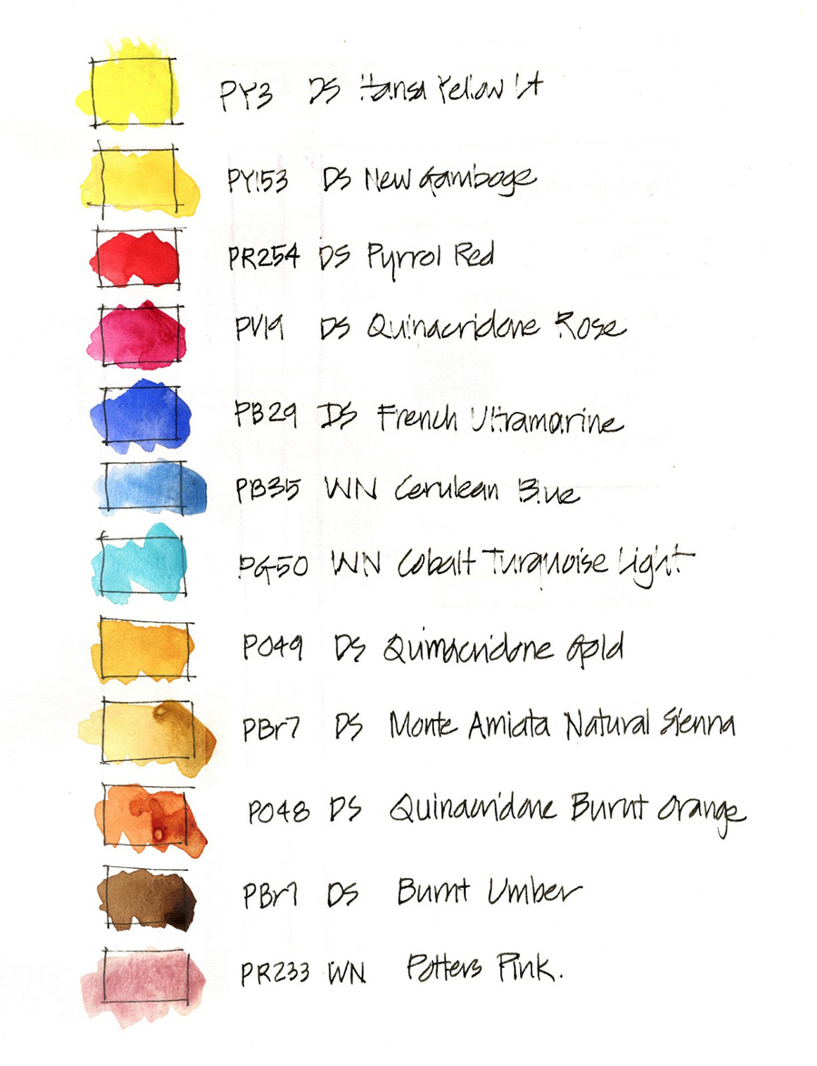
I made a slight change further to my post the other week on a basic palette of 12 colours…
And if you missed it- the actual palette I am using at the moment is slightly different – refer here
slightly modified from the other day- out goes the Winsor Blue Red and in comes CTL!!! I love that colour. Also Sepia has been replaced by Burnt Umber so all single pigments.
I normally use a few more colours in my everyday palette so it is hard to trim down to 12 and I still feel that it might need more refinement. I am thinking of whether it is possible to replace pyrrole red (which is the only really scary heavily pigmented colour in the mix) with transparent orange (a pigment I absolutely love….either Schmincke or DS Trans Pyrrol Orange which I only discovered this week) …like everything in my art I like to evolve and refine. All still the same principles but slightly adjusting over time.
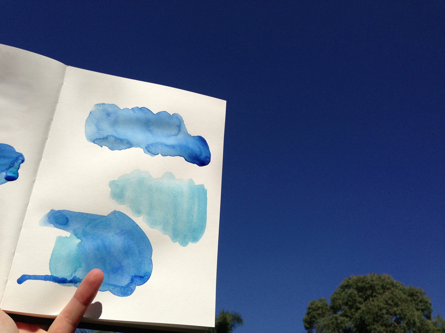
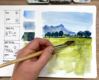
The change to the blue came about after this little exploration trying to match the amazing blue sky colour that we get in Sydney.
The most glorious autumn weather imaginable in the last month… SO warm and sunny. This photo has of course darken the colour of the sky – so hard to show you how much of a match it is. Our sky is still a little warmer than my mixes.
I made an interesting discovery today….looking up handprint.com for some pigment information randomly came across a statement claiming that you can match a pthalo blue by mixing cobalt turq light and a french ultramarine. Now I have Winsor blue (red) shade in my palette for two reasons – it makes a good(well good-ish!) match for our blue skies (this is the top splash of colour) and also makes some nice bright greens when mixed with quin gold. The middle splash of colour is W&N Cerulean Blue – it is just not the right shade for our intense blue sky on a day like today.
The bottom mix is French Ultramarine with CTL and it is indeed a close match for the top one but with much nicer as you have pigment interaction and granulation (this is just a 105 gsm cartridge paper, not serious watercolour)
I am excited as I have no found a way to get CTL into my basic palette… I just simply ADORE that colour. You have to have a few ‘I just had to have it in there’ colours in your palette – friends that just make you smile!


1 Comment
Hey Liz – you know you can mix a New Gamboge hue very easily with Hansa Yellow Light or medium + Quin Gold so you could drop to just two yellows. Makes room for some other friend!
I use Hansa Medium (DS) or Pure Yellow (Schimincke) as a neutral yellow and Quin Gold (only DS) as my two yellows and don't need any others.
I use Transparent Pyrrol Orange as my warm red. It's gorgeous. So is Pyrrol Red but the transparent version is an exact neutralising pair with Phthalo Blue RS so makes a totally rich black.
Isn't it fun?
NEWSLETTER
Subscribe for first notification of workshop + online classes and more.