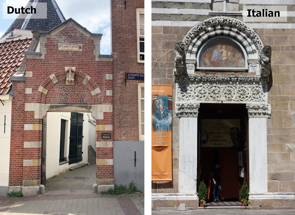
Last week during a livestream for my Foundations course I showed photos of two doors – one Dutch (in Amsterdam) and one Italian (in Lucca). I then asked the group which one would they prefer to draw and/or which one did they think would be easier to draw. There was not necessarily a right answer (it’s a personal choice) and the response was fairly 50/50.
My preference was clearly for the Italian door as the overall shapes were simpler. I then did a quick demo showing how I would approach drawing the two doors. We also discussed how to do brick texture – how much to draw in ink and how much to do in paint.
Yesterday I decided to have a go at doing a ‘proper’ sketch of both and I intended to draw ‘every brick’ for the Dutch door. I started out counting brick courses – something which I often did as an architect but as a sketcher this is extremely rare! As a result my sketch grew, I lost sight of the overall shapes and the symmetry got totally out of whack. So I decided that I didn’t want to continue with it. It was rather late at night and I have less patience for details the more tired I get. I switched to the door from Lucca and ah! it was much easier (and enjoyable).
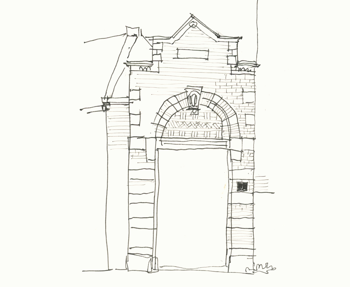
This morning I decided to have another go at the Dutch door. I couldn’t bring myself to draw every brick but I ended up drawing most of the brick courses. In fact, as a general rule, I much prefer to vary the amount of detail which you can see here.
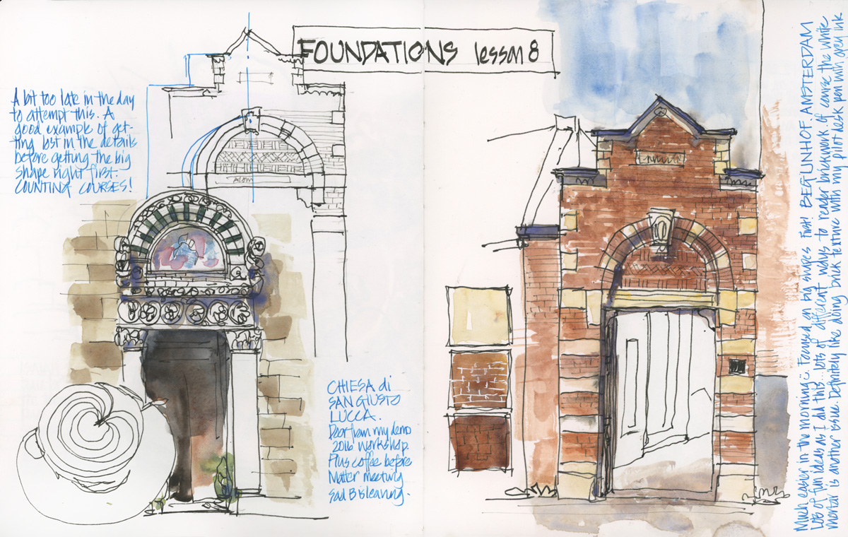
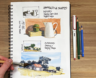
It was really fun to sketch some architectural details and also play with the layout of the page. The design of my sketchbook pages is such a huge part of my work and I’m putting more effort than usual into my pages at the moment as I continue to prep and film the lessons for my upcoming course – Sketchbook Design. This page includes a number of open compositions which we will look at in Lesson 3 of the course. I will start to share some free intro lessons next week, so if you are interested in that please sign up for updates here.
Finally, if you have signed up for Foundations at any time you have access to the replay of this livestream (and other ones too!). Just go to the classroom and check the latest section of the course. I will be doing two more livestreams in December – details for those are also included in the classroom (on the course home page).
So which door would you prefer to sketch, and why?
( If you are receiving this article via email please click on the post link below to leave your comment. Thanks!)

7 Comments
I actually like the Dutch one better, because it is brick. There are similar brick arched doorways all over Italy similar to the Dutch one. I took a few photos when I was in San Gimignano but I saw them in other towns. I love brick and terracotta so I was always drawn to the lovely arches over the doors with decorative brick placement and terracotta accents.
But, if I were to do a watercolor I would choose the Italian door. I like the contrast and it would give me practice in eliminating detail and simply inferring the design.
I prefer the Lucca doorway. The decorative pieces above and below it make it so interesting.
I prefer the Dutch door.. I love the angular aspect of this door and also the prospect of some nice colours for the brick work.. another reason could well be that I have seen the Dutch buildings in person and maybe that generates some level of familiarity..
The black and white marble (It must be) of the door from Lucca is more striking than in the photograph.
It is interesting that a sketch would point out the importance of this use of marble in architecture which I always found quite intriguing.
Hi Yves – yes, its fun the way that a sketch can make one aspect of a building more obvious. BTW when I first visited Italy I was really struck by the patterns of marble everywhere!
So very timely.. I recently leased an apartment in Lucca for 2 years and very sad that I can’t get there yet, as I want to do lots and lots of sketching. So studying your sketch is like my New Years Present!! Lucca is full of remarkable architecture and such rich detailing, like this door.
Yesterday, despite covid lockdown, I decided to treat myself to a visit to the only art supplies store in Bali… I bought 5 different sketch books to test and see which one I preferred… Thanks for that great article about choosing sketchbooks.
I hope you’ll contact me if you are planning to come to Lucca again….
HI Janet – yes Lucca is beautiful and what a place to have an apartment…sad that you can’t get there! Enjoy your new sketchbooks!
NEWSLETTER
Subscribe for first notification of workshop + online classes and more.