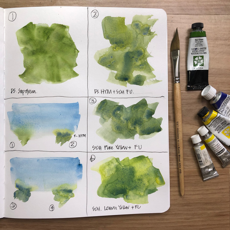
I’ve been saying for a long time that I’m not totally happy with Sap Green (Daniel Smith). It’s doing the job but the hue is not quite right and I’m not a fan of its aggressive dispersiveness.
I explained more about my thoughts in my article last year as part of my ‘Colours in my palette’ series here – where I also address why I have a ‘convenience green’ paint at all.
I’ve been thinking for a long time that I should just combine my yellow (DS Hansa Yellow Medium) and my Ultramarine (Schmincke French Ultramarine) into a pan and use this instead of Sap Green as this is my favourite mix for creating greens.
But then I got thinking… if dispersiveness is one of the things I want to address in my new selection, maybe I should consider using a different yellow (a Schmincke?) instead.(Daniel Smith paints are generally very dispersive – including HYM)
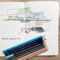
So I did this page to compare a few mixes, and also to see what happens when a bit of a green wash touches a damp sky. I’m liking the way the yellow is separating in options 2 and 3. I’m also liking the vibrancy of Option 4. All of these options are fun!
I’m writing this article while waiting for the page to dry… and I’m not sure which mix I should try. Any thoughts?
And btw, I’m continuing to go through my old blogposts and came across this one about Cascade Green this morning. Ah! that is a fun colour. See here for my article from 2015.


18 Comments
Be interested to hear more of your thoughts on dispersiveness.
Hello Liz, ah green, a really curly one. Of your trial greens mixes, no.4 appears to be the closest to sap green, having more warmth than the others and, of course, having the advantage of the variation in colour over using only sap green. Much more interesting.
May I take the opportunity also, to say an over due thank you for your review (livestream 7 I think) of my work on the Sketchbook Design course. I’ve made some of the changes that you suggested, ie. extending the wash on my wallabies adding borders, etc. Yes, an improvement I must say!! Thanks again Liz. It was truly a great course.
1 or 4 for me but similarly to Marion above I would like to understand more about dispersiveness and how it can help with the final effect when compared to non-dispersiveness . I was wondering about this when reading about the UM comparisons last month…
I like number 4. I use a few convenience greens mostly because I like the colour but I find that the one I use the most is Daniel Smith’s Apatite Green(or is it green apatite?)
Instead of DS “Sap Green” I am using “Green Apatite Genuine” a Primatek also by Daniel Smith. It is very rich and gives my a nice mid green.
I think the issue is particle size. Titanium white has a large particle size and some of the earth tones. Are there painting mediums that keep dispersion in check?
I like Holbein sap green.
I love DS Green Apatite Genuine. It can be very dark with a few layers , medium and light with more water. Can also mix with blue, yellow or red to change its tone. Love the texture too!
I like No. 4 too 🙂 Good dispersing and vibrant colour – winner winner
I use lately the sap green of Sennelier (PB 29 – PY 153) because it has many shades between blue green and yellow green than that of Daniel Smith.
I also like the color of Schmincke’s permanent olive green (PO 62 – PG7) especially when combined with lemon yellow for brighter greens like spring greens
The ‘dispersiveness’ of greens into a wet sky is a very annoying I find, but I dont know enough about different brands to comment of paints that are less so.
I removed all greens (inc. DS sap green) from my core palette about 18 months ago – I solely mix my greens now. I have a DS HYM as my primary yellow and Quin gold for darks. I use several blues – DS ultramarine, prussian (mainly) and pthalo blue torquise (for the rare vibrant/acid green, but I mainly use this for greys).
Not having a ‘convenience’ green doesn’t bother me anymore.
Can I also say, it’s thanks to you I managed to overcome my fear of mixing colours! My first core colour palette was pretty much yours in 2018 and I’ve chopped and changed since but I’m always thankful to you for my first colour palette 🙂
By the way, I like your #4 mix – depth and variation is lovely
I’ve been thinking about ditching my sap green, too. I find that I end up constantly mixing my sap green anyway. I seem to always need it a little bluer, a little yellower. I do admit one of my favorite mixes is sap green with cobalt teal light, so I’d have to learn how to make that mix! I have not yet done enough landscapes for the dispersiveness to annoy me too much, but I have definitely found it to “explode” surprisingly and unexpectedly. It does, sometimes, then cause mud colors, especially when it disperses into my oranges. Particularly in food sketches where I’ve got orange sauces and green vegetables in it.
Liz I tried a bunch of different sap greens and decided that for my taste QOR watercolors has the most palette-able Sap Green on the market.
Hi Patricia – thanks for sharing! that is very interesting… while have to do more work with QOR (one day!)
I have sap green from w&n, and it gets the job done, but is a very flat color. I don’t have Hansa yellow though….I have lemon yellow or cadmium yellow med I believe…would those work? I don’t have loads of paints, and no work meams no money to buy more so it’ll have to work I guess…but thought I’d ask to not waste what little I have. But if you’ve not tried it, of course thats no problem!! I appreciate this article a ton! Thanks for all your great insights!!
I have a mix of PG36+PY154 in my palette that I quite like. The PY154 has interesting depths to it – not sure how to describe it! It is a bright and clear yellow which gets a touch ruddy in masstone, and the texture makes for really neat mixes. My mix is slightly on the bright side of mid-green, and I like that I can add a touch of red, red-brown, brown or violet to make it a little more rich and deep. I’m thinking about checking out PG7+PG36 next. All paints mentioned are Mijello Mission Gold, which are so rich and vibrant and just a joy. I’m in west coast Canada, a large range of greens is very important to me! Liz – on my way to check out that Cascade green post!
Thanks for sharing Nicole and I can imagine how important green would be for you!
NEWSLETTER
Subscribe for first notification of workshop + online classes and more.