
It’s that time again… time for me to wrap up my articles about my recent Californian trip with a few reflections from my adventures. I love doing this after an overseas trip – you can read the other articles here.
This time I am going to keep it short and only share three thoughts.
Going on these big trips is an extravagant exercise, and so having a workshop (or two) to help fund the travel makes a lot of sense. But this trip was teaching free and therefore a big expense but I like to view it as an investment in myself as an artist. I love teaching beyond words, but because I wasn’t doing that this trip, I was more open to receiving new ideas. And I got an abundance of them – in fact I wrote four pages of notes recording the thoughts and ideas that I could remember once I was home.
Through my meetups with other artists, I got a heap of new ideas for art projects and also for my business. I had so many rich conversations about art and life as an artist this trip!
I also had time for the development of new skills through my success and failures in sketching the Victorians, the Craftsman houses and shadows on the white Mission buildings.
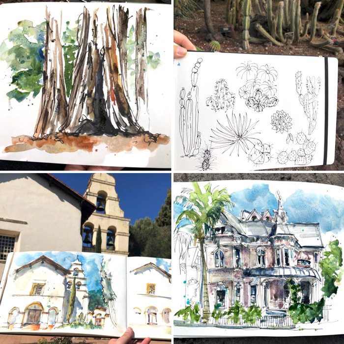
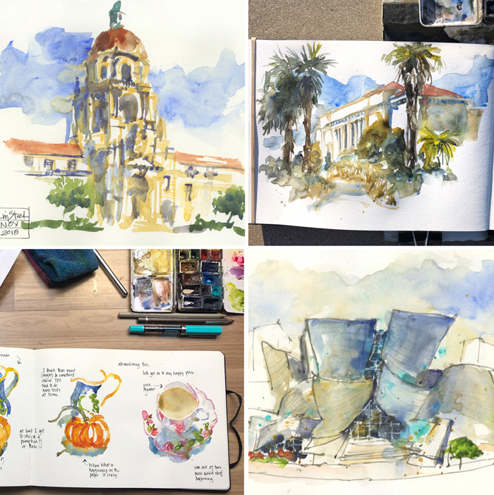
My sketchbooks for this trip contain the greatest variety of subject matter that I have achieved for a long time.
Being with other sketchers who took me to their favourite spots was a big part of this (eg. Suhita took me to sketch a vintage sign, Nina to the Google Campus, Gay to a redwood tree, Virginia/Phoebe to a garden and many more). When I’m in Europe I am often city bound and then sketch a lot of buildings, or if I’m in Scotland an do a lot of landscapes. But on this trip I saw a great variety – part of that is the richness of California too.
On this trip I made an adjustment to my palette and swapped out Cerulean Blue Chromium (temporarily) for Cobalt Blue. Now that I am home I want to make a more permanent change so that I can have both in my palette.
So why the change?
The light was different in California and the sky was a deeper and pinker blue than I am used to seeing. Cerulean Blue Chromium with a bit of Quin Rose (my usual solution) didn’t feel right so I tried Cobalt Blue and loved it.
Once Cobalt was in my palette I rediscovered what a gorgeous transparent pigment it is. (Note: I used to have Cobalt in my palette a number of years ago so it wasn’t a new colour by any means). I also realised how much it is a main stay to Brenda Swenson’s shadows.
I will be sharing more about Cobalt in a future article, but rediscovering it was definitely a big event of this trip.
There was so much more to my CA18 trip than these three ideas, but they are the most important takeaways.
Thanks for coming in the journey with me! I hope you enjoyed the ride.



14 Comments
Hi Liz,
The casual address would indicate that I know you. I don’t. Only through Instagram, old YouTube videos (where I first found you) and your emails, which I eagerly anticipate.
I just want to thank you, and tell you how much I personally appreciate your efforts and time dedicated to sharing with us far away art voyagers. The art community is made better by your dedication.
I’ve lived in California 76 yrs. Your resent trip helped me realize, I’ve got a lot to sketch, right here at home.
Thanks Stan – my pleasure.
Thank you so much for your notes on your CA trip! It’s been enlightening to “see” my area of CA through someone else’s. I’ve learned a bit about local architecture and sky color. So many things to draw, even if I don’t get out of SoCal!
thanks Corinne – yes! lots to sketch in SoCal!!!!
Love the persimmons! I’ve never seen them growing, but I think you’ve captured their colour beautifully.
Cobalt Blue has been on my wishlist for a while, as the sky here in the UK is often a deep warm blue on late summer and autumn days, so I look forward to further posts on the topic. Alas it’s getting chilly here and the days are now very short, so no outdoor sketching for me for a few months!
Thanks Anne. Yes, I have always thought Cobalt was good for UK skies… but previously was happy with cerulean Chromium mixed with a bit of quin rose. Will definitely be sharing more soon
That’s very interesting. I wasn’t too interested to try Cerulean for a sky color because I have been using a mixture of Ultramarine and Pthalo Blue (green shade) or Ultramarine and Cenereus Blue (a semi opaque Sennelier color).
The only cobalt I have is a weak Cotman paint. So I will have to look more onto it.
HI Andrea – totally understand your mixes.There is something beautiful about the cobalt pigment (more soon!)
Next time you come to California, be sure to come up North – I’d love it if you would bring a teaching trip up here!
Hi Michelle – yes, still lots of CA for me to explore!
Hi Liz,
Lots to love here! First, the variety is wonderful. In some video of Brenda Swenson, I believe she referred to this type of page as a sketch collage. Brilliant idea….combining many things! Second, I like the sharing of 3 thoughts so simply listed out with numbers! And third, I am very interested in that journal with Trip notes I and II. What do you include there?
Thanks for all that you share, I am always inspired!
Rhonda
HI Rhonda – the trip notes are ideas sparked from conversations I had and range in subject matter. Eg. Draw some figs or Study Sargent or Dropping in Colour: Do tests to see why TPO was behaving strangely.
I think it is good to take some time for you for a change. You seem to go non-stop with workshops and doing those you concentrate on buildings and perspective. This gave you the chance to draw what interests you at the time, not what is expected as part of the curriculum. I saw in your next post that you are doing a workshop at The Rocks. I remember being there and sketching that area when I was visiting this year.
Thanks Joan – yes I normally teach my speciality, so no teaching gives me the headspace to sketch different stuff.
NEWSLETTER
Subscribe for first notification of workshop + online classes and more.