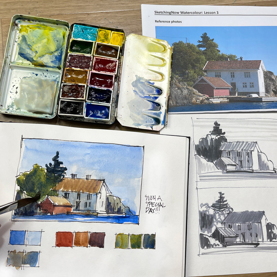
On Monday I shared two important skills for watercolour sketching – seeing scenes as simple shapes and being generous when creating washes. I also mentioned a third important skill which is to see colour as value.
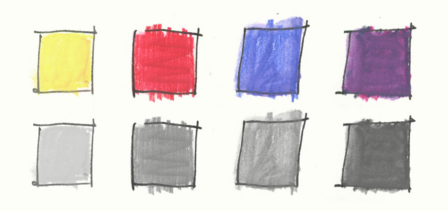
This image shows one of the exercises inside my Watercolour course where we explore the way that hue (colour) and value work together. We do a few value studies and then simplify the hues.
If you are a beginner…
Value refers to how light or dark a colour is. So, if we were to convert a colour to grey-scale, how light or dark would that grey be? In this example, yellow has a light value, red has a mid-value, blue also has a mid-value, and purple has a dark one. These swatches show that even though the hues are different (red and blue), sometimes their values can be the same.
Value is the most important aspect of colour because our eye is drawn to contrasts between light and dark. We have a tendency to put colour down as all mid-value and this is what our object brain thinks it sees! So when we paint we have to intentionally study the scene in front of us to make sure that our sketch has a pleasing composition of lights and darks. And often we make adjustments to the values in the scene to make our sketch read better.
When you are beginning with watercolour it’s easy to stress about matching the exact colours of our scene but focusing on creating a nice contrast of values is much more important.
Here is a simple example using a scene I sketch a lot…

If I’m just thinking about matching individual colour (hue) and not thinking about value at all I could end up with something like this. Everything is mid-value as shown by the greyscale version. And the result is that the sketch is terribly flat and heavy! 🙂

If I do a simple value study then I become more aware of light and dark areas and the sketch has contrast and interest.
Just for the record, I was bored by the time I had drawn this scene three times in a row. 🙂
And how do we start seeing values rather than hues? The simple answer is to squint!
This is a brief introduction to the topic but if this is a new concept for you I hope that you can see why it’s so important! And of course, we go into more detail inside the Watercolour course!
For those of you who are familiar with value studies, I now want to share a few thoughts on how I think about values in my everyday sketching…
I love doing value studies and the process of adjusting values and designing the whole composition to tell a story but the reality is that I rarely do them in my everyday quick sketching!
I will do a few thumbnails if I’m wanting to tackle a really complex scene but generally, I think through the process without actually doing a thumbnail.
I’m interested in developing ways of working that allow me to design on the fly and I love thinking through the issues as I work. I want my sketches to be spontaneous and exploratory and so too much planning takes away from this spontaneity. I’m not trying to become a Plein Air painter!
This is my preference for my personal sketching but when I teach I always use value studies and thumbnails!
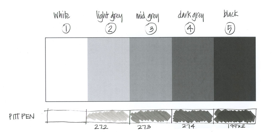
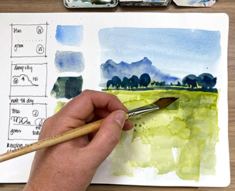
I use a 5-step value scale with 1 as white and 5 as dark. I think in terms of these numbers when I’m mixing and applying washes to my page. eg. I’m constantly asking myself “Is this wash a 2 or a 3?”
To be honest, I don’t always think in terms of the 5-step value scale but whenever I look at a scene I always mentally map the light and dark. This means that I clearly distinguish what areas are receiving direct sunlight and what areas are in shade and cast shadow. This is a really powerful way of quickly accessing the values of a scene.
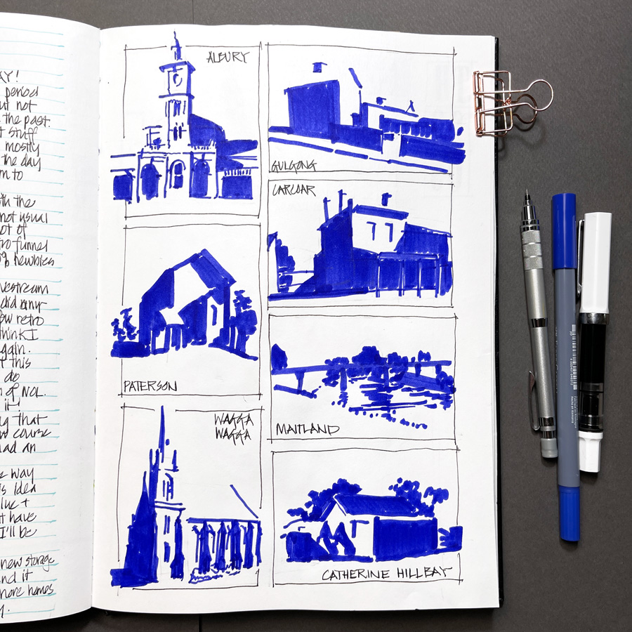
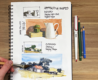
These thumbnails that I did last year as part of an exercise for Watercolour On Location show what I see mentally whenever I look at a scene (assuming it’s a sunny day). My architectural background means that I’m generally able to retain the areas of shadow in my head while I work.
I have a few general rules that I rely on after I have mentally mapped light and dark:
- Light areas are Values 1-3 and the dark side areas are Values 3-5
- The areas in the light are generally lighter than I think they are
- On the dark side, I try to merge and simplify shapes, add washes confidently without overworking and aim to create lots of pigment parties in my shadow washes.
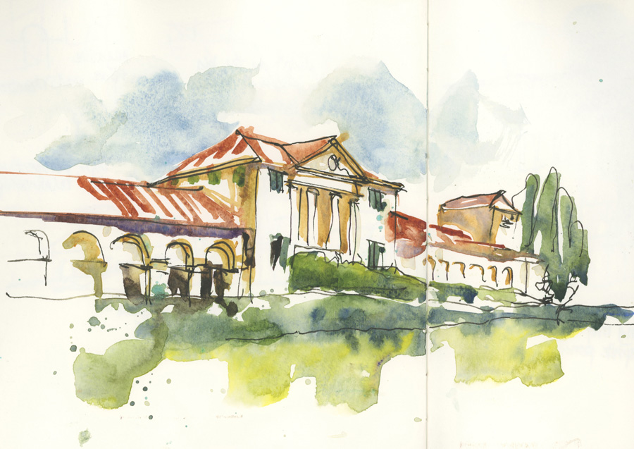
For many years I have used the technique of ‘starting with the darks’ – painting the shadow shapes first and then moving into the light areas. I think of this technique as an inbuilt value study and it’s a great example of how watercolour sketching can often be very different from traditional watercolour painting.
So in essence, I think through the values of a scene beforehand (relying heavily on defining the shadow shapes (the dark side) first), I make sure the local colours on the light side are not too dark and I aim to achieve the values I want in either one or two washes.
Ah! this is such a wonderful topic to discuss…but I think that this is enough for one article! 🙂
If you are looking for instruction about these concepts within my SketchingNow courses check out these lessons:
- Foundations Lesson 3 (essential shape skills)
- Edges Lesson 4
- Watercolour Lessons 3 and 4
- Buildings Lesson 4
- Watercolour On Location (Lessons 1, 2 and 4)… designing values is a huge part of this course!
And just a reminder that a group will be working through the Watercolour course starting on 15 March. If you have purchased this course at any time you can join this cohort – all you have to do is visit the Watercolour Course via My Courses and follow the instructions on the course homepage. I’ll be sending out an email to you next week with more details.
I hope that you have found these thoughts about working with values helpful. It’s a huge topic and one that I love thinking about and discussing! Do you have an everyday strategy for working with values in your work? Do you consistently do value studies? I would love to hear from you in the comment section below!
(If you are reading this via email, please click on the article title link below and add a comment on my blog. Thanks!)



14 Comments
Liz, this post was sooo helpful. It is just what I needed to think about! Thank you.
Thank you Liz. This is a great reminder and it takes me back to your wonderful instruction in the Veneto.
Thanks Sharon! and yes! those are great memories my friend!!!!
Hi Liz,
I hope you are feeling better! I just wanted to express how impactful this post is for me. Your comprehensive yet digestible approach to explaining the importance of value is extremely helpful. Moreover, this post provides a roadmap for me to take a deeper dive into the topic and improve my skills, even as I’m struggling to find the time commit to another run-through of the full watercolour course. This is like an intermediate to advanced mini course that’s brilliantly structured for us to follow. Your expertise and experience in this field truly shine through with posts like this one! I would love to see more of these posts that map out a beneficial path for us to follow, skipping and through the relevant lessons across your library of courses. I don’t want to take away from the importance of going through a course, like watercolour, start-to-finish. But this topical map across your courses is very useful! I hope you will do more of these kinds of posts to guide us back into and through your material.
Thank you.
~Lance
Hi Lanca – thanks for the lovely comment and I’m glad you liked the article.
This is a great summary of an essential concept! And it reminds me just how helpful all these exercises were in your courses. I’m really looking forward to jumping back into Watercolor with the group in March after I had to step out mid-way through last summer.
I’m deeply grateful to have had you teach me how to sketch and use the wonderful medium of watercolor. At the new year, I set myself a challenge and have been sketching every day since Jan 1st (haven’t missed a day yet). I’m looking forward doing next week’s 100 People/1 Week Challenge. 🙂
Susanna
Thank you Liz. I loved reading your advice .. very valuable! It’s a tricky technique but reading your article certainly helped to make more sense of it.
I will ne out there looking for my darks and lights.
excellent article! Thanks Liz!
Thank you! You changed my mindset and way of painting. Today I was painting outside and was having fun again. The value studies will help definitely help improving my sketches. I just started with the course: watercolor after painting and sketching for a year but now I am mixing colours in a different way (no overmixing but let the pigments party and let them do their magic) gives me so much joy!
Love this post, very helpful in understanding values and stopping to take the time to notice them
My pleasure Bruce – glad it’s helpful!
I love doing value studies, but I find I still don’t think about it in the moment if I’m sketching quickly. I’m particularly bad at remembering to leave the lights and whites.
HI Jamie – you just described a vary common sketching problem :-)!
I first really explored value studies in the Watercolour on Location class and was shocked at how much “structure” became visible by sketching ONLY shadow in a scene. From still-life’s to plein air building sketches, by drawing only the shadowed parts, the shapes of objects can be made out easily. This was an absolute wow-moment for me and, as a photographer, it has shifted my standard edits as well…I’m now intensifying the darks in my photos because I’ve fallen in love with the contrast! So thankful for all you have taught me!
NEWSLETTER
Subscribe for first notification of workshop + online classes and more.