
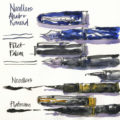
A number of you wanted to know what colours I have in my little palette (that I’m using as part of a new personal challenge), so here is the list.
Left Column:
DS Quinacridone Gold PO49
DS Monte Amiata Natural Sienna PBr7
DS Transparent Red Oxide PR101
DS Van Dyck Brown PBr7
Steels Grey III (a pre-mix of WN Cobalt Deep Blue with a little DS Quin Burnt Orange and a touch of DS Quin Rose)
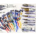
Middle Column:
WN Potters Pink PR233
Mixed Green (a pre-mix of DS Hansa Yellow Medium PY97 and SCH French Ultramarine PB29)
WN Cobalt Turquoise Light PG50
DS Indanthrone Blue PB60
Right Column:
DS Hansa Yellow Medium PY97
DS Transparent Pyrrol Orange PO71
DS Quinacridone Rose PV19
SCH French Ultramarine PB29
DS Cobalt Blue PB28
Notes:
- DS = Daniel Smith, WN = Winsor Newton, SCH = Schmincke
- Refer to this article for all the colours in my usual palette. And to this series for my reasons why.
- The palette was a gift, so I don’t have a link to it.
- To fit so many pans in such a small palette, I used Winsor and Newton half-pans (which are smaller than other brands) and slightly shaved off the corners of the end ones.
Let me know in the comments section below if you have any questions.
Finally – a HUGE thanks to everyone who left a comment on my previous article. It means so much to me to hear from you all, and I will reply to every comment.:-)


18 Comments
Liz — always glad for your pallette posts thank you …..
*- would you demo how you make those pre-mixes ?
*And describe why both Quin gold and MANS? Whats the difference between them ?
Hi Barry,
for the pre-mixes I simply squeeze a little of each colour into the pan and stir with a toothpick (nothing scientific about it)
Check out this article for Quin Gold vs Mans. https://www.lizsteel.com/colours-in-my-palette-yellow/
I was wondering about the pre-mixes as well? I might wonder if there is an explanation that in the watercolor course somewhere? I am not really focused on watercolors right now, as I am focusing on line work. I have a small palette with a lot of WN colours, as they are mostly available in my local art store. And some Aquarius colours which are good value. And I splurged at a larger 24 colour palette from Schmincke which I use a lot for my at home sketching. And I recently discovered magnesium brown by WN. It’s a colour that Ian Fennelly uses a lot, and I really like it. It mixes easily, doesn’t does weird things on the paper with other paints. I like that it isn’t too red or too brown. It’s good with mixing with natural sienna and is great for pastry, coffee and the fur colour of my beloved whippet. Three of my major sketching subjects LOL. Hmmmm….maybe I am more into watercolor than I thought 😉
Hi Martine, for the pre-mixes I simply squeeze a little of each colour into the pan and stir with a toothpick (nothing scientific about it)
I haven’t used magnesium Brown – thanks for sharing.
Thank you for sharing your colour choices, always helpful because I never seem to stop searching for just the right colours that will work. I have the same little palette set up in the same way with some of the same colours but some different, mine came from Winsor and Newton years ago and I’ve found it really useful for taking a minimal kit on a sketching outing.
Hi Carol – glad it’s helpful and yes! It’s such a nice little palette!
Hi Liz!
Will try to keep the comments coming! 🙂
Thank you so much for sharing your palettes! I love to hear your thought process behind color selections.
I’ve been using the same colors since 2019 (I’m on a very strict budget, so I can rarely buy new tubes of watercolor). Overall, I think I’m happy with my palette. I can fall in love with almost any color, so I’m easily contented. 🙂 Blogs like yours and Jane Blundell’s helped me to avoid so much waste while I was setting up my original palette. Thank you so much for all your detailed pigment posts!
I do have a long wish list of paints to try – someday. 🙂 I love cyans/blues, so I’d love to expand my collection there. I’ve also heard great things about Transparent Red Oxide, so that is on my list as well. It would be fun to experiment with single-pigment purples. Chrome Titanate Yellow also looks so soft and lovely.
I have one problem area in my palette, which is the yellow section. It’s not a problem, really — more of a dilemma. Currently, I have Hansa Yellow Light and Nickel Azo Yellow. I love the versatility of Nickel Azo Yellow and the pure, soft nature of HYL, but someday I would like to simplify to just one yellow. Nickel Azo Yellow is functioning as both my warm yellow (when diluted) and my earth yellow (when concentrated), and HYL functions as my pure yellow. I could go with HYL alone and mix it to achieve warm and earth yellows, but then I would lose the clarity of NAY as a single-pigment earth/warm yellow.
Anyway, these are nice dilemmas to have. 🙂
Happy painting!
Hi London – yes very nice dilemmas to have indeed. If you missed it my reasons for the colours are explained in this series of articles (it was really fun to put it together and document my thoughts at the time)
https://www.lizsteel.com/tag/colours-in-my-palette/
In Australia, these Fome palettes can be found at Senior Art. They also stock the variant that has a little built-in water bottle and “end cap” that doubles as a water container.
https://seniorart.com.au/index.php?main_page=product_info&cPath=12_2517_2518_2522&products_id=9452
North American readers can search for “Whiskey Painters” if the Italian Fome style proves elusive.
Thanks Yvonne!
Joyojoy to see the color selections
and this smaller palette! Cute as pie!
(Schmincke has one out now, tooooo, in their Retro Collection! So tempted!)
How do like the deeper mixing wells and how do you manage with only two?!??
Thank you so much, Liz!
allthebest!
Hi Lois- lack of mixing wells is super hard but as doing mixed media sketches at the moment I’m learning to make do!
You’re still using the old Quin gold pigment PO49! Such a beautiful color! I just bought Daniel Smith, Sennelier, and Winsor Newton Quin golds to experiment between them, and also see how I like them as my only earth yellow. I’m thinking it might be good for my desert colors? I’m curious to find out!
How’s the smaller palette working out so far?
Hi Jamie – this palette is 10 years old so still had original QG. Small palette is going fine because I’m using waterbrush and WCPs so not totally relying on watercolour magic. If that makes sense.
Hallo Liz, I’m trying to set up my box like you, but the bowls don’t fit in with me. Do you have a tip or trick? I would appreciate an answer. Kind regards, Tanja. ?
Hi Tanja – I used the winsor and newton half pans which are smaller than other brands and shaved the corners at the end
Thank you much. Kind regards. ???
Thank you much. Kind regards. ???
NEWSLETTER
Subscribe for first notification of workshop + online classes and more.