Despite sketching my coffee practically every work day for the past 5 months I am still not bored. Simply because there are still so many things to explore and I haven’t conquered the crema yet. Part of the challenge is the ridiculous time limit I set for myself. I refuse to drink cold coffee… or even warm coffee (I know that is how it is supposed to be). I like drinking it hot so I have to do my sketch in under 3 minutes.
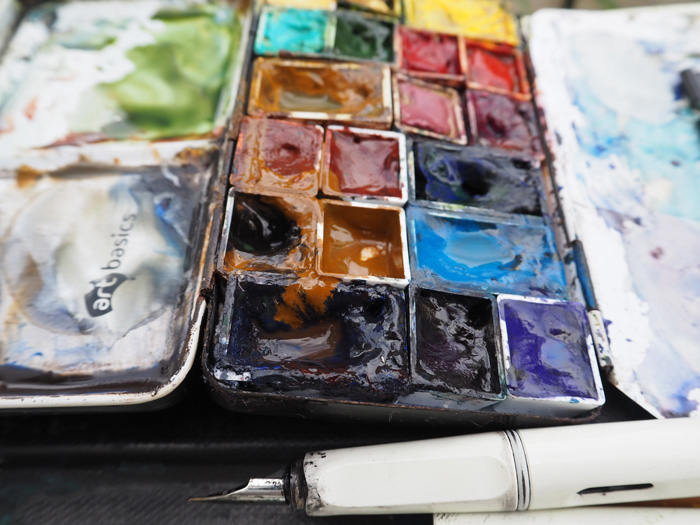
But also there are the unique patterns every day, interesting edges and textures to explore AND the colours to match. I have been using Daniel Smith Monte Amiata Natural Sienna as the base colour but a few weeks ago when the lock on my palette came off, I added Goethite (a colour that many of us know about thanks to Jane Blundell). Goethite is about the closest match to coffee that you will find and it is a lovely granulating pigment, so you would think that it would completely hit the spot for me. Surprisingly it hasn’t to date. I think that is partly because of a palette disaster I had as a result of not allowing the pan to dry for a number of days (see image below). Oops!
But it is also because I prefer granulating effects (and colour separation) that are the result of different pigments reacting to each other, rather than the gritty single hue granulation of many of the Daniel Smith pigments. This is a completely personal preference.Part of me wants Goethite to be perfect and part of me doesn’t really want to add another colour permanently to my palette.
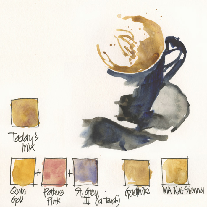
So today I was experimenting with another way to get the perfect coffee colour. I mixed Quinacridone Gold with Potters Pink with a touch of Steels Grey III. This breaks all the standard advice I give beginners – ie. not to mix more than three pigments, and if possible stick to only two. But hey, I love breaking rules (especially if it is something I have stuck to for years), and the result was very promising.
Note: All colours listed as Daniel Smith except for the Potters Pink which is Winsor and Newton.
And just for the record, I am still giving Goethite a go and have prepared a new half pan which I am leaving for a full week before putting in my palette to avoid a repeat performance of this mess. Note: this photo was taken after I had cleaned up the huge first day disaster and the second day ‘continued spread’ as well, so you can imagine what a mess it was on day one!
So if any of you have sketched a coffee recently, what colours did you use? This doesn’t have to be watercolour – I would love to hear of some pencil colours, or any medium, as well!

11 Comments
It would be interesting to splash some actual coffee (with cream in it of course) on a section of the sketch to compare. Or perhaps some cold black coffee mixed with chinese white……..wonder if the oil in the coffee would act as a resist?…….This is probably a really stupid idea, but hey! I’ve read about tea being used to give things an aged look! Of course, I’m speaking from a Mixed Media background where anything goes. LOL!
HI Gayle… coffee splashes have been popular with sketchers (especially Singapore USKers) but too weak (even black coffee) on the page to be use as the actual colour. Hey I love a mixed media approach.
Interesting mix, Liz! Slightly off the topic but today I tried to sketch a cup of matcha latte, which has a very rich and gritty green color. I used yellow ochre plus pthalo blue, two colors that I don’t use frequently otherwise, and I liked the results. I find coffee different from tea in its relatively opaque texture… and I think semi-opaque colors like ochres really come in handy in these situations. I know you prefer transparent colors (so do I, in general), so this is just an interesting personal exeption 🙂
Hi Ziaopei – ah! tea is never off topic on this blog! ha ha! Sounds great… and I also use opaque mixes every now and then.
I love this post, Liz! I love to see how you mix colors–it gives me a lot of inspiration when I’m working with my own palette!
thanks Emily – that is my goal …to encourage people to do their own exploration, not just follow my selections!
I’ve started my watercolour sketching journey only recently, and started with just a basic 6 tube starter set of DS, which had no brown- and really struggled with coffee colour 🙂 So my first additional colour was a brown. I think I got burnt umber, which is not a coffee colour at all it turns out. Loving your blog Liz, keep up the good work.
thanks Maria… life is too hard without at least one earth colour in your palette… hmm, is that a tweetable quote?
I have sketched coffee with an actual coffee! Espresso, to be precise.
oh ah! I hope you got to drink some of it too 🙂 It must have taken a number of washes to get it espresso colour!
NEWSLETTER
Subscribe for first notification of workshop + online classes and more.