More pink? First let’s have a little purple – or lilac to be precise.
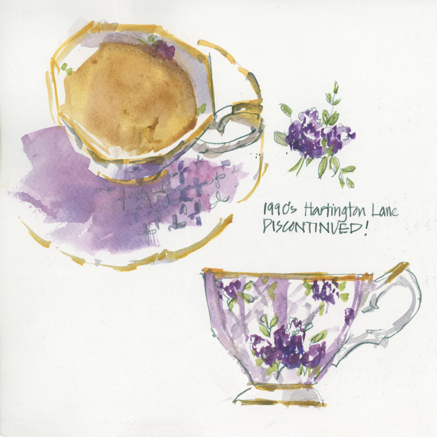
Saturday 01 Feb: 1990s Hartington Lane
A quick loose sketch while I drank my nice hot cup of tea and then a side view of the cup once my drink was over.
This cup is part of my Royal Albert 100 years set – 1990s Hartington Lane. I really like this lilac cup (even though the saucer is a little plain) and it’s the only one with a purple hue that I own.
It’s now discontinued and the 1990s cup in the 100 years set has been replaced by a different design. It must not have been popular… but for some reason it’s always been a fun one to sketch.

Thursday 06 Feb: 1980s Rose Blush
I’m determined to sketch more teacups this year (got to get through my collection!) and so even though it’s been a hectic week, I managed another super quick sketch on Thursday before I started filming some more bonus videos for my SketchingNow Buildings course. Doing a loose paint-only teacup sketch in a new book (this one is Epsilon by Stillman and Birn which is very different from my last book) was the perfect way to warmup before doing some serious architecture sketching.
Another from the Royal Albert 100 years set – this is the new version of the 1980s cup. Personally I prefer the original design but this one is fun to sketch. It has some fuzzy roses which look better in watercolour than in real life IMHO.
This is I have quite a collection of pink cups but to date this is only the second one I’ve sketched. Maybe I should do a few more pink cups before going on to another colour? What do you think? More pink????



6 Comments
Oh, I just love the lilac one!!! You don’t see that very often and i love how you did the shape of it too. The pink cup is very pretty too. I think there should be a teacup library somewhere where I can check out a cup, sketch it and return it.
Oh Joan! that is definitely a great idea! Would save me a lot of cupboard space 🙂
I’ve always disliked the pink-yellow combination, but you make it work beautifully. So, yes, please, more pink if you will 🙂
Thanks Olivera. Its a pink week so stay tuned
Hi Liz – your different teacup collection sketches are gorgeous! I think from memory they were what initially drew me to your site… can I please ask you – in general what colour do you use for the ‘gold’ edging of your teacups & sometimes I think I’ve noticed that you use a yellow/gold ink?? Plus what colour for the actual ‘tea’ part? Thx Fab ?????
Thanks Fabrienne!
I use DS Quin Gold for the gold and a raw sienna mixed ink (De Atramentis yellow and brown mix)
As for the tea, I use Monte Amiata Natural Sienna as the base colour and then modify it as needed – often with a bit of Transparent Red Oxide
NEWSLETTER
Subscribe for first notification of workshop + online classes and more.