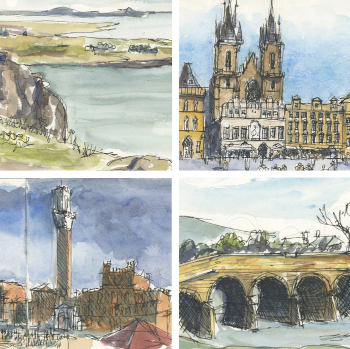
Following on from last week’s discussion about artist grade vs student grade watercolour paint, I spent a little time looking through some old sketchbooks and what I discovered was very interesting! There were examples of good use of student grade paint and examples of poor use of artist grade paint. So I thought it might be fun to choose four sketches and see if you can pick which is which. And some of my more recent followers might enjoy seeing some of my early work. These date from 2007-2008, the first 18 months of my sketching journey, when I was teaching myself to use watercolour and didn’t really understand anything about watercolour magic.
Notes:
- All sketches have been scanned today on the same scanner with no adjustment so they all look a bit flatter here than they do in real life.
- They were all painted in the same type of sketchbook – Moleskine Watercolour A5 size.
- For each example I have included a full spread and then a cropped square., so all the images are the same size.
(Aside: Isn’t it fun to see how my work has changed and in particular my linework!)
A. Australian Landscape


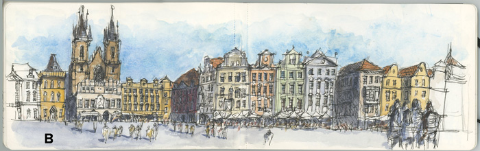
B. Prague

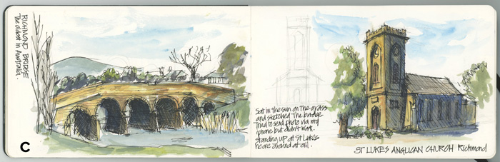
C. Tasmania

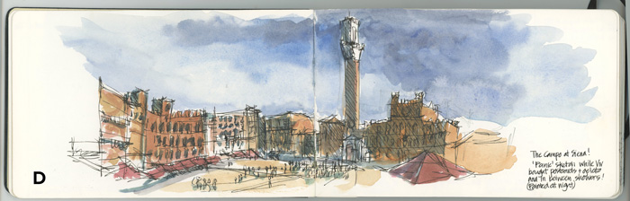
D. Siena

So, which of the above were painted with WN Cotman Water Colour (student grade), and which with WN Professional Water Colour (artist quality)? And how can you tell?
Hmm…. I just thought that it would be a better comparison if I did a sketch with Cotman paints now and compared it with an artist quality.
UPDATE: The answer has now been revealed – click to find out which ones were Cotman.


36 Comments
Hi Liz, This is a really interesting comparison… I am guessing A and C to be the student grade, as they just don’t have the brightness or vitality of color that B and D have… Can’t wait to know the answer!
My guess is the first three were student grade….just a guess!
I don’t really say you do that I mean why would they put an S for student grade and P for professional Grade
Honestly, I wouldn’t be able to tell which is which, I just notice that these are all a bit less saturated than much of your recent work. (The lime green jumps out a bit, though.) I don’t necessarily react negatively to that slight timidness; we’re so lambasted by blaring colour, all over the internet, that tone-down hues can be refreshing. But I guess everybody has their own, er… ‘intensity reaction threshold’, so-to-speak.
Totally… these are much flatter as they date from 2007-2008 when I first started.
Another variable for web viewing is: Every scanner & camera scans colours differently. (Your scans look pretty neutral, though.) And they can be _made_ to render colours differently (or computer edited to). If someone wanted images like these to pop, a tweak of ‘Vibrance’ or Saturation could make them retina-searing! They might not look that natural, but a skilled operator could come close.
Not to suggest Artist Quality paints aren’t worth it – oh, the richness, the texture, the mixability! Most of us would never go back, eh? (<—Canadian :^)
My guess is A and C were the student grade and B and D were the artist grade.
I’d have to guess that A & C are the student grade paints as they don’t look as transparent or as blendable as the other two. But it is a close call at that.
I suspect A and C are the Cotman student grade sketches.
Not sure but think that B is artists grade due to the granulation in the blue.
I’m with you and for the reason you cite.
I will confirm which is which soon… just waiting for a few more comments 🙂
All of them are Cotman?
A and D are student grade?
I was also thinking A and C as the student grade paint due to the depth of colour but also the ink work.
A and D student. Guessing.
C is cotman. the rest I could guess either way.
I’m guessing A and C are Cotman from the flat hues.
I think A and D are artist quality because of the mingling of the colours. I also might think that B is a good example of student quality.
Wow someone thinks A is artist quality- going against the common opinion 🙂
Hi Liz, I think A and D might be the artist grade paint, not so much because of the paint, but also because os the way you’ve painted them ie in D it looks like you’ve painted the sky first which I think maybe a more recent way of painting. But then again, to have a bet each way, A and C are similar colours and are softer more even colours and when looked at a bit closer, they look a nice even paint. Whereas B and D look sharper.
Some rambling thoughts from Julie on the beautiful east coast of Tasmania.
I still think B is the only artist’s grade because of the granulation in the blue sky. But I’m influenced to admire A & C especially for the lively painterly effects of working wet in wet (A grassy foreground, C to capture changing color/light on the stone bridge) and layering mixed with wet in wet in D (the darkening sky). Happy to learn the truth.
Same for me B and D have more vibrancy (ARtist ‘s grade) than A and C-…. looking forward to know the answer! Yes your line work has evolved too! cheers
I believe B is artist quality – colour more vibrant.
I might be fool but, in a total countertrend, I believe B and D to be the Cotman student grade watercolors and A and C to be the professional grade ones.
I think they may all be Cotman. I used them for a long time, and I’m certain you could get work from student grade that would pass for artist quality!
I think C and D are Cottman. It’s hard to say really.
I guess B is artist quality. Love the granulation and the colours are more vibrant. I am excited to get to know the truth!
A and D = Cotman because of the granulation.
I chose B & D for having higher grade watercolour paints because I see more granulation and deeper colors.
I agree, for the same reasons.
I agree with those who select A and C as student grades since they are not quite as vibrant. .btw, I selected these before reading comments. Fun game, dying to find out, thanks.
Going out on a limb here.
I think A and C show a bad use of professional quality paint; while B and D show a good use of Cotman student grade paint.
🙂
Hey everyone – the answer has now been revealed!
NEWSLETTER
Subscribe for first notification of workshop + online classes and more.