I’m really enjoying the Sketchbook Revival event as it’s making me think about what is special about creating art inside a sketchbook. There are many reasons… but an important one for me is the compositional fun that comes from designing a sketchbook page/double page spread. It’s not just the individual sketch, it’s the collection of a number of images, text, headings, maps, collage etc. For me this takes the pressure off creating a masterpiece with every sketch because I can nearly always create a pleasing composition on the page by adding these additional elements.
My session for Sketchbook Revival which went live on Day 2 included some ideas about designing sketchbook pages, and to continue this theme I went through some of my old sketchbooks.
So here are a few pages/spreads that I really like. They are in reverse order, with the newest ones first.

San Francisco 2017: Stillman & Birn 10×8 Softcover Alpha
A simple spread with a diagonal image and balanced text.
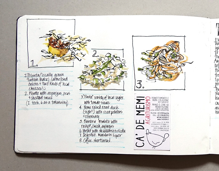
Italy 2017: Moleskine A4 Watercolour Book
An interesting page from an incomplete attempt to sketch a 8-course dinner – part of the Palladian Odyssey Tours.
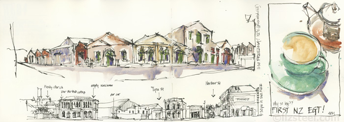
New Zealand 2017: A4 Moleskine Watercolour Book
I really like the two long horizontal sketches and how different they are to the other layouts in the sketchbook.
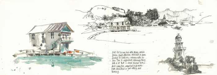
New Zealand 2017: A4 Moleskine Watercolour Book
Rather than a single big painting to describe this harbour, I did three smaller sketches, each using a different technique.
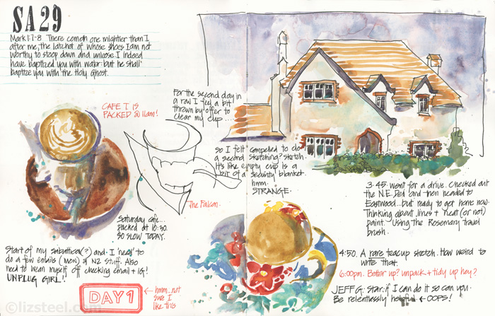
Sydney (home) 2016: Stillman & Birn 10×8 Softcover Alpha
First time I used this book – I loved the extra room for notes that this format gave me.

Sydney 2016: Stillman & Birn 10×8 Softcover Alpha
Another spread from the same book.
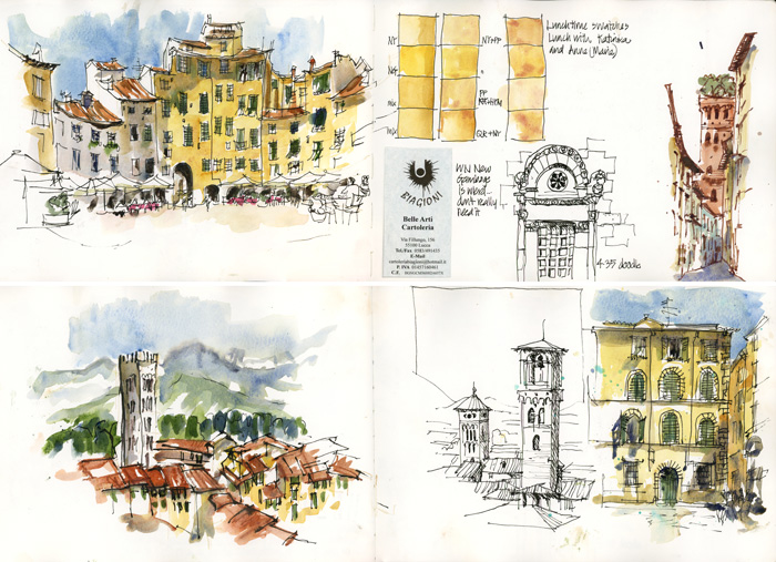
Italy 2016: Moleskine A4 Watercolour Book
Mixing up big view vs vertical slices and different media
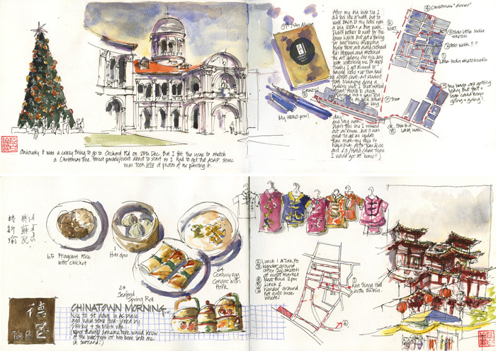
Singapore 2013: Moleskine A4 Watercolour Book
The first trip I did sketching in the big A4 book and I filled numerous pages with little sketches and maps.
As a general rule I am finding that I do less of these types of pages (text, maps and smaller images) in recent years. Two reasons are:
- I am busier these days when I travel and have less time to work on my pages in the evening – because I am either teaching and/or maintaining my usual admin (I never have a full 100% break/vacation which I had in the early days when I worked as an architect and left the office totally behind.)
- I am working bigger and looser and so my sketches typically take up a full page or most of the double page spread.
So finally here is a collection of my early sketches (2010 – 2012) when I was using a A5 Daler and Rowny Ebony book (150gsm cartridge)

2012 Sydney
A finished sketch on the right, and some working sketches on the left in two coloured inks for variety.
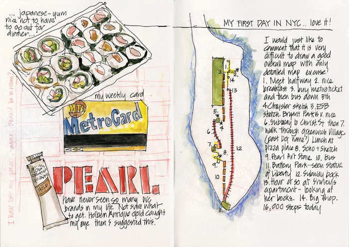
2012 NYC
Not much of a sketch, but I love all the little moments that are recorded in this spread. (I love maps)
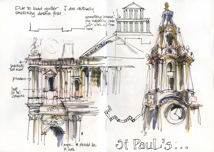
2011 London
Another working page this time of St Paul’s in London. You can see the final sketch here.
2011 Lisbon
One of my favourite sketchbook pages of all time with a full range of emotions mentioned in the text.
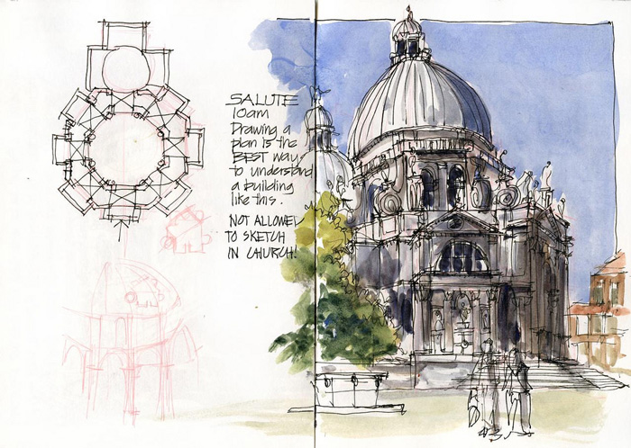
2010 Venice
Another old favourite containing floor plan, aborted interior sketch and competed outside sketch.
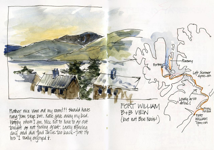
2010 Scotland
I love combining sketches, maps and text!
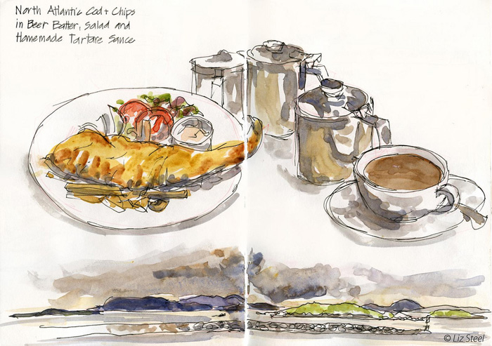
2010 Isle of Harris – Scotland
Most people would do a big landscape sketch and a smaller one of food… I do the reverse.
2010 NYC
An earlier NYC page with food and map!
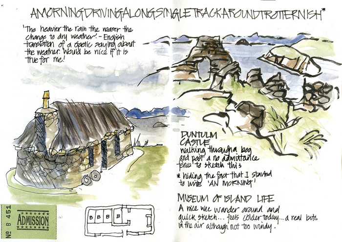
2009 Isle of Skye – Scotland
Crazy title to hide a typo, and then a few quick sketches.
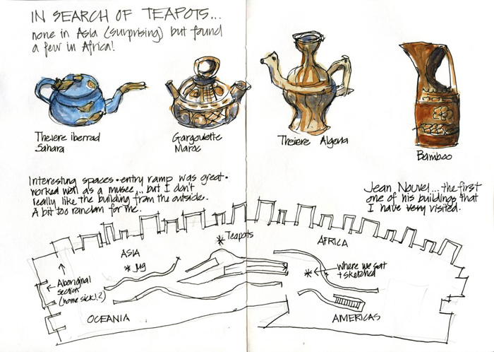
2009 Paris
A fun page recording my search of a favourite object.
There are many more pages which I could share, but I hope that you enjoyed this collection.




19 Comments
Great collection of double pages. I watched your class on Sketchbook Revival the other night and went to the Maritime Museum here in Sydney where the idea worked well. Sorry I haven’t been in touch while I am here. Time us going by too fast.
thanks Joan. This week has been a little busy for me too Hope you are having a great time!
Thanks for this collection of layouts. I found myself thinking that you put a lot of work into this posting, but be assured, it is awesome educational material for us!!
thanks Sheila! most of my blog articles take a fair bit of work and time… but I love it and very happy to do it if it can help other people.
Great inspiration! I like all of those different pages. Really inspiring! Your article is taking away a little bit of my fear to ruin a page/ to start a sketchbook. Thank you and kind regards from Germany!
Heike
Oh that is great to hear – all the best Heike!
I enjoyed learning more about your page layouts on Sketchbook Revival! I knew you enjoyed doing that from reading your blog, but it was interesting to hear more about the details and your approach to page design.
Glad you enjoyed it Tina!
Oh man…such yummy sketches that I would be thrilled to be able to do! Now to get going every day and try,try and try again.
I like your work and enjoyed the class on sketchbook revival, I’m a beginner but it is great to see your pages.
thank you.
Hi Liz! just saw in your monthly update email that you’re headed to Poland… Will you be teaching a class or maybe drawing with urban sketchers? Curious because i live in Warsaw and have struggled to find sketchbookers here. Would love to meet up for a coffee & drawing session here if you have time… as would a friend of mine who’s also a fan of your art. We both enjoyed your Sketchbook Skool/Sketchbook Revival lessons. If not, perhaps we’ll cross paths in Porto 🙂
I subscribed to the “SketchingNow Foundations” today and I am totally excited!
I was hooked from the beginning when watching your free lesson on Sketchbook Revival and sooooo glad I had this chance… During the last week I was reading for hours and hours on your blog and the more I read and the more links I followed my interest and enthusiasm grew.
This journey will be a great adventure. Thank you Liz!
Thanks Barbara – I hope you enjoy the course and it really helps your sketching!
I realy like your awesome blog. I found it a little Late on Pinterest. Jeep on blogging
thanks Wolfgang – welcome!!!
I LOVED your presentation on Sketchbook Revival, have watched and followed it more than once. I really like the “lesson in a bottle” format for honing in on a particular skill.
Wish I could do the Palladian trip with you…
Appreciatively,
Melissa
Thanks Melissa!
These sketches are SO beautiful and inspiring. I would love to learn more from you! I find a lot of joy in travel sketching, I just filled my notebook from 75 days of travel. There’s so much beauty in slowing down, observing the people, places, sounds, and behaviors around you. Also feeling your emotions and somehow adding it into the pages. It helps me find a sense of stillness, make sense of the world, and recharges me. As someone who struggles with anxiety and fatigue from over-stimulation in manhattan, plopping down in a park and drawing out my surroundings is my way of centering myself.
Hi Sonali! Do you know that I have a course on this topic https://sketchingnow.com/sketchbookdesign/
NEWSLETTER
Subscribe for first notification of workshop + online classes and more.