I was away up at Newcastle over the weekend for my second workshop with Newcastle Art Society. This time it was Architecture Sketching.
There are quite a number of important principles to grasp before heading out into the complex world around us – so the morning was spent inside doing exercises from photos. It is not ideal – I always prefer sketching on location – but it is very hard to find the suitable subjects for each exercise with space for a group to sit in the shade opposite.
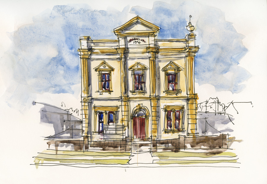
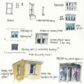
Last month when I was in Lambton for my travel sketching workshop I was very pleased to find a perfect building for the main morning exercise. The MG Club building. I thought you might find it interesting to compare three versions I did of it and why I believe something special happens when you are sketching on location.
So the first one (above) is the sketch I did on location on Friday – I sketched it from the comfort of my car just because I was parked directly opposite and there was a swarm of flies in the vicinity which I didn’t feel like getting in the midst of! Not only is it much more satisfying drawing from life being able to see all the details and ‘feel the edges’ (a reference to one of my important goals when I sketch a building) but there is a certain liveliness to the work which the other two don’t have. Whilst this is a ‘building portrait’ I instinctively included the context – something I didn’t bother with for the other workshop ones.
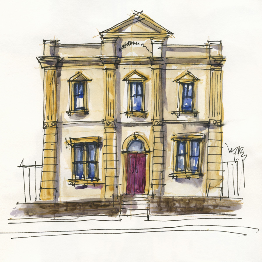
Second: This is a sketch that I did from a photo in preparation for the workshop – I scanned the various stages of this sketch to use as a handout. While still loose and lively it is a lot more restrained than the first one. Please note the point of this exercise is to explain ways to draw to proportion and all the features of a building accurately. It is therefore a ‘front-on’ elevational view.
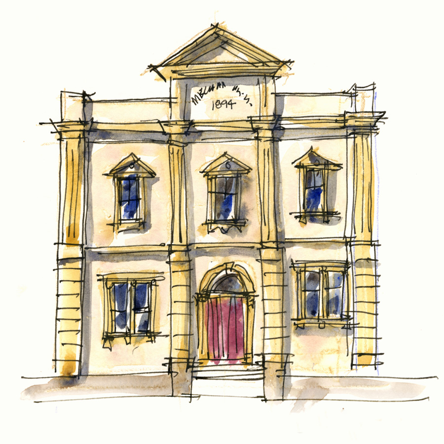
Third: The demo I did for the class – explaining my steps. I have no qualms about admitting that doing demos during a workshop is a challenge. Talking nonstop while explaining the process can interfere with your concentration on the work itself. I am also trying to do my demo as quickly as possible so that the class can start sketching. Hmm… what am I talking about? – how is that different from most other sketching outings? (ie. talking while sketching fast!)
I don’t know about you, but I am often inspired to start about 10 minutes into watching a demo… if the demo goes over 30 minutes though, I find I lose that urge – I become content just to watch and find it hard to start my own. So… I try to aim for about 15-20 minutes max.
They are never fully finished… and never perfect!
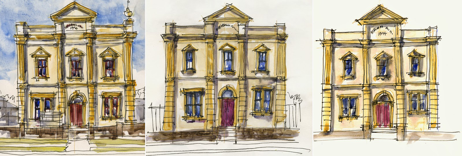
And here are the 3 versions side by side. All are very much “liz-style” but they are different aren’t’ they?
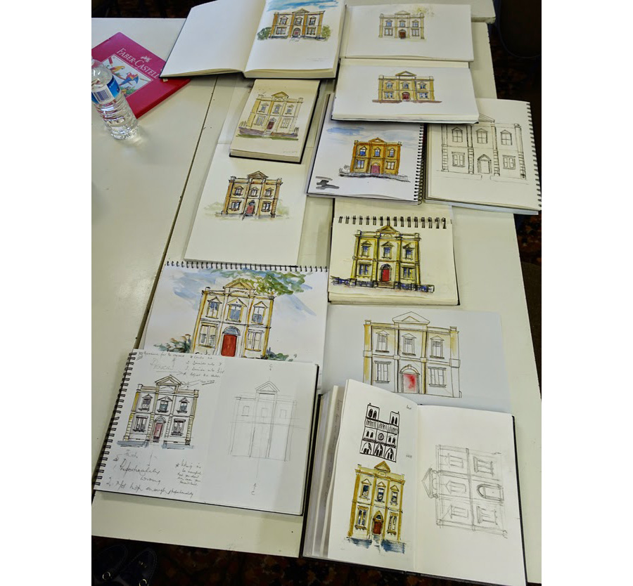
And here are the class efforts…aren’t they great?
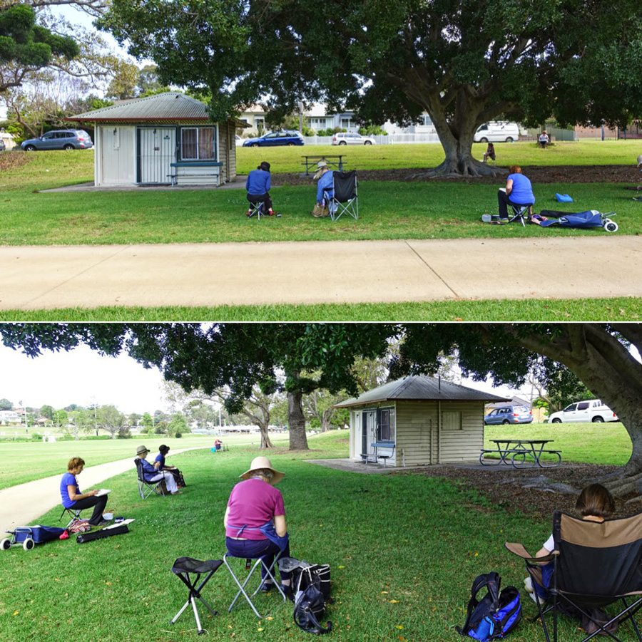
In the afternoon I explained perspective which we then applied by sketching a park shed. I couldn’t find a more ‘exciting’ building that was not too complex, that was on flat ground, that had shady area opposite for 12 people. As it turned this building was just right to explain the basics and there were enough quirks to make it interesting.
Last time I taught perspective (believe it or not – November last year!) I used a gabled-ended building – the hip roof needed a different approach…and has got me thinking about a new idea that I want to develop and flesh out. My approach to perspective is to understand the technical side but then find a non-technical “hands-on” way of applying it on location sketching. Rather than stressing about locating VPs – I think a VIP is more important. I have got some new ideas to make the VIP even more useful and can’t wait for a quiet moment so I can flesh it out so it is in a more teachable format (follow this link for more details of my general perspective approach).
I might not be interested to set up accurate perspective in my own sketches but I sure love teaching it and researching it.
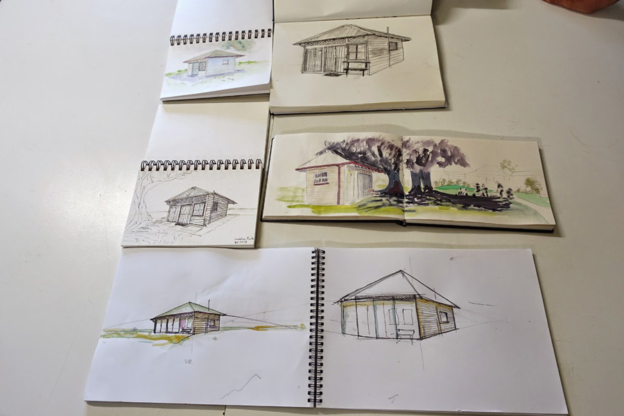
Very impressed by the results!(sadly many people had left before we took this photo)
Subscribe to my mailing list for my monthly newsletters including first notification of my new SketchingNow Online Sketching Courses and face-to-face workshops.



6 Comments
What is interesting to me about these three sketches is that the two done from photos show a slight lean to the building. The top is fractionally narrower than the bottom as if it is leaning away. Thats a common effect of photographing buildings without a specialist lens as I understand it. Yet when you did it from life the building is straight. Shows the difference being there makes!
yes indeed I noticed that – and also I have trouble fitting in the big window on the right both times from a photo.
The class did do an awesome job!
yes- they did didn't they?
The top should be slightly more narrow than the bottom due to 3-point perspective. I've noticed that if I draw from photos I generally get that "right" while when sketching on location I generally do all the verticals, well, vertical and so it doesn't show up. No concious thought here..it just happens. I find it so much easier to draw on location than from photos. More fun, too.
Cheers — Larry
Would you mind explaining the steps you took to sketch this building or would I need to take on of your workshops :-). Frequent visitor to your site and enjoy looking at your architecture sketches.
NEWSLETTER
Subscribe for first notification of workshop + online classes and more.