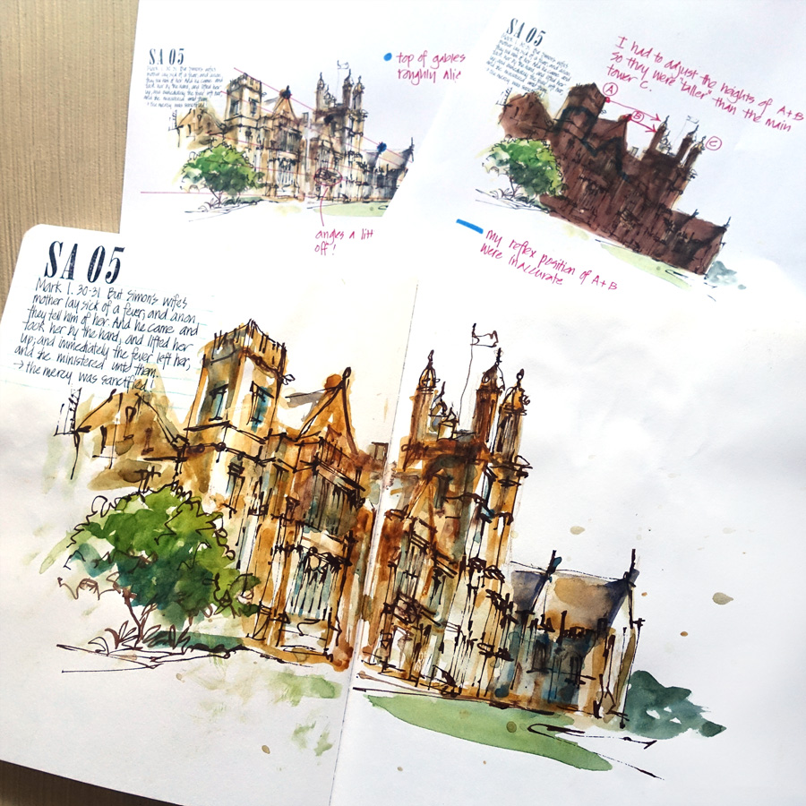
I just want to share with you a few thoughts about my sketch of the Main Quadrangle Building at Sydney Uni from Saturday’s Urban Sketchers Sydney event. I’m always analysising my sketches, looking for ways to improve all the time, and I thought it would be fun to describe my personal review of this sketch.
I was attempting to sketch a challenging building from a challenging angle and just after I started, a fellow sketcher came up and sat beside me. We then started chatting and as a result I went into ‘reflex sketching mode’. Over the years I have trained myself to rely on my reflexes when I am sketching and chatting at the same time and to suspend any judgment of the end result. Note: Developing this ‘reflex sketching’ is one of the reasons why I sketch so much as it works best when my eye-hand coordination is good.
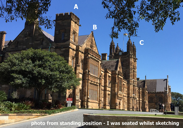
On this occasion I had just started with a painted shape when the conversation began. I wasn’t concentrating 100% on my work nor was I thinking about perspective, but I was aware that there was something tricky about relationship between the top of the elements A and B and the top of the tower C. Note: this photo was taken from a standing position and not the exact view I had sitting on the ground.
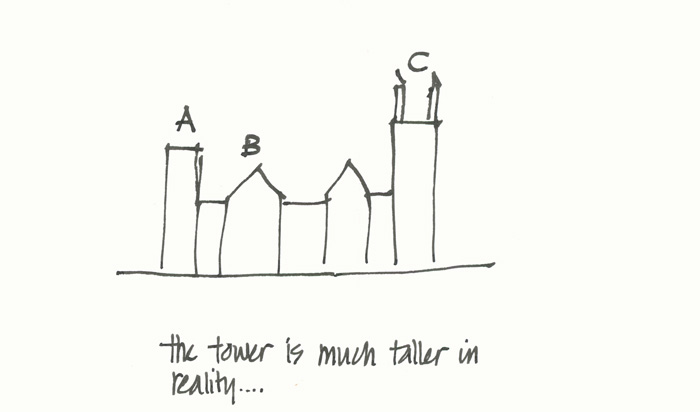
Because the main tower is in reality a lot taller than the side tower A and the gable end B, I was fighting my ‘object brain’ at the time, and had to switch off from the conversation for a few moments to concentrate on getting the relationships correct between A, B and C.
UPDATE: If you want to see a photo of the building check out this image.
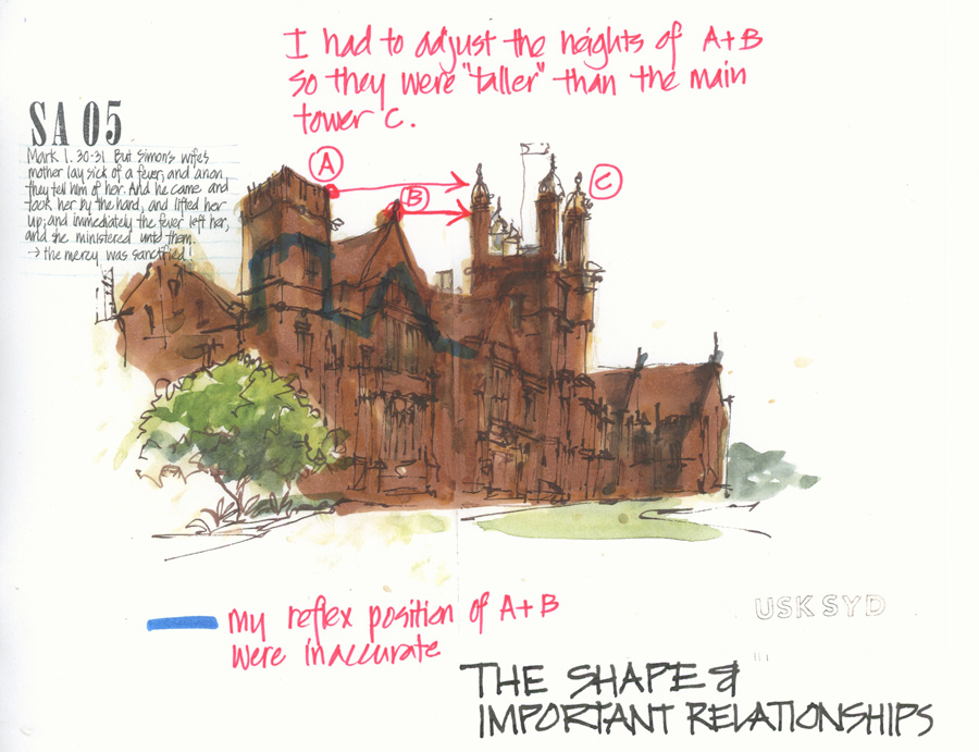
This markup of my sketch shows the overall shape that I painted and the correction I made to this tricky area. I don’t think I made A and B tall enough even with this correction, but at least the final version is better than my original attempt.
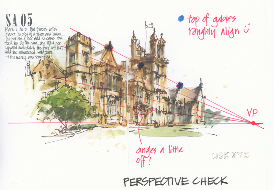
I thought I would also check to see how accurate my sketch was in terms of perspective and was very pleased to discover that the tops of the gable ends more or less aligned, and most of my lines were evenly converging. There were a few wayward angles, but as I was sketching very loosely without thinking about perspective at all, that is to be expected.
So what’s the point I’m trying to make?
Although I didn’t use a perspective setup while sketching, I have such a working knowledge of it (due to my architectural background and my obsessive sketching in the last 10 years) that it has been second nature for me. So even when I am working loosely with shapes, this feeling of perspective helps with accuracy and speed (or in this case conversation distraction). The important point to note is that even with this knowledge of perspective I still had to rely heavily on checking relationships between edges from my particular point of view. Also my angles aren’t perfect but they are good enough!
I wasn’t born with this knowledge of perspective, it is something that I have developed and worked on for years. So if you are a beginner sketcher, and don’t understand perspective, don’t beat yourself up, it does take time and diligence. Just take it one sketch at a time. But most of all I would just encourage you to take it slowly and work on your observations skills and draw slowly, one edge at a time!
This approach to sketching architecture is what I taught in my recent SketchingNow Buildings course. Check here for more details.

10 Comments
OK, so basically, you can chat or you can do perspective, but doing both is nigh on impossible. Gotcha LOL
I sometimes honestly think that the less you know about perspective the easier it can be to just relax and do it. As long as you draw what you see and not what you think you see, you should be ballpark, which is good enough for me.
I love theseeing broken down sketches where you put up a perfectly good djetch and then show us how it could have been even better. I would never have known your proportions were off if you hadn’t pointed it out, and it really helps when you’re looking back at your own sketches.
Hi rhomany… ha! I think I can talk and do perspective at the same time, but I can’t talk and paint in shapes for a tricky foreshortened building at the same time.
I am always surprised that people seem to say that if you look carefully you’ll get it right. Just draw what you see not what you think you see maybe fine for a)people who have been sketching for a long time or (b) people who are naturally talented. I’ve taught adult beginners for some time and they often need to be taught how to look at things. After many years of not really looking at stuff they need to unlearn that. I regard a basic knowledge of perspective as just another tool to help them to learn how to look as much as how to draw. I have come across a fair number of people who have never noticed that regular spacings between objects get closer as they get further away, and even some who have never consciously thought about things getting smaller as they get further away and that horizontal lines appear to be at an angle when looking down a street. They “know” it, but a little perspective helps them realise it and learn to use it in their art work. I’m not suggesting they need to learn lots of the rules of perspective, just that it is a useful tool to have when used in moderation.
Hi Denise, agree, perspective helps SO much and so does an understanding of building design and construction (which is what I was teaching in my SketchingNow buildings course)
When I look at the photo, A and B appear taller than C because C is farther away than A or B. It seems that the top line receding to the VP would intersect C at the top horizontal edge of its side closest to the viewer, which would push the VP farther out. Your sketch seems to have incorporated a bit of the frontal view into the actual scene shown in the photo. What do you think?
Hi Sharon, good question… Check out this phoo https://en.wikipedia.org/wiki/University_of_Sydney_Quadrangle
Tower A aligns with the bottom of the top storey in tower making the VP a light closer to the building than I drew it.
Two other thoughts: 1. the photo isn’t the same view as I sketched but 2. our natural tendency is to draw foreshortened sides of buildings/object much bigger than they are. So yes, I didn’t foreshorten enough!
My analysis of my sketch was based more on what I had drawn, and not comparing it to the photo as it wasnt the same view but it is a great exercise to analysis the photo too
Are the tops of the gables that align (in the sketch with the VP) the same height in reality? From the photograph they don’t all seem to be the same height to me. Maybe if I saw a frontal view of the building(s) I would understand better.
Hi Keren, yes they are all the same height in reality- the stepping of the building makes it hard to tell. Sadly I didn’t take a photo of the front of the building but there is one here. https://en.wikipedia.org/wiki/University_of_Sydney_Quadrangle
The funny thing is, now that I look at this photo, that the gable closest to me is wider than the other ones.
I’m slightly confused here Liz. Are you saying that your final drawing, showing the tower on the right being taller is the ‘correct’ version? I’m asking because your sketch your describe as ‘inaccurate does look more like your photo than the last one. The last one almost seems to be one where you are drawing what you know, rather than what you see. Or have I misunderstood something fundamental here?
Hi Pam – not sure which image you are referring to – as they are all the same sketch. If you are refeering to the line I note as inaccurate in the shape diagram, then yes, that line is wrong. Tracing the lines on the photo would help to see how much higher A is from my point of view. You have to use your visual brain (rather than your object brain) to see that.
NEWSLETTER
Subscribe for first notification of workshop + online classes and more.