Today we officially kick off the Live Version of Sketchbook Design and I’m SO happy to be going through the course again.
Over the next 9 weeks I’m going to be intentionally leaving some pages in my current sketchbook unfinished so I can share my thought process for designing the final layout during the livestreams inside the course.
Whilst some people like to plan a layout before they start sketching I rarely do this! Instead, I normally allow my spread to evolve as I work. I absolutely love this process of ‘designing on the fly’ (this is a term I’ve used since my early days both in regard to the way I compose a single sketch and also a full sketchbook double spread.)
Over the years I’ve realised the importance of two techniques for working this way:
- briefly thinking about the placement of my sketch before I start
- leaving plenty of white space
Doing both gives me lots of options to finish the layout at a later date.
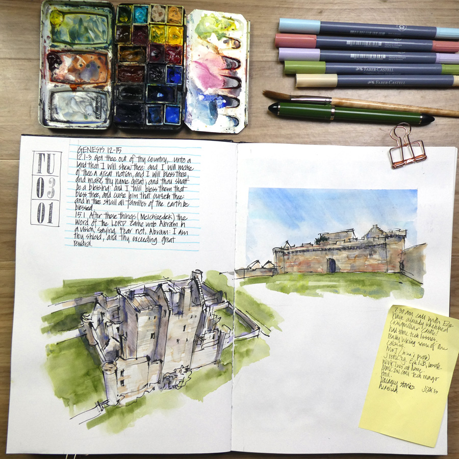
This spread was done during a zoom catchup with my friend Esther Semmens early yesterday morning. We were talking non-stop for 2 hours and so I wasn’t really thinking about my sketches or the composition of the page.
However, I knew that I wanted the first sketch to cross the gutter and then briefly decided to position the second sketch in the upper half of the right page. The area between the two sketches is a touch awkward but I’m confident that a little careful design will make this less obvious.
The sky in the second sketch was the last thing I did and at this point, I was starting to think about the design of the page. And so the shape of the sky was defined by my initial thoughts on a possible layout.
I do have an idea for how to finish this double-page spread but I will keep it for the first Sketchbook Design Livestream that I’m hosting early next week. And I might change things after we have had a discussion about it!
BTW It’s not too late to signup for the Live Version of Sketchbook Design!! We’ve just started the Introduction week – working through the pre-recorded videos and doing the first assignment. Then early next week we will catchup and discuss in the first live session.
But while I’m discussing recent sketchbook pages…
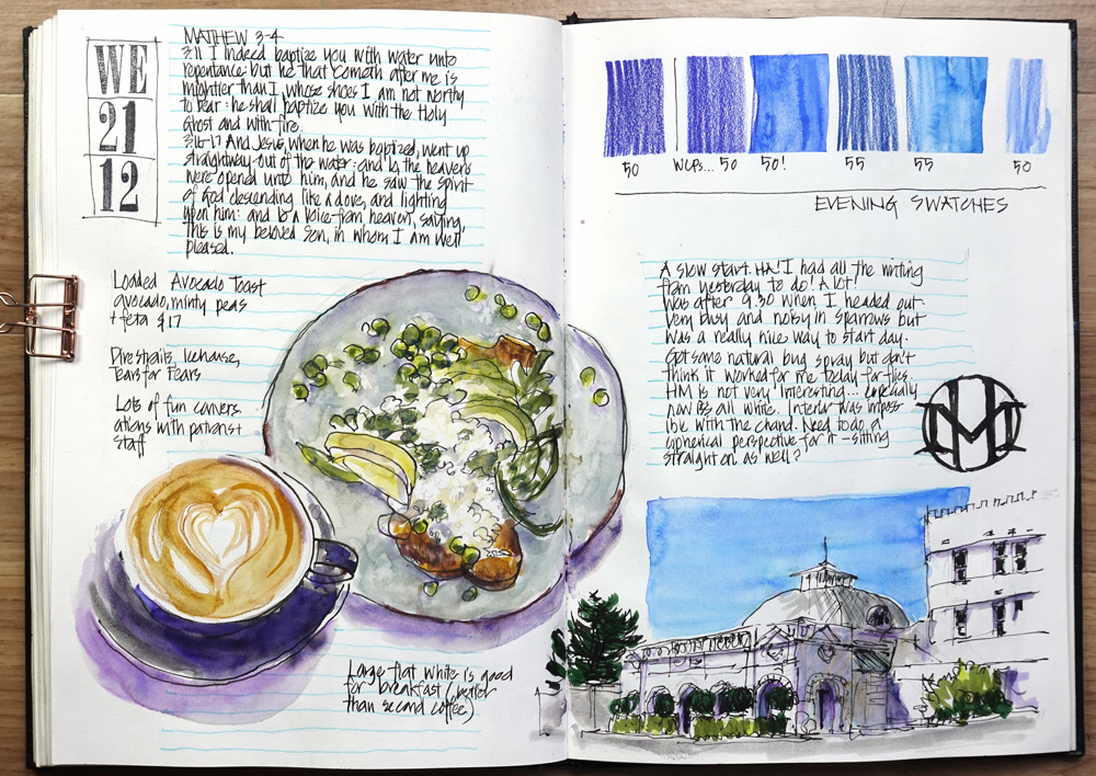
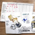
Here is one of my favourite spreads from my recent trip to the Blue Mountains. (Note: It will be included with more context in Friday’s article.)
For most of the day, it simply contained a breakfast sketch and a quick line drawing of the Hydro Majestic and looked a little empty.
And then in the evening, I added colour to the drawing and another carefully considered sky shape. Next, I added the HM logo, some colour swatches and finally a text block. This spread doesn’t have a ‘masterpiece’ sketch but I really like the combination of colours, the balance of round and rectangular objects and how the elements interlock.
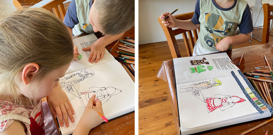
The third example happened last week when I let my 5-year-old nephew and 7-year-old niece freely colour on my sketchbook pages. A bit risky??? 🙂
They were playing dress-ups and so I did a few extremely quick line drawings (30-60 seconds each) and then let them colour in as they pleased. I did show them how I created a test strip of colours to help them find the best colours and made a few minor suggestions. But other than that I just let them do their own thing!
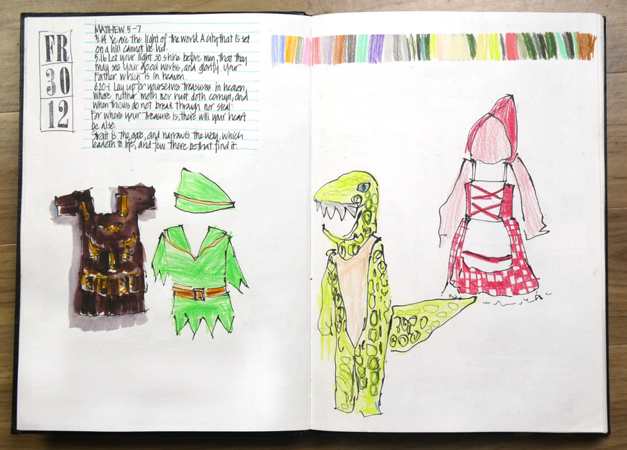
And this is the page when they were finished. (Note: I had intended to do all the sketches myself but only got the first one done before they took over!)
The layout is very random as the situation was a touch crazy and I just had to draw something anywhere on the page. But I was quite pleased with this result and the options I could see in my head for finishing the spread.
And then they wanted to do more!!!
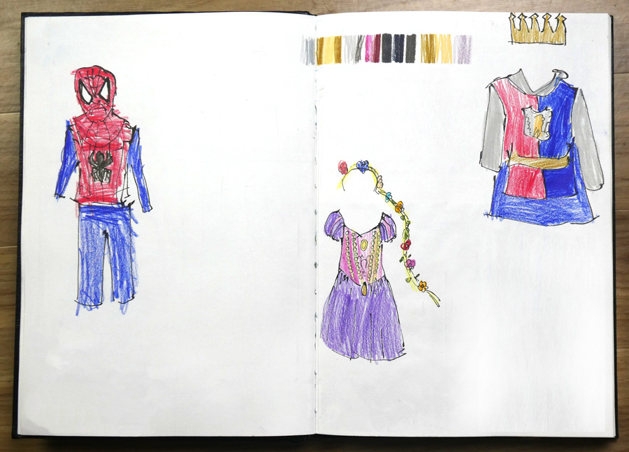
So on the next page, I intentionally put one sketch on the far left and another on the far right edge so that there would be more room for the two little ones to colour at the same time. My placement of the king costume was very awkward (“Draw this right now Aunty Liz – this costume is too hot!!!”) but I did manage to fit the crown on the page. Just! 🙂
I was expecting to add a few more drawings on this page but the option of going in the swimming pool meant that the colouring-in session abruptly came to an end.
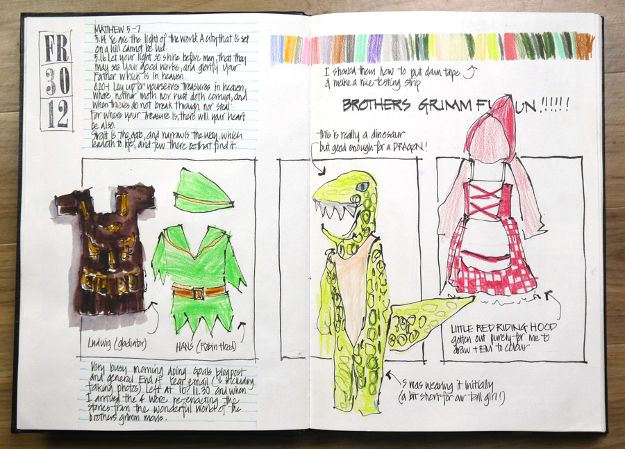
And so later that evening this is how I finished off the first page with a horizontal row of frames.
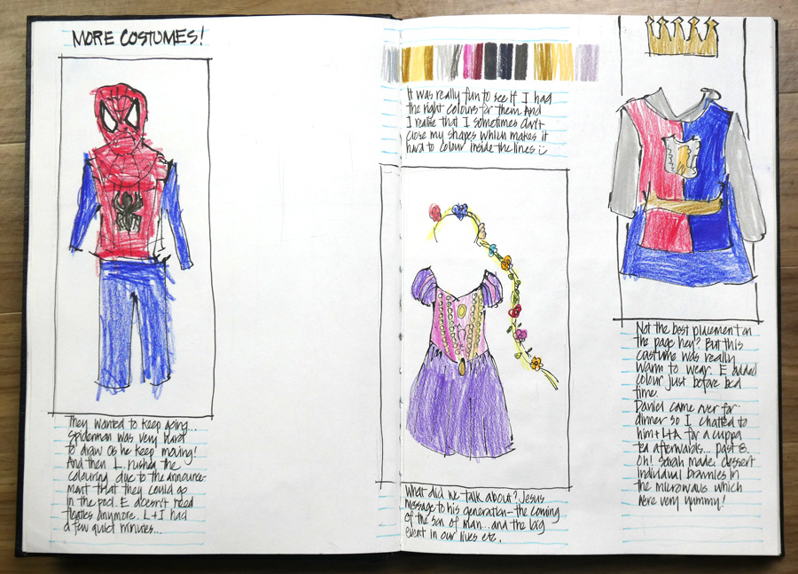
And I created three unevenly spaced vertical columns on the second page.
Such a fun sketching session and composition exercise!
I hope that you enjoyed getting a sneak peek into some of my thought processes when designing sketchbook pages. Of course, I share a LOT more inside the Sketchbook Design course.
You might not want to add as many notes on your pages as I do, but the principles that we explore inside the course apply to all kinds of sketchbook usage. And there are so many different styles shared within the classroom assignment galleries that you will get many new ideas for creating beautiful sketchbook pages in your own sketchbook.
And one final thought… the ‘compositional muscles’ that I constantly use while designing interesting layouts help a lot with the composition of my individual urban sketches! 🙂
Please let me know if you have any questions about the Live Version of Sketchbook Design

10 Comments
Fascinating to see how the added design elements come together and really enrich the page!
Yes Jamie – it’s why I’m so addicted to designing my pages!
Hi Liz ! I already bought Sketching design but did not finish it. Can I use the same again and how ? Let me know
Thank you .
Isabelle
Yes of course Isabelle – you should have gotten an email from me – otherwise just go to the classroom and you will find a blue button to signup!
I love the energy of the pages your niece and nephew helped you make! The photos and commentary on the process are immensely helpful. I’m so excited to be a part of this session of Sketchbook Design.
Good to hear Jan – looking forward to seeing your work in the classroom – in fact I already have 🙂
The before-and-after costume pages are dramatic examples of how design elements and an “evolving layout” approach really make the page successful. Thank you for the inside peek to your process. It’s helpful to realize it doesn’t pop out all at once. ?
Hi Suzy – glad you enjoyed seeing how awkward the before was!
What you did with the costume pages is very inspiring! Really looking forward to the class.
Thanks Sydney – looking forward to seeing you in the group!
NEWSLETTER
Subscribe for first notification of workshop + online classes and more.