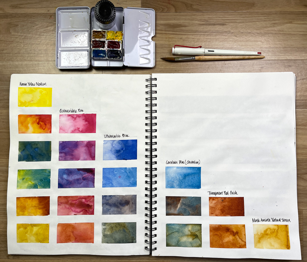
This week in my SketchingNow Foundations course (we started on Wednesday) we’re looking at ways to get to know (and love) the tools in our kit. It’s really easy to get addicted to buying new art materials in the hope that somehow a new tool or colour will magically improve our work. (Have you ever fallen into this trap?)
However, the really important thing is to properly test our tools and work out whether they are a good fit for us and why they should (or should not) be part of our sketching kit.
As mentioned in my last article I’ve set up a brand new tin containing a 6-colour palette to use for Foundations. These colours are what I used when I filmed Foundations and they are the core of my full palette (see here). This new palette is what I’m using in the mornings during my coffee and sketch session and so far it’s been really fun to use a limited selection again.
As many of you know, the characteristic of the pigment of a specific watercolour paint is as important to me as its hue! Combining different kinds of pigments (granulating, staining, sedimentary, transparent etc) is essential to achieving watercolour magic – to create a lively ‘pigment party’. So whenever I restrict myself to 3 or 6 paints I really really miss the watercolour magic that I normally get for my larger palette.
I also don’t typically mix my paints a lot so with a smaller palette I end up doing much more mixing (which in turn makes my water get dirtier more quickly!)
So on Wednesday night, when we officially started the Group Run-through of Foundations, I decided to do a colour chart for my 6-colour palette and then I did a little targeted mixing for some important washes.
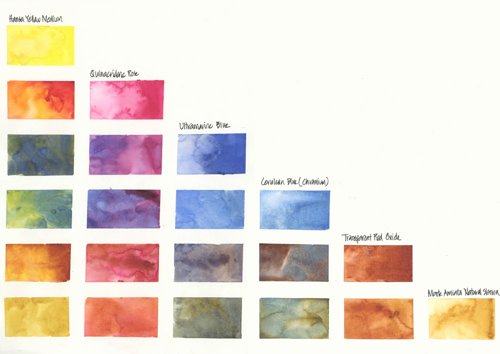
The mixing grid that I did was the biggest I’ve ever done before (full double-page spread in my 11/14 spiral Alpha). The generously sized swatches enabled me to get an idea of what kind of pigment party I can achieve with each combo.
I was also intentionally dropping water into some of the washes to test ‘backrun tendency.’
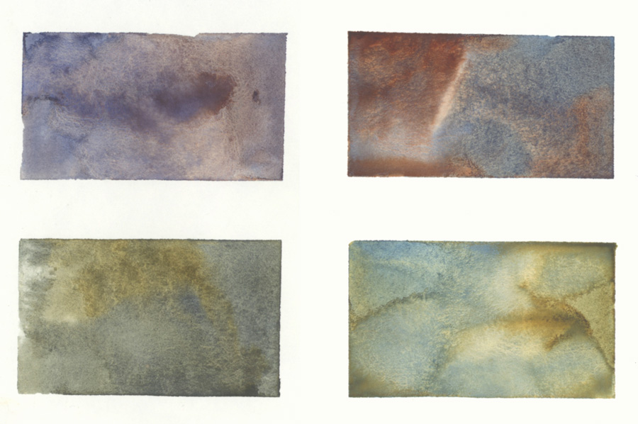
Look at some of these swatches!
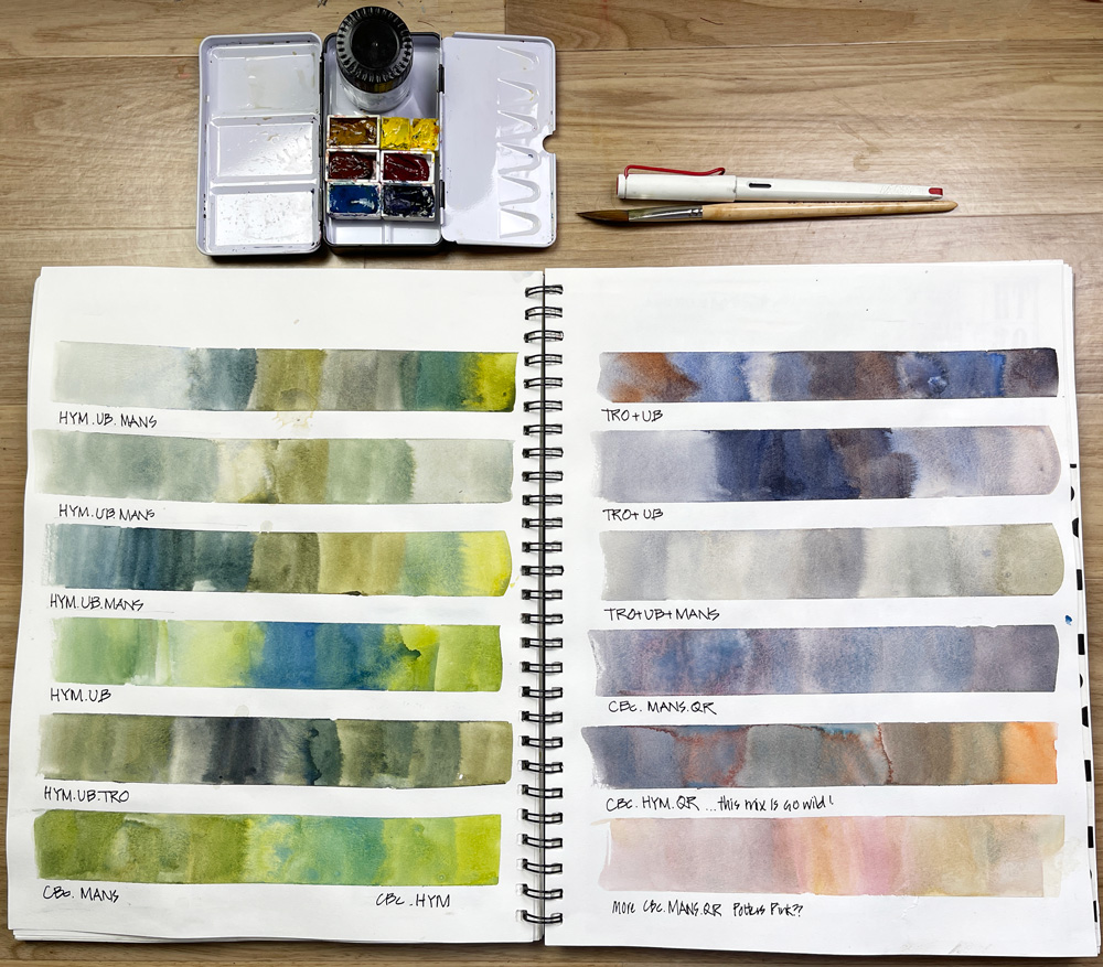
As for my mixing strips…
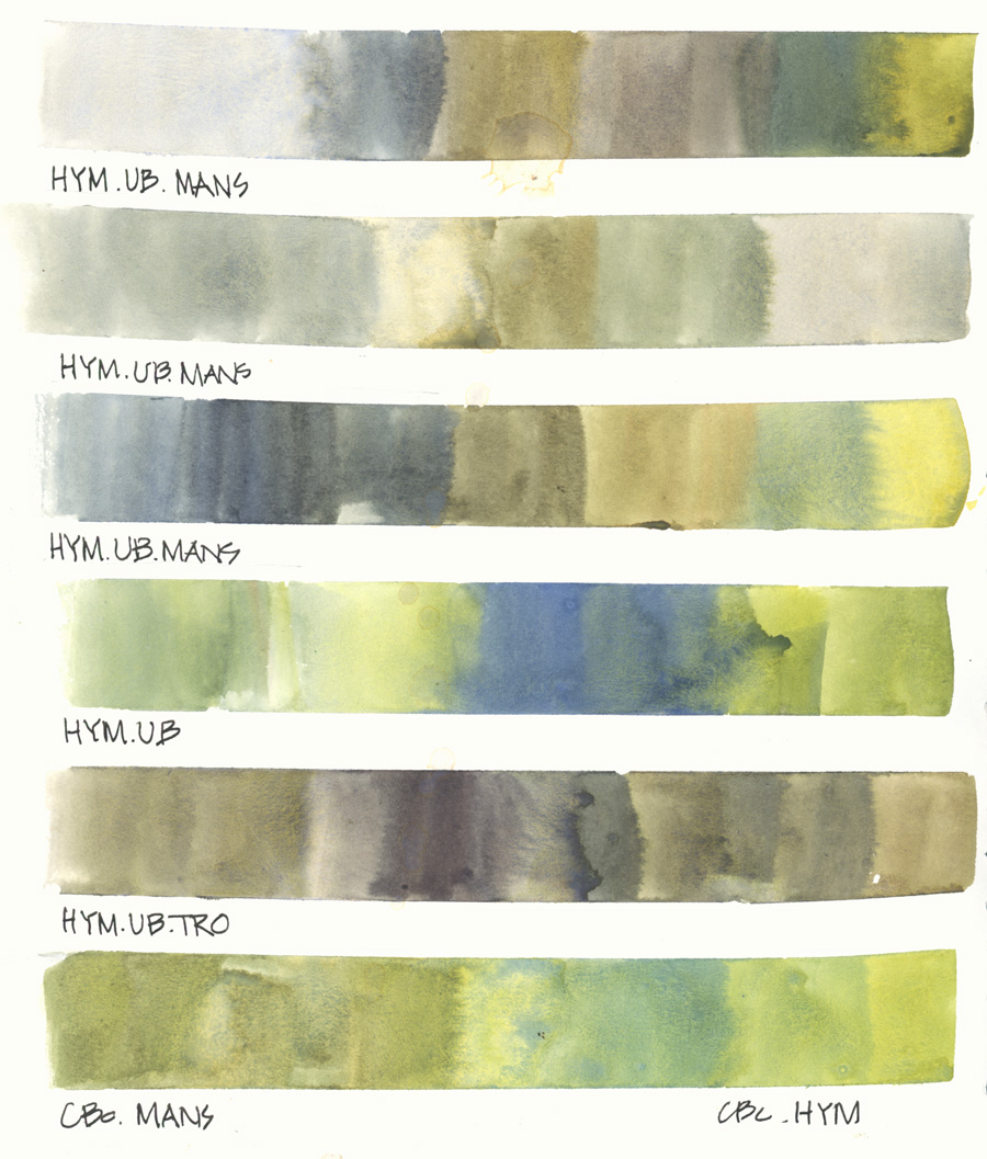
I wanted to explore different ways of creating Australian greens for my bush (forest) sketches and so most of these use 3 different paints.
Note: Whenever I do mixing swatches I try to replicate my usual brush strokes and so I’m constantly adjusting the colours in the mix and the amount of water.
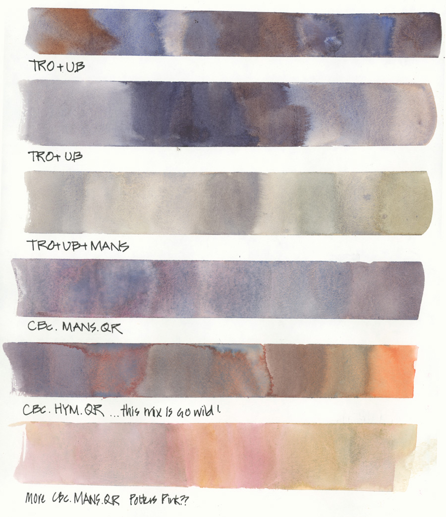
On the second mixing strip page, I was testing greys. I was pleased with these results although I do miss Potter’s Pink!
It will take me a little while to get used to my limited palette but I’m enjoying the challenge!
Finally… if you are wondering, it’s not too late to join the Group Run-through for Foundations! 🙂

12 Comments
What fabulous colours!
I’m wondering if you differentiate between granulating and sedimentary, or is it just different terminology for similar thing?
Hi Marion, while most granulating colours are sedimentary too, some granulating pigments are heavier and settle to the paper quicker than others – so that is the characteristic I look for as sedmientary!
Absolutely gorgeous mixes here!!! Very inspiring.
Hi Sydney – so glad you find it inspiring! And I agree – I’m happy with these gorgeous mixes!
Just magical, Liz! Looks like the similar effects as in handmade marbled paper. My question is colour choice for the DS Transparent Red Oxide. I have taken classes with other instructors who use DS Permanent Brown. Can you explain to me what the difference is and why you prefer the TRO in your palette? (I have both in my kit but I want to reduce it to one). Thanks
Hi Mercedes, I’ve never used Permanent Brown so can’t comment on it. The colour chart says that it’s non-granulating and it looks a little red. Granulation in a burnt sienna-type colour is normally important for me. as you have both in your set, see which one mixed the colours / washes you want better 🙂
Thank you, I am finding the same thing with the Permanent Brown – a little too red. I will experiment and decide at the end of the course. thank you.
The larger pages for the color chart really allows for some stunning effects in those color blends! Gorgeous!
These are so beautiful to look at. Do you put down tape to get the clean edges? What a great way to find out about your colours!
HI Jane – yes I use washi tape! if you use the search bar you will find more about that in another article
Hi Liz! just updated/reduced my folio arttoolkit palette to 9 big pans from the set of 12.
its now: HYM, QR, UB, CB, QG, PP, MANS, TRO and VDB.
I skipped the SAP, CTL and the TPO. Doubted if I should keep the teal blue and skip the quin gold or vand dyck brown but I love mixing with Quin gold an love the earthy darkness of VDB.
Hi Liz, I’m new to watercolour, and find your work very inspiring. I would like to know what kind of coil bound book you used for your mixing strips. Thankyou very much for sharing your knowledge with us.
Sherry, Vancouver, BC, Canada
NEWSLETTER
Subscribe for first notification of workshop + online classes and more.