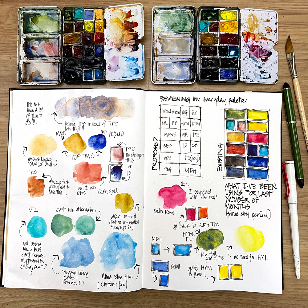
Several months ago I decided that I wanted to use more full pans in my everyday palette. This meant some hard decisions as I love all the pigments in my everyday palette (see the full listing here) and all the colours are included for a specific reason.
I’m a little surprised how well I’ve been able to survive with fewer colours but with the Live Version of Watercolour starting this week (on Wednesday) it was time to re-assess what I’m using on a daily basis.
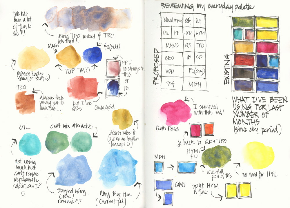
I hope that my notes (and the legend below) are sufficient for you to understand my thought process.
I’ve now got to make this palette up!
Legend
DS = Daniel Smith,
WN = Winsor Newton,
SCH = Schmincke
HYM = DS Hansa Yellow Medium
HYL = DS Hansa Yellow Light
TPO = DS Transparent Pyrrol Orange
QR = DS Quinacridone Rose
FU = SCH French Ultramarine
CBC = DS Cerulean Blue Chromium
MBH = DS Manganese Blue Hue
IB = DS Indanthrone Blue
CTL = WN Cobalt Turquoise Light
CB = DS Cobalt Blue
PP = WN Potters Pink
NY = WN Naples Yellow
QG= DS Quinacridone Gold
MANS = DS Monte Amiata Natural Sienna
TRO= DS Transparent Red Oxide
QBS = DS Quinacridone Burnt Scarlet
VDB = DS Van Dyck Brown
STG = Steels Grey III (a pre-mix of WN Cobalt Deep Blue with a little DS Quin Burnt Orange and a touch of DS Quin Rose)
Important Notes
1. This is my everyday palette that I take out with me and in the last few years I’ve done some experimentation with it. So just because I’ve decided to remove a colour at the moment it doesn’t mean that it’s not an important pigment.
2. My full palette which sits on my desk (shown on the right in the above photo) is relatively unchanged – see this article for more info.
3. I’m sharing this page with you so that you can get a glimpse into the things that I’m thinking/testing. I’m not sharing so that you blindly copy my choices. It is possible that I might make another tweak to it soon. 🙂
4. If you want to learn more about how to choose the colours in your palette to suit your preferences, I have a few exercises inside my Watercolour course that will help with this!
5. This is the palette that I’ll be using in the coming weeks but the palette for my Watercolour course is here
Further Reading
Here are a few links to articles about the reasons why I chose certain colours and how I set up my palette.
- Setting up my palette
- Mixing in my palette (and why I prefer 3 wells in the lid)
- My watercolour section with lots of things to consider when choosing your colours
- Recommended minimum palette of 6 colours
- A basic 12 colour palette
- Putting together my palette for a big trip
- Colours in my Palette – explanations of my pigment choices.
Live Version of Watercolour – starting 10 Jan 2024
Are you joining the Live Version of Watercolour? Do you have your palette ready?
In the Live Version of Watercolour we will work through the course together over 7 weeks and I’ll be hosting weekly livestreams where you can ask me questions, and watch additional demos and reviews of selected work from the classroom. And best of all you’ll be part of an amazing cohort who will inspire you and cheer you on every step of the way. Last chance to sign up before we start – find out more here.




9 Comments
Yaaaaaaaaaaaay!!!
It’s soooooo very helpful to see what paints you have in your palette and why!!!
Thanks to you, my twin sister and I have the small Schmincke watercolor tin, too! Joyojoy!
Onward!
Thank you Liz!
Great to hear Lois!
I have my palette all set for the Watercolour course, can’t wait! One question: is Cerulean Blue Chromium more transparent than the regular DS Cerulean Blue? I have started paying more attention to this issue and I am eager to learn more about it.
Yay! I haven’t used DS Cerulean for year (very weak colour and prefer the WN version). The main reason for using the Chromiun version is the hue – it’s a stronger and brighter colour.
Palettes are always under revision and there are so many wonderful pigments to play with and learn. I’m fascinated you’ve got quin burnt scarlet instead of trans red oxide?
Hi Jamie – QBO has been in my palette since the last time we went through Watercolour. See here https://www.lizsteel.com/revisitingoldfavourite/
Are you using the old transparent pyrrol orange or the newer less red version?
Both. Of course I prefer the darker version!
I love reading about your palette choices and their reasons. I appreciate your reminder that this is YOUR palette and ‘our mileage may vary’ from it. While I love Cerulean Blue Chromium, for example, I have found it just isn’t in my natural environment, and Cobalt Blue more closely matches my Central Indiana, USA, skies. I’ll have to look through your archives to see how you’ve been doing with QR as your only red!
NEWSLETTER
Subscribe for first notification of workshop + online classes and more.