IMPORTANT NOTE: Since I wrote this review the new Moleskine paper HAS improved considerably. It still has a mechanical grain and a noticeable front and back, but the differences are not as great as they were back in 2014 when I wrote this article. If you ever come across old stock of the watercolour moleskine sketchbooks I would recommend you buy them, as the old paper is superior.
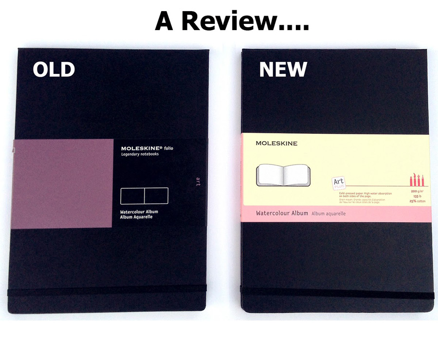
If you haven’t already heard about this … the biggest news in the sketching world in recent times is that Moleskine has changed the labels on its sketchbooks….
so is the paper different?
In a word YES it is different and not as good – in my opinion. Sigh! I love the old paper very much!
Last month when I was in Tasmania I spent the first week using one of the new labeled books (referring to this as NEW for the rest of this post) and the second week using the OLD. I thought the best way to test the paper was to use it in my typical travel sketching situations. Today I have done some more controlled tests in the studio to confirm what I discovered out on location.
Please note:
- This is a very personal review based on the way that I work with watercolour. It is not a scientific, careful test – I am far from being an expert on watercolour paper (though I would love to be like ‘Mr Handprint’ one day!)
- I use watercolour in a fairly loose and spontaneous way – I don’t think that I could possibly do 3 perfectly even washes for a comparison – so I have tried to do tests that mean something to me & the way that I work.
- I love granulating pigments so have done some tests with crazily reactive mixes. I have also done test patches where I varied my brushstrokes – this means that every swatch is inherently different – but I think the characteristics of the paper is still visible. I am very interested in other people’s comments on my findings.
Ok… before I start with today’s test I will share some on location experiences.
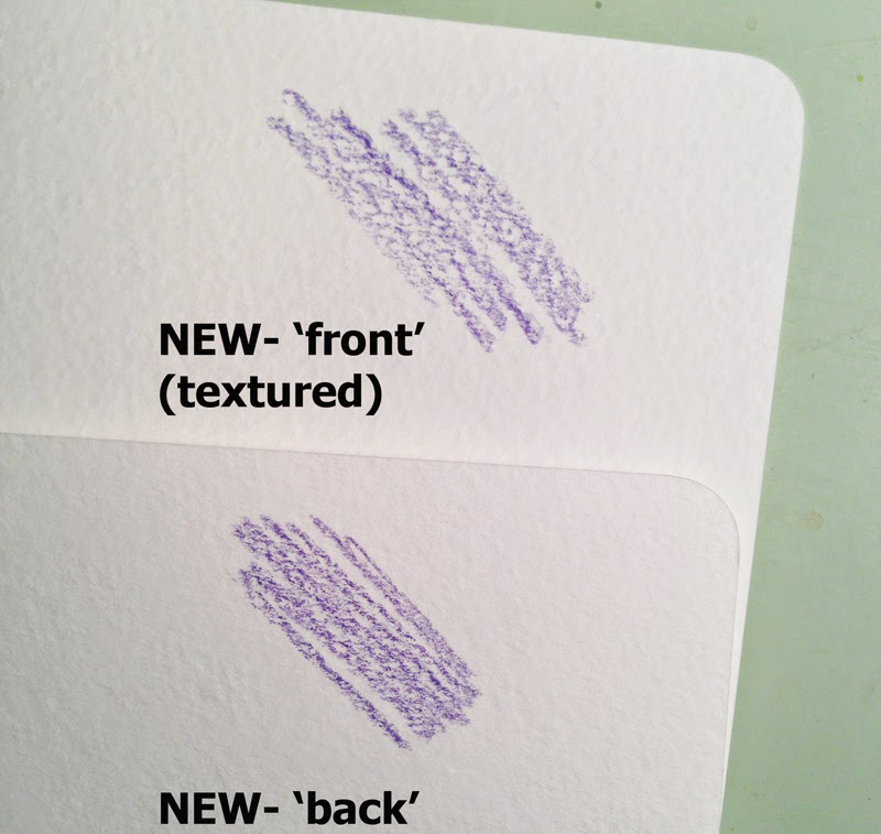
But before I do that… the major issue with the new paper is that there is a marked difference between the two sides of the paper. The paper is bound in the book so that a spread has the same side across both sides.
One side is more textured – this is what I am calling the ‘front’
The other side is less textured and more like the old paper (in texture anyway) – I am calling this the back.
So I am comparing three types of paper surfaces
old – new front – new back
In Tasmania…
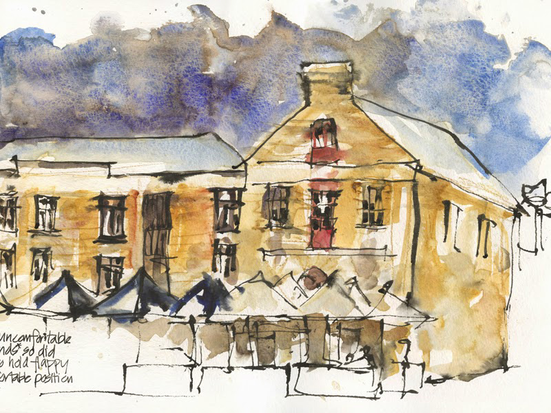
New-Back: First real sketch I did was at Salamanca to the “New Back” side. I was pleasantly surprised that I got some good granulation- more than normal? But felt that in some patches it was flat (eg. the sandstone on the side of the building)
I also felt that there were harder edges (visble in the sky)
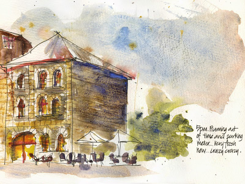
New-Front: The front side of the paper has a strong texture (and it appears to have a grain that runs on an angle) and in general I wasn’t liking the results at all. Look how strong the texture is to the side of the building. I wasn’t liking what was happening with the sky so I got a plastic card out for a little scraping… hmm. that wasn’t what I wanted either.
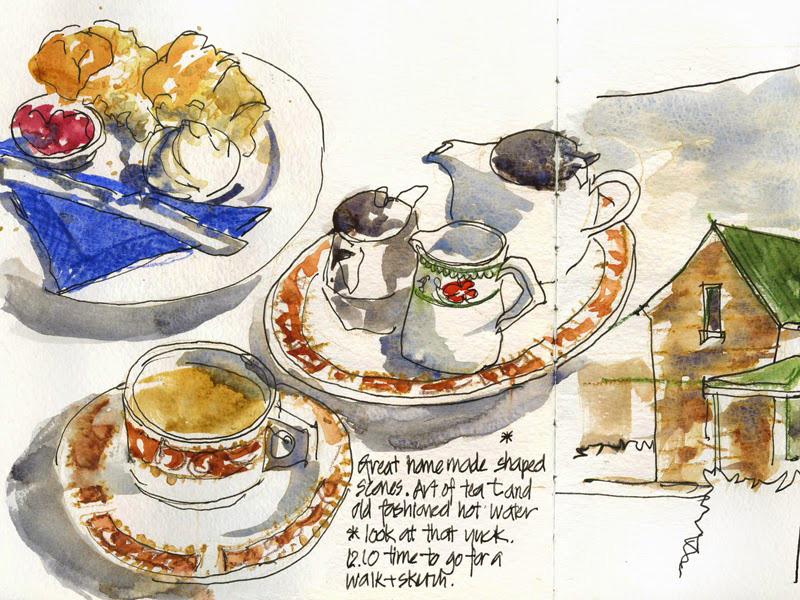
New-Front: Now sketching tea and scones is something I do from time to time (ah hem…what??) Ok…I do it a LOT and it is a kind of reflex action…so I was a little surprised at the yucky bits that appeared on the page (hmm is that a technical term? I told you this wasn’t going to be that scientific!) Obviously the paper was behaving differently from what I instinctively expected from it -my reflex timing of working wet into wet was off – so must be a different drying time and/or a different sizing?? (the same thing happened a few days before as well)
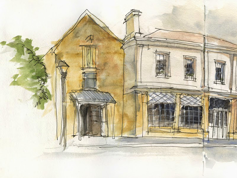
New-Back:
(This is part of my street view of Richmond and it is a little tragic to be highlighting the worst part of the sketch which some of you might not have noticed… but in the interest of this review I will do so.)
I was very conscious of the greater tendency for hard edges so was careful with my sky and was happy with what I achieved(getting to know the paper helps to work with it)
However the sandstone shop was a bit of a mess. I tried to do some varied brushstrokes, didn’t like what it was doing so went in while still wet (so I thought) to adjust and it got worse. Ended up trying to lift off and re-work (something that I rarely do!)
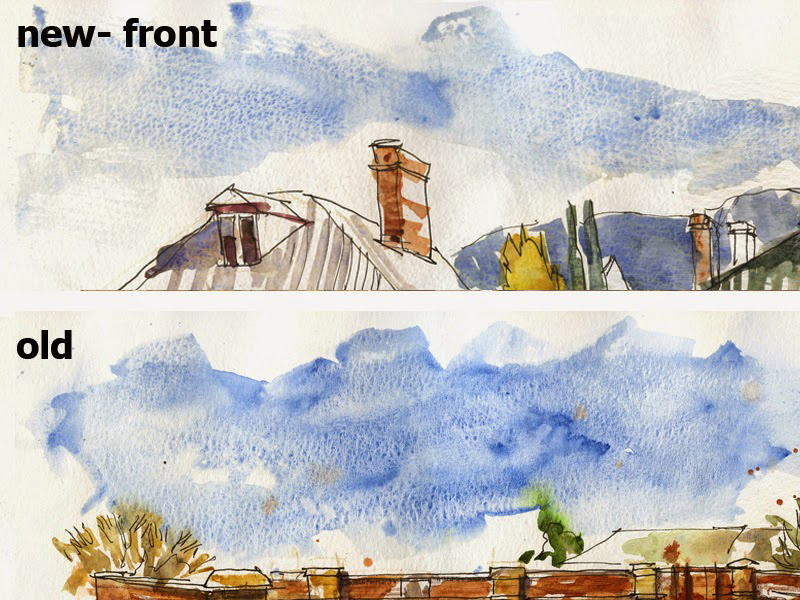
Comparison: New Front sky on top, Old Below
Hopefully this shows the strong paper texture on the top (New-front paper) compared with the varied pigment granulation that I have been able to achieve with the Old paper.
In the Studio
I did a number of tests with highly granulating mixes and a staining pigment (I was also doing the same tests on Stillman & Birn beta paper… but that is for another review)
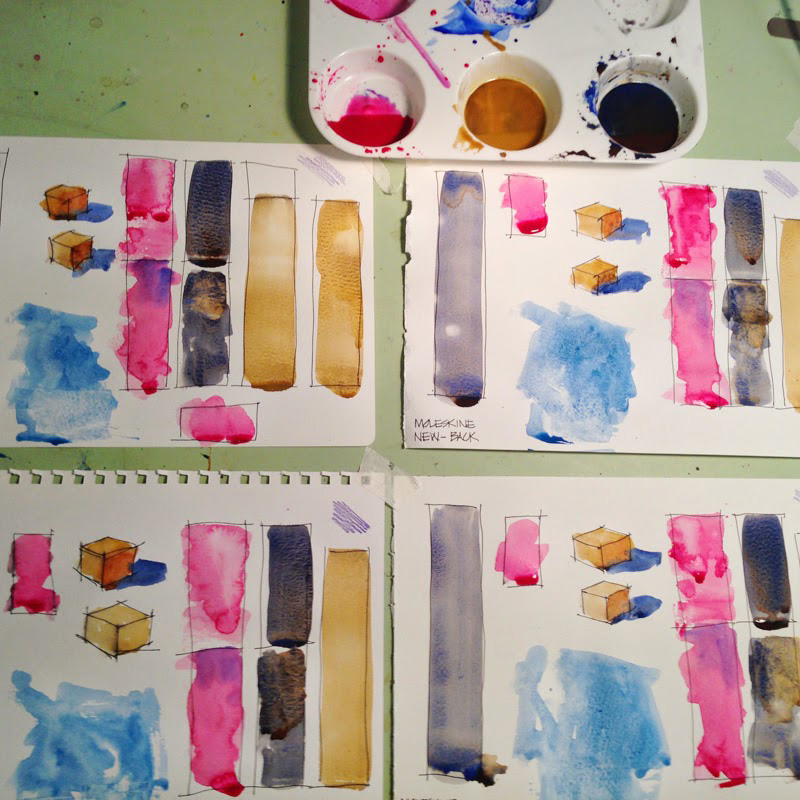
Here are the more interesting comparisons:
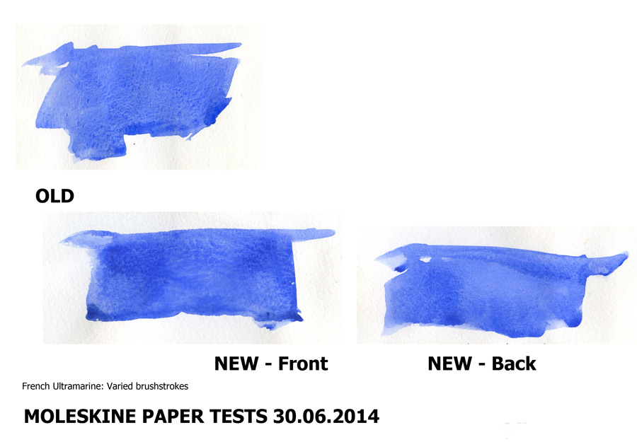
French Ultramarine wash with varied brush strokes (the way I normally do my washes)
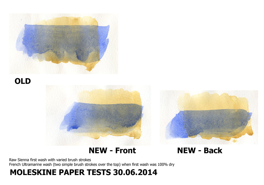
Raw Sienna first wash with varied brush strokes – French Ultramarine wash (two simple brush strokes over the top) when first wash was 100% dry
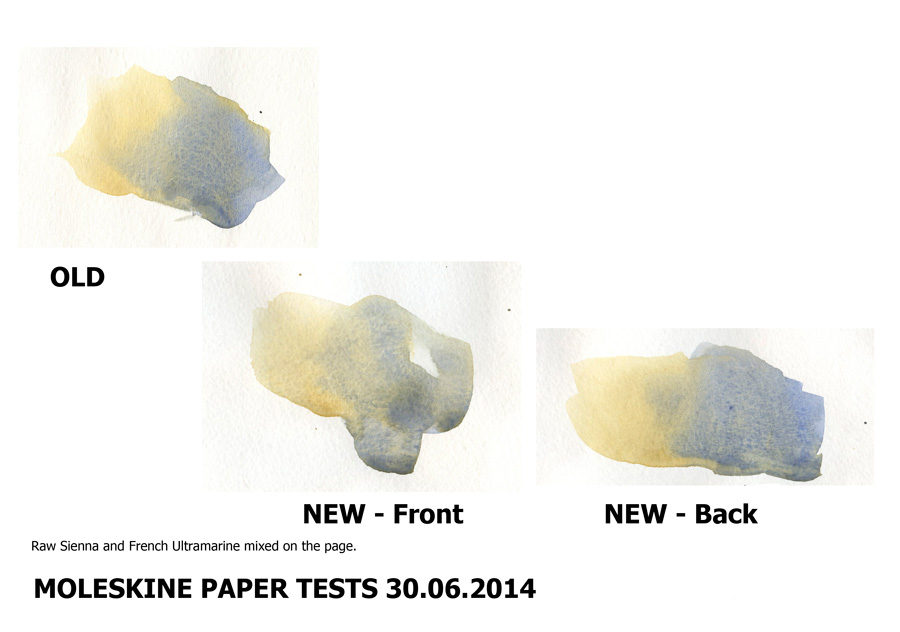
Raw Sienna and French Ultramarine mixed on the page.
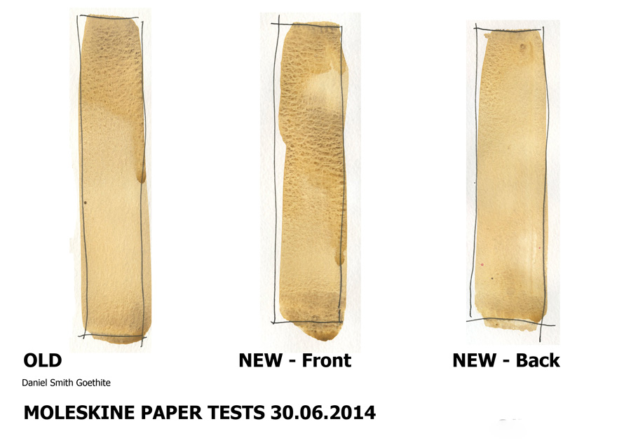
Crazy granulating Daniel Smith Goethite used a wide flat brush single stroke down the page(though in the New-front sample I momentarily paused)
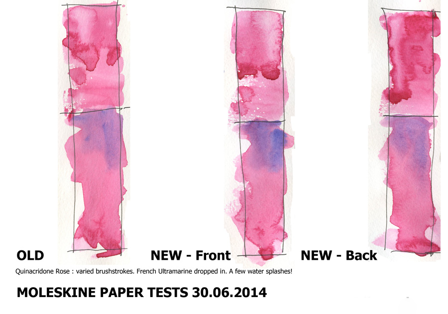
Varied brushstrokes wash of quin rose (staining colour that blossoms easily)
This is just the tip of the iceberg when it comes to tests that could be done (I can think of numerous more consistent ways to test the paper… the ones that I have done are simply the way I work)
Summary of the characteristics of the new paper
– Texture on the front side was too strong for my liking – diagonal grain and uniform pattern
– The back side seemed to be flat and I think there is less sizing(or more easily dissovled?) so that I was unable to work with the paint as much as I normally do (interested in other people’s assessment of this as I am no real expert on sizing)
– Harder edges around washes
– Staining colours more prone to blossoming
– Washes dry a lot quicker on the back side
– The paper sounds different when I flick through the pages of my book – more hollow sounding and feels stiffer.
– A little more buckling (I do use a lot of water)
– No noticeable difference using ink
So… what is the verdict?
The new paper is inferior in my opinion to the old paper (which I loved so much!).
I do not like the texture and worry about the sizing/ flatness of the ‘back side’. The differences between the two sides is very surprising in a quality sketchbook like this.
But …. is it a deal breaker?
My experience from using the book in Tasmania….
I had moments of frustrations while I was using it but I was certainly in the process of adapting the way I was working to suit the new characteristics. It made me be more sure with my washes because I didn’t want to touch them again (not a bad thing!)
Is my sketchbook from that first week full of disasters…. NO NO NO! I am very very happy with nearly all the sketches in the book. The paper, the format and make of the book still suits the way I work. As I flick through the pages of the book now, being distanced from the process, I ask myself – Was the new paper really that bad?
So once again… what is the verdict????
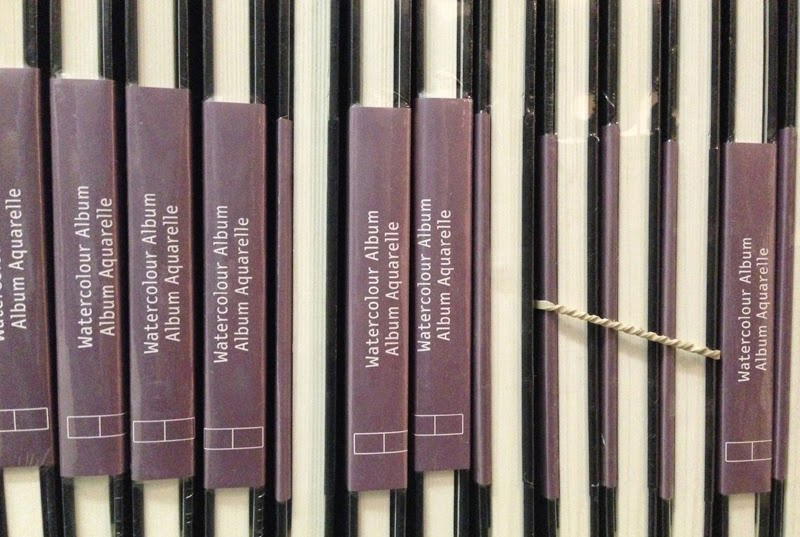
Well, lets put it this way… I have gone and bought as much stock of the old books as I can so I don’t have to make a final decision for a while.
But I will certainly be testing the Beta paper again as my ‘serious outing’ watercolour sketchbook.
(I use the Alpha book for my daily sketches and notes)
I hope that you have found this review useful and I am very interested in any questions and comment – and particularly if anyone else has used the paper (I know that Shari Blaukopf has – she was the first person that I know to use a new book) How do you find it?
IMPORTANT NOTE: Since I wrote this review the new Moleskine paper HAS improved considerably. It still has a mechanical grain and a noticeable front and back, but the differences are not as great as they were back in 2014 when I wrote this article. If you ever come across old stock of the watercolour moleskine sketchbooks I would recommend you buy them, as the old paper is superior.


40 Comments
Thanks for going to all this trouble, Liz! Very interesting and helpful.
I don't like the diagonal grain of the new paper evident in these tests.
I'm so glad you did this Liz. As I had hoped, you are much more scientific than I am. Well maybe not as rigorous as Handprint, but still… I'm glad to see that I wasn't just imagining that this was different paper. It really is and you don't like it either. I have given up on Moleskine. Although I love the look of the books, the new paper is awful. I use many types of sketchbooks but as far as Moleskine goes, I will use up the stock I have and move on to something else. Thanks so much for posting this!
Liz, thanks for showing all of your comparisons. I've been feeling a bit guilty about having so many unused sketchbooks in my closet but now I think I'm quite pleased about it because they are all the old paper. And I should add that while I could see the differences you pointed out and I'm sure it felt very different while working, your style shone through and all of the images you painted on the new paper on your sketching outing looked just as fabulous.
You are not the first person who has not liked the new Moleskine watercolor. I've not yet seen it in stores where I live (Seattle). It's not really my favorite sketchbook anyway, though I DO use the pocket size for my carry-every-day. I've done as you and bought up all in stock but when on sale.
–Kate B
Oh dear. The new paper looks so MECHANICAL. I hate those–but not my problem I guess, since I never used Moleskine! A uniform, really mechanical surface allows you to control your work better, but…I'm not that hot for control, with watercolor! I've always loved the spontaneity of your work…
Thanks for the thorough, informative review! I'm glad I don't use Moleskine anymore so I don't have to panic!
– Tina
Thank you for this test, Liz. I use the Pocket diary from Moleskine, and the paper's quality has also been getting worse and worse.
I think it's the marketing strategy of Moleskine. When they began to grow they positioned theirselves as a company for fine high-quality artist's writing and sketchbooks. But in the meanwhile you can buy Moleskine in every store, filling station and rail station.
Moleskine has become a mass-produced article, and the quality suffers. They left their previous market niche and rely on mass now.
Sad, that they alienate their quality-conscious customers, but they don't care. Quantity not quality is Moleskine's motto.
Lucky you that you've got so many old books, so you have enough time to search a new watercolor book.
Kathrin, https://www.flickr.com/photos/98657307@N00/
Thanks for the review. It doesn't sound good, but I will give the new one a try. Sometimes a change in paper or media lead to a different result or style, which in itself is not a bad thing. But the total sum quality of the product should be prevailing.
Ah- mechanical! that is a good way to describe it. Yay for spontaneity and losing control!
…or using a different brand… we will see what happens and whatever does …I know I will enjoy the ride!
HI Kathrin – I love what you have done with the pcoket diary over the years. Interesting that you have notice a change over the years…. yes sadly quality vs quantitiy
Ah! but loose sheets of paper can change too…. never panic though we take everything in our stride hey?
I had the same thing… 'how different really is this paper?" that is when I realised the difference between the two sides. Very disappointing!
yes – good to have some of the old stock Diane – time to use it and fill up those sketchbook – hint hint!
Yes- although I did find the paper frustrating, I was getting used to it and it wasn't that bad!
Thanks Kate – I know- I don't think anyone will prefer the new paper!
you're welcome Walt!
exactly – it is not nice- too regular and stripey
any suggestions for a different brand for a newbie????
the difference in the two sides was want was throwing me… every second spread I was going 'this is not that bad'. It did take a while before I worked it all out… since I work so quickly I am far more concentrating at the subject at hand not analysising the paper qualities. Need to start testing the beta in detail!
Tony- I am wokring on a specific sketchbook section on my blog (like my tools page) so stay tuned!
Liz, thanks so much for all this thorough and excellent testing and reporting! So useful to know (I would probably have thought "it's just me")…and, I'm looking forward to seeing your report about the Stillman & Birn Beta.
Thanks Liz,
I think I will try out the Stillman and Birn.
Hi Liz
I checked out this review after reading your answer on De Atramentis.
I have a Moleskine Notebook and a calender. I must say I am not impreese with the qulity of the paper. Using a fountain pen it has massive show through no matter what ink brand I use.
Funnily my girlfriend bought me a Molskine look-a-like notebook once. It is MUCH cheaper and the paper is thicker… Show through therefore is almost absent.
I can publish some photo of both notebooks (written side and back side) for a comparison if you are interested…
Regards
Peter Vlutters
Hey Liz,
Excellent test you conducted. I was just about to do the same thing for my newly launched kick-starter project. Long story short, I wanted to make a series of top quality sketchbooks filled only with Artist Grade 100% cotton paper. This is just a start and hopefully a good one that can bring about sufficient scale to bring the cost down in the future. Let me know your thoughts and hopefully you will like it and share with others 🙂
https://www.kickstarter.com/projects/theperfectsketchbook/the-perfect-sketchbook-for-travel-artists-and-art
It's all so tricky isn't it finding the "right" book for ones work. I recent bought a new smaller landscape moleskin and didn't notice the difference, but maybe I found it better for drawing than loose washes. Still my dream would be a S&B landscape that was slightly squarer. Ahhh see, maybe none of us can be pleased! Thanks for your (as always) thorough review.
backed it! all the best Cherngzhi!
exactly- so tricky.
Am so interested to seewhat other people think- keep me posted!
Love the review. Thank you! Just got two of the new ones last week from Amazon. But I still have one of the old ones in pocket size waiting for me to have the guts to use it. LOL Sometimes new sketchbooks just scares me. Go figure… 😀
Thank you for doing these tests.It is obvious from your illustrations that the texture in the new moleskines is intrusive and mechanical. I shall not be buying any for watercolour purposes.It seems to me that if you want to have a good watercolour sketchbook you have to pay almost double the cost of moleskines. Better still, make your own. It isn't difficult.
Great review. An amazing surprise find your blog 🙂
Regards from Colombia
I'm quite disappointed with the new paper. I have not done extensive tests as you have done and really appreciate the trouble you went to! I just felt that I was frustrated at the way the paper handled my watercolor, where before I absolutely loved it. The paper buckles and curls and I thought maybe it was me, that I was doing something differently than before. But this confirms to me that the paper is not the same and I hope those of us who feel this way will write to them and let them know.
Liz…I am crushed that Moleskin has changed their paper. WHAT are they thinking? We all love that one!
I hope that you will be sending your results and this blogpost to them. It’s important that the feedback get to them. Everyone seems disappointed too. Where is moleskin made? I have a Stillman & Birn Beta series sketchbook also because that is what Brenda Swenson recommends and loves. But I have not fallen in love with it and it’s fairly pricey. The landscape Moleskin has always been my main sketchbook! and it’s so portable. I love doing two page spreads and how is that going to work with two different surfaces????
I’m a novice in sketching and I was planning to buy a watercolor sketchbook for my next travel.
Now I’m worrying about moleskine and it’s different papers. How about Hahnemühle sketchbooks ? Are they any good ? Or is there other alternative ?
Great blog btw !
hi Annie,
I haven’t really tested those books – only this particular one https://lizsteel.com/a-few-new-sketchbooks-to-test-out/
Hi Liz,same problem with my Moleskine I bought last year. It seems that one side absorbs more water than the other. I notice it even when im sketching only with my fountain pen(Lamy Safari or Platinum carbon).In one
side the line is thinner . Its frustrating!
Thanks for the info.
I have two questions:
1. What black soluble ink do you like for drawing with a fountain pen–i.e., not a permanent ink, but one which works for ink washes.
2. In your Lamy safari pens, do you use EF or F nibs? (or both)
Hi Thomas – 1. I rarely use watersoluble ink so have not definite recommendation. Often you fineliner or pilot V pen.
2. I use either EF or F.
Hi Liz, I’ve been looking up for reviews of the Moleskine Watercolor Sketchbooks and I found yours. I guess it’s too late for me to be looking at reviews. We are now in 2017, and I have bought 2 Moleskine sketchbooks last Christmas in a Moleskine shop in Paris. I have to say it didn’t meet my expectations. I should have bought only one first to try! The pages still do have the diagonal texture and some patches are differently textured! Even though it has 25% cotton, I still prefer the Canson cold press. I’m still in seach for the perfect sketchbook for me.
NEWSLETTER
Subscribe for first notification of workshop + online classes and more.