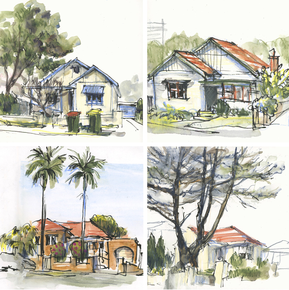
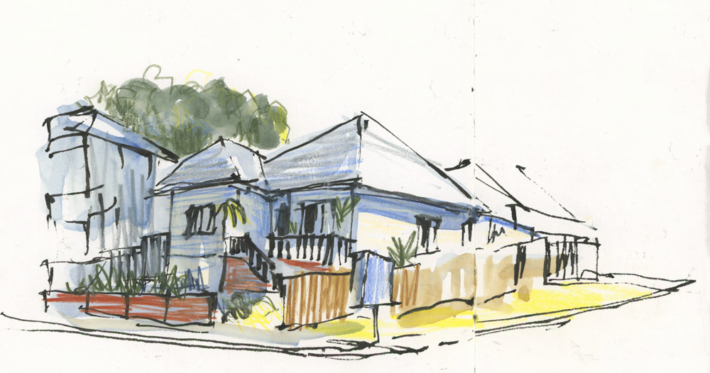
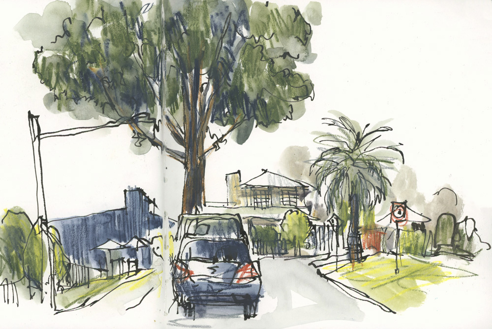
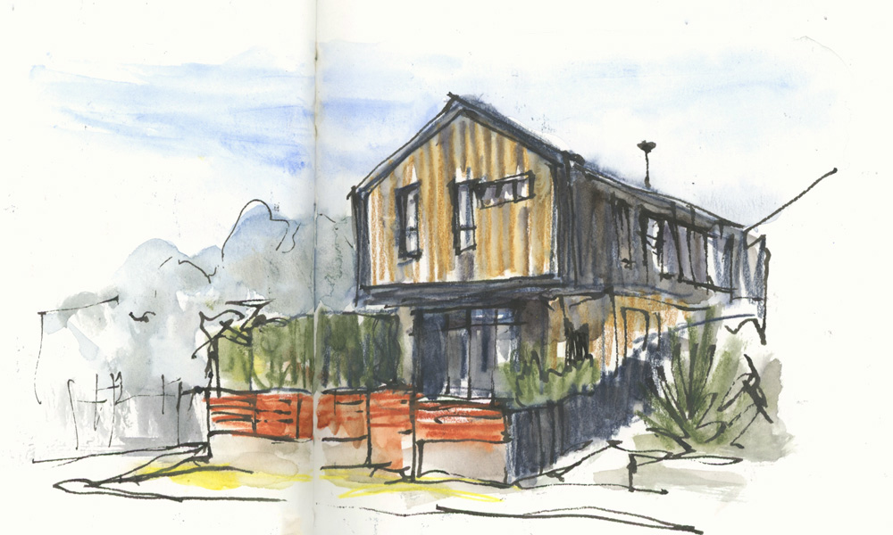
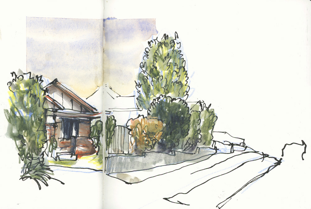
 As mentioned a few weeks ago, I’ve changed my routine a little and now I’m sketching local houses from my car while sipping my morning coffee. I’ve moved my morning walk to the afternoon and that’s working well too.
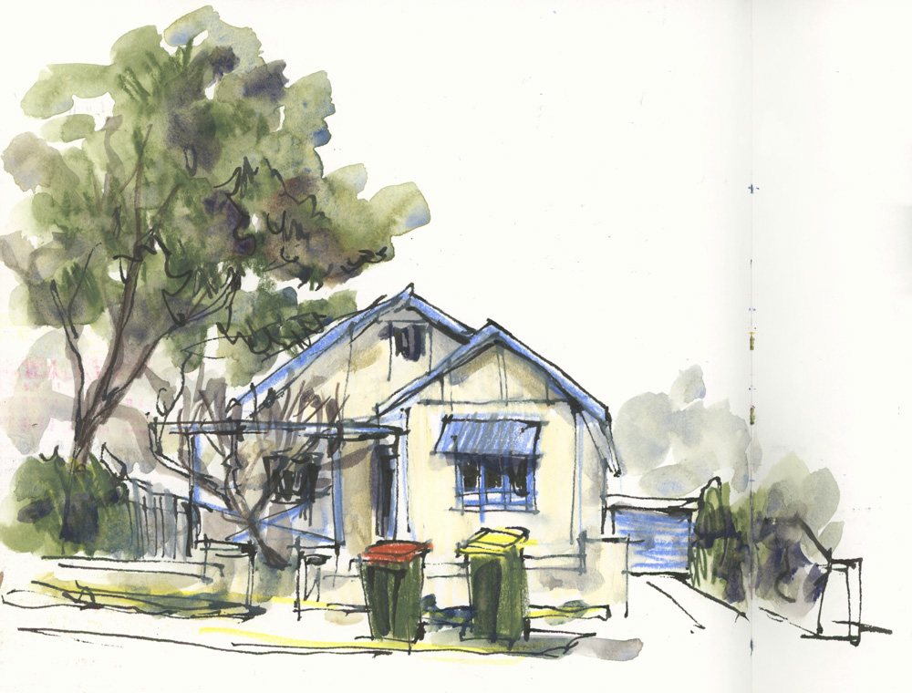
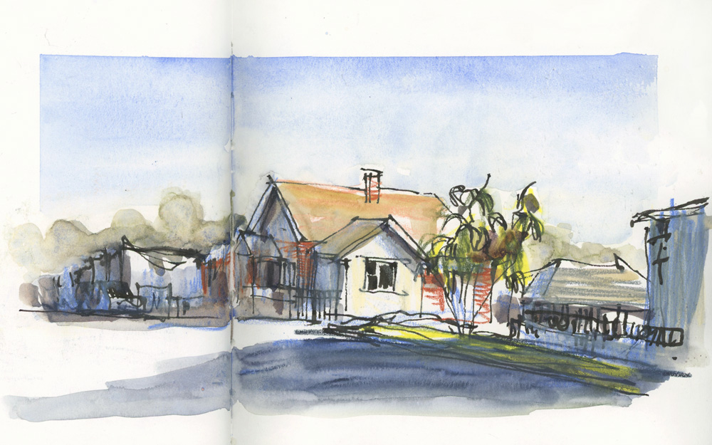
I’m enjoying having a variety of subjects and the challenge of making boring houses into nice sketches.
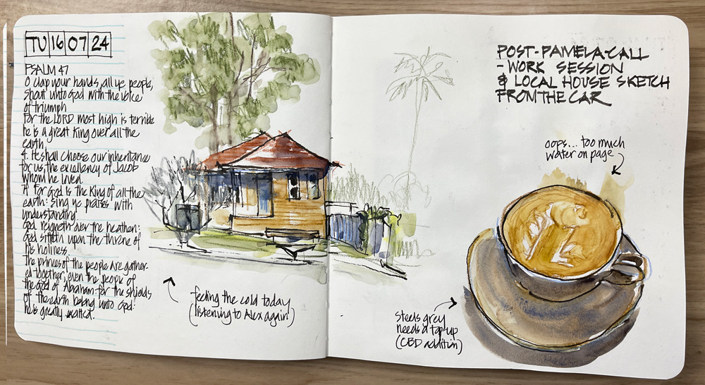
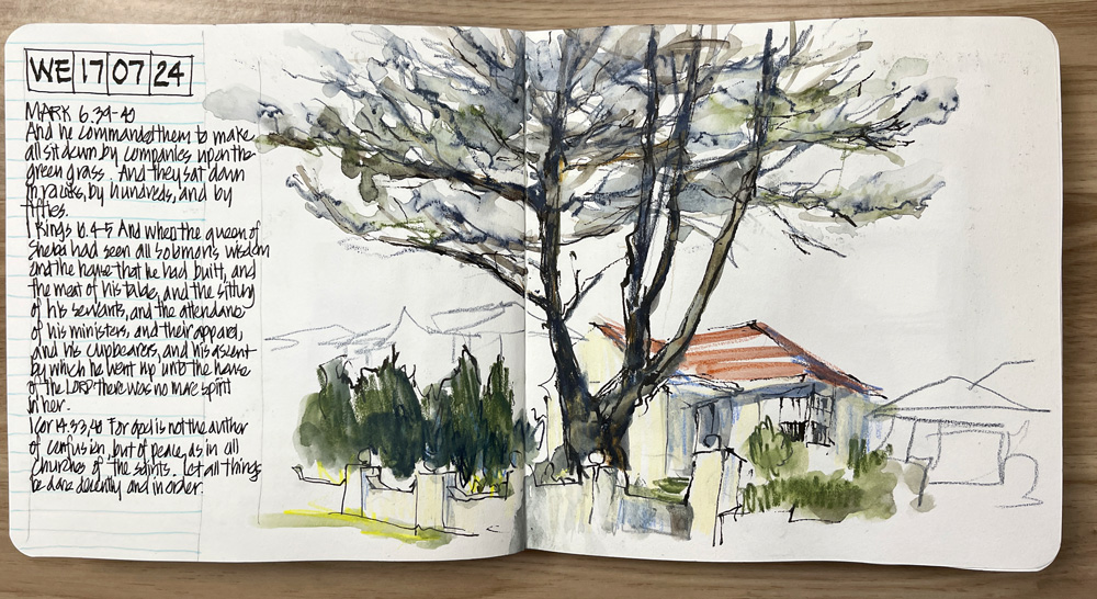
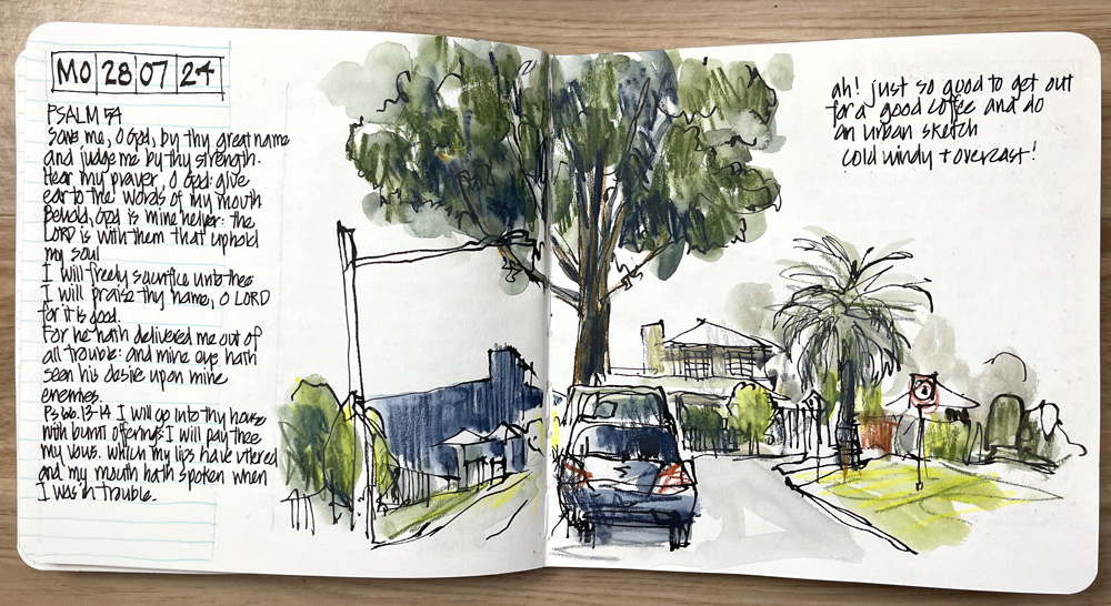
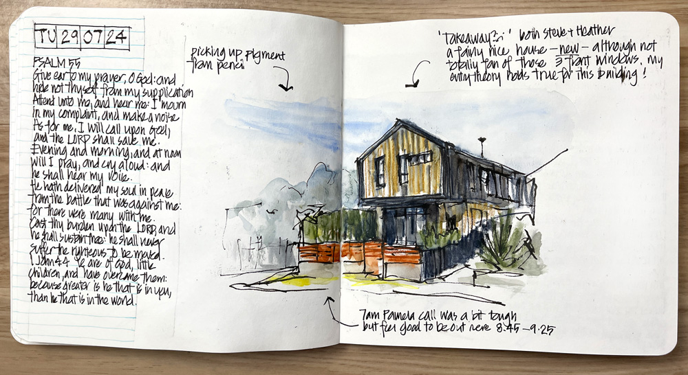
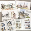
All of these sketches were done in approximately 10-15 minutes from the driver’s seat in my car. I’m not trying to create masterpieces, but I’m simply starting my work day with a small sketch to get the creative juices flowing.
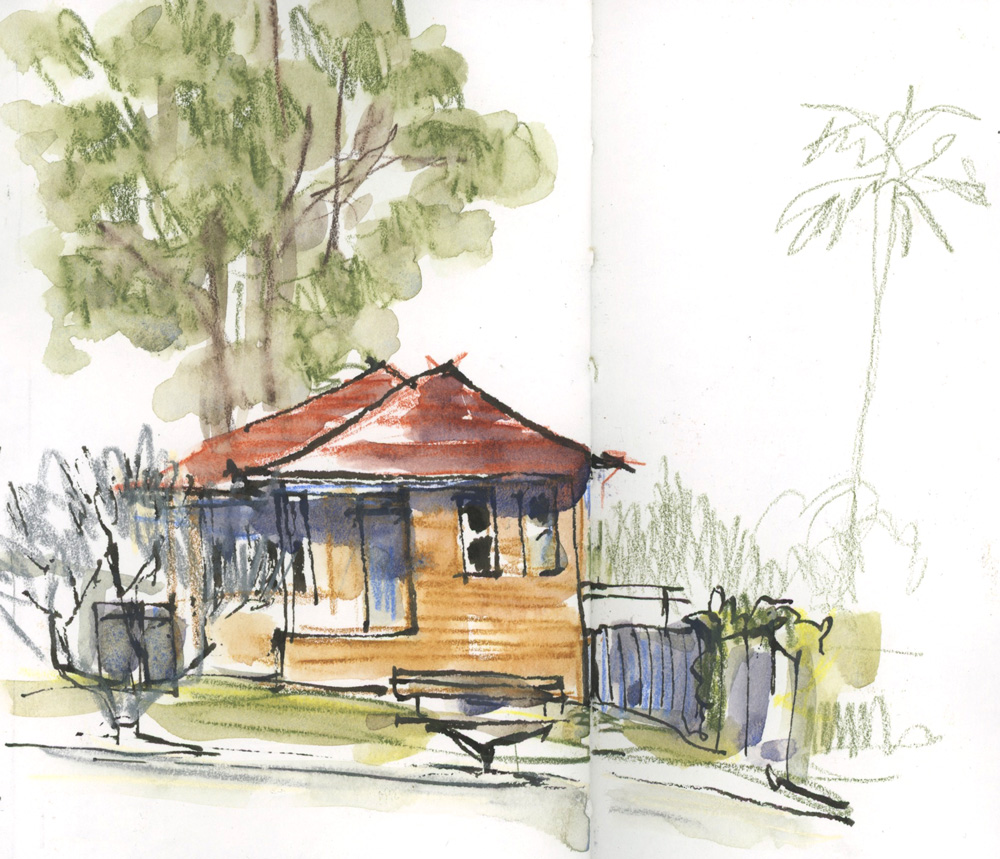
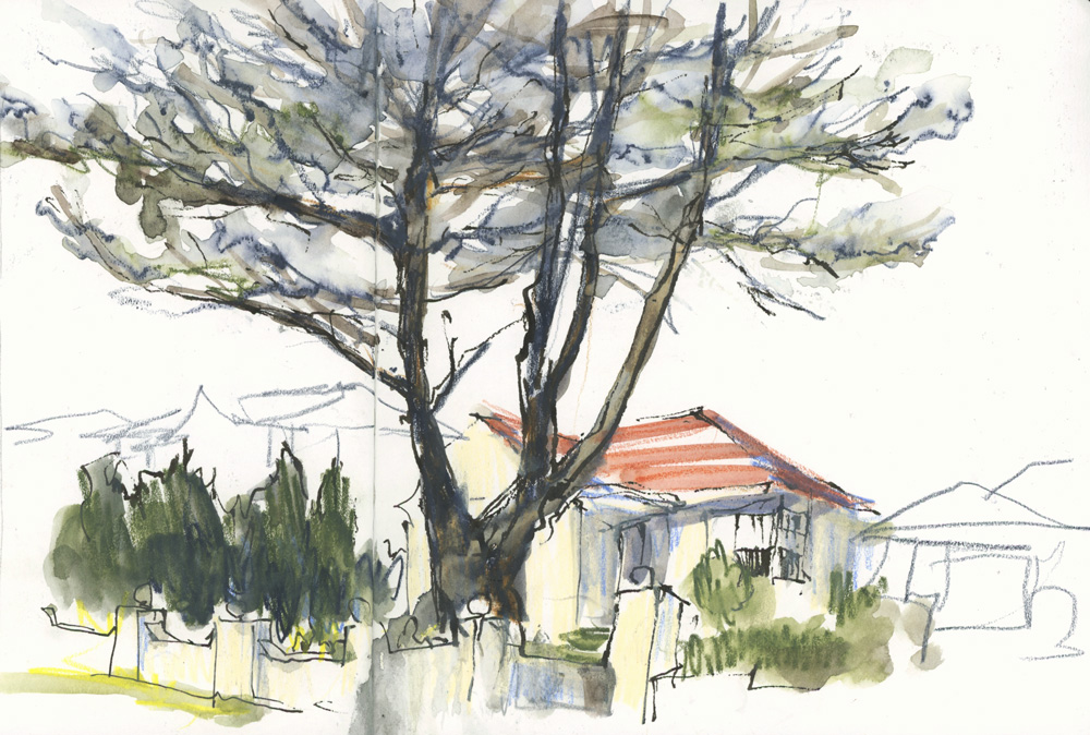
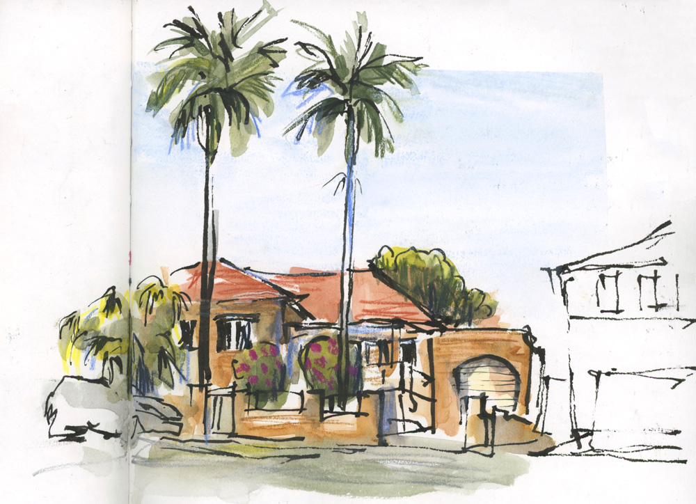
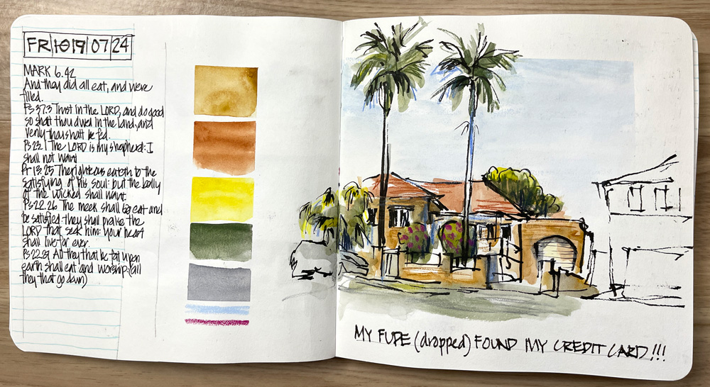
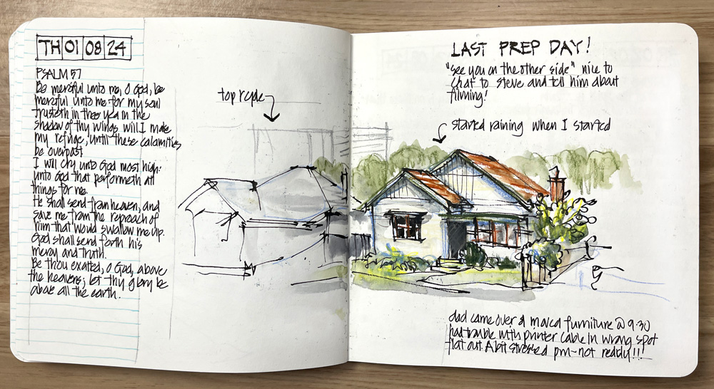
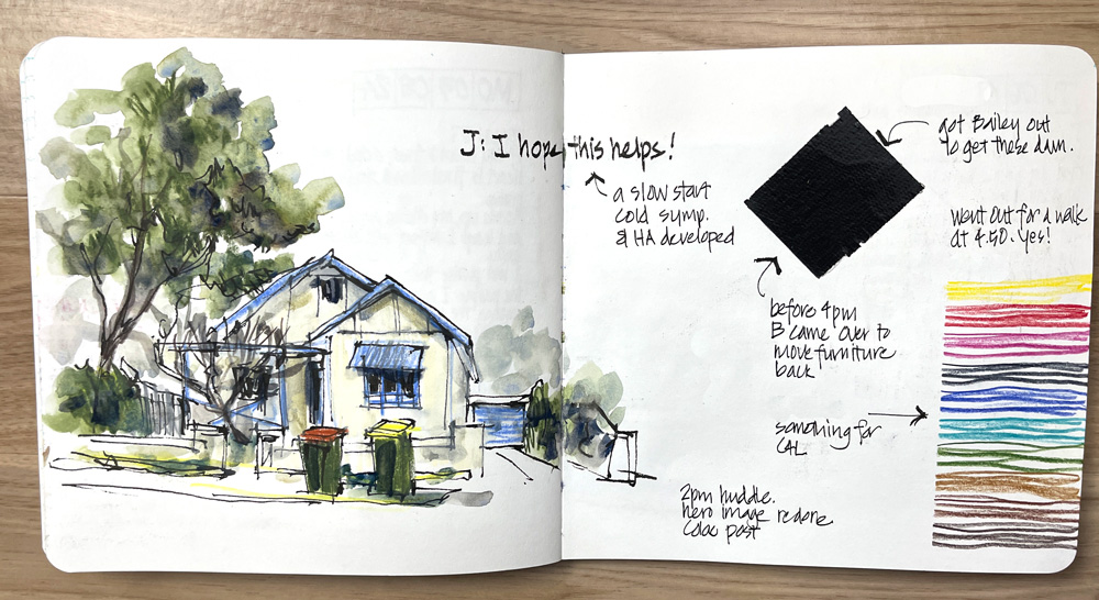
And for those of you who want to see the full spreads…
Just for the record: One day I will erase my pencil guidelines but at the moment they are all still there. (It’s a sign of how busy things are that I haven’t erased them yet!)
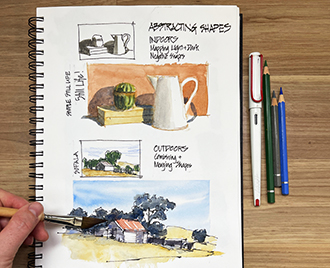
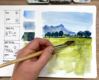
I’m really enjoying this new routine, and I’m happy that despite being in a very full season at the moment (preparing my new Travel Sketching course), I’m still sketching so much!






12 Comments
Thank you for sharing all these sketches Liz. Showing us how to keep sketching even when things are super busy for you! I enjoyed them all!
My pleasure Ginie!
I love how, on August 1, you show an outline of the house next door and an even fainter outline of the building behind. It was immediately clear to me that the focus is the house on the right but that other buildings are present—sort of like a bokeh effect in a photograph. I’m going to try that.
I’m not sure if it was your intention, but the color bars on July 19 reminded me that one can indicate a sunset even without always painting it behind the sketch. I like that.
Thanks for sharing!
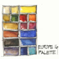
Hi Cowboy Bill – yes I like to include the context. And any resemblance to a sunset is totally coincidental – I was just recording the colours I used in the sketch
Thank you for sharing your sketches of making boring houses interesting. I REALLY loved seeing the full page spreads after “studying” the individual houses. Showing both was a refresher for me of things from your Sketchbook Design course. Incorporating colour swatches into a spread was a timely reminder for interesting ways to play with my newly purchased watercolour pencils. I’m looking forward to the upcoming travel sketching classes.
Thanks Jan – yes I always like sharing the full spread and the design of the page is just as important to me as the sketch itself – maybe even more important when I’m in a crazy busy period.
Love how your sketching style and techniques makes what otherwise appears to be an ordinary house look interesting. Thanks for sharing your artistry!
Thanks Brenda! And yes these are really ordinary houses 🙂
Another really helpful post, thanks. Would you mind mentioning what size your book is?
Hi Rachael – it’s the softcover square Alpha
Gorgeous! These houses do not look boring at all! I hope the new travel class includes tips on how to make boring house into such lovely sketches. I get stalled out when faced with boring types of scenes, then do t have confidence in sketching them even when I want to capture the moment. A smaller sketchbook makes it much easier to sketch in the car!
Thanks Jamie
NEWSLETTER
Subscribe for first notification of workshop + online classes and more.