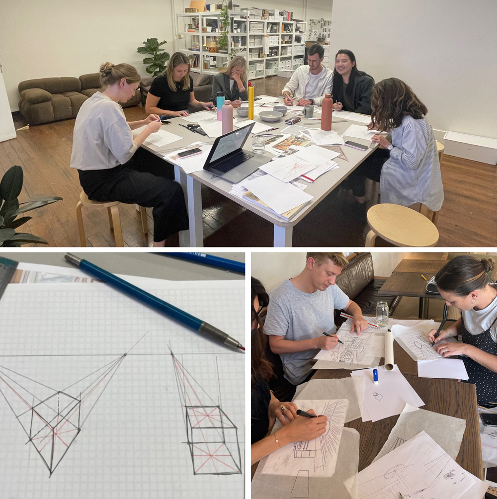
This year I’ve been doing a number of perspective workshops for Interior Designers and so I thought it was time to do a blog post about it!
These workshops have been focused on design/presentation drawings rather than observational sketching – so it’s a change from what I normally teach and I’ve been enjoying it very much.
Perspective drawing for the workplace is very different from observational sketching. Everything has to be constructed and drawn accurately either manually (using traditional perspective techniques) or using 3D software.
Over the last few weeks with the Five Foot One Design team, we’ve been doing a lot of manual setup – involving lots and lots of construction lines! Even though the most likely perspective drawing they will do is adding details (such as extra furniture or fixtures) to a 3D computer model, it’s important to understand how to construct everything from scratch as they need these skills for any minor additions. I do enjoy this process a lot… but it certainly makes me appreciate how much easier it is to draw a scene from observation and rely on eye-hand coordination!
Earlier this year, I also ran a workshop for Alexander & Co explaining how to add more details to computer setups and then how to trace them. As the Alexander and Co team draw with fountain pens I also taught them how to use them – eg. to pull, not push when drawing lines and how to change the grip to get consistent or varied line weights. And when it comes to tracing there are some important techniques for getting a good result!
But to get back to perspective…
I didn’t receive comprehensive instruction about perspective when I was studying architecture at university so a lot of my knowledge has been gleaned through my own experience and research over the years. Over the last few weeks, I’ve been brushing up on techniques and filling a few gaps in my knowledge. I’ve absolutely loved getting back into the nitty gritty of perspective. Thanks to my friend Olga who shared one missing piece about setting the depth in one-point interiors.
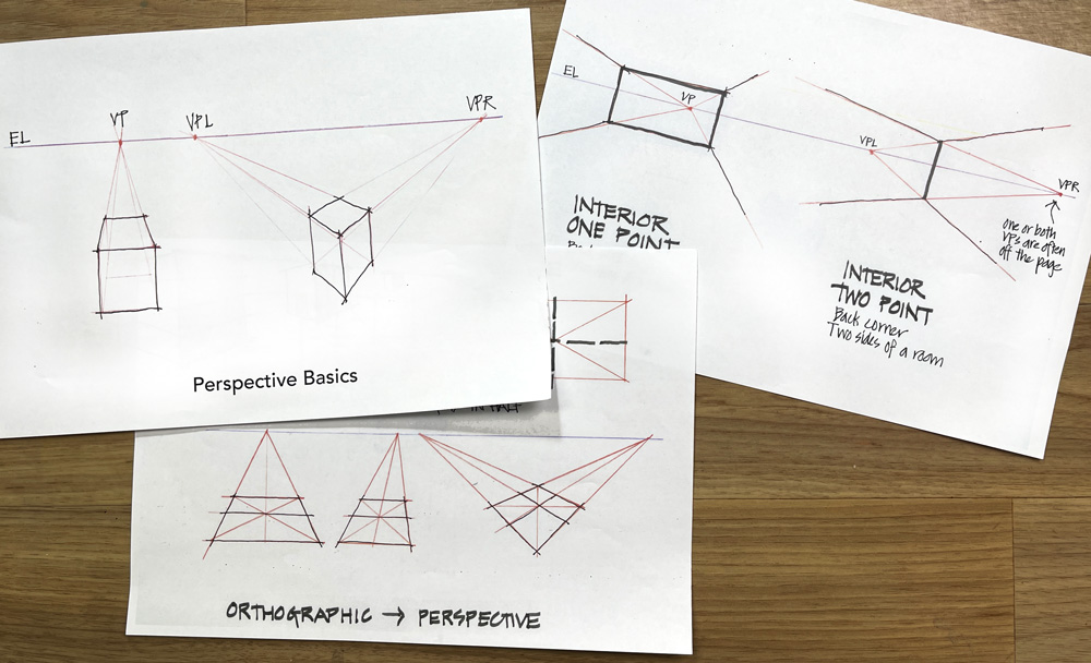
I think perspective is very cool but there is no doubt that it’s a hard topic to teach.
It requires explaining the main concepts in a really logical manner and trying to keep it simple and clear at all times. I absolutely love this kind of challenge and I’ve been having a ball as I’ve been preparing the lessons for these workshops. I’ve created a new series of theory sheets to break the process down and a number of exercises to progressively build the skills of the participants over a number of workshops.
It was a little strange initially to start using a ruler again. Although the end result for these types of design drawings is a free-hand sketch, the best approach is to do all the setup lines using a ruler so that it’s accurate. I really started longing for my old left-hand drafting machine but I’m happy that I found a cool new tool as a substitute!
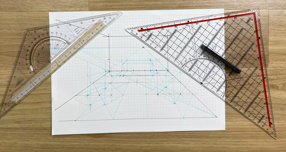
Those of you who have done my Teacups course will have been introduced to my fancy triangular ruler (on the left) that includes a protractor, three different scales, and most importantly a long edge with the measurements starting from the centre. (Aside: If you haven’t bought my Teacups course you might find it strange that I’m discussing a ruler! But it all makes sense inside the course). Recently I found a similar but larger triangular ruler and it’s even better – particularly for doing these perspective drawings.
Important note: This is not something that an urban sketcher needs! But if you are doing accurate perspective drawings it’s great. So is having a long ruler (40 or 50cm in length) as for this kind of drawing we need to draw lines from both vanishing points (and often extend our page as well!)
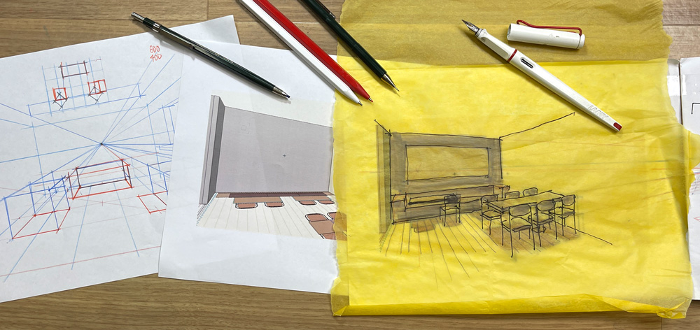
As the point of these workshops has been to build core skills and an understanding of perspective I don’t have a lot of photos or exciting drawings to show. But here is an image showing the progression from setting up a perspective from scratch to creating a drawing using a 3D model as the base (projecting up from the floor plan).
In this example, I did a loose sketch over the top before I had finished setting up all the chairs. There is a limit to how many accurate ruled perspective lines I can do before wanting to get out my fountain pen.:-)
Note to self: my using Lamy Joy with Medium Gold Nib is too wet for drawing on Yellow Trace – use a finer/drier pen next time.
I’m absolutely loving teaching these workshops as it’s a way to continue using the skills I have from my days as a full-time architect. I have a new appreciation for this type of drawing now after my years of urban sketching and teaching.
If you are an Interior Designer or Architect in Sydney interested in small group private workshops to improve free-hand drawing skills please let me know via the Contact form.
If you are a sketcher… most of what I’ve mentioned in this article doesn’t apply to you. 🙂 But over the years I have developed a simple and practical approach to perspective specifically for urban sketching. It’s based on my technical knowledge but relates more to my love of loose and lively urban sketching. This is what I teach inside my Buildings course – find out more here!

NEWSLETTER
Subscribe for first notification of workshop + online classes and more.