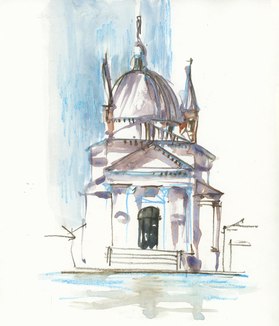
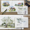
Here are three sketches of Palladio’s churches in Venice that I did in a very loose style – mixing watercolour and watercolour pencils. I started with some paint but then alternated between line and colour.
They were done late at night when I was just wanting to play… but my choice of playful subject matter might be a little odd to you! In these first two sketches I didn’t plan what I was doing but just started and worked from one part to the next.
I have such an ingrained feeling for classical buildings like these that if I draw (or paint) the classical orders (columns and horizontal bands) early on in the sketch, no matter how crazy and loose I’m working, I know that I will be able to pull it off.
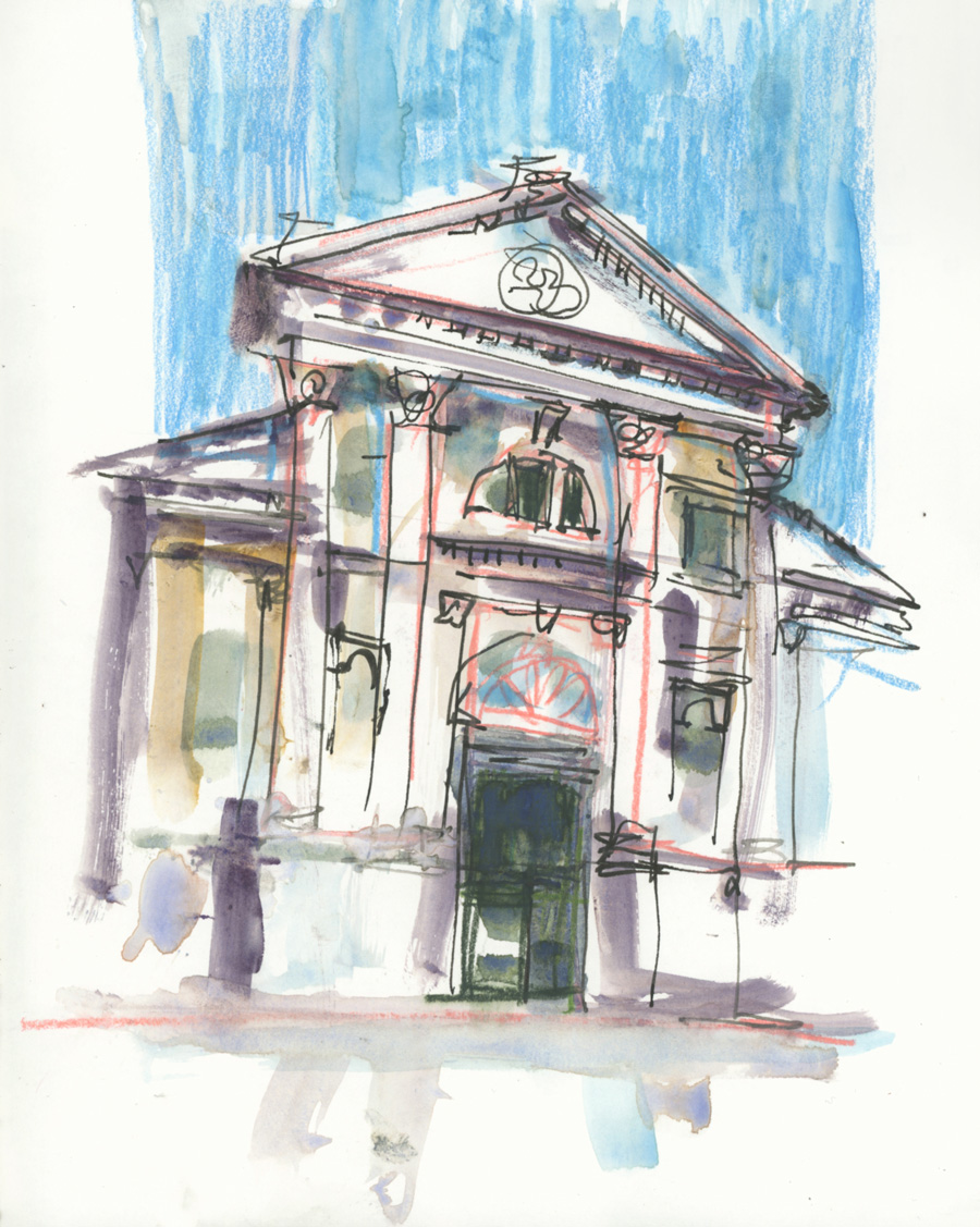
I really enjoyed doing these two sketches but afterwards, I noticed all the imperfections – such as unequal bays and not-quite-right perspective. That’s not surprising,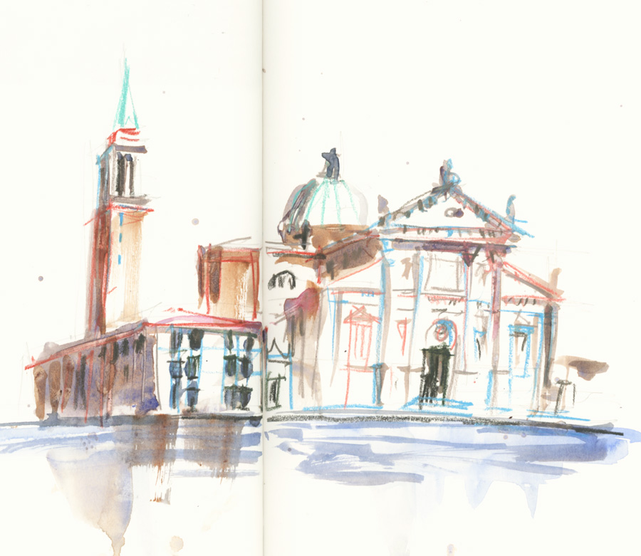 is it?
So for my third Palladian church in Venice, I did some quick light 2H pencil setup lines first.
Hmm, that affected the freedom I felt while doing the sketch. However, I think that the size of the sketch is a factor too. I’ve recently reminded myself that working larger works well for me.
I’m always trying to find ways to create accurate loose sketches of architecture and so these quick sketches are based on technical know-how that has become second nature for me. And I guess, you all know by now, that these are the things that I share in detail inside my Buildings Course. I’m so excited to be doing a Group Run-through again – as I really want to focus on this balance between looseness and accuracy. The Group Run-through for Buildings officially starts on 13 October… but already there is a very special group forming inside the classroom, sharing their work for the Intro Lessons. Find out more here.
And for those of you who must know what colours I’m using… these are the Caran d’ache Museum pencils that I’m loving at the moment. A very different colour scheme than usual!
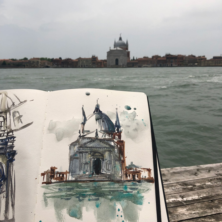
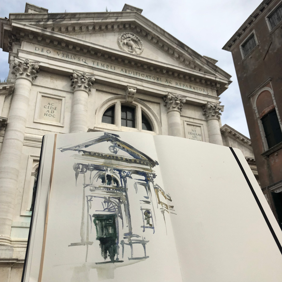
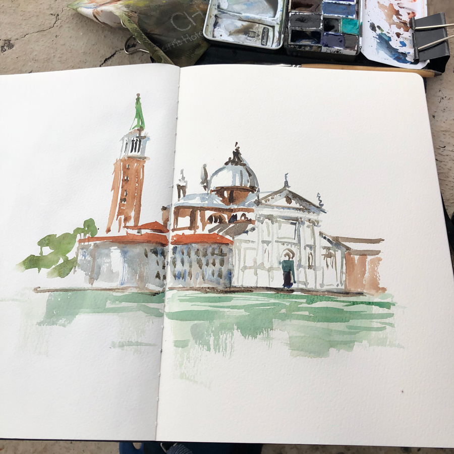
These three churches in order are Il Redentore, San Francesco Della Vigna and San Giorgio Maggiore. And I will finish with one sketch of each that I did on location during one amazing day trip to Venice in 2019.



6 Comments
These loose sketches are so full of joy/dreams (as I ‘read’ them) and spontaeity – also due to the vivid colour scheme!
I easily imagine situtations to use this loose stile also on location: when you “capture” the view, create a memory and then just ‘inhaling’ the view and atmosphere instead of sketching it.
I hope this makes sense,´my English knowledge restricts the choice of words 🙂
Hi Barbara – your meaning comes through! i agree. thanks!
I notice the looseness captures the soul and mood of the moment. Loving the free feeling the colored pencils are adding to your sketches, too!
Thanks Jamie!!!
Must be exhilarating to look at a building and sketch it freely without anxiety and have it turn out the way yours always do. Hope I can achieve at least a bit of that joy at some point.
When you finish a sketch do you have a wonderful sense that the building is part of you in some way?
Yes totally Maria – I feel as if I’ve gotten into the mind of the architect and that is very special!
NEWSLETTER
Subscribe for first notification of workshop + online classes and more.