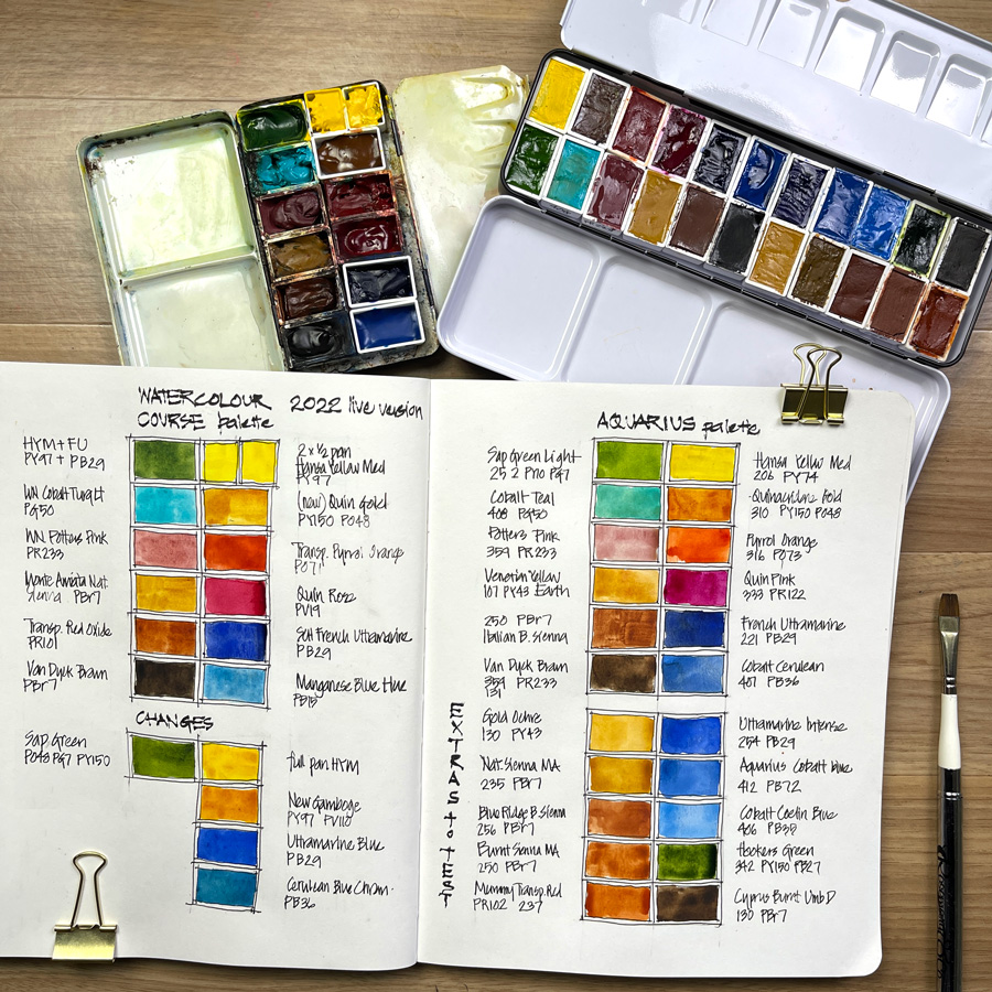
With the Live Version of my Watercolour course starting next week (I can’t wait) it was time on Monday to get my dedicated Watercolour palette out, clean it and top up the colours.
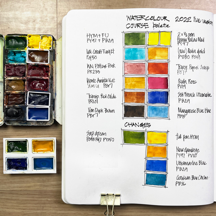
And in doing so I decided that it would be fun for me, as I revisit the exercises in the course, to make a few tweaks. And so I’ve changed a few colours so that I can explore the differences from the original selection.
I still love the four paints that I’ve removed and as you can see in the photo, I’ve topped them up so that they are ready to use as well (especially during the weekly livestreams).
Note: If you’re doing the course for the first time (if you want to get the same results as mine) I continue to recommend that you use the original Watercolour 12 colour palette. It has a great selection of colours for mixing and a wonderful variation in pigment characteristics so that you can really develop important foundational watercolour skills. See this article (and the materials list) for more details.
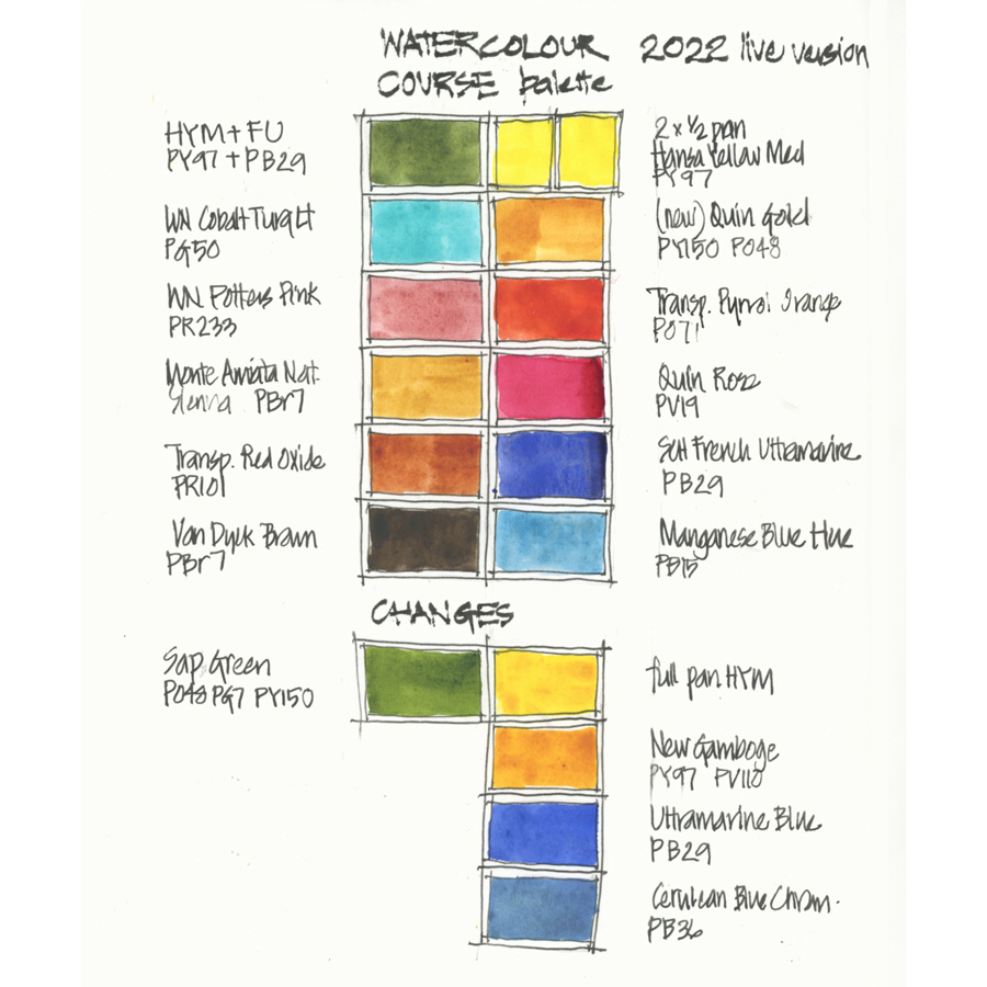
So what have I changed:
- Splitting the full pan Hansa Yellow Medium into two half pans (one for green mixing and the other for oranges and reds).
- Swapping New Gamboge (such a beautiful dark yellow) for Quinacridone Gold (new formula). The reasons for this change are 1. Quin Gold is an essential paint in my everyday palette 2. I want to test out the new formula. I still have a number of the original Quin Gold but I know that most of you are buying the new version. BTW I used New Gamboge this morning in a sketch (see here).
- Using Schmincke French Ultramarine in the place of DS Ultramarine Blue as it’s the Ultramarine I use at the moment in my everyday palette. The SCH FU is more granulating (and makes some beautiful neutral washes) but it’s not as vibrant as Ultramarine Blue (which I still love a lot!)
- Swapping out Cerulean Blue Chromium for Manganese Blue Hue as a way of getting to know MBH better. I’ve had MBH in my palette for a year but have not seriously put it to the test. CBC is still a favourite paint and creates some very special pigment parties. So I will definitely have CBC nearby as I work through the Watercolour course
- Using a premix of Hansa Yellow Medium and French Ultramarine instead of Sap Green. This combo creates lots of watercolour magic and means that I don’t have to mix a blue and yellow version of green from scratch. Sap Green is still my favourite tube green and it’s a great example of highly dispersive paint. 🙂
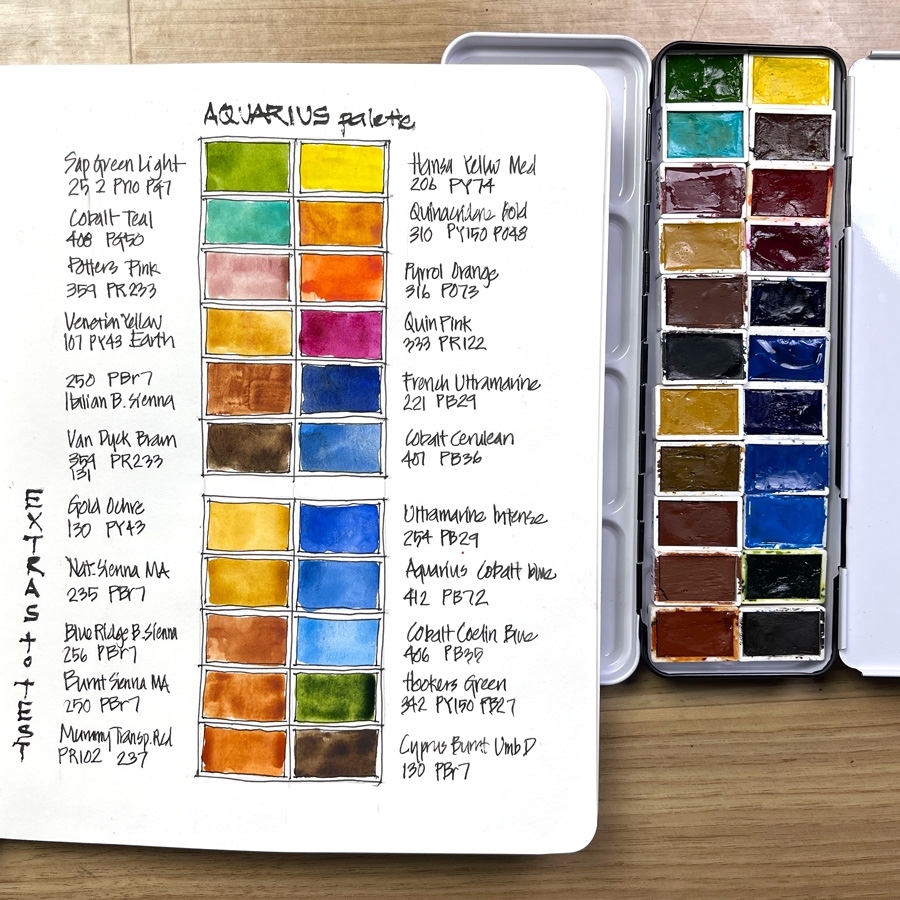
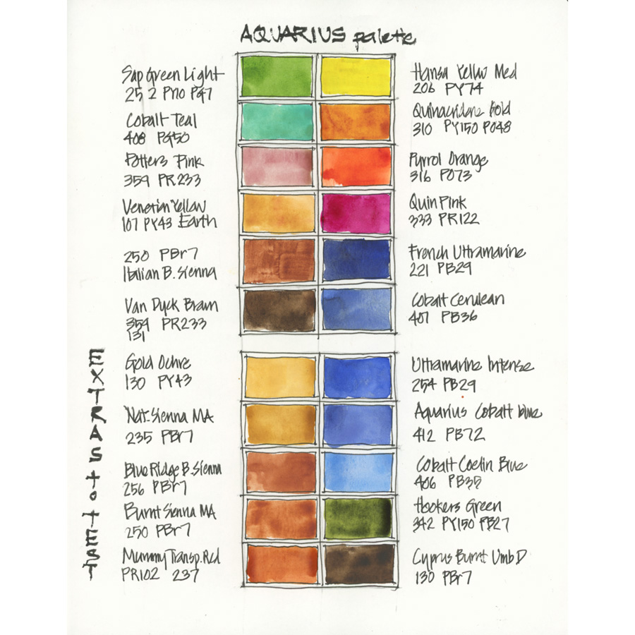
After picking up a few new Aquarius watercolour pans from Adamstown Art during my recent trip, I’ve been keen to have another go at putting together an Aquarius palette that matches my normal palette. Last year I started doing that but I got interrupted by my big road trip and never determined my favourite Aquarius paints.
They are lovely watercolours and very affordable, so I want to have an Aquarius option available. However, as there are so many nice colours in their range it’s quite a process. Some of the colours have the same (or similar) names and use the same pigments as those in my palette – however, they might not necessarily work in exactly the same way. Doing a few colour swatches is not enough for me to really determine my preferences – I have to use them in real life sketching situations. So it’s a serious undertaking!
Therefore over the next number of weeks, I want to start using this palette for my own personal sketching (including the 30×30 challenge). I’ll be happy to share my discoveries with the group doing the Watercolour course (particularly when we get to the Pigment Lesson in the third week) but my focus for the course will be the original palette (plus my tweaks).
Are you joining the Live Version of the Watercolour course? Have you got your palette ready? Are you using colours that you know and love or new ones?




14 Comments
I love your palette posts! I just started your Watercolour course for the first time, and I’m looking forward to the live sessions. I’m using a mix of well loved and new paints.
Old favorites include Indanthrone Blue, MANS, Transparent Red Oxide, Lemon Yellow, Quin Rose (though I’m using a new version of it, Da Vinci’s Red Rose Deep, which has a nice range).
New ones I’m trying out include Perylene Red, Nickel Azo Yellow (in place of Quin Gold), Viridian.
Somewhere in the middle (colors I’ve worked with somewhat) include VDB, Potter’s Pink, and Cobalt Blue. I am falling way in love with Cobalt! It’s a lot like Ultramarine, but (to me) seems a more natural “clear blue sky” color. Like Ultramarine, level of granulation varies a lot from one brand to another. I didn’t like Daniel Smith’s weak version, but I’m really enjoying Da Vinci’s juicy moderately-granulating version, and I’m also playing with a more granulating Holbein version that is like the French Ultramarine of Cobalts.
Hi Logan – thanks for your comment and recent blog post too.
thanks for the feedback on Cobalt… I love it a lot too and just between you and me (and everyone else that sees this) I was thinking of it instead of MBH for my second blue! Too many good blues IMHO!
Oooh… I am so curious to see how you like the Aquarius colours. After reading your blog about Adams Town I checked out the aquarius watercolours and discovered they are now available in The Netherlands. I ended up buying an entire 12 half pan travel kit and some extra colours. I will be using the aquarius palette for the watercolour course. They are more affordable than most other brands, and I haven’t done extensive testing but I like most of them so far. Hopefully working with different brand/colours will help in deciding for my future ‘ultimate’ palette (if there is such a thing).
HI Martine,
Looking forward to see you in course.
And great news that they are available in The Netherlands.
Good luck on the ultimate palette 🙂
Can’t wait to take part in the live run throuhg watercolour course!
Very curious to read/hear/see about Aquarius colours. I own a few and I love them (+I found out that I love honey based watecolours in general) I love their earth colours a lot!
(One question: did Schmincke really change the pigment for French UB to PB36? Checked their brochure and it still says PB 29)
Hi Barbara, Yes Aquarius are lovely!
And oops! PB36 was a typo. It IS PB29 – I’ve just updated the images to correct that!
Hi Liz 🙂
So you green mix HYM+FU is also with PB29 I suppose – happy at least in theory some things I learned from your courses settled in my mind!
yes Barbara – and image updated! 🙂
Great start, wish you good luck with your new try 🙂
Your journals and daily sketches are a source of a sudden inspiration for me, let alone your thorough materials review. Though its not my style of painting at all, it apparently made me happier and wanting to capture and paint every single trash can in a range Xd sure, im exxagerating, but only for a bit. One just starts seeing lovely things here and there. Like you know, “I never knew I was a dancer till Delilah showed me how”.
Wish Aquarius was available in Ukraine – eventhough its Polish brand and they are our closest neighbours, one can biy anything (Daniel Smith, Pinax, Schmincke etc) but not Roman Szmal…
Can I ask what proportion you’re mixing the HYM and FU for the pre-mixed greens?
Hi Heather – doesn’t really matter that much. the first few I mixed were probably 50:50 and the end result was a light yellow-green. My current mix is darker – probably 40:60 yellow:blue which I think will work better. It’s never an exact proportion… and that part of the fun. Each mix is slightly different
Those palette changes look like so much fun! I am so excited about class!
Liz, I just sent you a msg about your “current” palette that you will be using in Jan 2023 on another blog page, but then I found this page…..which one is the most current palette?
Bev
Hi Bev – the current one is always the one on the sidebar
https://www.lizsteel.com/current-palette-jan-2020/
But when I go out for my morning sketching I sometimes switch it (eg. Aquarius palette)
NEWSLETTER
Subscribe for first notification of workshop + online classes and more.