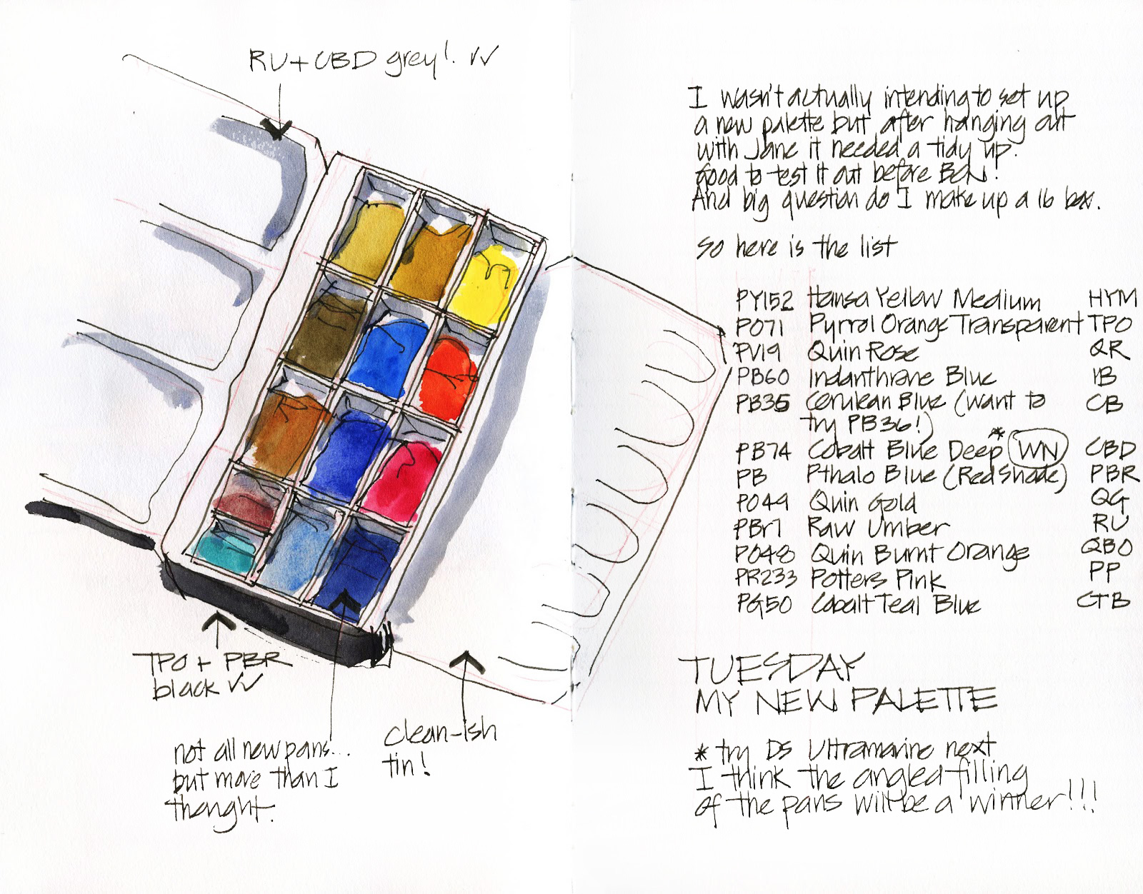
 Ok – here is my new palette – post colour mixing master class with total legend Jane Blundell http://www.janeblundellart.com/ (I can’t put into words how great our session yesterday was – thanks again Jane!)
I am not sure how many people are that interested in this…but it is a great record for me to type this up. I blame this addiction to exploring pigments to Roz Stendahl – she did a post years ago (2009?) where she went through all her mixes and decisions. I started to research the pigments behind the names and what they did as a result of that.
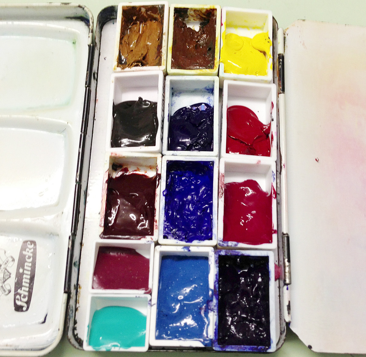
Before I get into the pigments, one amazing tip I picked up yesterday from Jane was not to fill the pan fully. I have heard that before but always thought it was a little silly since the top bit is the easiest to pick up with the brush. I moved to full pans because 1. I go through paint too quickly 2. more importantly I was drilling down into the pans with my brush to pick up paint and ruining the tip of my sables. So, the brilliant idea is to fill the pans at an angle so you pick up paint on the side of the brush not the tip. I am going to see how easy it is to train myself for this new pickup of paint and work out which is the best direction.(I can fit in my pans either direction)
This is not a total new palette- I cleaned mine up and tried to introduce a ramp into existing pans. My palette felt SO self conscious when surrounded my Janes prisine palettes yesterday! Also my ‘ramps’ were not smoothed out yet when this photo was taken
Ok…ramblings about colours….. warning another one of my long blog posts!
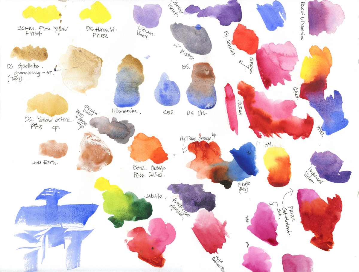
All colours are now Daniel Smith except for WN Cobalt BLue Deep but I am planning to wean myself off that as it is series 4 and too expensive (surely I can find a grey mix that is as good….) So any colour below is referring to DS uno(unless noted otherwise)
We worked systematically through my list of list analysing each choice.
Yellow
Previously I had two yellows – a cool (Lemon Yellow PY3) and a warm (New gamboge PY153 I LOVE the colour and it came into my palette in 2011 when I went to Lisbon. Hansa Deep is an alternative but more opaque) but we discovered that Quin Gold can do that job. I am also happy that I can mix light bright greens so no need for it to be a lemon yellow. Decided for a more mid yellow – Hansa Medium (PY97). This gained one spot – a good start!!!
Red
I have never found a warm red that I liked – most are too strong and a bit opaque. I am also in love with the Sch Translucent Orange but could never justify having a dedicated orange colour (though VERY useful with all my trips to T2 and those orange napkins etc!) SO when I discovered a week or so ago there was a colour transparent Pyrrol Orange PO71 I knew I had to test it out – being a dark orange means that it could function as a red. It did not disappoint. It is also a perfect complementary for a pthalo blue (red shade) which is another quirk of mine.
I had done some research recently on the cool red spot and decided that Quin Rose PV19 made a good orange with yellow, lovely pinks when diluted and gorgeous purples with blue AND when mixed with my warm red makes a primary red. (this is an example of having a single colour that can mix different directions and truly multi-talented!) We did explore other options – some Jane had actually been doing recently. Quin Red, Sch Quin Magenta, Da Vinci Perm Al. Crimson….but happy with Quin Rose ( I might try quin red one day)
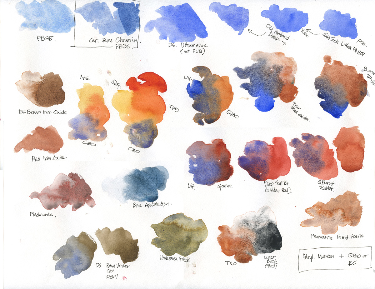
The rest of my palette (9 of them) is devoted to blues and earth colours… I am a brown and blue girl no doubt about it. A lot of that has to do with sketching a lot of architecture…and want lots of variations in browns and greys. And I just love blue too!
Blues
- these haven’t changed much except for trying more Daniel Smith. I love Indanthrone Blue PB60 as my dark colour- and use it for dark greens (instead of perylene green- another colour I love but can’t justify in my palette).I make dark browns, indigo, black from it with QBO. It makes lovely deep purples as well.
- Next spot – one of my peculiar choices Cobalt Deep Blue(PB74) instead of French Ultramarine . This colour is my standard blue and important for mixing purples and greens but also MOST important for my greys – blue grey or warm grey.. I just prefer the grey it mixes over a FUB. My next variation will be to try the DS Ultramarine instead of the French variety. It is slightly greener and makes better greens.
- Cerulean – I have the wrong one PB35 – I need to try the PB36 Chromium version. This blue is great for skies and my more subtle moments (do I have them?) when I want soft greys or greens.
- Pthalo Blue(red shade) PB15 I don’t like the green shade version- too strong, but the red is less staining and a good match for our sky and still mixes lovely greens with Quin Gold. This is the main reason it is in my palette…and sometimes you do need a bright bright blue!
Earth Colours
- Earth Yellow – I am sticking with Monte Amiata Natural Sienna PBr7 – a transparent Raw sienna …though I really want to explore Jane’s favourite Goethite and I did get a tube. Yellow Ochre is a more yellow earth colour but I prefer more transparent colours.
- Earth Orange – This is the burnt sienna spot. Two pigments are used for this ‘colour’ – Pr101 transparent or PBr7 more plaque. I am definitely a PR101 girl (this is what Winsor and Newton use which was the first BS I used) and my favourite is Quin Burnt Orange. The other contenders are transparent red oxide and trying a more opaque burnt sienna for a change. But I am trying to get a VERY specific mixed grey so sticking with QBO!
- Earth Brown (cool) – this is the NEW addition. DS Raw umber PBr7 is a beautiful cool brown colour (nothing like the WN raw umber) and I am looking forward to exploring what this does. I think it is going to give me some good greys! I did have Burnt Umber in this spot but it can easily be mixed, I love the coolness of Sepia but it has Black and a huge drying shift. So raw umber is an exciting discovery!
Personal (Crazy?) colours
- Jane and I were laughing – she is a Buff Titanium fan…while I use potters pink PR233 for the same reason. I use PP to add granulation and mute colours. Love it! Mix it with a yellow and you get great creams (as in jam and scones!)
- And my latest craze CobaltTurq light – trying the DS version combat Teal PG50.
Ha! Can you tell
1. I am having fun
2. I love colour!
BTW guess what we are going to be looking at tomorrow during my sketching class at manly…. hmm, COLOUR! But I am NOT going to mention a single pigment number, I promise!!!


12 Comments
oops – yes forgot that in my book. well spotted. I am looking forward to trying the slant paint in the pan
ah! colour is so personal! I haven't missed not having a green but you might. Tube greens are hard. DS ones that are nice jadelite, serpentine and green apatite. Have fun!
I've enjoyed reading about your new palette pigments. I think you failed to add Monte Amiata Natural Sienna in the list? Would it be top left? Will follow to see what you change next..Great hint about adding pigments at a slant.
Liz, I've followed these posts with a lot of interest, so thanks for writing them in such detail! Surprised by your many blues…I've always used green pigments and several earth colors, including Yellow Ochre, in addition to yellows and blues, but I think I'll try the Quin Gold and Hansa Yellow with the various blues and see what I think, since I've never been very happy with the green pigments I've used — and in the northeastern part of the U.S. and Canada, green is what we've got, in all its variations! One necessary color is a kind of light apple-green that's quite difficult to mix – it's very bluish – and your Cobalt turquoise might be the answer there. Anyway, you've inspired me to work on my own palette, thanks!
Hey Liz. Decisions made…for now. Well done.
So it was the wrong cerulean eh. Shame. The PB35 does granulate nicely once you get it going but the PB36 is more useful when you, like me, choose Phthalo Blue RS.
cheers
Jane
pb36 is on my next purchase list! thanks again!!!!
Now I have to have Potters Pink! Or Buff Titanium.
Love this website that I've just discovered. Such a wealth of information and inspiration. Really appreciate the detail in your investigations and that you share it. Will spend many happy hours here! Thanks!
Just found your great website and loving it…am just beginning watercolor so all your info was very helpful for me, thank you for taking the time to do that. Love reading the things you write and love your website.
I just found this blog accidentally & love it ^^
I'm gonna following on your FB, Z ya!!!
Hello, I love your post, because you give the pigment names too. Daniel Smith brand not available here in Finland (except in webshops) i think.
Sandra D (Melbourne) Australian Artist John Lovett mixes his Greys, from French Ultramarine Blue, Alizarin Crimson and Indian Yellow great article in current addition of International Artist his work is fabulous
NEWSLETTER
Subscribe for first notification of workshop + online classes and more.