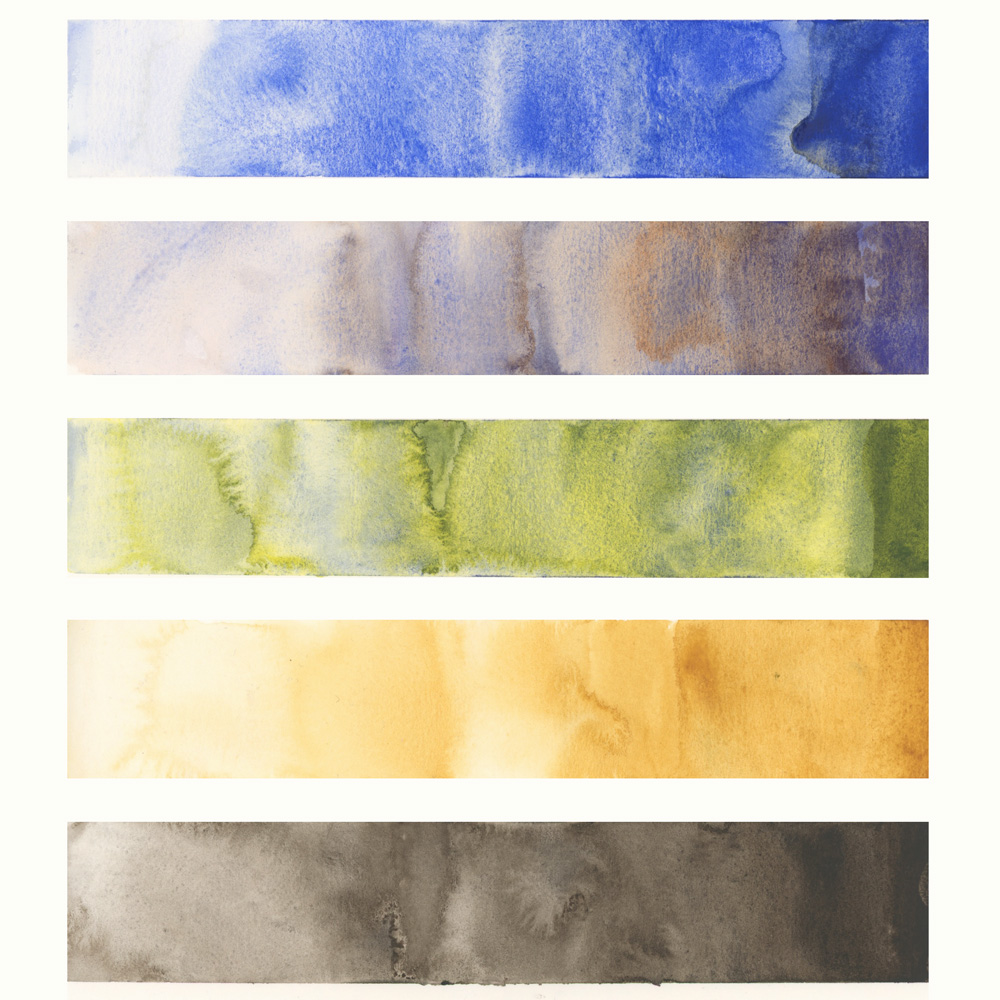
A few days ago I refilled my palette and this was a chance for me to record my most used paints. So that is what this article is all about!
Here are my top five…

1. The clear winner (by a long way) is Schmincke (SCH) French Ultramarine and this is because I use it in so many different mixes – for blues, greens, greys, browns and purples. Find out more about how I use it here.

2. Next is my pre-mix of Steels Grey which I use for a lot of greys and shadow mixes. Find out more about this colour here.

3. Typically this third place position would be taken by Daniel Smith (DS) Monte Amiata Natural Sienna (see below) but as I’m sketching more trees than buildings on an everyday basis at the moment this spot goes to my Mixed Green (DS Hansa Yellow Medium and SCH French Ultramarine). I started using this instead of DS Sap Green a few years ago and I’m never going back! Each time I top up this pan it’s a slightly different mix – sometimes 50:50, other times 40:60 or 60:40. It doesn’t matter although a slightly darker mix than what is shown here works a little bit better for me.

4. Number 4 is DS Monte Amiata Natural Sienna which is the most beautiful glowing earth yellow. It’s been in my palette for years and years and I love it.

5. The last on the list is a mystery. I have no idea why or how I use so much of DS Van Dyck Brown as I don’t think there are that many dark washes in my work. But VDB is always a colour I need to top up a lot. I use it for browns, grey and black.
As for my favourite colour in my everyday palette…it’s most definitely Winsor and Newton Cobalt Turquoise Light. But I don’t use it much these days. Hmm, writing this article is a good reminder to me to use it more.
If you want to find out more about the reasons behind my colour choices please check out the Colours in My Palette series.
NOTE: These colour strips show each paint colour in a watery, juicy and pasty wash. Being able to consistently mix washes with the right amount of pigment and water is a big part of my Watercolour course which I will be going through with a cohort in the new year starting on 10 Jan 2024. Find out more about the Live Version of watercolour here.
Finally… what are the most used colours in your palette? Let me know in the comment section below.
(If you are reading this via email, please click on the article title link below and add a comment on my blog. Thanks!)


15 Comments
I just found out today that quite a few pigments are being discontinued including several of the quinacridones. None of them are on your list above but you might want to look to see if anything you do use occasionally isn’t going to be available at some point in the future. Daniel Smith says they have a 20 year supply of PO48 but I wouldn’t wait 19 years to stock up.
Mary, can you provide any further detail on which paints, timing, and perhaps the source of this information? Thank you!
My most used colours are French Ultramarine, Quinacridone Gold, and. Burnt Sienna.. I am interested to try out Transparent Red Oxide. I am really looking forward to starting the live Watercolour course on January 10. Enjoying reading your blog posts along with the little videos.
I have been experimenting with my watercolor palette and noted an earlier reference you made to trying the Aquarius series. I ordered a 12 pan set to try out and find them very rich and beautiful. Have you used them any more since your earlier post?
I haven’t started the course yet, but was taken by surprise when you said that you combine the paints in the pan! That has never occurred to me. Looking forward to learning more tips in the water color course. Have a wonderful Christmas.
Hi Pamela, nice to see a familiar name! I’m sure you’ll enjoy the Watercolour course. I did it on my own in late 2022, and then earlier this year in a Group Run Through. I’ve paused my participation in the Buildings course while I worked on my sea glass pictures for Christmas presents. I’m going to complete Buildings in Jan/Feb on my own, and then join the Edges course Liz has got planned for March/April.
It’d be nice to see you again!
I looked at my palette to see what my most used paints are: 1. Sch French Ultramarine 2. DS MANS 3. & 4. tie between DS TRO and DS VD Brown 5. WN Potters Pink
Is it any surprise that I’ve been heavily influenced by your choices? I’m looking forward to re-visiting the Watercolor course now that I have a little more experience. The Buildings course is where I finally understood watery, juicy, pasty! Sometimes you have to use the concepts before they sink in all the way.
Liz: thank you so much for sending us recently your plan for 2024. I’ve been excited to read all the courses that I can do next year, and continue my sketching journey. I’m aiming to join Edges (after I finish up my paused Buildings course).
As to my most topped up colours, based on what I topped up yesterday: WN Raw Sienna (similar to DS MANS) and my yellow: Aureolin. It’s an odd yellow. My mum used to use it back in the 80s and 90s, so it’s kind of nostalgic for me, but when the tube runs out I think Hansa Yellow Medium is on my list to purchase.
And I just added Prussian Blue to my palettes yesterday. It’s sort of like Indanthrone Blue, which I think you have in your palette Liz.. I was inspired after my husband drew my attention to Tasmanian artist and cartoonist: Jon Kudelka recently reporting on a conversation he had with a friend. They were comparing favourite colours and said that “Prussian Blue was the thinking watercolourists’ Payne’s Grey.” My mum used it too so I’ve been trying it as a shadow colour and yes I like it. Like what your Steel’s Grey Liz, does and what you, and Pat Wafer and Ron Ranson say: “get those shadows lively!”
Added to your list : Sch Ult blue. MANS, VD Brown ,Hansa Yellow Med., I like Transparent Red Oxide. I can mix darks with it and Ultblue and make the mix warmer or cooler. If I add Van D brown and Indathrone blue I can get a nice black too.
Hi Linda, nice to read your name and comment. And thanks for the tip re Indanthrone Blue and VD Brown mix. I don’t have either of those colours and usually use UMB and WN Burnt Sienna (which is the same pigment as Transparent Red Oxide), or sometimes Alizarin Crimson and Winsor Green (Phthalo Green/Viridian). But I’ll give my newly added Prussian Blue and Burnt Umber (my darkest brown) a go too!
What a lovely way to document the colors that needed to get topped off!
How do you mix two watercolors to put in a pan?
How do you mix two watercolors to put in the pan?
Hi Liz. It’s fun to see all the color choices that people have. My faves used most often are Quin gold, Quin red, UM blue, Cerulean blue, Alizarin crimson, Paynes grey, Brown madder, Winsor yellow, Burnt umber, New Gamboge, and sometimes Rose madder genuine and sometimes Sap green. I have been lagging behind in the Buildings course but will get back into it after the new year. This is my second round with it and I have enjoyed doing it again. Merry Christmas and all the best for 2024!! Hannah
Hi Hannah, nice to see another user of what sound like a lot of Winsor and Newton paints, and fellow Buildings course laggard! My watercolourist mum, now passed on, loved WN paints and I still love her old Rose Madder Genuine small tube. I recently bought a new one and it still has that lovely rose smell!
I’m also aiming to rejoin and catch up with my Buildings course lessons in January and February. I tapped out mid stream. I’d be lovely to see you in the classroom. I’ll keep an eye out for you!
NEWSLETTER
Subscribe for first notification of workshop + online classes and more.