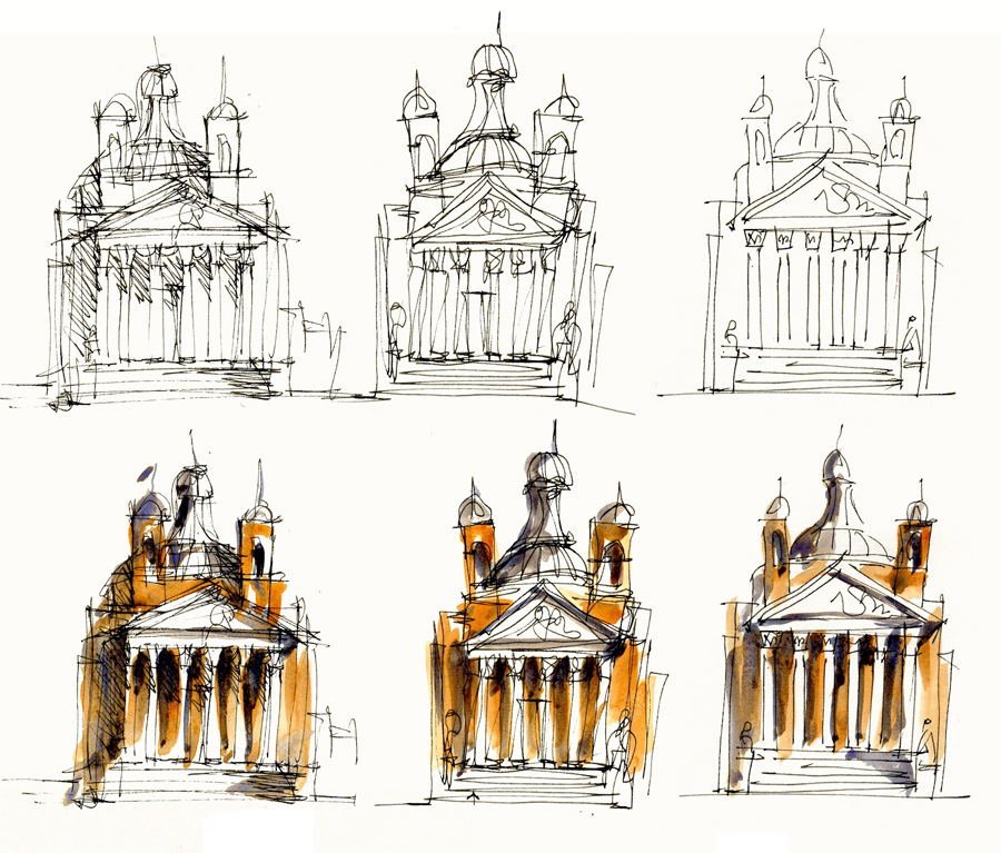
Here are close ups of some of those sketches of Palladio’s Tempietto Barbaro that I did last week.
In recent weeks I have been experimenting with ways that I can sketch complicated buildings in a looser way (so that I am not stressing about perspective so much) Of course, being an architect, I do have the principles of perspective programmed into my brain, so that although I am often too lazy to set it up accurately, and although sometimes my lines have a mind of their own, I instinctively know where the lines “should” go.
I choose this building as it has an interesting 3D form, nice colours (how very descriptive!!!) and not too complex so I would get bored sketching it over and over again. (I did all those sketches in my previous post in a hour or so one afternoon)
Also refer to a previous post here where I first starting exploring different line styles…
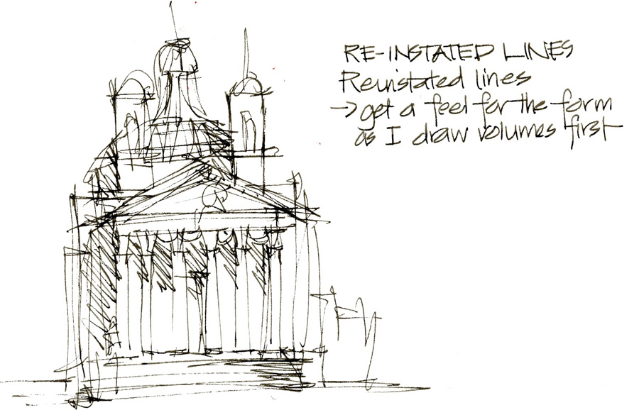
1. Re-instated multiple lines. This is the style that I sketch in when I design. Starting with the main shapes, I draw quick rapid lines, correcting if needed as I go. My lines continue to pass the edge of the object, creating ‘architect’s crossed corners. This inaccuracy allows me to draw my lines quicker and more confidently. (Aside: People often say that they can’t draw a straight line… but I personally think that defining corners is more important.)
I am not sure that the above sketch is the best example of this… I want to try again with a finer pen, no cross-hatching and really layer my lines to define the building.
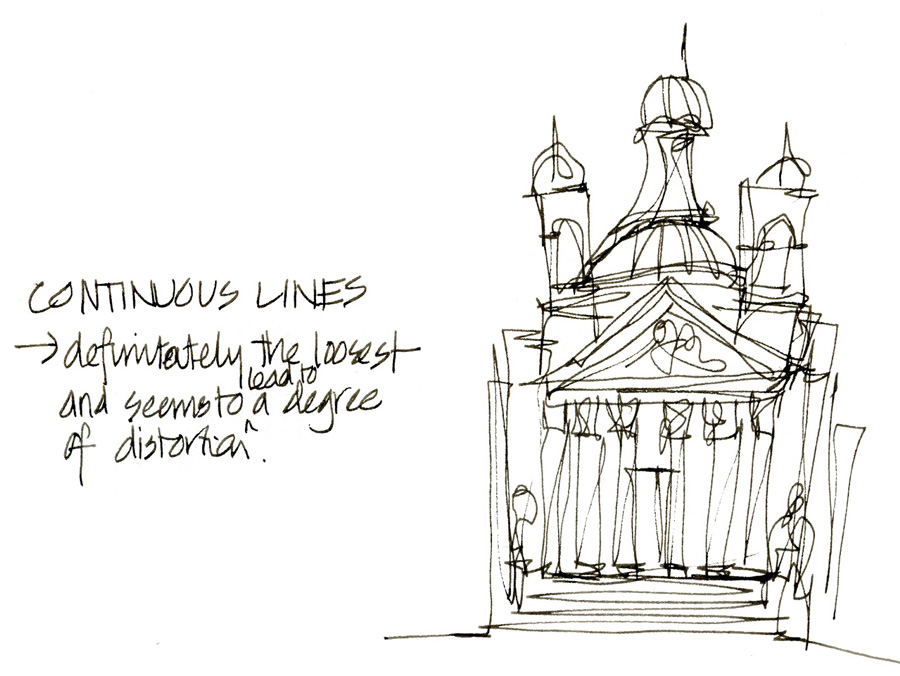
2. The second example is Continuous line… this is a great example of how to loosen up before start a ‘proper’ sketch. I let my lines wonder around the building back and forth without worrying to much about distortion… FUN!
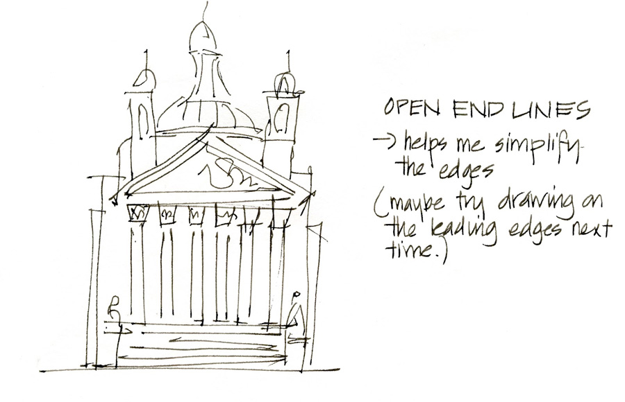
3. The third example… which I am not 100% sure about, is the open-ended line. This is the opposite of my desire to define my corners. When I TRY to sketch this way (crossing corners is a reflex action!) I find that I need to work out which are the most important edges of the building to draw.
And here is the three styles in B&W and coloured next to each other.



NEWSLETTER
Subscribe for first notification of workshop + online classes and more.