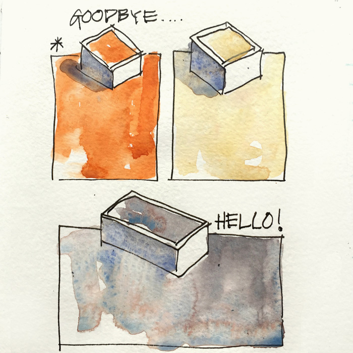
I am in a palette experimental stage at the moment and have no firm decisions to share yet – but this is just to let you know that:
1. Despite loving Schmincke Translucent Orange and Winsor & Newton Naples Yellow I’m just not using them enough for them to remain in my palette. (Sad goodbye… for now!)
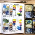
2. I am testing a new pre-mixed grey that I used a lot on my big trip.
The grey is a combination of three colours that are already in my palette and the reason for pre-mixing this pan is to save mixing time. As yummy as this version is I’m not sure it’s the best – or whether I have got the best three colours (there are a few options) or I got the correct proportions of each. Ah! there are always so many variables with watercolour.
I’ve just started testing this mix so my lips are sealed until a decision has been reached.
It’s horrible to tease you like this, isn’t it? Guess away if you want!

30 Comments
Looks like a bit of Potters Pink in there!
Liz – I love your new mixed color and the results you get from it! It is beautiful to see that separation of the various pigments and now you have me guessing: trans. pyrolle orange, UM blue & payne’s grey? (although I know that Payne’s is a mixture already….hmmmm….) I wanted to also tell you that when I started watercoloring a few months ago, after reading your blog for a year or more, I inadvertently bought DS pyrolle orange instead of DS TRANSPARENT pyrolle orange. I couldn’t figure out why I didn’t like it much. Finally I noticed in another post of yours that you were talking about using the transp. version. What a difference! Love your blog and all the great tips you give. I’m more of a flower painting girl than architecture, but still enjoy following you! Thanks for sharing what you do!
Very interesting marbley-grey. Can’t guess what it might be, though!
Hi Liz, first of all: Thank you so much for your Newsletter. It’s the only one I read at a regular basis. I am always inspired. And it helps me in busy times not to forget how much I love sketching and painting.
You mentioned the pre mixed color you added to your palette. Can you say a little bit more? How do you mix the colours? How do you get the amounts of the colours right? Maybe you could do a blog on that topic? That would be great.
Thanks again and best wishes from Switzerland
Franziska
Cerulean Blue + Burnt Sienna?
I’d also guess cerulean blue + burnt sienna + ultramarine blue?
Which are those three “enigmatic” pigments???
Cheers!
Cobalt B + Bt Sienna and maybe a touch of Cerul. Watercolor ptg can’t be rushed. FYI my teacher david Dewey stressed mixing the colors on the paper not the palette = More organic paint effects.
Looks like Ultramarine blue, Quin burnt orange (or burnt sienna) and a Cerulean blue or Marine Blue. Instead of Ultramarine Blue, it might be Winsor Newton’s Paynes Gray though. Whatever the colors, its gorgeous! Yes, mixing on the paper is best however to save time, this is a great idea to have it premixed. If nothing else, just the three colors somewhat separate in the same half or full pan. Almost like mixing in the pan. Sad to give up Schminke Trans Oh..its my favorite orange of all time!! but mixing orange is better. Im getting inspired for your buildings course coming up. Might have to reaccess my own palette!
Ok, I’ll take a stab at it – how about one of your hansa yellows, phthalo blue and burnt sienna. Phthalo blue might be a bit strong though so maybe ultramarine blue instead. Some version of each of your primaries I guess, is what I am trying to say. I have left an empty pan in my palette box for it so hope I don’t miss the final verdict.
Here is my guess: ultramarine blue, raw Sienna and burnt sienna. My personal choice is manganese blue, permanent rose and raw sienna. Let it mix on paper, not pre-mixed on palette.
I think it is Daniel Smith transparent pyrol orange
and chromium cerulean, but can not guess third colour.
reminds me of DS moon glow.
hmmm, light red/english red, ultramarine and Cerulean? pretty color:)
I understand. I’ve discovered so much of the world we paint is made impressive by the use of ‘shades of gray’ ( no pun intended). I look forward to your next post. FYI, the next time I’m England hope to meet you, maybe go on a trek.
I’d say Ultramarine Blue+Burnt Siena+Cerulean Chromium 🙂
My guess is DS Indanthrone Blue, WN Cobalt Turquoise Lt. and DS Transparent Red Oxide.
Lovely. Many thanks for the guessing Liz, always much more fun than you just doing all of the heavy lifting and us benefitting.
So appreciate all you do, much gratitude.
Love your news letters and looking forward to your choice of pigments for your next made up grey. A complete guess on my part: Ultra Blue,PB 29 Trans Red Oxide PR 101 , Pthylo green (blue shade)PG7. Anyway you may find, in your journey, you don’t like it and on you will go. That’s an adventure I reckon. Yesterday we had a 2 hour workshop in Christchurch NZ where John Cogley, owner of Daniel Smith watercolours described how their paints are made. All the minerals with the colours ( Prima Tech) were examined and the large group present spent a happy hour mixing with all the colours. I asked the question relating to the colour “Moon Glow” or any other mixture, why cant I just mix the three colours: Viridian, Ultra Blue and Anthraquinoid Red and get the same Hue and he told us that ( bare with) In the breaking down of the pigment molecules which want to stay together but have to be separated with opposite rotating rollers tearing apart the pigment molecules after which a film of Gum Arabic covers each particle; light when it hits these give a certain hue which when artificially mixed cannot be duplicated. Having learnt all this though I think I’ll just continue to mix my shadow colours, Mmm I think?
Without looking at my palettes I would say cerulean blue, burnt sienna and perhaps a touch of Paynes grey. I know you will let us know when you are ready.
I’m going to guess Trans Brown, CBC, and UB
Oh ah! I love all these guesses. Do you want me to give you a clue?
For starters it is made up of three colours….
cobalt blue, cerulean blue and burnt sienna!?
Hi Liz I look forward to your results. I would go with your hint..three colours and say pure transparent colours of yellow, blue and red. But which ones and in which quantity. If they are equal it is a boring grey??. I will give it a try myself.
Yep, I’d rather not play games and just hear the bottom line and why. . .
ah! I’m not one for guessing games either, but I will have to admit that as a result of not telling, we all now have a long list of other suggestions
Liz, seeing you’re not going to tell us any time soon, I should probably tell you that I met John Cogley recently (owner of Daniel Smith paints). He was in NZ to demo the watercolours, and I told him all about you. I suggested that when he meets you (probably that has happened by now), that he should talk to you about putting together a shadow colour. Of course, you would have to call it “Steel”. Don’t you think that’s a great idea?
Hi Liz! I’m thinking DS Cerulean Blue Chromium, WN Potter’s Pink, and a bit of DS Transparent Red Oxide. Am I in the vicinity? Cheers!
Liz – I looked for but did not find an answer to this question (this does not depend on the selection of colors but the process): Do you pre-mix more than just the one pan at a time? How do you store it if you do? I looked at empty paint tubes through art suppliers but they are so large. The smallest were 30 ml – twice the size of a large tube of wc paint. How do you measure if you are not mixing whole tubes. Are you using the pre-mix for shade and shadows (warming for shade, cooling for shadows)?
I premix about 3 at a time. I roughly know how mucu of each colour to put in and then mix with a toothpick. It is not scientific, so each pan is slightly different. Will take some photos next time I prepare some.
NEWSLETTER
Subscribe for first notification of workshop + online classes and more.