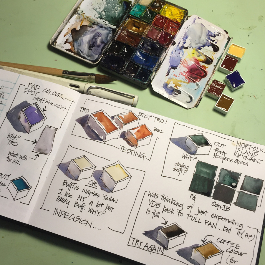
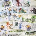
Yesterday I made some changes to my palette after locking it in place for three months. While I was making my final decision I decided to sketch my adjustments which was a fun way of recording my thinking.
I can’t share anything about my palette without adding a disclaimer that my colour choices are incredibly personal – ie. somewhat quirky!
I was chatting to Jane Blundell this week, and as always had lots of fun talking about pigments. We think the same way about many pigment choices but there are a few colours that we have different experiences of. Goethite vs Monte Amiata Natural Sienna(MANS) vs Quinacridone Gold is one of the comparisons we love talking about. MANS and Quinacridone Gold are VERY similar and yet for me do completely different things. Although a gorgeous pigment, I find Goethite a little dull (doesn’t have the glow of MANS)… though you will notice I have added it as I want to try it out again.
There is no palette that will work for everyone… so enjoy making your own decisions as you try various pigments out. Please read these general comments about what I believe are important considerations for you to make… and don’t copy someone else’s palette and expect it to magically produce the same results when you paint with it.
One of the important aspects of being an artist is having confidence in your own preferences – allowing your personality to come through your artwork. So if you like a certain colour – stick with it! This is one of the reasons why these days I only recommend 6 colours in my teaching so that you have the freedom to expand it to include pigments that you need, use often or just a few colours that you love! You do need a good core selection, but colour IS FUN, so having a few ‘just because I like it’ choices is good for your sense of play!
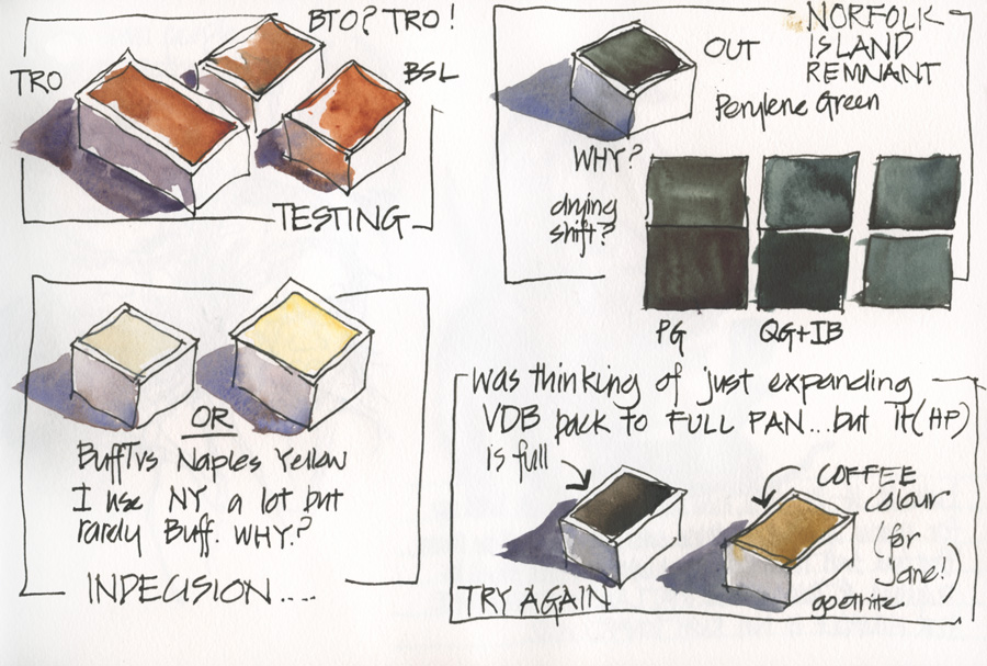
Anyway, I could go on and on discussing my colour choices… but here are the current changes. And please refer to this post for the listing of my starting point.
Notes:
- I am splitting DS Transparent Red Oxide full pan into two so I can test out the new DS Burnt Sienna Light (PR101)
- Swapping Buff Titanium with WN Naples Yellow
- Taking out Perylene Green (I think it is DS) as although I love the colour I can mix it easily with DS Indathrone Blue and DS Quin Gold
- Putting Goethite into the spot where Perylene Green was, rather than restoring the DS Van Dyke Brown back to a full pan.
- DS Colbalt Blue Violet is replacing Holbein Marine Blue.
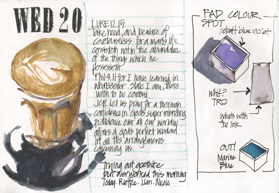
This page has a coffee sketched using Goethite. It is a little overworked as I was half testing the pigment at the same time. There is no doubt that Goethite straight out of the tube is a great coffee colour, but colour is not the only characteristic that is important to me. Stay tuned for more thoughts about this interesting pigment.
As for my fad colour spot, I was thinking of a very faddy purple colour but after kicking around a few options with Jane decided on Cobalt Blue Violet, a colour that another one of my great pigment pals, Paul Wang, absolutely loves.
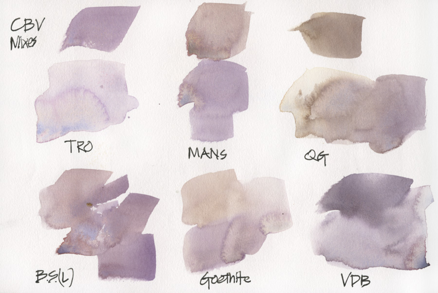
I have always been happy to mix purple but I am quite interested in the greys that this pigment is creating. BTW I am very fussy about mixed greys.
Ok… enough about colour for today. It is nice to have some new pigments to test out because there is an exciting sketching event happening over the weekend. Stay tuned for more!

8 Comments
I completely agree with everything you have said here!!!
Hi Liz. I’ve been ‘getting to know-and LOVE’ my paints lately. I’ve been spending hours making color charts and have only scratched the surface. There are so many choices and it’s such a blast to play with the pigments. I’m trying to pick the paints for my palette based on how they make me feel. I have to admit I’ve often tried to match my palette to those of people whose work I admire, studying the colors trying to figure out what they are. Silly girl…from now on if I don’t love a color, it’s out!
Ah! have fun. Of course need do need to have some workhorses in your palette so you can mix a full range of hues, but there should always be room for a little play!
Oh how I wish your captions listed the full names of the pigments shown as abbreviations in the art! My brain is too tired to search for matching words/letters! 🙂
Hi Kate,
It was a rush to post yesterday but I now have typed up all the colours and added to the text.
Good point though generally, I really should write a better description in my book so I remember them more easily down the track!
TPO is Transparent Red Oxide – a more orange, granulating and reactive alternative to Burnt Sienna.
CBV is Cobalt Blue Violet
MANS is Mont Amiata Natural Sienna
QG is Quinacridone Gold
IB is Indanthrone Blue
BSL or BS(L) is Burnt Sienna Light – a more burnt orange version of burnt sienna that is only available in the Alvaro set.
VDB is Van Dyke Brown
NT is Naples Yellow
I think that’s all…oh – BTO – looks like Transparent Brown Oxide but that would be TBO so I can’t help you on that one 😉
(All Daniel Smith)
Ha. Bto was a sign to me that I was tired and my codes came out.- a complete mistake. I meant tro!!
Always fun discussing pigments Liz. And while we share MANY favourites, it would be boring if we ended up with all the same – though I did use Potter’s Pink for the first time in a recent painting and of course thought of you 🙂 Perylene Green is one of my favourites for foliage but as you said it can be easily mixed. I like to include it, but I have a lot more greens in my palette than you. More colours actually – with 20. I also paint more landscapes and botanicals! We each have to find what works best for what we do.
I add a touch of Quin Gold to Goethite if I want more of a glow – the granulation is just so wonderful for sandstone, beaches and rocks. And while you may not use Buff titanium much, that’s one I go through fastest, along with Goethite and Jane’s Grey.
I have put yellow ochre and raw sienna into my teaching palette along with Goethite – I love the yellow earth colours – and they all mix different sorts of greens and greys.
My studio palette hasn’t changed in years though. Works fine!
NEWSLETTER
Subscribe for first notification of workshop + online classes and more.