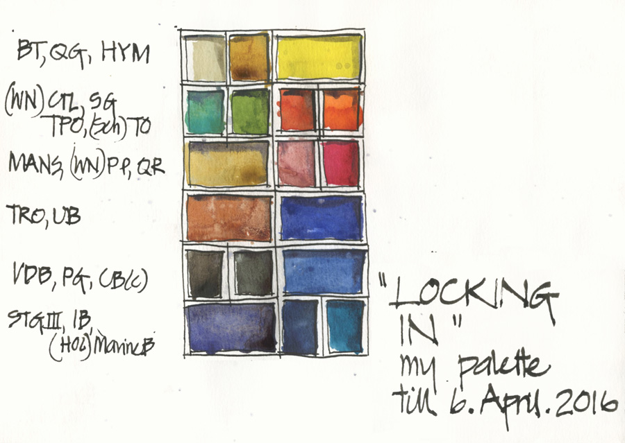
I was asked a question last week that got me thinking:
Would you give some advice please, I keep changing my watercolors to different palettes and can’t seem to settle on a basic one. I guess I like the exploration of seeing how different color mixes but this is frustrating and expensive! It’s also keeping me from drawing and sketching! Do you have any advice for someone like me?
Thought No. 1:
Am I a bad influence on people to buy and constantly change? Hmm, perhaps I am.
Thought No. 2:
The only way to stop changing the palette is to stop changing it! Oh! sorry, I know that is a silly statement.
But seriously, if you keep changing paints you will never get to know them. I do tweak a lot, but it is normally my extra colours and not the basic selection of 6 colours. But what I propose to do in response to this question is to LOCK IN my palette for 3 months.
Yes, this is extreme, but I am going to try it – do you want to join me?
Over the last few days I have been thinking about my current palette which is still in its mid-trip adjustment from my visit to Norfolk Island:
- I had Marine Blue as a fad colour,
- I split Van Dyke Brown into two so I could sneak in Perylene Green
- I swapped Buff Titanium for Naples Yellow since it was a perfect match for the painted walls to the historic building in Kingston.
I have decided that the only change I will make is to put Buff back in and then, rightly or wrongly, the rest is staying – I don’t really need Perylene Green as much as I love it, and Marine Blue is not really a stayer, but I am going to lock them in for 3 months and then review!
For the full listing please review my Watercolour page in my Sketching Tools section.
But here is the listing
DS Hansa Yellow Medium – PY97
DS Transparent Pyrrol Orange – PO71
SCH Translucent Orange – PO71
WN Potters Pink – PR233
DS Quinacridone Rose – PV19
DS Ultramarine Blue (not French!) – PB29
DS Cerulean Blue Chromium – PB36
DS Indanthrone Blue – PB60
WN Cobalt Turquoise Light – PG50
DS Buff Titanium – PW6
WN Naples Yellow – PW6 PBr24 (this changed on 14.10.15 to Holbein Marine Blue PB16)
DS Quinacridone Gold – PO49
DS Monte Amiata Natural Sienna – PBr7
DS Transparent Red Oxide – PR101
DS Van Dyke Brown – PBr7
Steels Grey III (a pre mix of WN Cobalt Deep Blue with a little DS Quin Burnt Orange and a touch of DS Quin Rose)
Don’t worry about whether you have achieved the ‘perfect palette (for you)’ yet… just LOCK IN what you have now. If you use these colours exclusively for 3 months you will come to discover any limitations of your current palette.
So are you going to join me?
Do you think I will be able to stick to this palette till 6th April?
SketchingNow Online Sketching Courses: Foundations Self Directed course start today!


9 Comments
I like this idea because what I do is switch around to different paint sets, which have different palettes and I haven’t secured one I feel satisfied with, so I will carefully make my choices and give this a try!
Hi Liz,
Love your new blog. I know most of the colors in your palette but some I can’t make out. Could you help me with this?
No Perlyne Green! I am aghast! Must be all the pine trees here. I can’t seem to do a single painting without it. ~m
ha! I have perylene green in my kit at the moment from being in Norfolk Island, but it is definitely not a common tree green here in Sydney! It is one of the colours that is coming out.
I love perylene green for all the shadows under the trees. It’s a stayer in my palette – has been for years!
Yes I know you love it Jane!!!
I love it too – although the drying shift annoys me. more about this colour soon.
I have more than one paint set, and I like the pan watercolors (especially Schminke and Sennelier) but I tend to use the same set all the time. You are right–I have really gotten to know them. I plan to branch out soon and know some other sets, but these current paints feel like my friends.
Just happened upon this nice website and saw this,….I’m no longer an artist but when I was I found it very useful training to keep to just basic yellow, basic red and basic blue pans of watercolour. Mix everything from these and after a few weeks add only ‘useful’ shades such as a suitable green for foliage and sienna for brickwork,…these help save time in mixing those shades and thus speed the work. For everything basic just use the three colours until you can do anythng with them.
Yes- great tips Thanks Bob. That is similar to my idea of a 6 colour palette (2 triads). With watercolour though I love the effects of pigments, so colour is not the only criteria.
NEWSLETTER
Subscribe for first notification of workshop + online classes and more.