We all want to improve our sketching and/or do more of it, don’t we?
I think that my choice of sketchbook has a significant impact on the quality and the frequency of my sketching. In fact it might be the most important decision I make about the materials I’m using.
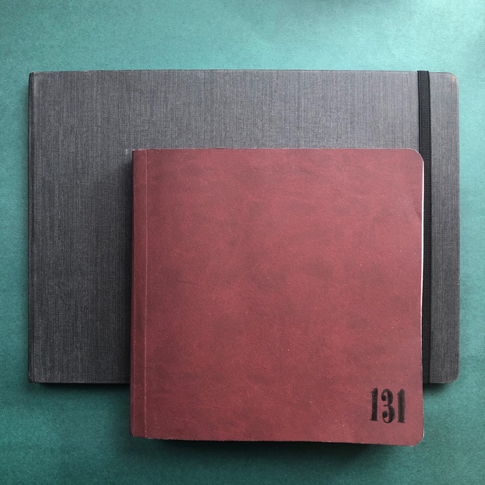
During lockdown I really enjoyed using the new-ish square format in the Stillman and Birn Softcover Alpha series – it was such a great size and really encouraged me to do a lot of sketching.
But when restrictions lifted and I was able to sketch outside again, I felt the need to upgrade my sketchbook to one with true watercolour paper, a hardcover and in a larger size. So I started a Hahnemühle A4 landscape sketchbook which I had enjoyed using during my big 11 week Virtual European Trip. I normally only use this type of sketchbook (larger size and better paper) when I’m travelling or going on dedicated sketching outings, but I’ve always struggled to feel comfortable using them for everyday sketching. See more about this here.
I managed to fill this book within a three week period and it felt great to use it. But even more exciting is the fact that many of these sketches were done on location!
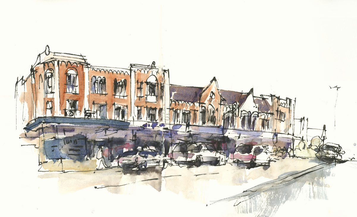
As I mentioned in a previous article I have been wanting to ‘up my game’ in regard to urban sketching, and this has coincided perfectly with the Group Run-through of Watercolour On Location. I’ve been doing lots of new sketches to share with the group during the weekly livestreams and a better sketchbook has worked well for this.
So all up I’m really happy with my decision to change sketchbooks!
I’ve scanned nearly the entire sketchbook to share with you, so please grab a hot drink of your choice and enjoy scrolling through these pages!
(Click on any image to view at a larger size.)
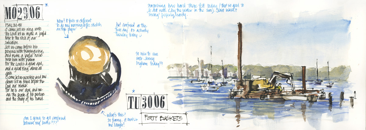
First spread and first sketching outing outside my local area since lockdown. More about this outing here.
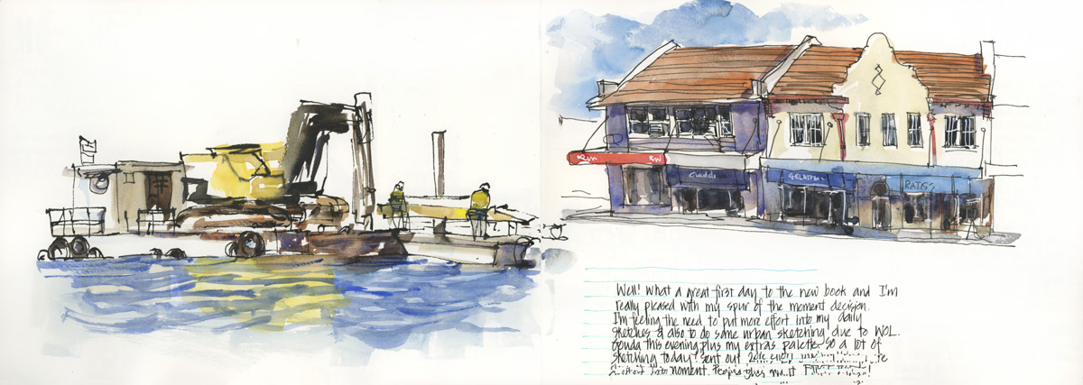
The book felt so good and I enjoyed taking more time than usual that same afternoon to sketch some shops in Lindfield on the Pacific Hwy.
It was a great start to the book but the next day was busy and I didn’t fill a full double-page spread. But it was fine to combine two days together.
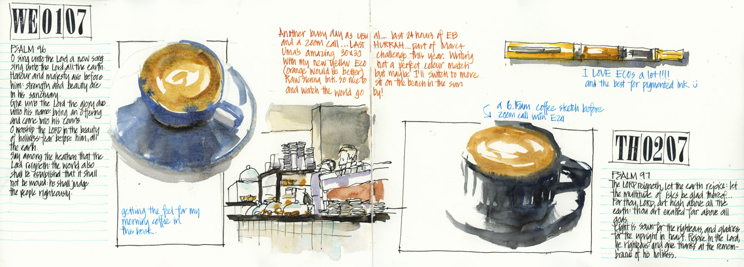
Sketches on this spread include sitting outside the cafe drinking my takeaway coffee and a new TWSBI Eco. Aside: I find the ECO pens the most reliable for part-time use so they work great as my coloured ink pens.
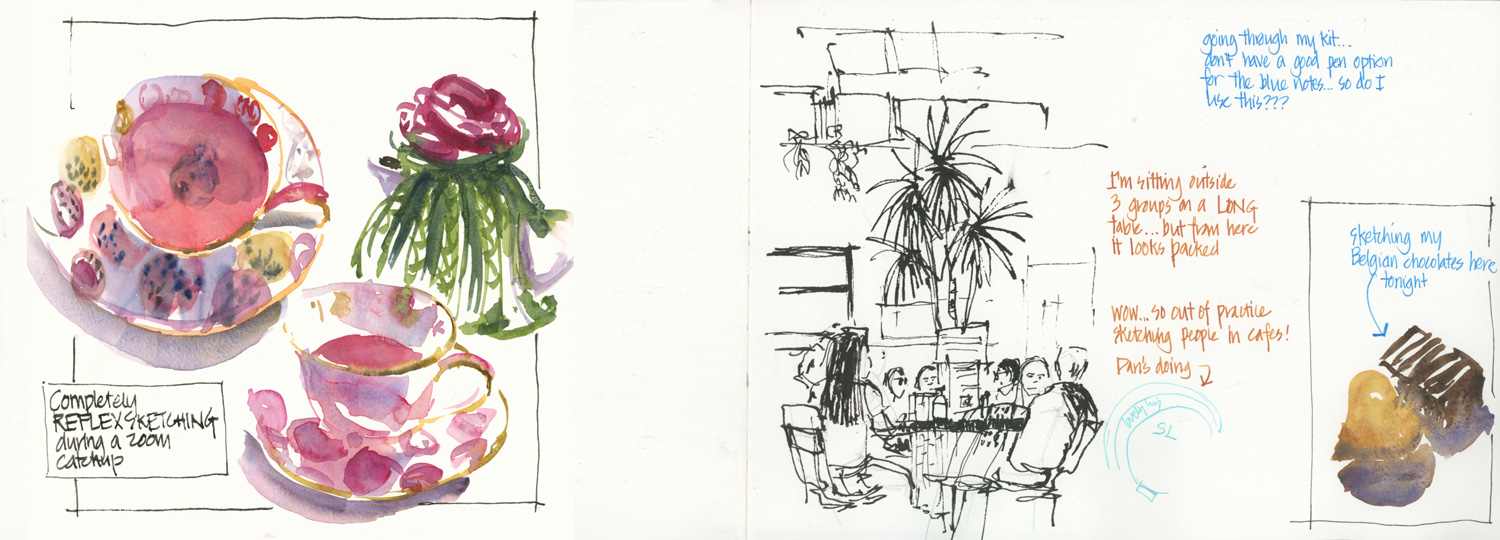
My pink cup with pink tea. More here.
It was a warm day so the bi-fold doors to Goodfields were open and I could sketch the people at the long communal table… but oh! I’m so out of practice. It seems an age since this table was filled with sketchers as part of 1w100p.
And some Belgian chocolates I bought as part of my virtual trip to Brussels.
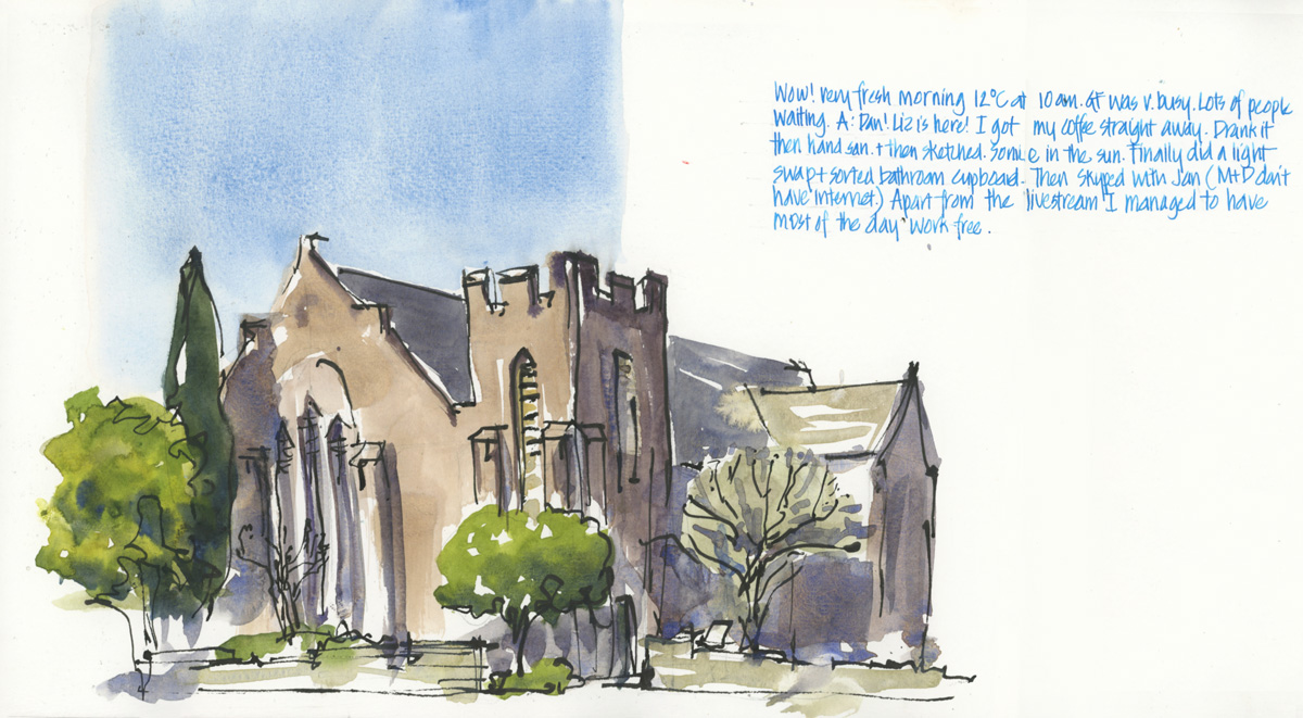
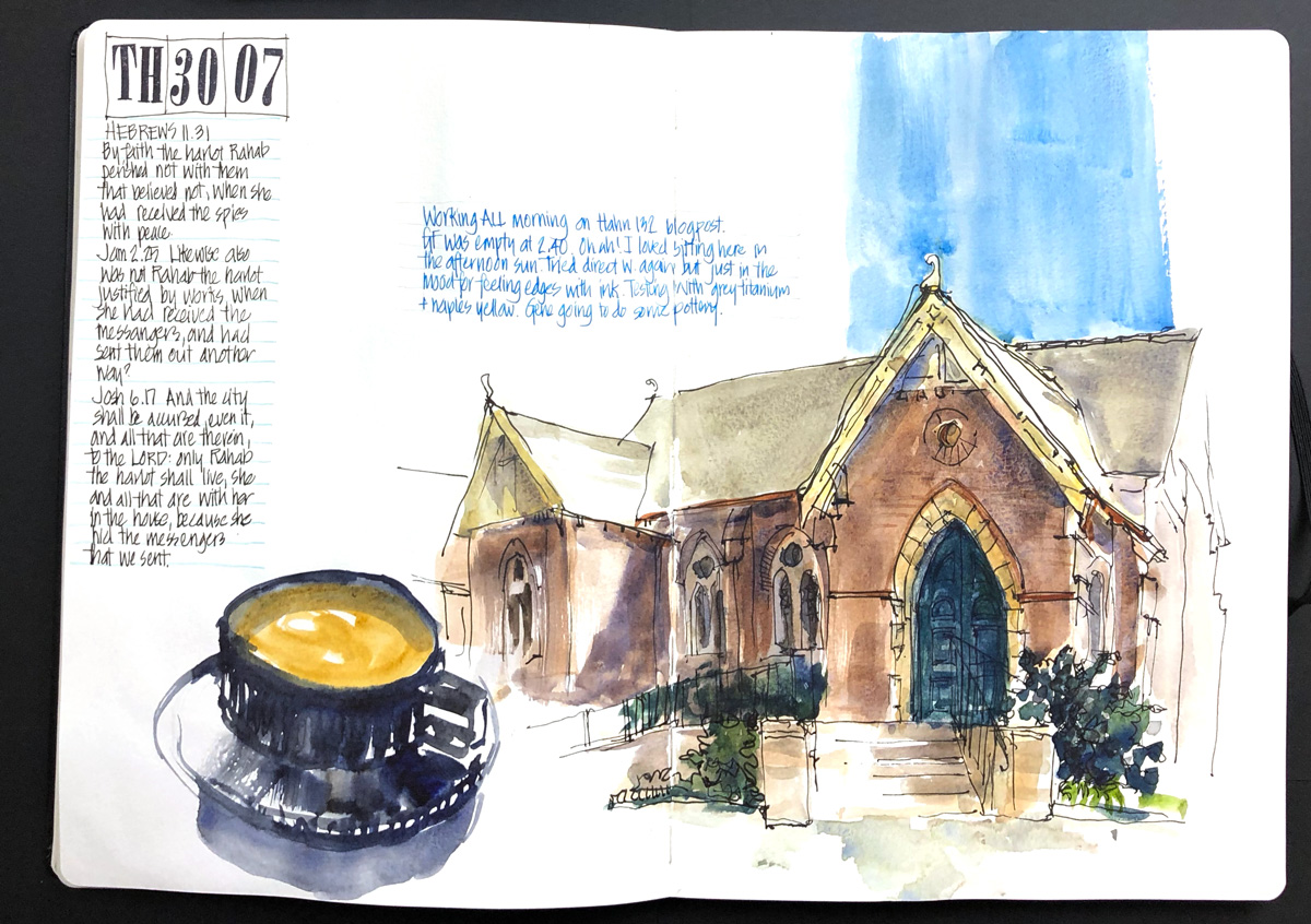
The local St Albans church in Lindfield – one of my regular sketching subjects. Stay tuned for more.
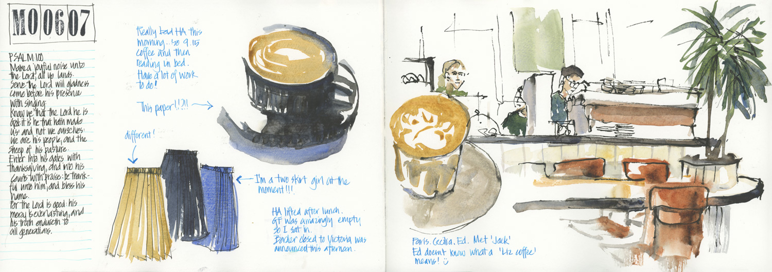
On this day it was really empty in Goodfields so I actually sat inside which was so nice. I miss doing this a lot! (Note: At the time this was sketched there was virtually zero local COVID transmission so I felt okay to sit in.)
The ‘different!’ note pointing to the brown skirt is a personal code celebrating that our church services started again (we have a very large building so the 4 square metre rule is easy to abide by!)
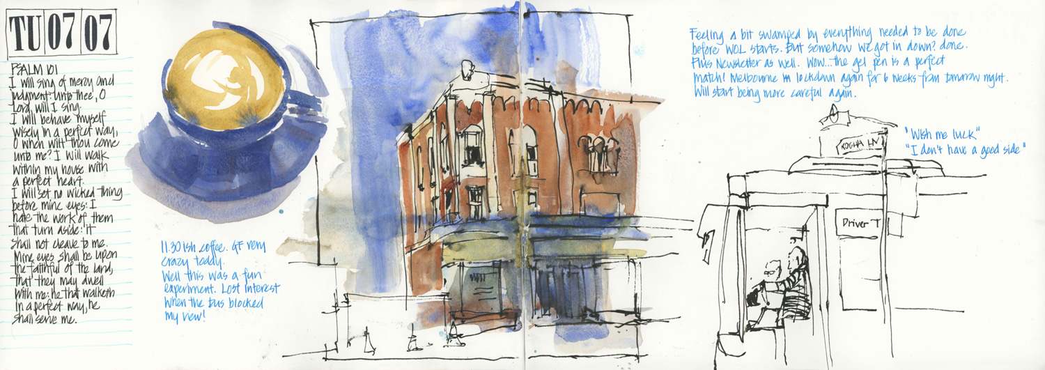
The first for this book of many sketches of the iconic Spanish Mission building on Lindfield Ave. A fun chat to the guys in the bus – trainer and trainee.
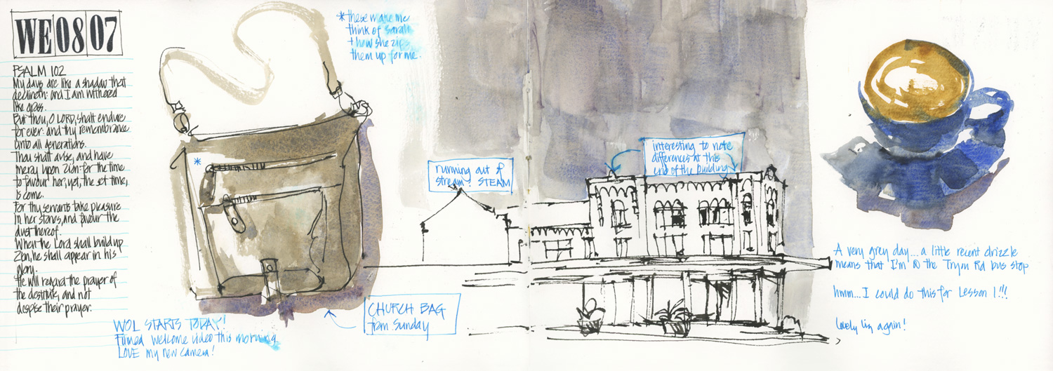
My church bag which hasn’t been used for months and another sketch of ‘that building’!
BTW I have not been able to achieve consistent results on this paper for my usual morning coffee sketch techniques.
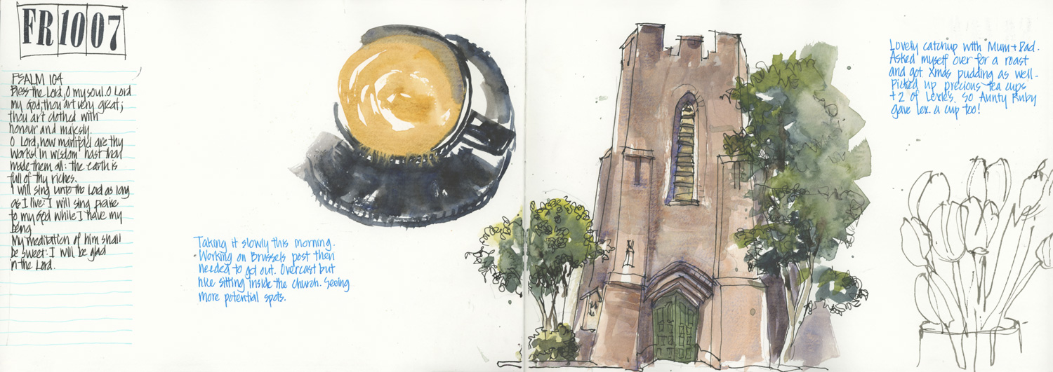
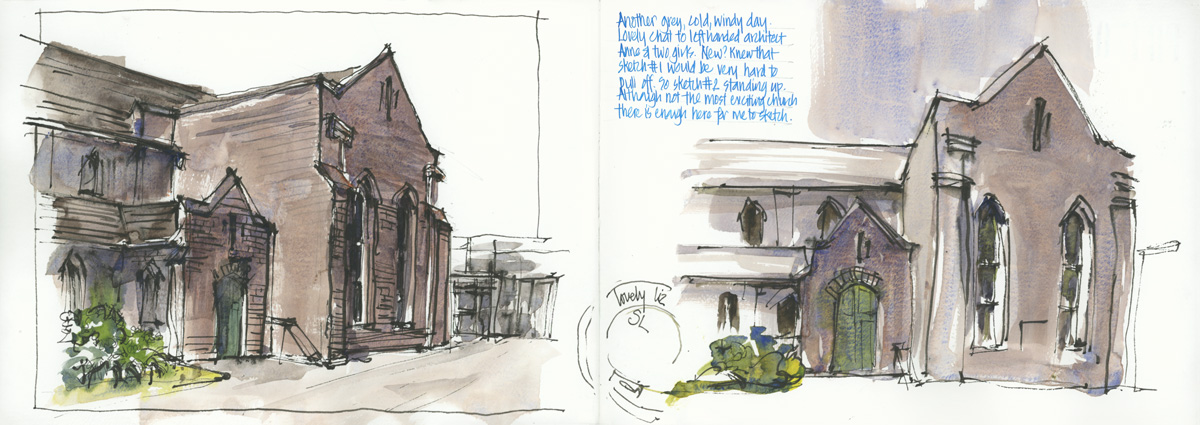
I really enjoyed doing this sketch – the front door of St Albans. I’ll share more about it in a future article.
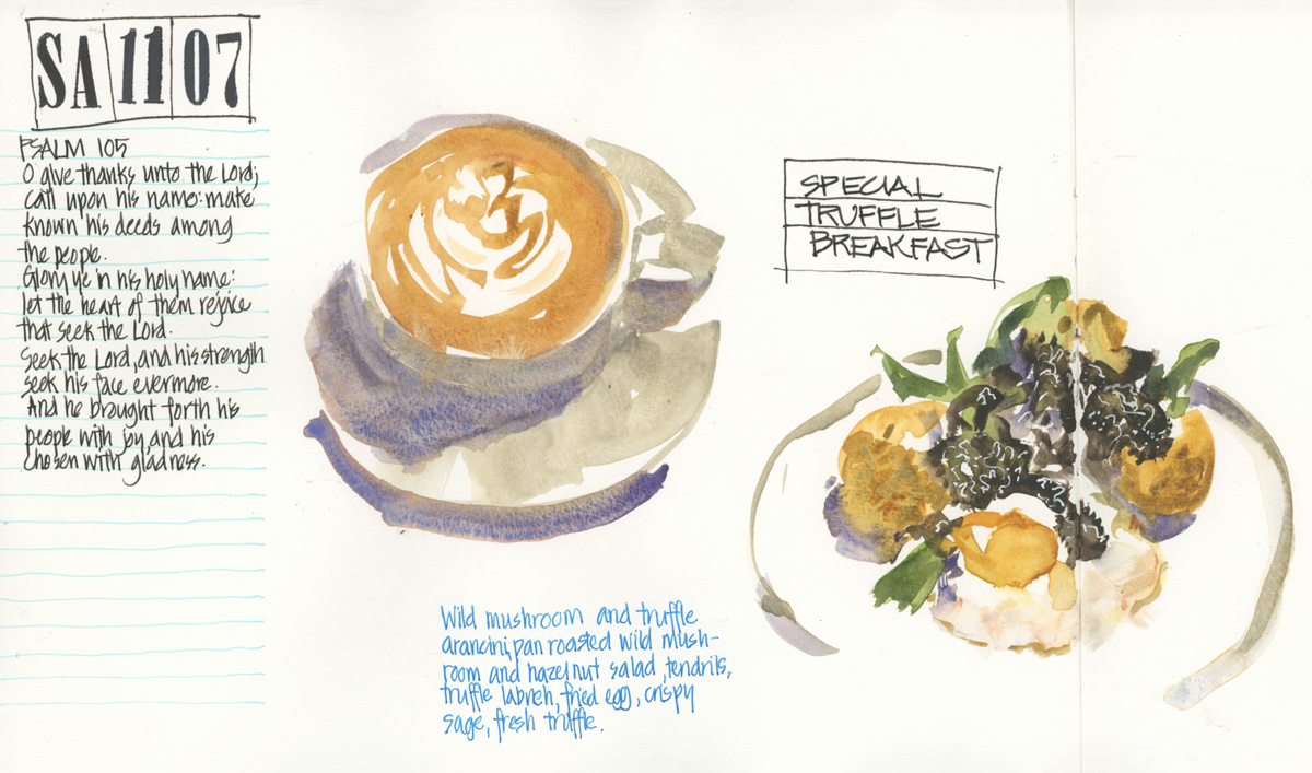
Early morning at Goodfields (it was empty) so I could have a fancy breakfast and try one of their truffle dishes. Yum! Sketching gourmet cafe/restaurant meals like this is definitely something I’m missing.
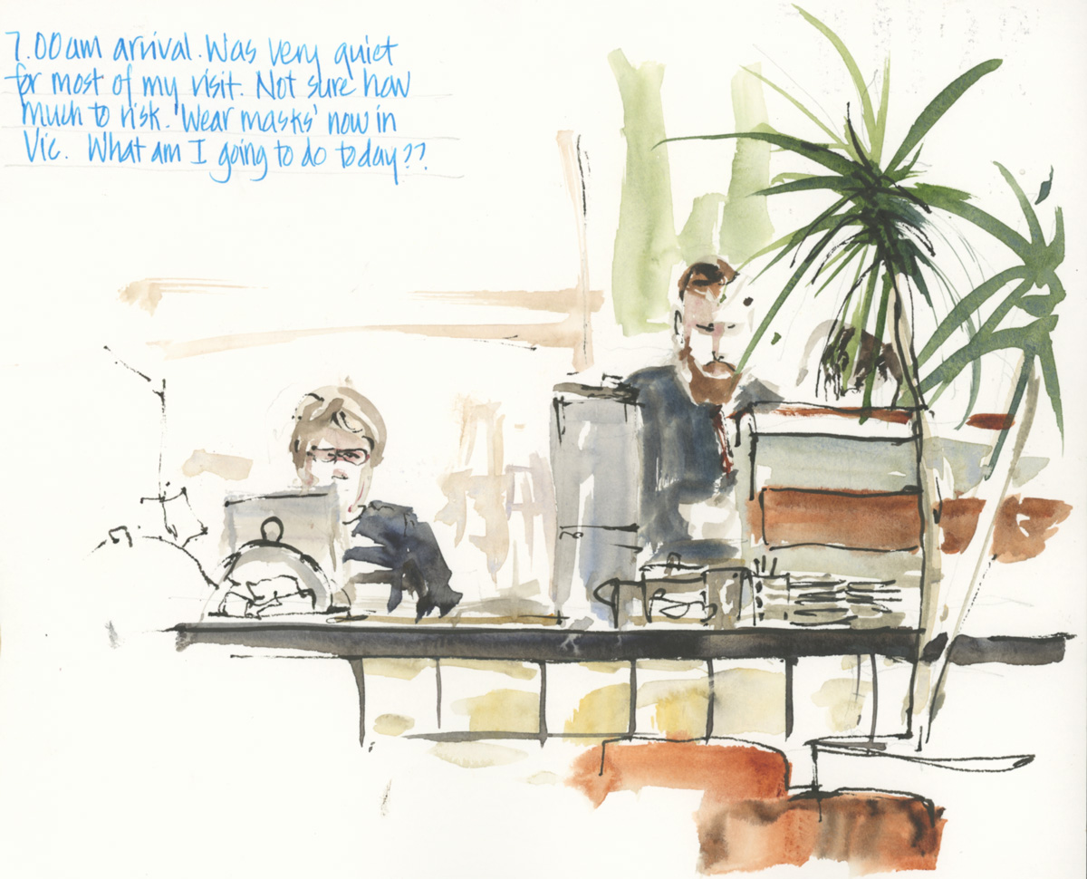
I also enjoy sketching this view – especially when there is a tall barista!
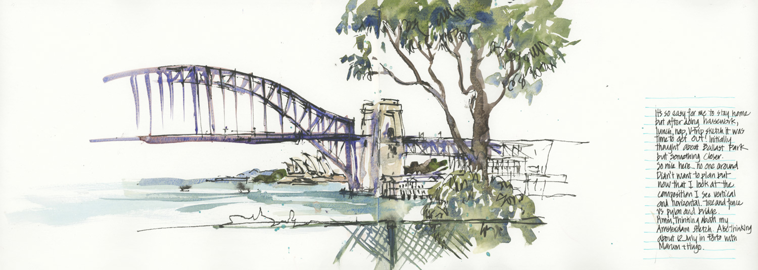
Afternoon outing to Blues Point. This sketch was intentionally stopped early so that I could talk about focus and composition on a Watercolour On Location livestream.
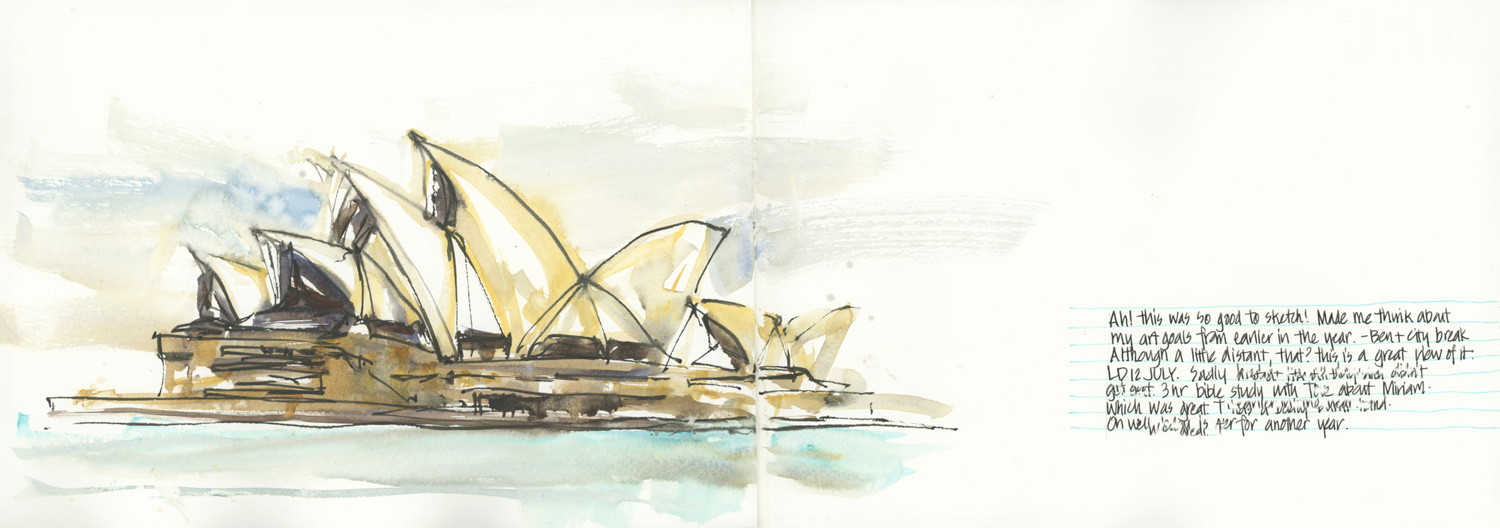
I’ve shared this sketch of Sydney Opera House before, but here is it in the context of a whole spread. Sometimes I just need some white space!
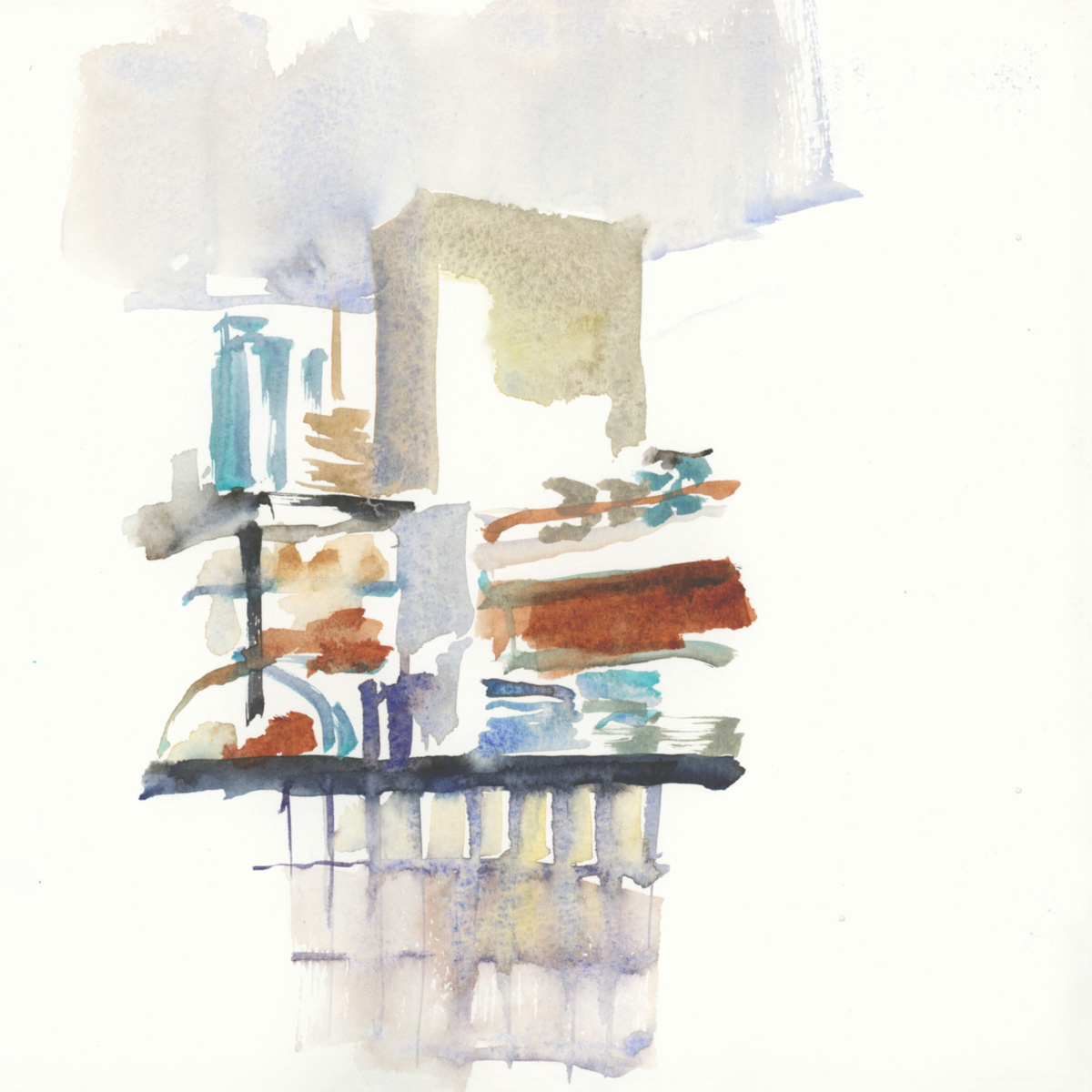
The same view looking into Goodfields as I did earlier, but this time I was focusing on shapes.
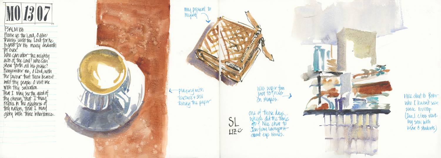
Here is the full spread – I like the colour scheme of this page.
I finally got around to buying myself a new purse/wallet. The zip to my red wallet broke 6 years ago and I decided it was time to finally get around to getting a new one.
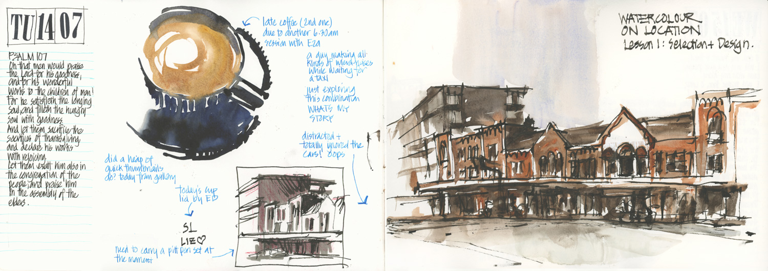
A rushed two colour sketch as part of Watercolour On Location (Lesson 1 homework). A strange guy talking to himself and making weird noises came and sat down beside me so I was slightly distracted!
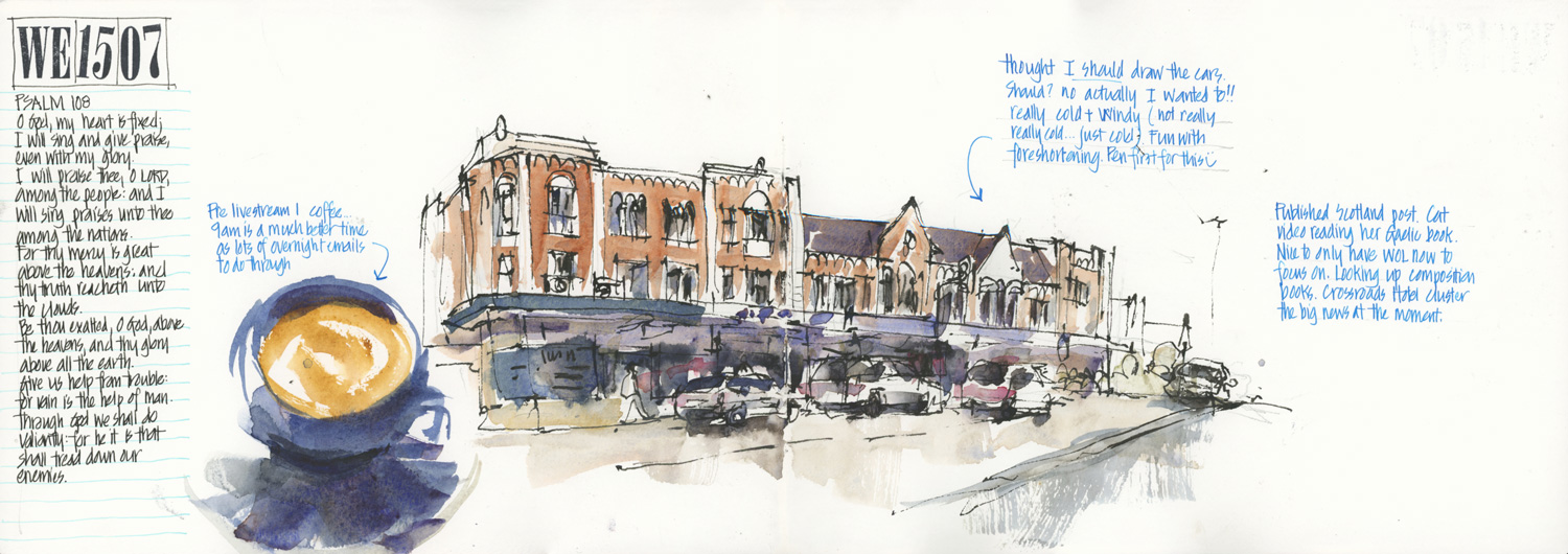
The next day I just had to have another go and include the cars this time.
I know that you all know this… but, just a reminder that I love combining different sketches and text on a spread.
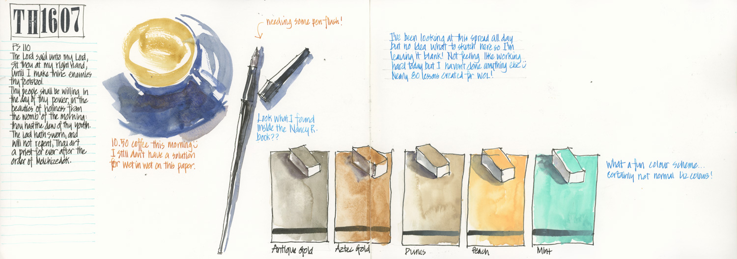
I found my lost Sailor desk pen inside an art book (it had been there for over a year?) and completed my collection of metallic and pastel White Night paints (until they bring out more!)
I wasn’t sure what to sketch to finish off the spread so I left it as it was – with the top right corner empty.
Two versions of the side of St Albans to discuss story inside the Watercolour On Location course. I want to do another version where I position myself in between these two views.
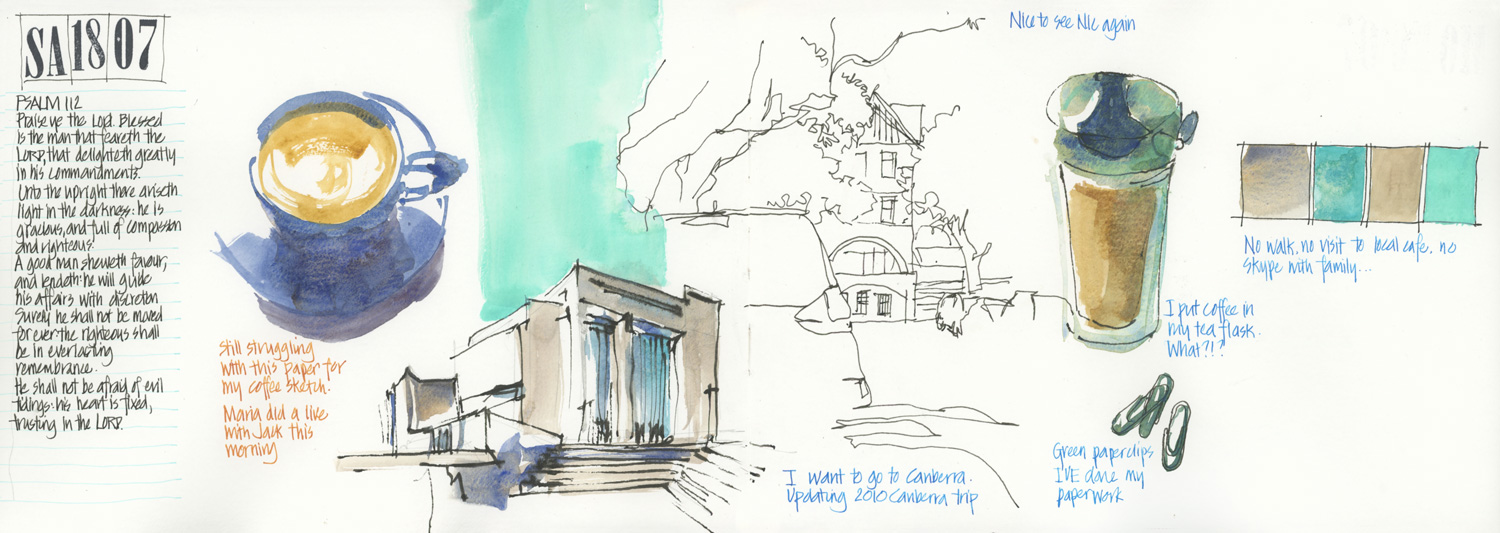
A random page of bits and pieces (including updating some old sketches of a visit to Canberra – it’s been 10 years since I’ve been… so definitely overdue for another visit!)
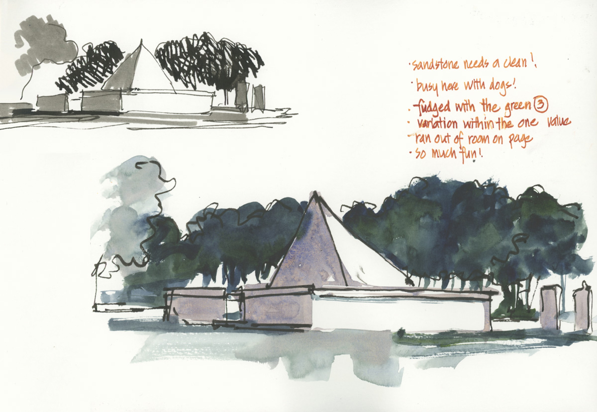
A quick value study and a two-colour sketch – more work to go through on one of my Watercolour On Location weekly livestreams. I used to sketch here in St Thomas Rest Park all the time when I worked nearby.
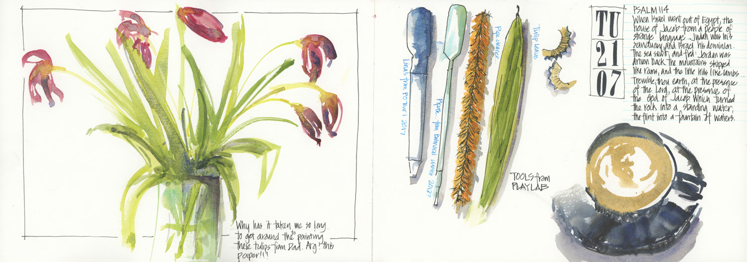
The paper wasn’t doing what I wanted for this super quick sketch of my dying tulips.
The tools I used for a Sketching PlayLab session with Paul and Suhita and some friends.
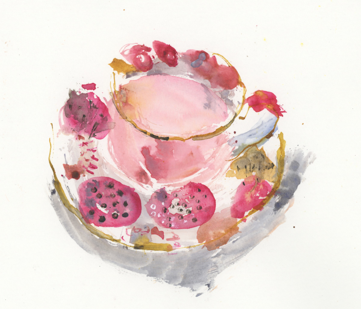
This teacup sketch was done using some of those tools at around 12:30am. Eek! that was a late night!
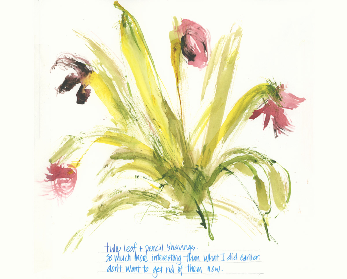
And this is another sketch done just after… Oh! I was tired but had a lot of fun.
I highly recommend Paul and Suhita’s Sketching PlayLab zoom sessions.
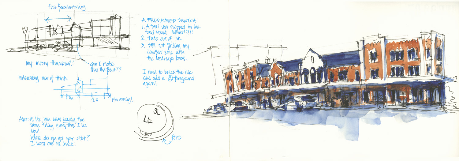
Another two colour version… and another frustrating sketch. This time I ran out of ink and a taxi van blocked my view.
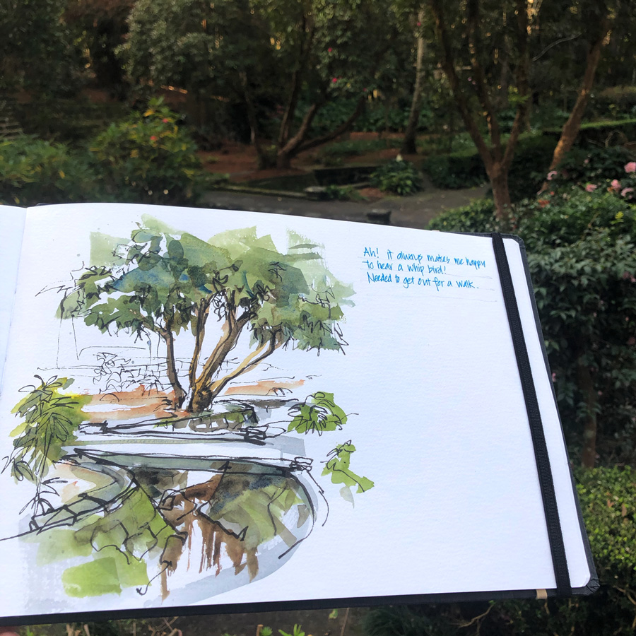
I stopped this sketch (of the lovely Swain Gardens) at this point so I could work out what more to do with it. I then decided to leave it as it was.
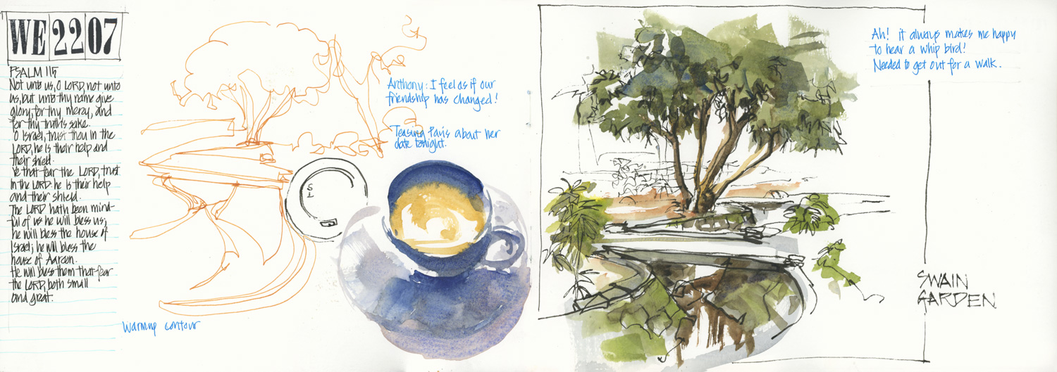
Here is my spread. I really love Swain Gardens and hope to visit it more in the coming months.
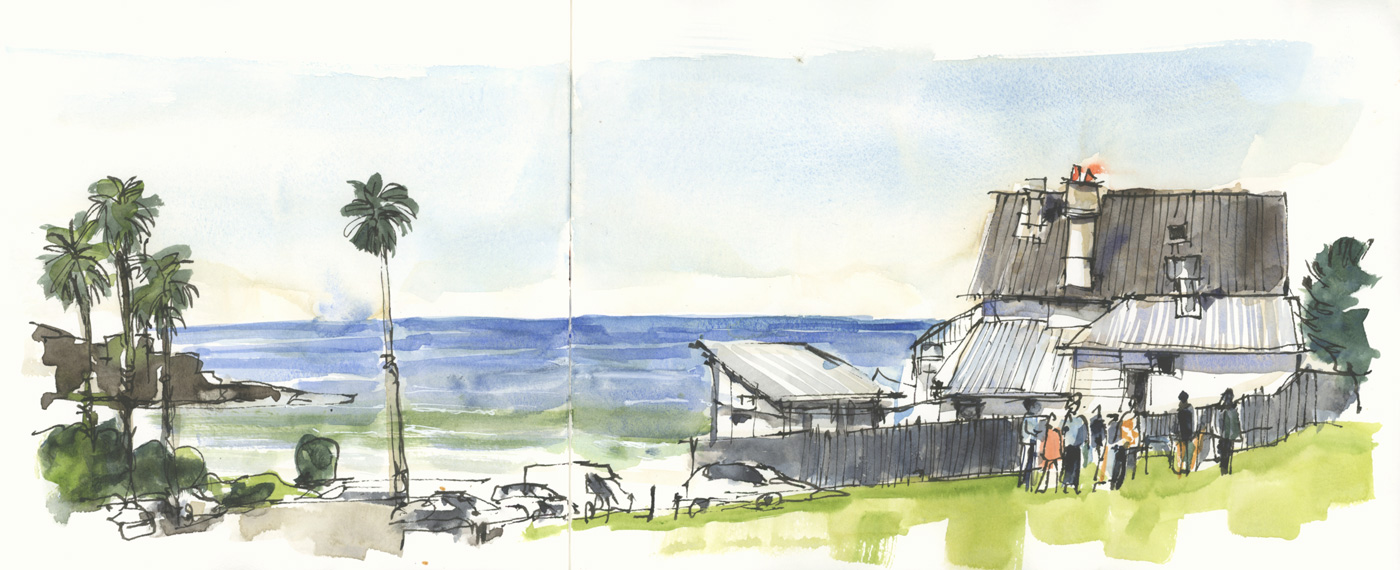
A sketch at Freshwater – I finished early and then did a value study (which you can see here) to work out how to finish it. This is another sketch I discussed during one of my weekly livestreams.
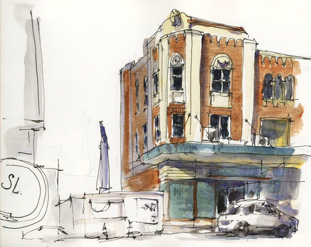
The last sketch in the book exploring the transparency of my shadow wash – more work for the Watercolour On Location course!
So what do you think, have I managed to ‘up my game’?
Well, I definitely think I have and upgrading my sketchbook has definitely been a big part of this. I think the main reason is that the bigger book has meant that I’m making more time for my sketches. And obviously, being very actively involved with the Group Run-through of Watercolour On Location has also had a huge impact on the number of urban sketches I have done in the last three weeks. So it’s been a great decision to switch to the Hahnemühle Watercolour book.
But on the other hand I’m missing the freedom which I have when using an Alpha book. I’m taking less risks and sketching less in the half opportunities. I think the size of the spread might be the problem as on a number of occasions I was reluctant to start a new page for a quick sketch.
I found the A4 landscape size awkward to handle out on location until I got used to it. Even though I have used this size book many many times for travel sketching, I realised that it does take time to get used to handling it. When I’m travelling, I sketch all day and so by the end of the first or second day, I’m totally in the groove and feel comfortable with it. It takes more effort to reach this ‘handling ease’ when I’m just doing a single sketch per day.
I really loved using this landscape format for my virtual trip but found it harder to use for everyday sketching. I felt as if I had to put more work into the design of my spread, but in the end that has paid off and I’m happy with the results.
As for the paper and my random comments over the last few weeks… I do really love the Hahnemühle Watercolour books and still highly recommend them, but I have discovered that Moleskine works better for me. This topic needs a separate article – stay tuned for that.
The final thing to tell you is that… drum roll please…
… I’ve started the next sketchbook.
This is an A4 portrait Watercolour Moleskine and it feels great!!! More about this coming up soon!
Please let me know if you have any questions, or if you have experienced something similar.
Do you find that using a sketchbook with good watercolour paper works well for your everyday sketching? Or does it sometimes feel too good?

12 Comments
Hi Liz, interesting to read your thoughts about sketchbooks. Yes, I bought a good quality “too good” watercolour sketchbook at least a couple of years ago and it’s still waiting for that something special to fill it! Will it ever happen?! Love looking at your page spreads and am I right in thinking that the paper in your new A4 Moleskine gives your sketch a slightly brighter, livelier and somehow more translucent quality than the paper in the other books.
I’m greatly enjoying the WOL course!
Hi Jane – ‘too good’ can be a problem, but if it contains good paper than your sketching and watercolour washes can get much better simply due to the paper. So it’s worth pushing through the mental barrier and trying it 🙂
And yes the colour is brighter and my work more lively on the moleskine – just published an article about it.
Glad you are enjoying WOL!
Very interesting article Liz.
This subject is at the heart of what we do, as the character of the paper influences technique, pigment choices and even subject decisions.
I love Bockingford paper (not available in a bound sketchbook) but found that once I’d put in the work to make a sketchbook, I had that ‘don’t mess it up’ anxiety !! I found the size and shape of the Soft cover 8×10 S & B Alpha was perfect for carrying around and designing spreads so I’ve persevered with adjusting my technique to cope with the thinner smoother paper. It is very unforgiving if you want to make a changes, but what I’ve found is that I’m ready to ‘have a go’ in the Alpha and if I want to explore other ideas or techniques I do another version on a loose sheet of Bockingford. That’s a win/win for me ! I’m glad I’ve pushed through with a paper I would otherwise have given up on, I think it’s helped me to be more adaptable in technique.
Hi Fiona – thanks for sharing your thoughts. I think you can get great results with Alpha if you work out how – and yes its unforgiving and I think that is why I love it so much. Glad you have got it to work!
(Easier for me than 100% cotton – go figure!)
Hmm interesting question about watercolor paper! I used to use the Moleskine water color book exclusively and I liked that but since I don’t exclusively work in watercolor (although that’s becoming more and more prominent), I switched rtf the Stillman and Birn alpha so that I could use other media without it being too “textured”. But now I’m starting to wonder if I should go back to the Moleskine watercolor paper! Decisions decisions!
Hi Emily… yes always decisions!!!! its good to change it up from time to time as our work is always evolving. Keep it up!
This has been one of your best shares yet.
I prefer cold pressed, I love the texture. Because I don’t use a fine point pen often I have no issues with it.
I also struggle with using watercolor paper everyday because of the price… I try to wait for sales and buy as much as I can, but journals are expensive, even if I work in the B5 format. But a funny thing happened during the pandemic — I had done a couple pages in a toned Hahnemuhle watercolor journal and realized that I did not want two journals simultaneously with the protests and riots and pandemic hitting Portland all at once, so kept using it… It changed what i did in my journal so much! I am going to switch permanently to the watercolor journals after I use up my Nostalgie journal if I can… I will do the B5 as a compromise but use the better paper. I still have a couple of A4 Moleskins from years ago (don;’t like their paper so much but better than Fabriano — ink washes go right through their paper) and a couple of A4 Hahnemuhle watercolor journals to use as well, and will see if I really want the larger format.
I like S&B’s paper but not their formats… I want a hard cover, and bound. I like the square formats (I have always been nuts for squares, is that an architect’s thing?) but actually use my landscape for mat with a square as the image format and writing on the longer edge.
Thanks Kate! Always great to here your experiences. I haven’t gotten hold of a toned watercolour book yet… your comment reminded me of that. Ha!
And yes! I love square too!!!
I love seeing your journal pages all in one go like this – so many ideas to inspire me. A few years ago I started using Alpha sketchbooks, 6 x 9” on your recommendation I think, and I’ve stayed with them, except for an A4 Moleskine for the Watercolour course. I love Alpha books because I’m never “too scared” to mess up because they’re fairly good value. Sometimes I wish they were a bit more textured to help that WC magic along… 6 x 9 works great for me too, big enough to project flexibility in layout, small enough to use outside easily, and not have a large expanse of blank paper staring me out. It means I sketch more and don’t care if I’m just testing, experimenting, or completely make a mess!
Thanks Sandra – my thoughts exactly about the Alpha = good enough but not too good. Very good for an everyday sketchbook. It will be interesting to see how I use it when I go back after this sketchbook upgrade. (Because I will go back at some stage!)
Hello Liz
I am Amanda I love to sketch buildings, water, nature.
What inspires me, a path, a track, a cliff over water, waterfall, trees.
All of which, inspire me. I can draw both from references and what is in my Mind.
Psalms!
Salmos, en los cuadernos! Por Dios es la mejor motivación para pintar… más que las discusiones sobre pigmentos y marcas de pinturas!
Gracias, gracias, gracias!!
NEWSLETTER
Subscribe for first notification of workshop + online classes and more.