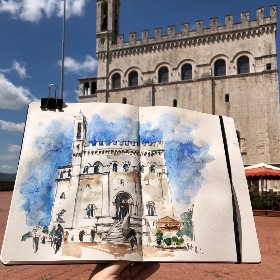
Last week during the virtual tour of Umbria (for the 2020 Palladian Odyssey group) I shared some important techniques for including people in an urban scene. It was based on the workshop that I taught in Gubbi in 2019 and this photo was from a visit to the town the week before the workshops.
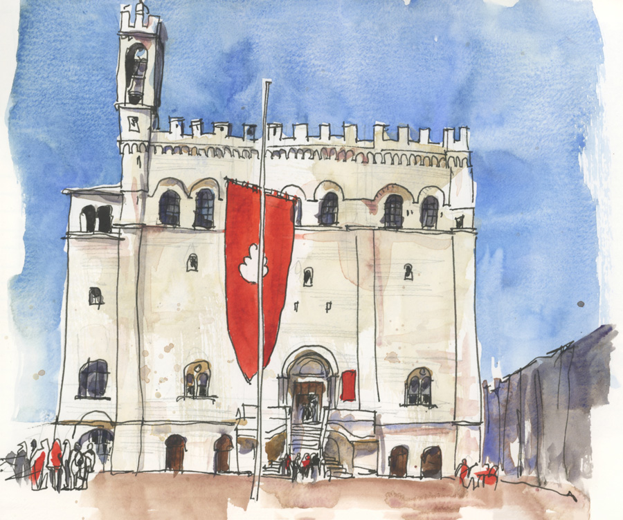
The main goal of the workshop was to learn how to place people in an urban scene so that they are positioned correctly and drawn at the right scale. And I’ve realised that I’ve never summarised these techniques here on the blog. So that’s what I’m doing today. Please note this is a summary only (I explain more details during face to face workshops) and of course it’s not a detailed guide on how to draw people in general. I’m just dealing with including figures in your sketches of urban scenes.
There are three important steps:
1. Have a simple way of drawing people in the right proportions.
2. Draw people with simple shapes and in a consistent style with the rest of the sketch.
3. Understand how to place people correctly in the scene.
1. Proportions
I have found that the standard approach of using 7, 7.5 or 8 heads to draw the figure in proportion was too complicated for sketching on location. (Note: I can’t remember how many heads to use (is it 7 or 8?) and don’t like counting more than 5!)
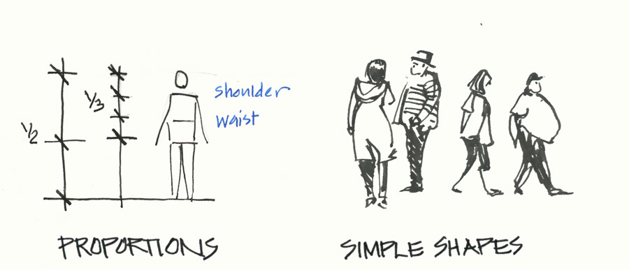
So when I came across the technique shown above (I believe it was from Andrew Loomis) I knew that this was much more practical to use. Draw a line, mark 1/2 way for the crotch (or the top of the thighs) and then divide the top half into three. The first division represents the waist and the top one the shoulder. I like this approach for two reasons: first, the line of the shoulder is important for capturing gesture and secondly, if I’m sitting on a stool my eyeline ‘aligns with the thighs’ of the people in my scene making it really easy to place them (the eyeline is directly in the middle of the people)… ah! but I’m getting ahead of myself!
2. Simple Shapes
It’s really important to do a lot of research on the human figure and have an understanding of anatomy (from a visual point of view) in order to draw a convincing person particularly if you are wanting to tell stories of the people. However, it is possible to include people in your sketches without a lot of anatomy knowledge, by simply developing a way of indicating a figure by simple shapes.
It is best if these are drawn in fairly correct proportion but the most important thing is that they are drawn in a consistent style to the rest of the sketch. Diagrammatic figures drawn with the same confidence as the buildings and the trees etc will provide a great sense of scale and liveliness to your urban scene. You can see in the Gubbio sketches above, that I’m not overly concerned to add much detail to my people – I just want to document how many people were in the space at the time.
Telling stories of how people are interacting with each other is another matter entirely – and does require much great knowledge of the human figure.
3. Placing people in your scene
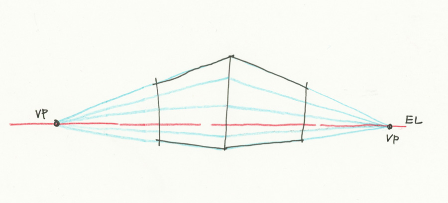
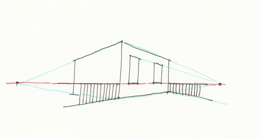
This involves a little understanding of perspective and in particular the concept of the eye height line (what I simply call the eyeline).
This is a line that corresponds exactly with the height of your eye at the time… so if you are standing up the eyeline for the scene is higher than if you are sitting down. The horizontal edges of the buildings converge at a point on the eyeline called the vanishing point. I can’t go into a detailed description of perspective and the eyeline in this post… but the amazing thing is that lines are horizontal on the eyeline.
So that means that if the ground were totally flat and I were sitting on a stool with my eye height at 1 metre off the ground, then any object/element that was 1 metre high would all align with the eyeline. In this example, the base of the windows and the top of the picket fence are at 1 metre so these lines are horizontal. (For more about Perspective please refer to my Buildings Course where I have an entire lesson devoted to this subject.)
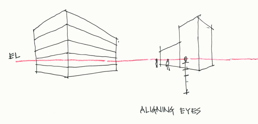
This principle can then be applied to people – assuming that the ground is totally flat and everyone is the same height. This means that if you are standing, all the eyes of the people in the space line up – and so you can ‘hang their heads off the eyeline’ by aligning their eyes. So just by adjusting the size of the people you draw, the people in your sketch will appear to occupy the space.
Of course, people are not all same height and the ground is rarely totally flat so this technique is a simplification. There are ways of modifying it to be more realistic but that’s a topic for another day!
In this example, I drew varying-sized heads centred on the eyeline and then I drew a line for the shoulder. This then was the basis for determining height of the person based on the divisions mentioned above in Point 1.
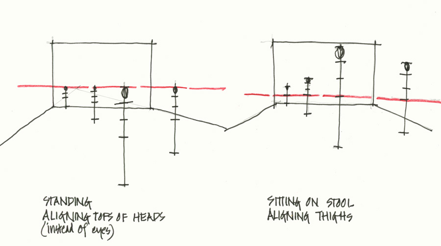
There is a simpler way of doing these measurements by hanging the top of the heads from the eyeline. This is not totally accurate (unless you were standing on a step so that your eyes were higher than those of the people) but it makes it easier to add people. However, it looks a bit static with all the tops of the heads at the same height.
However, if you are sitting on a stool, you can create a much more dynamic relationship between the people and your surroundings and also place people very easily on the eyeline. If your eye height is the same as the crotch/thighs of the people walking past, you can simply ‘align the thighs’ and draw your people exactly centred on the eyeline.
Basically, in summary, the technique is to work out what body part of the people in the scene aligns with your eye height (if you are sitting on the ground it might be their knees , if sitting on a bench it might be their waists) and then hang that body part on the eyeline.
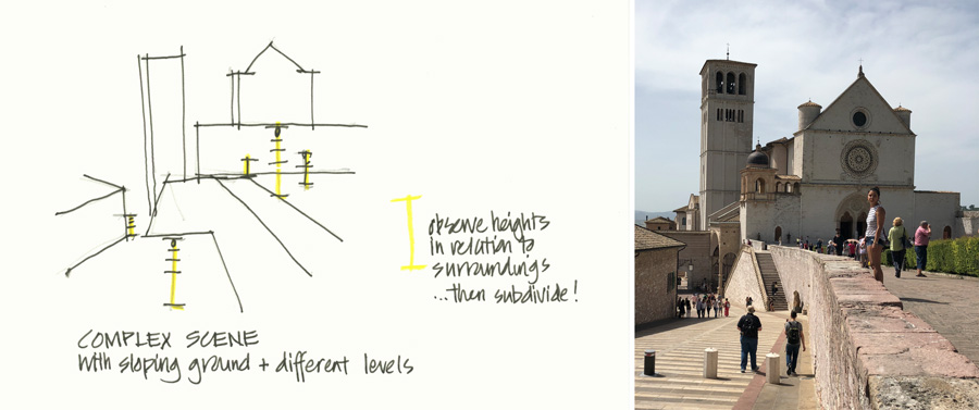
If the scene is complex, with a sloping ground and different levels, then I simply observe how high a person is related to the scene, draw a line to represent the height (drawn in yellow) and then sketch the person around that line.
Ah! this is a big topic but I hope that this blog article has given you some techniques that you can incorporate into your sketching today. For more on this topic please refer to Lesson 3 of my Watercolour On Location course where I talk about drawing people in general and also demonstrate how to include people in your sketches.


6 Comments
Super helpful diagrams, thank you for making this!
glad that it’s helpful Bailey!
Hi Liz, very helpfull. Thank’s
I came to this page because I am doing the foundations course and I think in last weeks lesson (or maybe the one before) there was a link, so this article has been sitting waiting for me and I am so glad I have started it…and definitely bookmarked it, because it is the clearest description of perspective that I have had! I am excited to read the rest and try it out…..and eventually want to do the Watercolour on location course to get more! I bet the Buildings course would tell a lot more….just don’t know if I’m ready for all that yet. Thanks so much Liz—you are a great teacher!!!
I came to this page from the first lesson of the travel sketching course, and it’s just … I must say, it’s a revelation. For 50 years, I’ve had the unexamined belief that “I can’t draw.” I think when I was like 6 or 7 years old, I noticed that the things I drew didn’t look like I wanted them to, and there was another kid (Jim Kelly) who made much better drawings… and I just concluded that some people can draw and some can’t, and I can’t. And that was that. I basically didn’t question it for 50 years. And now I’ve come to this travel sketching course thinking “Well maybe I can learn to draw a little bit.” And I’m seeing that drawing is absolutely something that can be learned. It’s really incredible. What a wonderful discovery.
Yay! Barbara! so great to hear – keep going!!!
NEWSLETTER
Subscribe for first notification of workshop + online classes and more.