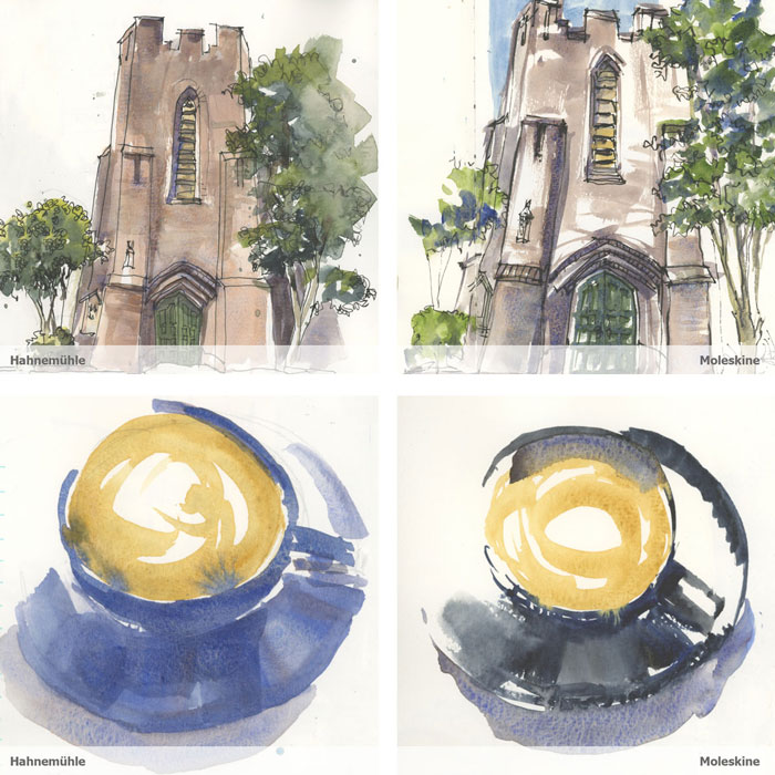
I’ve been casually dropping comments over the last few weeks about how I prefer Moleskine Watercolour sketchbooks over Hahnemuehle Watercolour books and so I think it’s time to finally explain this in more detail.
My personal preference – not a recommendation!
It’s very important to stress at the outset that this article is all about my personal preference based on the way I like to work – it is not a recommendation! In fact I think that most of you will have a different opinion to me. And so my goal is to help you think about the paper you use and whether it’s right for the way you work and the results you want to achieve.
My own method of watercolour is definitely rather quirky and differs a lot from a more traditional style of watercolour painting and/or a standard ink and wash style. So please don’t copy my decision without making sure that it truly works for you too.
Also it’s super important to note that I love both of these sketchbooks. I really like the Hahnemuehle Watercolour books and I’ve loved using them over the past few months for my 11 week Virtual Trip project. I still highly recommend this book – especially for beginners – as it works well for creating nice watercolour washes. (read my review here.)

What type of paper suits my style of sketching
If you have read my article Best paper for Quick Urban Sketching you will already know that I want a sketchbook which will enable me to work quickly – to work into damp areas and create lots of hard edges. What a lot of people consider bad marks, are what I like the most!
But it’s not just the texture which is important, it’s also the ease at which I can continue to work without having to wait for washes to dry. I want my sketches to be spontaneous and to flow almost effortlessly and so it’s crucial that the paper I use will enable me to do this. This feeling of flow is the number one goal in my art.
I also want to keep my washes to a minimal (say more with less), with little glazing/layering and for the paper to keep the colours vibrant.
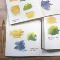
The Moleskine paper is great for all of these aspects and also allows my washes to retain their vibrancy. The Hahnemuehle paper creates softer effects – it’s hard to work into damp areas on the and overall it creates edges which are not as crisp. I also find that the colours are slightly duller. It’s not a huge difference in vibrancy, but the Moleskine is better in this regard.
I love the bright white of the Hahnemuehle paper and its texture, but as a general rule, it’s harder for me to use. This is especially true when I’m out on location ( I’m less patient to wait for washes to dry) and when sketching direct watercolour.
I love the Hahnemuehle books – the cover, the paper colour and the texture and overall I have enjoyed using them! I was able to adjust my usual techniques to (generally) get results I’m happy with. So I’m definitely going to continue to use them.
Moleskine books continue to have quality control issues and have noticeable differences between the two sides. But having said that, even though the texture isn’t my favourite, the overall paper characteristics just work the best for me.
Side by side comparisons
As always, click on any image to view at a higher resolution.
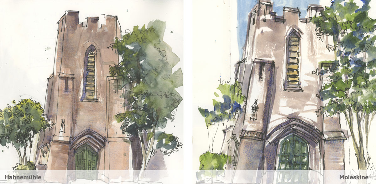
St Albans Church
I think this comparison shows the dramatic difference between the two sketchbooks and how freely I’m able to work on the Moleskine!
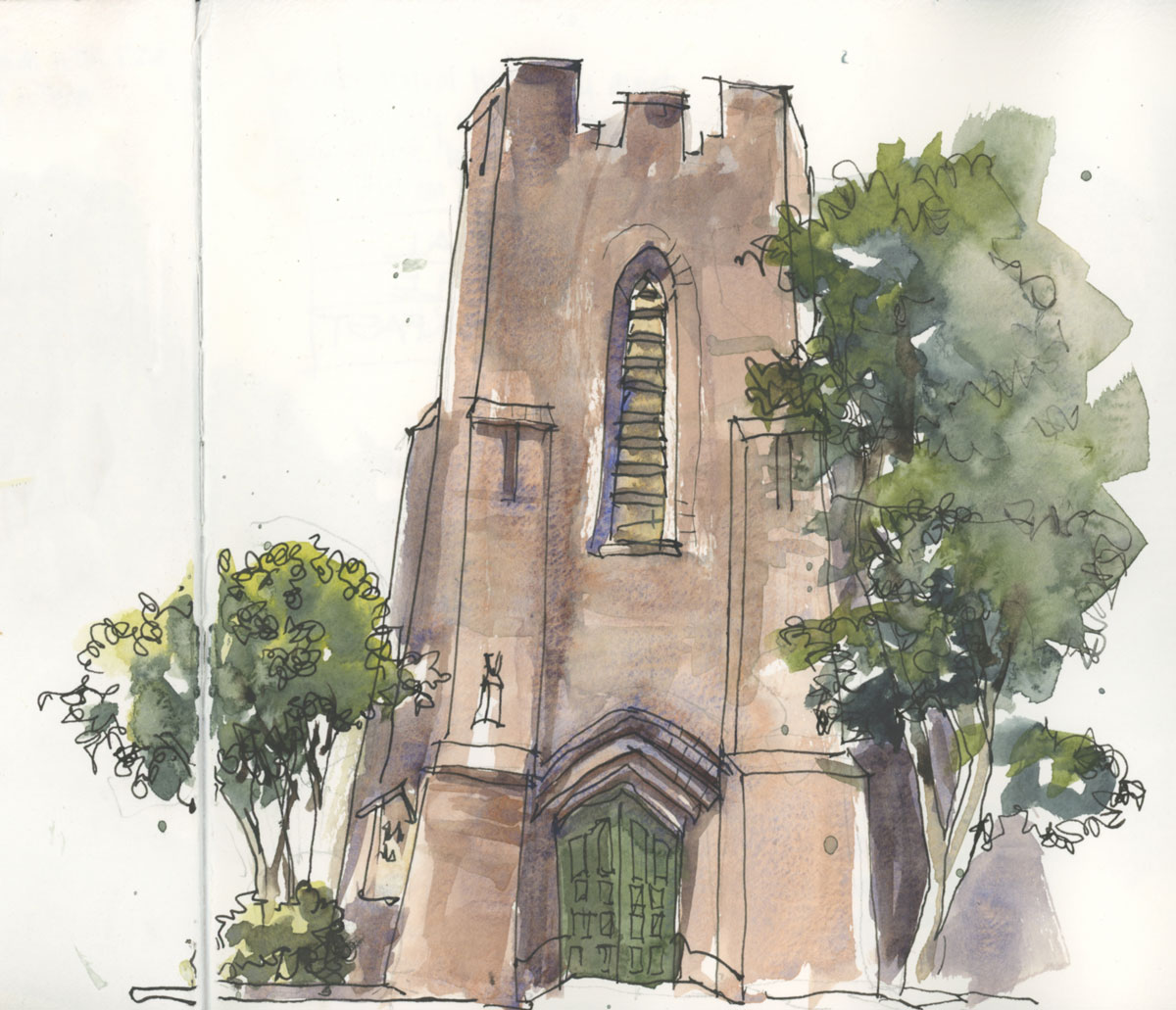
Hahnemuehle: Although happy with the outcome, at the time I struggled to get the texture I wanted in the brick work and I’m not crazy about the second layer. The tree texture is nice but there is some big drying shift happening and some areas of flatness. Overall the colours are less vibrant.
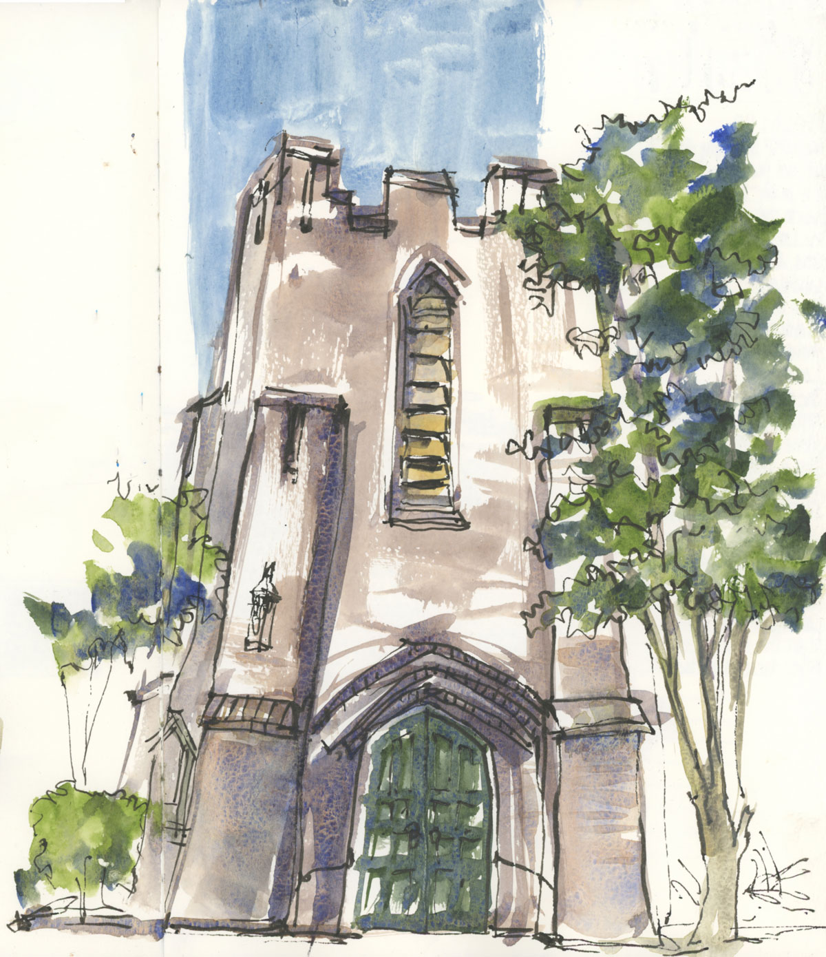
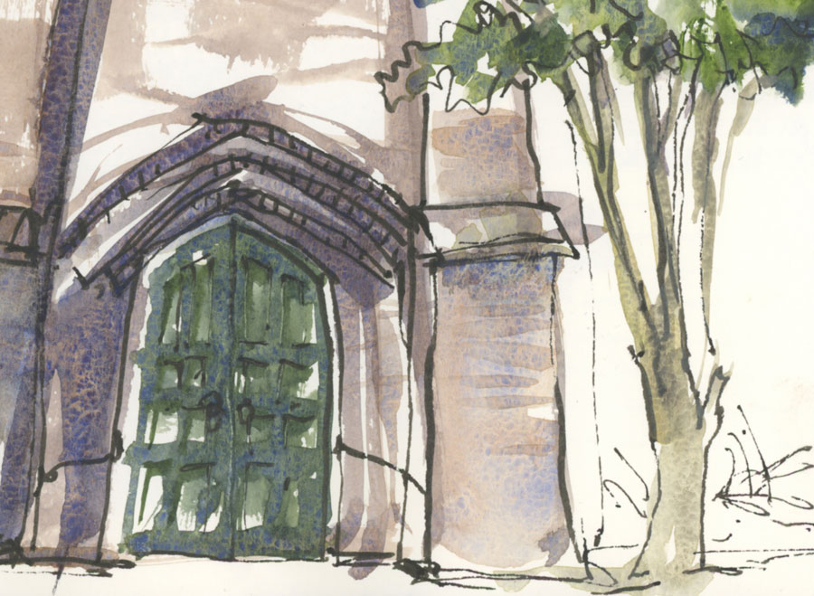
Moleskine: This was a loose and free style so it’s not a direct comparison, but I enjoyed this sketch much more! I love the texture of the door and the tree! This sketch was actually done with a little distraction (a friendly man sat next to me towards the end and had a LOT of questions for me) so I’m even happier with the result.
This was the first sketch in my new sketchbook and the A4 vertical format felt really good. It was nice to be able to work larger!
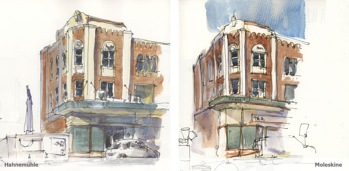
Spanish Mission Building
These two are not a perfect comparison as I felt super comfortable and in the groove when I did the Hahnemuehle version, while I felt very uncomfortable doing the Moleskine sketch (not sure why).
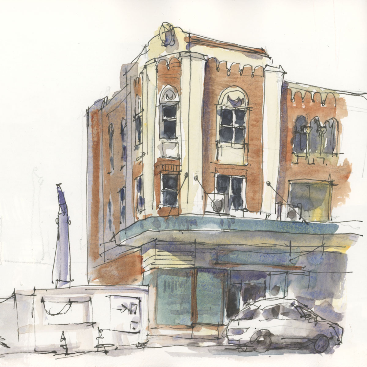
Hahnemuehle: This sketch has lovely soft washes, but the colour is more subdued. This is a good example of what works really well on this paper. Simple washes layered over each other with little wet-in-wet and risk-taking.
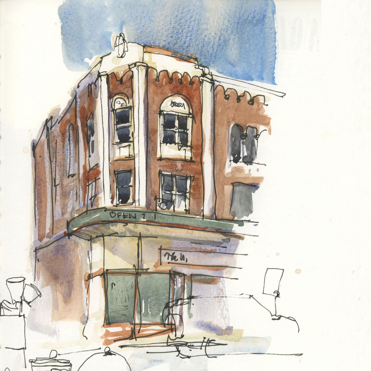
Moleskine: As mentioned above this was a little half-hearted effort but the colours are more vibrant and the edges crisper. You can also see a lot of granulation in the sky which is a combination of the pigment characteristic and the paper texture.
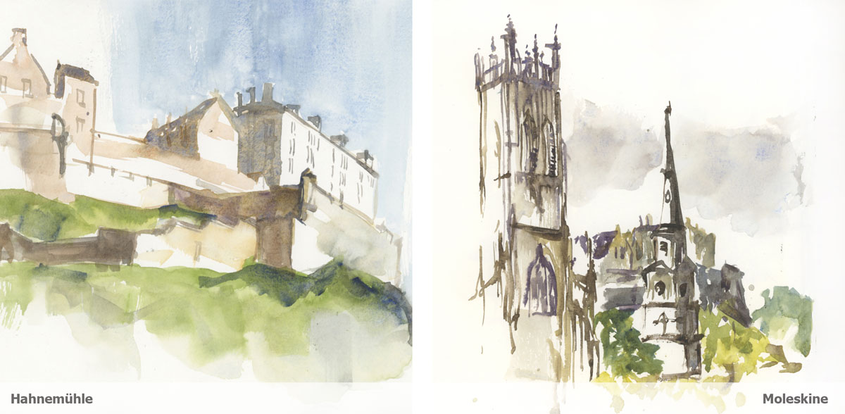
I don’t have two comparable sketches of direct watercolour but these two sketches of Edinburgh Castle do explain the difference. The Hahnemuehle sketch was done from photos as part of my Virtual Trip, while the Moleskine example was sketched on location during last year’s visit to Scotland.
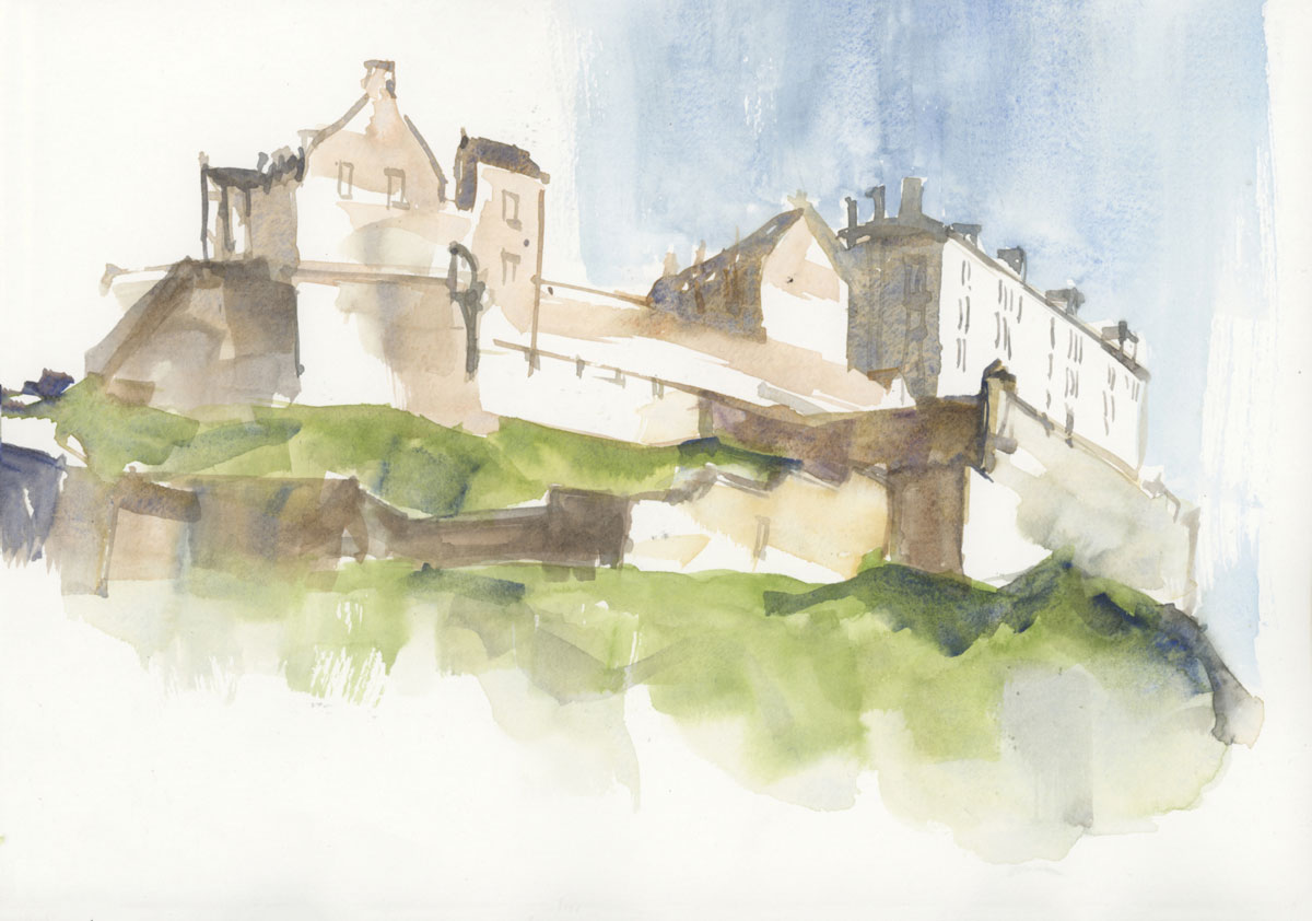
Hahnemuehle: As mentioned in my Virtual Trip articles, I generally struggled to do many direct watercolour (paint-only) sketches on this paper. The main reason is because the edges are softer and the paper remains damp for longer. This is one occasion where I was happy with my edges and I was able to resist getting my pen out to firm up the edges at the 70% mark. A big factor in this was the type of image with lots of white space.
BTW my approach to direct watercolour varies a lot from most people’s more traditional method. See this article for more about that.
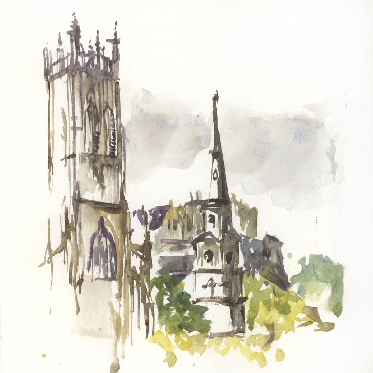
Moleskine: I did this sketch last year sitting on the footpath (sidewalk) with Esther just before I headed to the airport. It was done very quickly and it’s a good example of lots of crisp edges.
Aside: actually the first sketch was done with Esther too (a zoom call) so both we done while chatting. 🙂
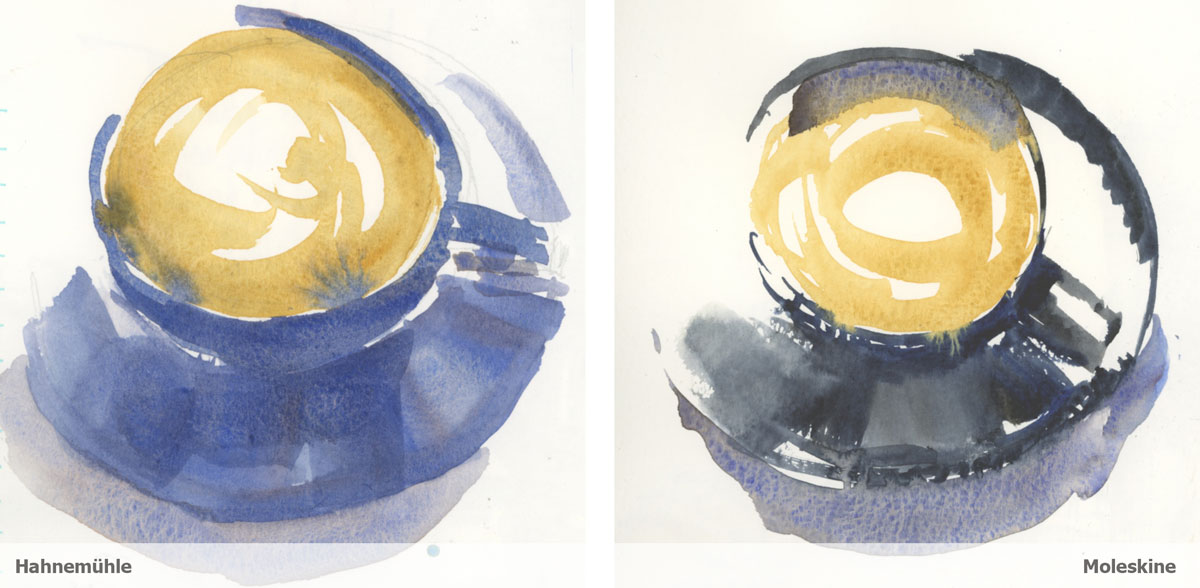
My morning coffee sketch is all about the ritual of starting the day in a way that gets my creative juices flowing. So I’m not trying to make a good sketch and in fact I often try to produce ‘disastrous’ results as I experiment with wet-in-wet techniques.
Overall I struggled getting results I wanted on the Hahnemuehle paper. I couldn’t get the textures in the one wash, and if I left my first pass to dry, I then wasn’t happy with the layered effect.
On the other hand the Moleskine textures that I can create (even if doing crazy things!) always make me smile. I can more easily create a wider variety of marks.
In summary…
So there you have it, a few side-by-side comparisons.
I’m not going to make a big deal about asking whether you prefer my Hahnemuehle or my Moleskine sketches (although of course I would love to hear any of your thoughts in the comments below) because ultimately it’s about what feels best for me. In fact, I’m guessing that many of you will prefer the smoother look of the Hahnemuehle because that is what you are trying to achieve in your own work! 🙂
But for me, the Moleskine paper always feels right – it is great to paint on, especially when I’m out on location. I can get more consistent results and it suits my crazy wet-in-wet techniques and approach to direct watercolour.
I really love the Hahnemuehle sketchbooks and I’ve been happy with the ink and wash work I’ve been able to produce using them. However the paper doesn’t suit my direct watercolour work as well as Moleskine, and I find that it’s harder to produce consistent results when I’m working wet-in-wet. I’m more likely to overwork a sketch on this paper than I am using Moleskine paper especially when I’m out urban sketching.
I hope that you have found this personal review helpful and that it encourages you to think more carefully about your own work and preferences.
Your favourite paper?
So what is your favourite paper to work on and (more importantly) why?
BTW: Answering the “why?” question is always so much more interesting than just a “what?” question, don’t you think?

19 Comments
Dear Lizzie May
I used an Hahnemühle expandable concertina sketchbook (Never used one before) in Venezia just prior to the lockdown before I got thrown out.. it was a little difficult to use because you need clips to hold it study. I found it excellent as I could wallop on the Daniel Smith paint It held the colour well.” Remember the Ducks !!!” I seem to be happier with Hot Pressed Paper as I frequently use pens along with watercolour. To be perfectly honest I have loads of Sketchbooks and definitely lean towards the heavier weight of paper as I had one that always buckled. So the favourites are in not in order of preference Moleskine, Hahnemühle, Stillman & Birn & Fabriano.. I was very disappointed in the frightfully expensive Etchr Sketchbooks. I found the paper heavy. I had to buy several so if you haven’t tried them I shall gift you a couple.. I hope all is well with you. Dougie xx
Hey Dougie!!! HOpe you are going well. Sad not to see you this year. I found the Etchr books diffcult to use too
https://www.lizsteel.com/review-etchr-sketchbooks/
I’ve never used the moleskin but from your sketches I like the look of the moleskin. It seems to give the best it both worlds by providing fluid washed while still being able to capture the detail as you mentioned in the tree. I’m still exploring my taste in paper And just ordered two of the Hahnemühle sketchbooks. I’ll try the moleskin next. I’m used to using arches paper when I’m not working in a sketchbook. Thanks for the info !
Hi Annette – if you are used to Arches then the Hahnemuehle will probably suit you better 🙂
Hahnemüle, is it a little bit like a blotting paper, not very possible to pass over many time … I can make mistake … I like paper which one hasn’t is effect because I like not only pass over to make crisper edges but also to be able to pull-out painting, to do some effects or fix a little bad mark …
I use on location Canson ArtBook 224g 6,5X8 inches or A5 size … very vibrant effect when dry … brush slide well on it … and texture of paper is like velvet over …
Thanks for sharing Lise – don’t really know the Canson Artbook
Hi Liz. Thank you for the info in this article. I had come to the conclusion it was the paint, and my use of it, that was causing the dulling. I hadn’t thought of it being the paper which I’ve really been in a bit of a rut about as I’ve not really given Moleskin a try.. It will be fun to try out something new. Hope you’re doing well!
Hi Sharon!!!! Hope you are going well.. sending you a big hug! While it is often the amount of pigment you have in your wash, paper can have a big effect too.
I gave up on Moleskin and Fabriano for different reasons.
Moleskin was completely inconsistent paper quality and that just didn’t do it for me. At that price I cannot throw the dice.
Fabriano PILLED almost immediately! AAACK! I complained to them, they sent me more journals, and they all did the same (now they are tests for ink colors and such.)
I’ve not done a side by side but I am all about textures and use a lot of primateks and have not noticed that colors are duller with a juicy wash or that it is hard to get textures in a Hahnemuhle Watercolor journal — or in their Zig-Zag journals. I like linework so rarely do direct watercolor, but have not ever seen a “blotter” effect with the H. paper. In fact, just this morning I pushed texture into a painting and it worked well… over an ink wash.
Kate, what did you mean with “pilled”? Thank you!
Thanks for sharing Kate. I remember your problems with the Fabriano. As for texture in Hahnemuehle – yes you can make some lovely texture on that paper… just harder for me to achieve what I’m after wet in wet (or wet in damp).
Liz, thank you so much for this blog article about Hahnemuele and Moleskine sketchbooks. I have only used my Hahnemuehle A4 so far. Maybe, I haven’t really tried to go really wet in wet in it. But when I read that you didn’t do much direct watercolour in it, I understood that it may not be the best paper for it.
I have been using my Goldline sketchbook with Clairefontaine paper 200 g/m for about two years. I cannot do a few layers of paint, and I prefer wet in dry in this sketchbook.
Last year, I purchased a Moleskine A3 sketchbook which feels a bit overwhelming right now, even if I am going larger.
Thanks to your blog article, I think that I’ll start sketching in it, playing with direct watercolour painting!
Hi Helena, ah! I have very fond memories of using a Goldline during a trip when I needed to buy an emergency sketchbook 🙂
Hi Liz –
I like the beta series Stillman and Burn and the Pentalic 140lb. They stay flat longer when I apply watercolor to the drawing. I usually do a quick pencil sketch then add the watercolor, let it dry and use Pitt pens to ink over the watercolor for the finished drawing. During the 30×30 direct watercolor challenge in June I Cut smalller sized pieces from sheets of Arches hot press paper and and an old Whatman cold press paper I bought years ago. I liked the former for more detailed work and the Later for distant landscapes. It was interesting the try them both.
Cheers! Lindsay
Hi Lindsay – thanks for sharing. Interesting that you like both of those books ad they are very different. Love that we are all so different
Hello Liz,
Thank you for this review. I have used both Hahnemüehle and Moleskine. I have the same experience (sometimes frustration) with the Hahnemüehle, as it is hard to work wet in wet, the colors blend becoming one and it is difficult to create hard edges. I used a Hahnemüehle 300g for my virtual tour earlier this summer and I love the paper color and weight, but you need to wait till it dries to apply a second layer. It is great if you are working at home from photos and can take the time for the paint to dry. I am using a Hahnemüehle 200g watercolor notebook for my outdoor sketches, outside of this course. Same comments, regardless of paper weight.
For this class I am using S&B Beta for the first time. Not totally crazy about it, but it may be too soon to judge. Working wet on wet can also be challenging. It will take practice on my part to create the effects I want. That’s the fun of it.
I enjoy Moleskine, which I used last year for my travel journal. It is easy to work with, both wet on wet or layering. The surface is too smooth for me, but that is not a problem. I like the way the colors stay vibrant.
Just today I have received 3 watercolor notebooks from Laloran, near Lisbon. They are handmade and I think they use Clairefontaine paper. I have them in 220g and 180g. They have some fine texture and I look forward to using them.
I also have a notebook from Escoda 200g waiting in the wings. It also has a bit of texture. I like notebooks with a bit of tooth because I really like the dry brush technique, which is not as easy to produce on very fine or smooth grain papers.
All these notebooks can be used to paint on both sides of the page, as there is no difference in texture. None of them buckle either.
Hi Isabel – thanks for sharing! I really need to try some Laloran!!! Looking forward to hearing how you like them
I like your results in the Moleskine! The colors are more vibrant! At the moment I’m working in my Hahnemuhle but I have also a moleskine A5 portrait sketchbook and I think I like the paper of the moleskine also more! For a normal sketchbook I also prefer using a moleskine sketchbook.
Thanks for sharing Marleen. Yes the colours being vibrant is a big deal for me!
NEWSLETTER
Subscribe for first notification of workshop + online classes and more.