Last week, a number of people asked about what I used to mix the grey greens in my recent blue gum sketches and so I thought it was time for a little update on my colours and my use of the Folio palette by Art Toolkit.
A little while ago I published an article on the difference between yellow ochre and raw sienna (see here) which explains my recent inclusion of Yellow Ochre in my palette.
In summary, I started using YO on my big Road Trip in order to achieve lovely grey greens of the gum trees in western NSW. Raw Sienna when mixed with blue (in particular French Ultramarine) creates a grey which is more useful mix for me as I sketch a lot of buildings. Note: I use Daniel Smith Monte Amiata Natural Sienna (MANS) as my raw sienna.
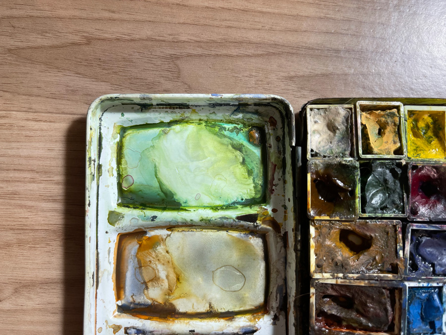
As I don’t have a spare spot on my palette for YO I’ve simply gotten into the habit of squeezing a little dob into my green mixing well (ie. the well in my Derivan palette dedicated to mixing green – see more about how I use my mixing wells here).
During my recent two-week break (exploring my LGA – Local Government Area) I used my Folio palette by Art Toolkit whenever I was sketching away from home (in the bush or in my car). I started off doing the YO dob trick, but I was using up the paint in a single day!
However, I discovered an alternative… by simply using MANS in my green mixing well (with remnants of other green mixes still there) I was able to get lovely grey greens. Just the tiniest bit of remnant green paint was enough to get the result I wanted. As I use plenty of water there is little risk of creating mud even though my washes definitely have more than 2 or 3 pigments in them. (Many of you know all about that already from my Watercolour course, don’t you?)
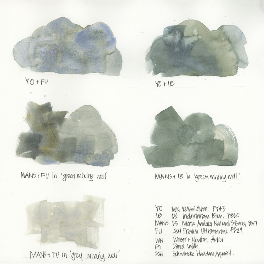
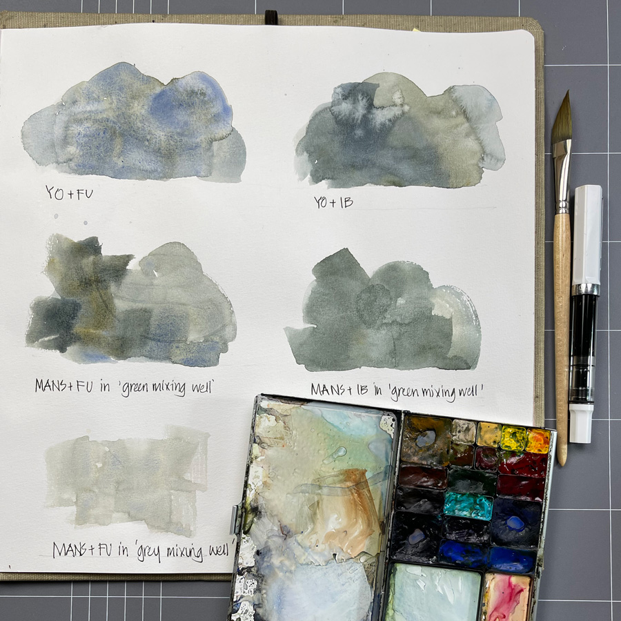
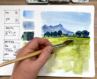
And so for most of my two-week break I was using MANS with French Ultramarine and MANS with Indanthrone Blue for my greens. Here is a scan of the mixing comparison.
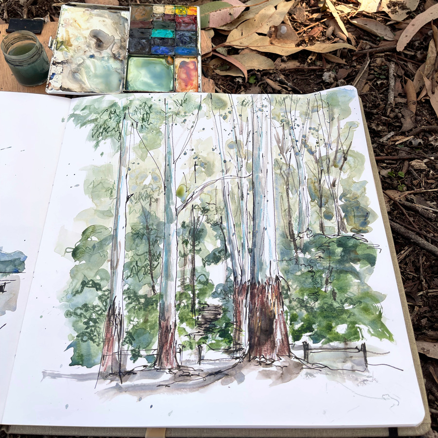
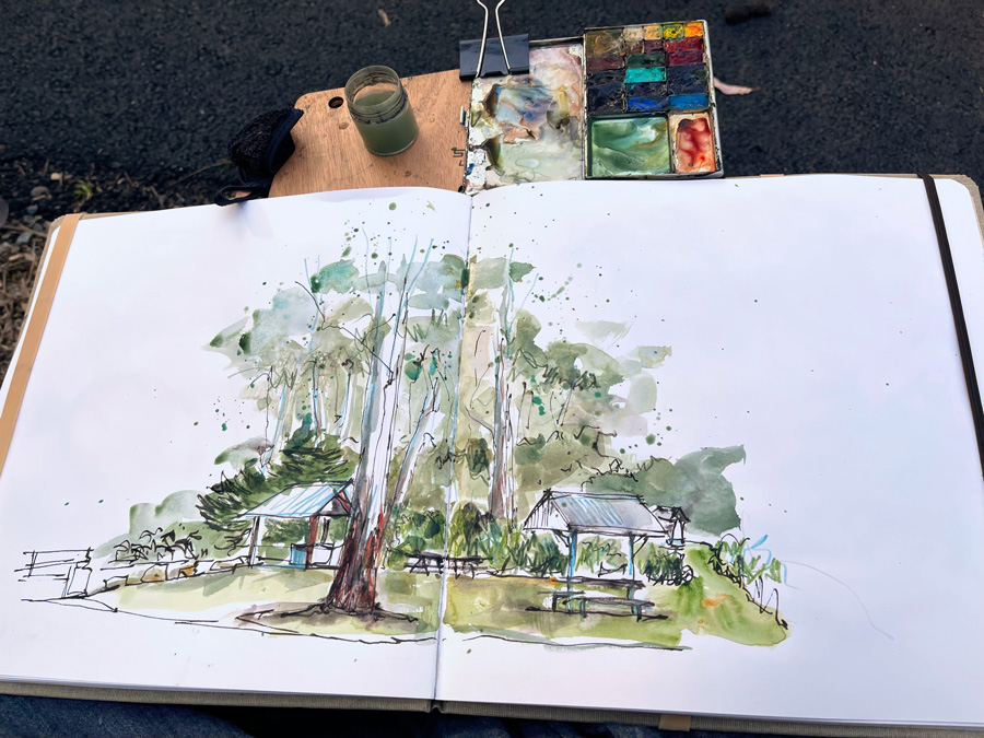
The washes on this page are not as exciting as the ones I was able to get on location so here are a few samples from my sketches. You can also see a little Sap Green, Cobalt Turquoise Light and watercolour pencil in these images.
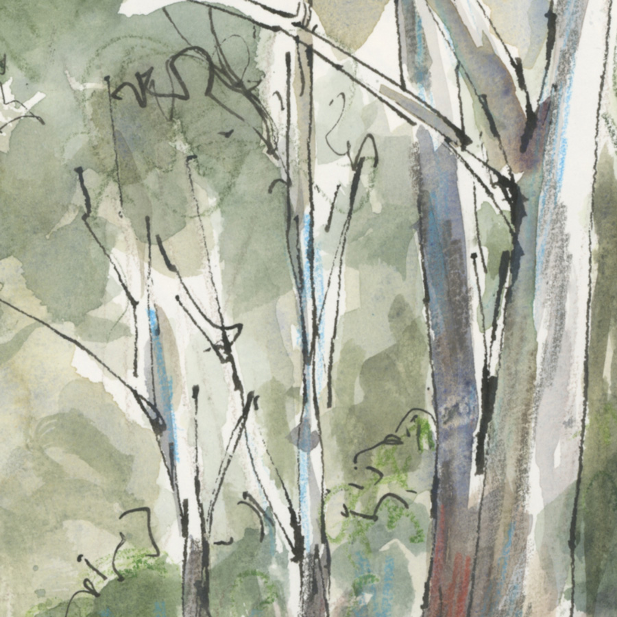
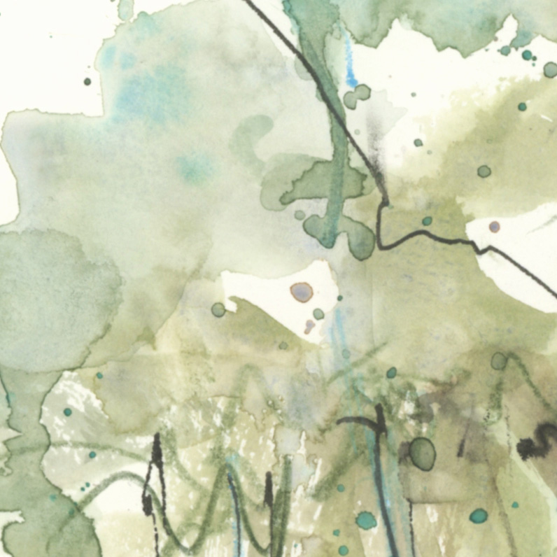
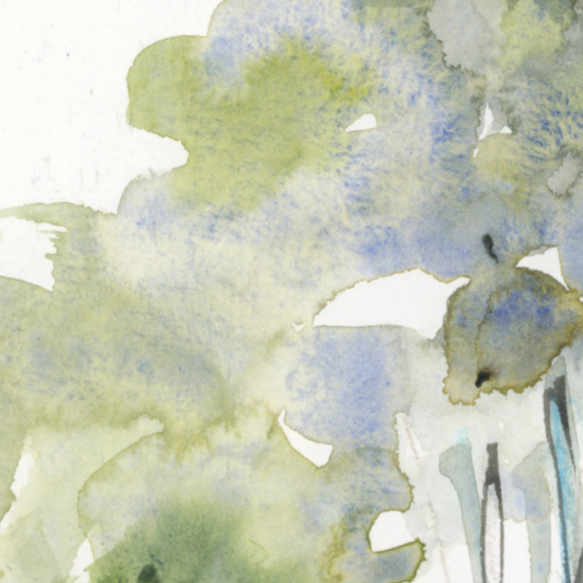
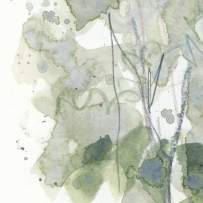
It’s nice to see these fun washes up close, isn’t it?
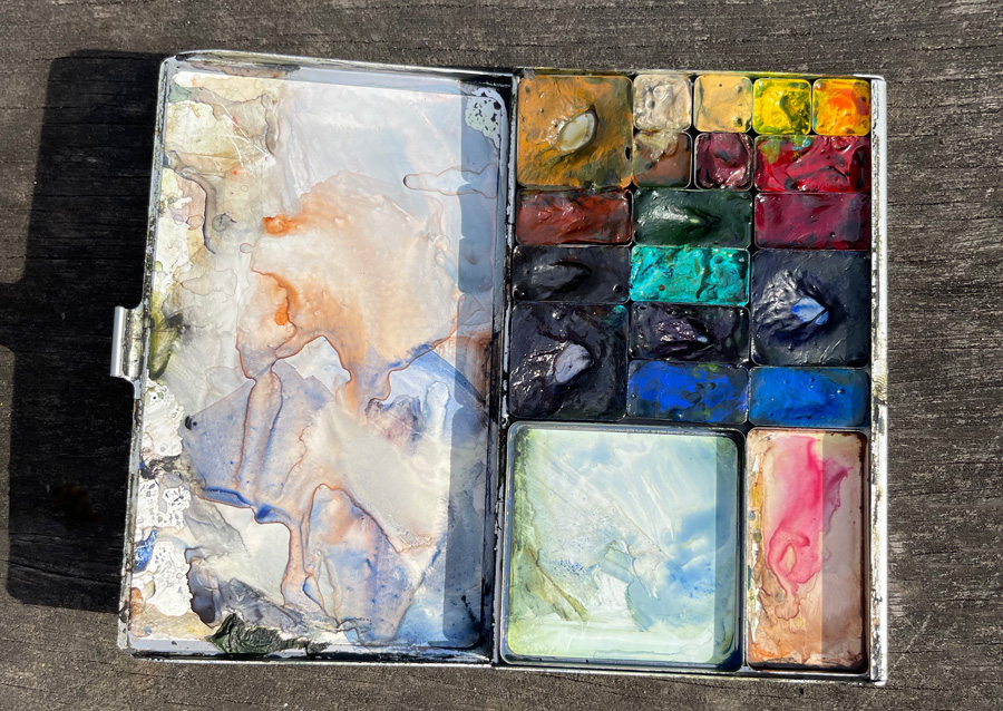
As for the Folio – this is a photo of its state after two weeks of good use. I’m loving it!
The mixing areas are working well and I’m surprised at how much paint the pans hold. I’ve done a fair bit of sketching in the last two weeks and still have plenty of paint!
Refilling these pans is a little fiddly and you can see that there is a little spread between colours. (I’m a messy painter!) But these are the only downsides that I can think of. You can read more of my initial thoughts about the Folio here.
I think that this is going to become my go-to Sydney palette. If I go on a big trip for more than a week, I will stick to my usual palette since it’s easier to carry spare pans, but for everyday sketching in my local area, the Folio is perfect.
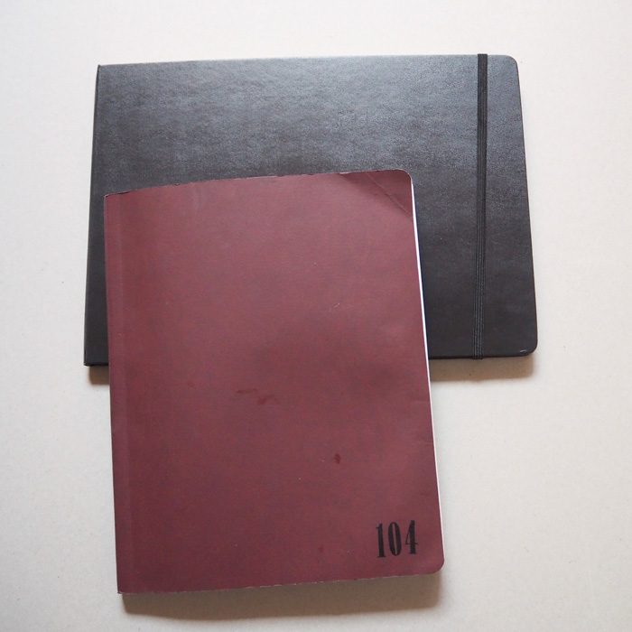
To finish, here are a few photos of my folio in action with my Stablo and large square (30x30cm) Clairefontaine Goldline Natural book. You can see the dob of Yellow Ochre in the first photo.

2 Comments
My Pocket Palette and Folio Palette are now my most used kits! The pans are much easier to fill if you place them at the end of a bar-shaped magnet — holds it steady.
Love your green greys!
THanks Vicky – that is such a good idea and would help a lot!! thanks!
NEWSLETTER
Subscribe for first notification of workshop + online classes and more.