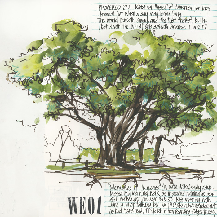
Sometimes I just feel the need to sketch something green! It is easy for me to get stuck in a rut of drawing lattes (or cups of tea), simple line drawings and the occasional building, but never get around to sketching anything natural! As I flip through the pages of my sketchbook this imbalance can become very obvious.
A few weeks ago I knew that this was indeed the situation so I was very pleased when Jane Blundell (with whom I was catching up with) suggested that we sketch this tree near Mosman Village Green. This was fun to do, not only because it was an example of reflex sketching (ie.we were having a non-stop conversation) but also because of all the memories that flooded my mind as I painted. I worked in Mosman for many years and sat on the benches around this tree many times at lunch. I love the way that memories become encoded into sketches!
As for using greens… “Greens are hard” is a common phrase in the art world. Do you find them hard?
Whilst there is much I could do to improve my use of greens, I am happy with my current selections and it rarely crosses my mind that greens are any harder than any other colour. There is a lot of very unnatural ‘straight out of the tube’ green paint on the market, but once you work out a few reliable mixes it is a lot easier.
I plan to do a follow up post with a few of my favourite green recipes, but in the meantime I would love to hear from you. Do you find greens hard? What greens do you have in your palette? What are your favourite mixes?


19 Comments
As a sketcher I want to carry a small palette but at the same time be able to use shortcuts, so Serpentine Green comes i handy. It looks natural on its own and can be quickly modified. I also carry round Phthalo green and Undersea Green if I have space in the box.
Greens are difficult & I’m primarily a landscape artist! I have two greens for convenience sap & Zoisite genuine ( Dan Smith) a great granulating dark green. I vary using yellows or blues. I love Phthalo Blue & Vermillion for a great grey green for eucalypts & distant trees.
I love greens and do not find them hard. One of my favorites is phthalo blue with some Mission’s Burnt Sienna [not a good sienna, but a great mixing gold] I also like cobalt blue with Hansa yellow lt. I’ve spent pages mixing green charts with all my blues and yellows. Takes time, but when I need a specific feeling, I can look up to the charts and find one using the palette I happen to be working with.
I love green, it’s one of my favourite colours, but recently in my acrylic painting class we worked on a monochromatic scheme in green, only using shades and tints, and boy was it hard!
I’m going to try to work on the same idea using watercolours, so I’m taking notes from all the other comments here to use for a starting point, since I’m new to this!
My favourite is quin gold and either pthalo blue or indigo. You can get a great variety with these plus sometimes a little yellow. Much better than a tube green.
I actually enjoy greens, particularly since I took a whole class in mixing greens about a year ago. Sap green is always on my palette as is Phthalo green, but during that class I discovered DS Undersea Green, which I keep around to tone done overly bright mixes.
Greens are tricky, because you tend to think of nature, trees, leaves and grass as much greener than they actually are. Just like a child “knowing” that trees are green. But you don’t need to use a bright green to convey the message. Muted green-grays, browns and such can look like a natural green in the context of a whole painting.
My go-to greens are Sap and Olive. I vary them by adding yellow ochre, burnt sienna, cobalt, ultramarine blue, Payne’s gray or any red. I’ve recently discovered Earthen Green, an American Journey watercolor, and it’s very natural-looking straight from the tube. I find I’m using it a lot lately, too.
I mix a lot of greens, but one of mine that is can’t-do-without is an electric yellow green by Holbein called Leaf Green. It is brilliant, in both senses of the word. Pizzazz to spare.
When I painted in oils, I loved Ivory Black and Cad Yellow Light, that mixture creates very natural leaf greens.
I find that one of the problems mixing “greens” or other colours is that many of us have trouble identifying the actual colours that we are looking at. So we pick up the wrong pigments to try and match the colour and get frustrated. Olive green for instance is not a green at all but a low value low chroma yellow.
The turning point for myself and an eye opener for my workshop students is an understanding of Munsell colour. It helps in true colour identification, proper complements and an understanding of visual colour space which leads to better pigment choices resulting in truer colours being mixed.
I am interested in drawing from nature and live in west coast Canada – it is a world of greens. I think for me greens feel challenging because there are so, so many of them here. And it turns out, colour matching is important to me! I am journeying through my paints with a wonderful course in modern colour theory, and I appreciate your use of the word “value” in your colour description. I find value is often mentioned and then kind of brushed past as chroma and hue receive more focus. If you have any suggestions for online watercolour courses on mixing the colours (greens in particular, if possible) that you see, I’d love to know!
I love greens and mix my own so that they fit into the rest of the sketch. My travel palette usually includes 8 pigments: cad. red light & quin. red or magenta; cad. yellow & quin. gold; ultramarine blue & phthalo blue; turquoise; and quin. burnt orange. This gives me 3 yellows and 3 blues; any pair of the hues will work, depending on the rest of the sketch. A touch of a red or the burnt orange will gray the color nicely.
thanks for all the replies! I am loving reading these!
One of my favourite dark greens is Quin burnt orange and Prussian blue… also like Daniel Smith green gold for some bright punch!
How about Daniel Smith’s Green Apatite Genuine….nice and natural
When I lived in Seattle I used a good bit of Hooker’s but now living on the other side of the states it just doesn’t work. I think a lot depends on your surroundings. Love to mix greens and am excited to try some of the suggestions in these posts.
I’m the opposite and mostly drawing or painting nature. I haven’t thought about greens… but I don’t strive to get the most realistic colours I rather go for the overall image.
I like to use Daniel Smith Prussian Blue with their Rich Green Gold, Quin Gold or Hansa Yellow Medium. Prussian isn’t as potent as Phthalo, but I like that it’s a little redder, and richer. I keep Phalo green in my palette to mix with Trans red oxide, or sometimes the Rich Green Gold. The RGG also functions as a cool yellow and a glaze for me.
In the UK for most of the year greens are quite muted and I was taught to mix a tiny bit of black into yellows rather than blues. These days I tend to use a three colour mix, indigo and a brown to make a dark grey then drop that into hansa yellow med,, raw sienna or Sap green. All Daniel Smith colours.
NEWSLETTER
Subscribe for first notification of workshop + online classes and more.