If you have missed it I am doing a few workshops down in Hobart and Launceston soon! This post gives you an idea of some of the things I will talk about as I share my top tips for sketching on location and what is so great about sketching your life!
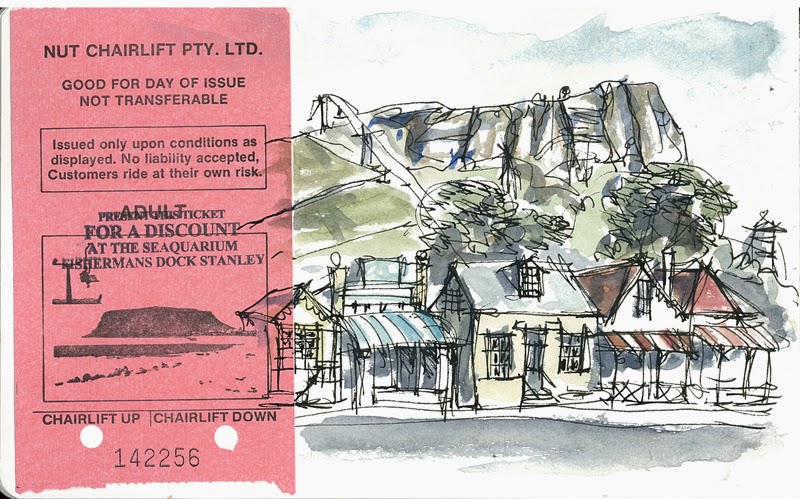
I can’t help thinking about how much my work has changed since I was last in the “Apple Isle’ (is it still called that?) I thought I would share a few sketches from my trip in Sept 2008…and do a little reivew!
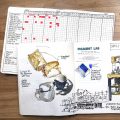
My very first sketching trip was in 2007 when I went to Europe with a friend, but this Tassie trip was the first time I went away for a full week all on my own, and the first time a trip was totally dedicated to sketching. I filled the moleskine sketchbook (A5 landscape one) in that time and recorded everything I did in sketches.
See all the sketches from my 2008 trip here.
A few things that come to mind while looking at this sketchbook again…..
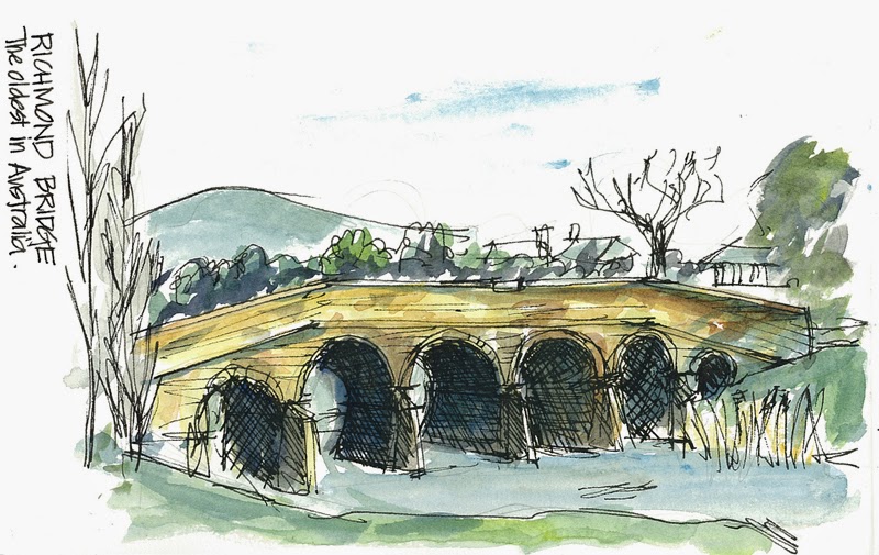
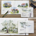
I used a lot more linework – my lines were sketchier (more like my thinking design sketches) and there is a lot of cross hatching to define the areas of light and shade.
Generally a lot weaker and watery watercolour wash (I hadn’t got ‘juicy’ in my head. I didn’t get that concept till 2010 when I was in Kansas City and saw Kate Johnson’s work in real life) But the quick, bold brushwork is there (quite a bit of overworking too!) I was definitely more a drawer than a painter back then!
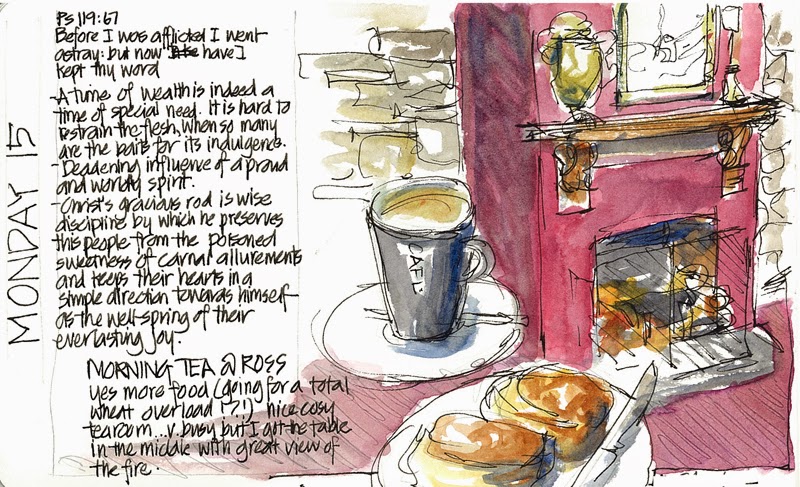
The theme of food and architecture is quite strong – most of my meals have been recorded.
Most of you will be very surprised there are more coffees than teas in my sketchbook – 5 coffee sketches vs 1 teapot sketch (at breakfast) This was before my tearoom obsession started and I never ordered tea when I was out (against my principle to pay for a pot of hot water with a teabag!)
But hey there were some scones sketched!
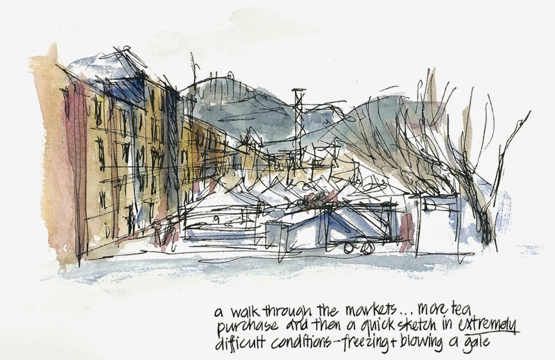
The desire to try to sketch in crazy conditions – freezing cold, blowing a gale – and these impact on my linework.
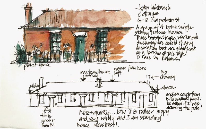
…I realised that doing the details first helped me doing the big sketch.
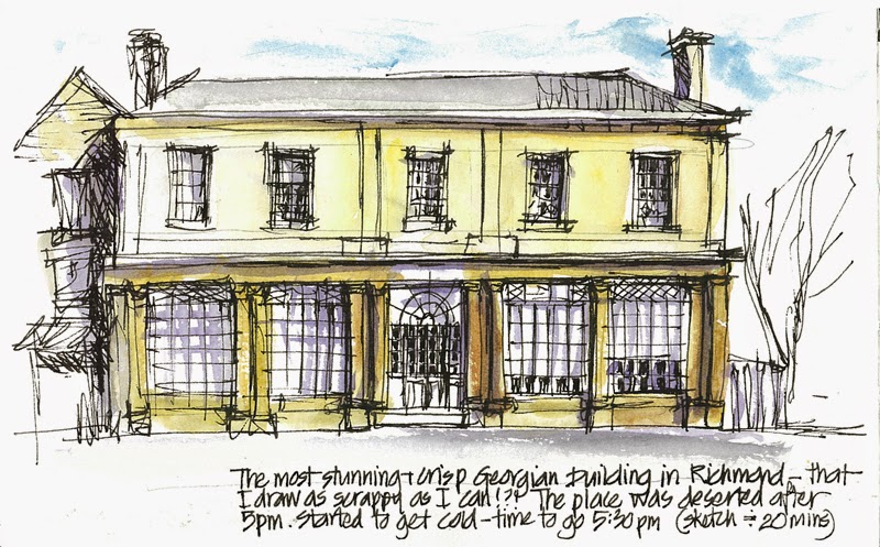
I was scared that with my ‘scrappy lines’ I wasn’t doing justice to the elegance of the Georgian architecture.
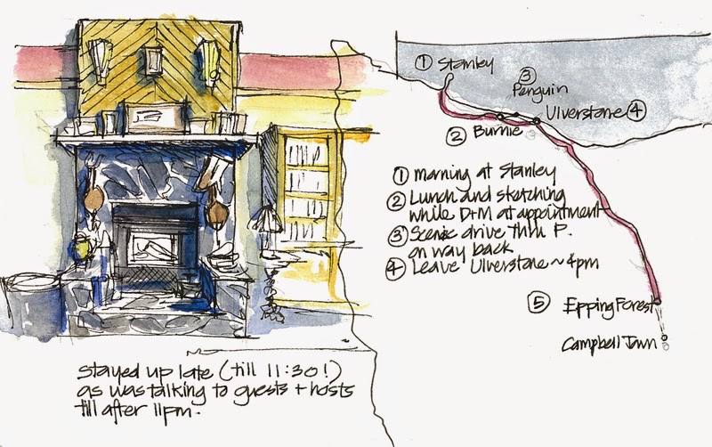
Was happy to sketch in the presence of others – sitting around the fireplace in the B&B I was staying. ..and of course I love drawing maps!
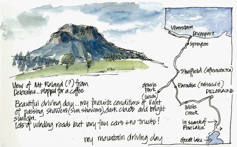
;
Smaller quicker sketches were sometimes more satisfying than the bigger ones
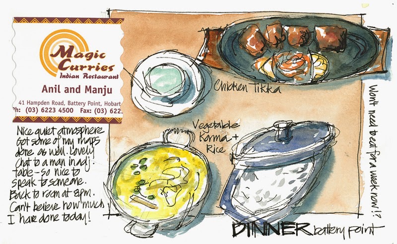
Discovering the truth of this statement: “You are never alone when you have a sketchbook” Having dinner by myself at an Indian restaurant – a nice guy from the table next to me (who was having dinner with friends he hadn’t seen for ages) sat at my table with me for 15 minutes looking through my sketchbook and chatting “better get back to my friends!”
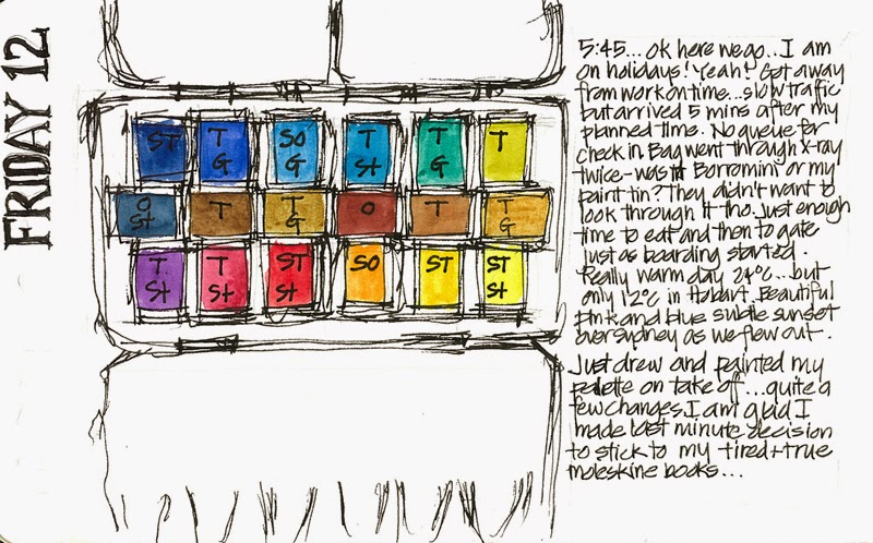
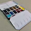
Finally (which is actually the first page in the sketchbook) …I was obsessive in learning about paints. This palette was the result of reading Jan Hart’s great book Watercolor’s Guide to Exceptional Color
I think you get the idea… not much has changed in principle- hey?

And here is a photo of my palette and a very clean water container and a young-looking BB!



2 Comments
Oh how I love your sketches! I always love line work in art…maybe because I so love DaVinci's drawings and paintings. Somehow, the line work lends to that same sense I have from his work. I don't know. No matter, I'm just glad that I refound your blog because I love seeing the variety of sketches you do. Love that red color wash too. I bought a bear for myself that I've named Fergus. He is apparently Borromini's twin, which I did not realize when I bought him (at an antique mall). He sits on my dashboard.
I enjoyed reading through your memories here! (especially the part about sketching with Kate in Kansas City — fun memories of my own!) So how come I have sketched with her in person for years and STILL have not quite mastered that "juicy" wash concept?? Mine aren't what you'd call weak, but the water ratio is still not right.
I looked for a copy of the book you mentioned by Jan Hart — it lists for nearly $100 now! Out of my range, sadly. Sounds like one I'd read over and over, color junkie that I am.
NEWSLETTER
Subscribe for first notification of workshop + online classes and more.