Welcome to the final part of my current series of Fountain Pen Sketching where I will be sharing about my second favourite pen and much more!

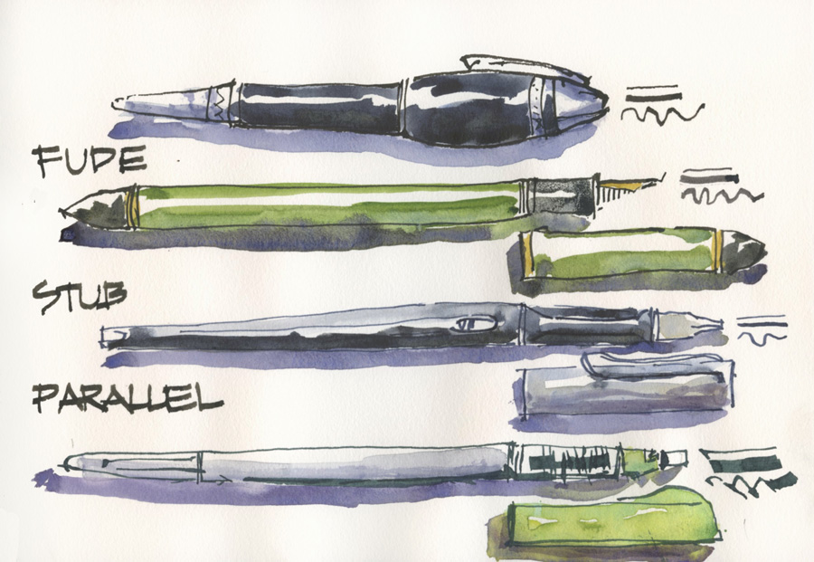
If you missed it, in Part 6, I introduced the types of pens which give some good line variation and looked specifically at flex nibs and brush tip pens. Now I want to look at calligraphy nibs – stub, parallel and fude. I will also be referring to these terms – pen angle, nib angle, nib tilt and pressure – which were explained in Part 6.
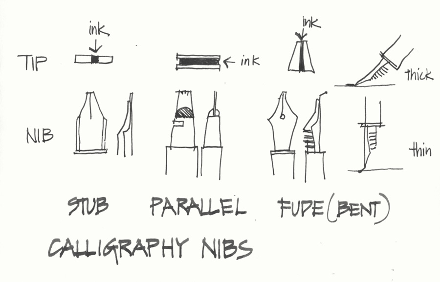
These three types of calligraphy nibs have different designs which result in different methods of sketching. The more you understand about each pen the more you can get out of it.
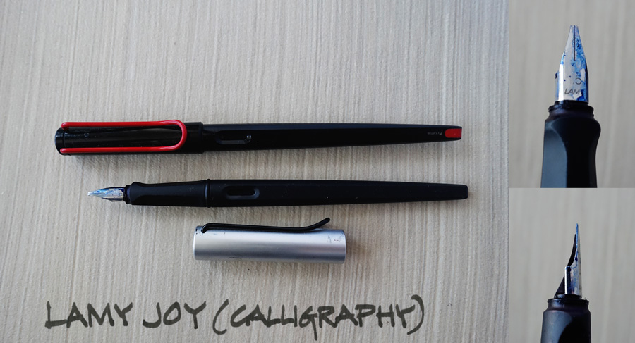
Calligraphy Stub Nibs – Lamy Joy
Current List Price* ~$28-36
Full Range at Goulet Pens here
Special ‘Liz Steel Packaged Set’ including a calligraphy nib and a standard nib here
Well, you all know by now that I am completely addicted to using my White Joy for drawing, but that is with a standard style nib, not the calligraphy stub nib that the pen comes with. There are many other brands of calligraphy pens/nibs and Goulet make their own which can fit into a number of different pens including the Noodlers Konrad or Ahab (video explaining that here). So although I have photographed my Joys (the Black Joy and the AL Joy) my comments are relevant to any brand of stub nib.
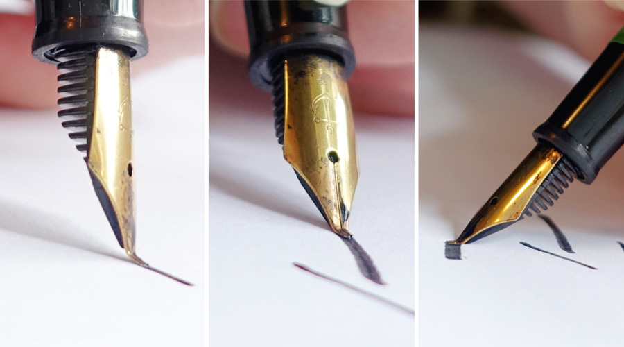
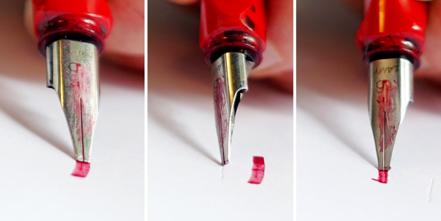 Stub nibs are designed to be used so that the full edge of the nib is on the paper. If you tilt the nib the slit (where the ink comes out) will not touch the page resulting in no line! But if you vary the angle of the nib in relation to the direction of the stroke you are drawing, the thickness of the line with vary.
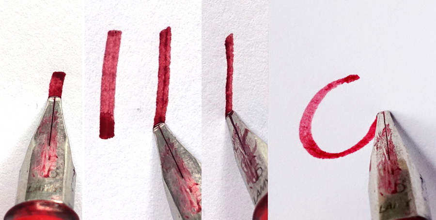
Understanding the relationship between the nib angle and the direction of stroke is the key to using a stub nib. And the really exciting part happens when you draw a curved line – you will get beautiful ‘calligraphic’ variation without doing anything! I know this is fairly obvious to a lot of people, but sometimes being reminded of basic principles can really open your mind up to new possibilities.
So you can pick up a calligraphy nib and just draw normally and you will get some lovely varied lines. However if you want to control which lines are thick and which are thin you need to be more deliberate about your nib angles eg. change to a sideways grip and pull the nib across the page horizontally to get a broad horizontal.
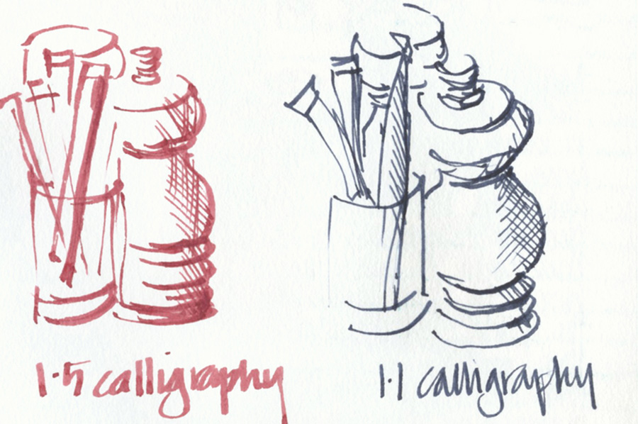
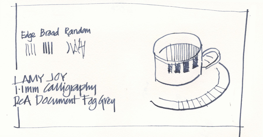
I like using either the 1.1 or 1.5 size. but 1.1 is my preference as I can write normally with it as well. But which nib size will suit you depends on how thick you want your lines. Here is a quick comparison I did the other morning while waiting for my coffee.
The major limitation with using a stub nib is getting a consistent thin line for anything other than a straight line… and this is where the parallel pen comes in handy.
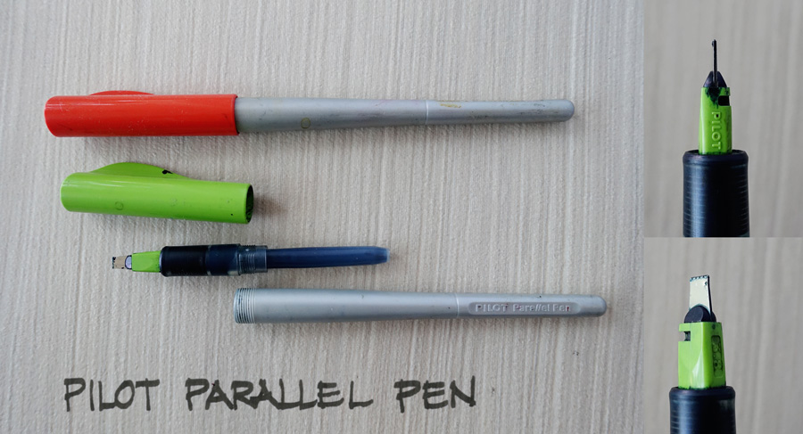
Calligraphy Parallel Nib – Pilot Parallel Pen
Current List Price* ~$10
Full Range at Goulet Pens here
The Pilot Parallel is a very cool pen in which the nib is delivered in between two parallel plates. The great advantage for sketching is that you can draw on the corner of the nib and get a consistent crisp line as the ink comes out of the corner of the nib exactly the same as it does from the centre.
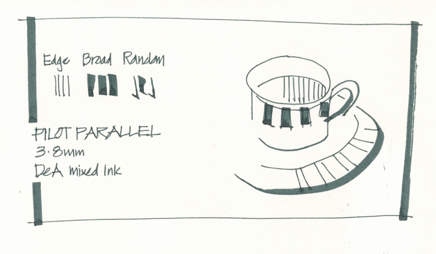
Now, I could have done an example with a 1.5mm parallel pen so that you would have a useful comparison with the stub… but instead I have done my pen test with the 3.8mm which gives me very crisp fine lines and crazy broad strokes. For some reason this is the size of Parallel Pen that just does it for me – not a complicated reason but it just feels right.
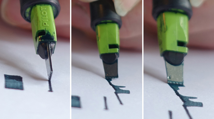
If I am are not careful with the position/tilt of the nib I can end up with some crazy lines – hey, why be careful – these lines are wonderful! So this size parallel pen gives me great thin lines, great broad strokes, crazy random lines and not much in between.
UPDATE: How could I have missed mentioning this initially… one of the VERY cool things about the Pilot Parallel pen is the hack to convert it to a ‘folded pen’. Check out this video by Parkablogs – maybe something for me to do over the Xmas break
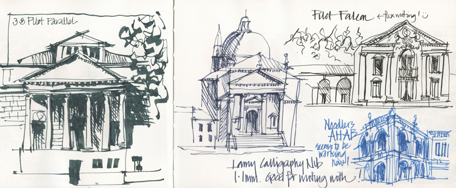
I first bought this pen after to seeing the great work of my friend Josu Maroto a number of years ago but it has been neglected of late. I think I will get back to using it as I love the dramatic effects it creates. Here is a comparison with some other nibs (click to enlarge).
Fude (Bent Calligraphy) Nibs
These are my favourite variable line pens and if I could only have 2 pens it would be my White Joy and my Green Sailor – but I will discuss the fude nib design in general before looking at the various pen options.
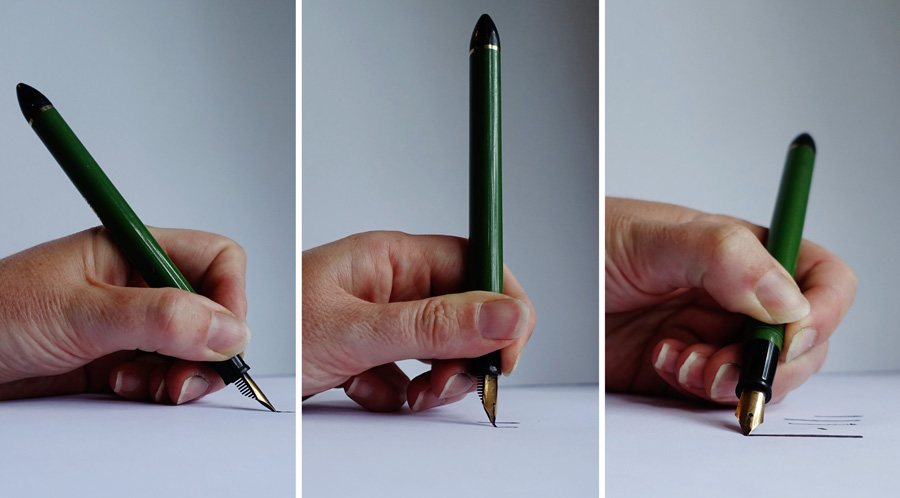
The fude nib is bent upwards to create a wedge shape tip (as per diagram above) and the basic principle is that changing the pen angle will change the thickness. Fine lines can be achieved by holding the pen vertically and using the tip. As you lower the angle of the pen the line will get thicker because more of the wedge is on the page. The thickest stroke is achieved by dragging the nib sideways. Like a standard nib you can get even finer lines by drawing with the nib upside down.
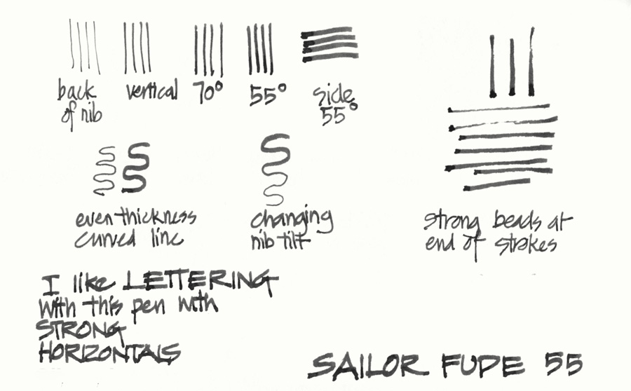
There is not as much calligraphic variation (thick to thin) within a single curved stroke as you get from a stub or parallel nib but this means that it is easy to get a fairly uniform thickness which is handy for sketching. I am interested in exploring whether I can achieve calligraphic variation by changing my pen angle in a single stroke – at the moment this pen movement is a little challenging!
Fude nibs have a tendency to leave a nice bead of ink at the end of the stroke and this is particularly the case with the Sailor pens due to a lesser ink flow.
Using a fude nib involves mastering a completely different hand movement to the other nibs – one of changing the pen angle depending on the thickness of line you want to achieve. Surprisingly. I find that this is more intuitive for me than increasing the pressure as with a flex nib. However, one interesting feature of my own use of fude nibs is that because my natural pen angle is 45 degrees, I end up with sketches with thicker lines than normal. This doesn’t bother me as I love ink drawings but they are a lot heavier! Drawing with a more vertical pen angle is just not instinctive to my loose drawing style – more about this at the end.
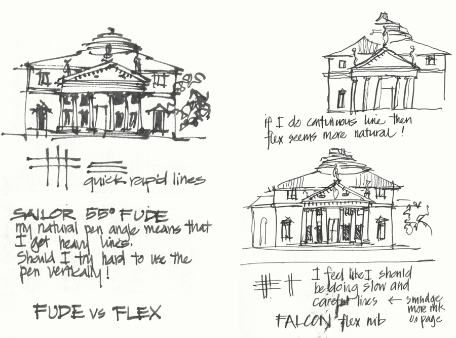
So how does fude compare with flex?
What I have discovered is that a fude pen with the expressive marks (caused by the shading and beads at the end of the strokes) and the greater variation in width suits my strong rapid architectural lines better than a flex pen. When I use a flex pen I feel the need to slow down and this really doesn’t suit my lines – particularly when I am sketching architecture. Possibly other subject matter with more curved lines would be different. The best way for me to use flex at the moment is to sketch with a continuous line which seems to allow me to respond with pressure better.
Ok, now onto the different pen options…
Hero and Duke Pens
Approx price: from $5 on ebay or Amazon.
Search for ‘Bent nib’
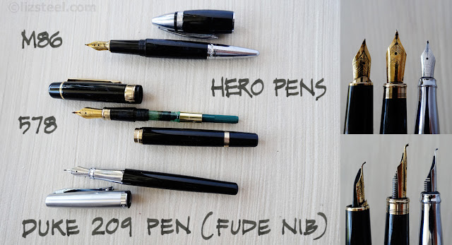
Using a fude nib for sketching was something that came to my attention thanks to the Urban Sketchers in Singapore – they mainly use Hero or Duke pens. These pens are made in China, are very affordable but the quality can be patchy- but I haven’t had any problems with any of mine. They are readily available on ebay or Amazon. All these pens have nibs with an upturn of 55 degrees – the greater the upturn the thicker the line.
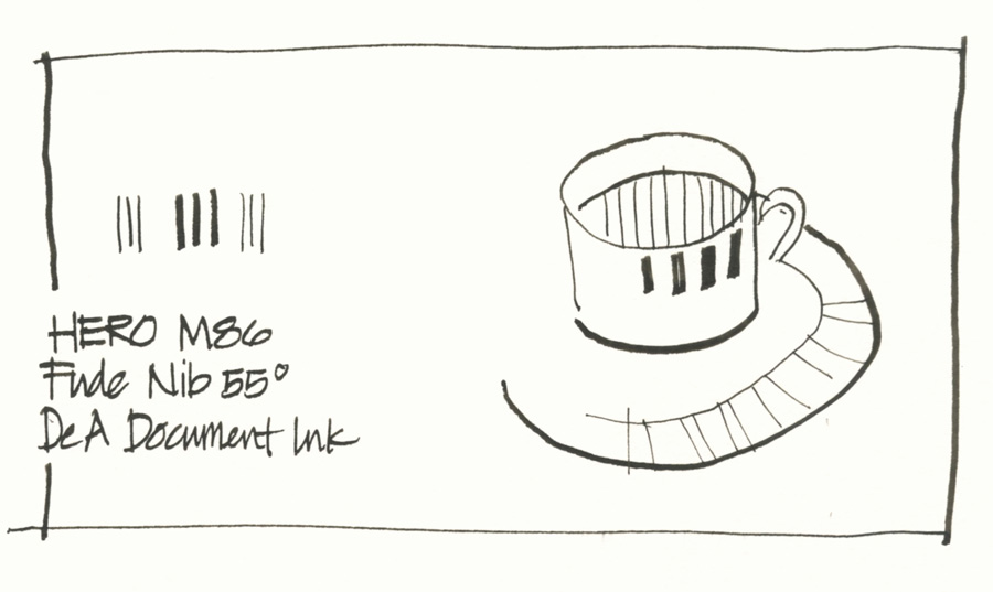
The two most popular models are the M86 and the 578 models. The M86 is one of the more lightweight Hero pens (it is still a solid pen) and even though I am very sensitive to pen weight, I find that the tapered design sits comfortably in my hand.
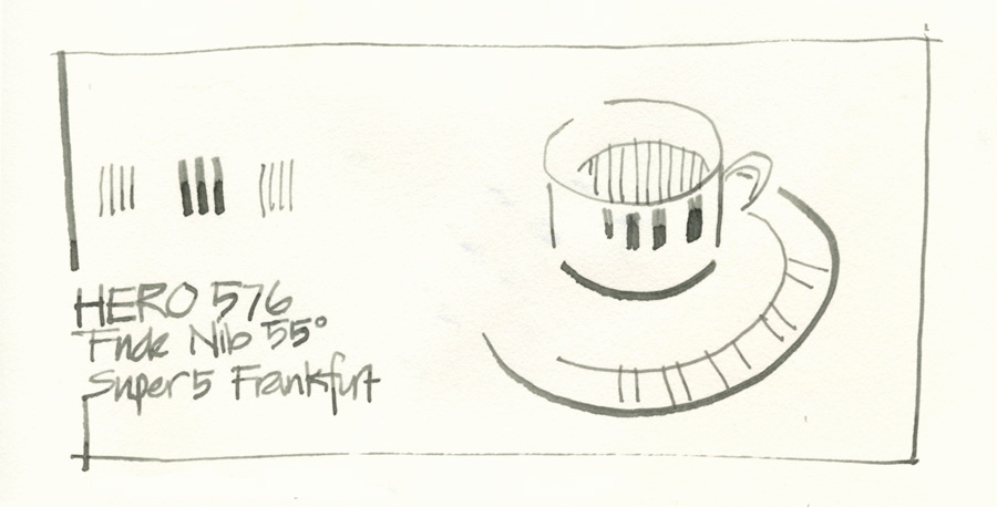
The Hero 578 (not 576 as per my handwriting!) pen has a bigger nib (more variation!) but is a much heavier pen. I really like the nib in this pen!
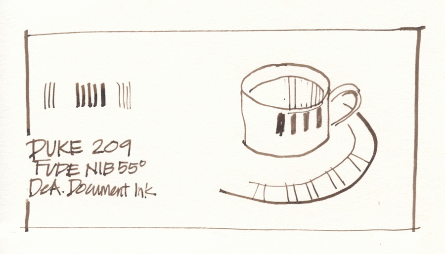
The Duke 209 is a much lighter pen and most popular is a stainless steel model which I found was very slippery to hold. I managed to find this black version on eBay, and as I often hold my pen in the barrel section, it is much better to use. The word on the street is that the quality of the Duke pens is better than the Hero pens – but please let me know if you have a different experience.
I haven’t used this pen a great deal but the flow is great and the nib very smooth.
There is also the Duke 551 Confucius Compound Art Pen with a huge upturn to the nib (oh ah!) but the pen body is massive and very heavy so just not an option for me – if I could find a lightweight pen to put this nib into I would!
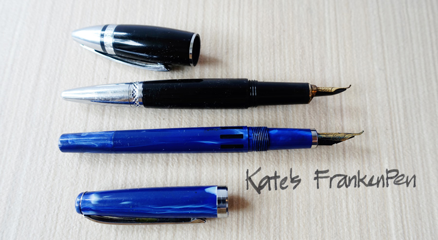
The main issue with the Hero pens for me is simply pen weight so I have gravitated to the Sailor version.
However, Cathy Johnson recently reminded me that she puts a Hero nib inside a Noodler’s Nib Creaper (details and step by step here, here and here) so I just did that yesterday and am excited about giving it a go!
For more about the different Fude Pens see Parka’s comparison
A short video by Cathy Johnson showing some marks
Sailor Fude Pens
Approximate price: from $10 on Amazon here or here
Sailor have a number of different pens with fude nibs:
- My First Fountain Pen – link to Parkablog review
- Sailor Profit Fude De Mannen fountain pen – link to Tina Koyama’s review. This was the first Sailor Pen I bought but haven’t included it as it has the same nib as the Green Sailor.
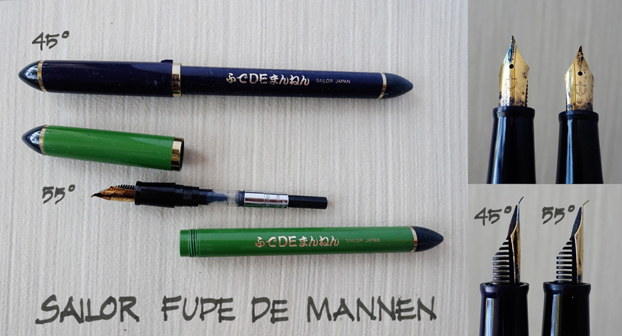
- Sailor Fude de Mannen 45 degrees – Blue
- Sailor Fude de Mannen 55 degrees – Green
- There is also a gold nib version… sigh! I am not going to make any further statement about that but will wait till Tina adds something about it in the comment section!
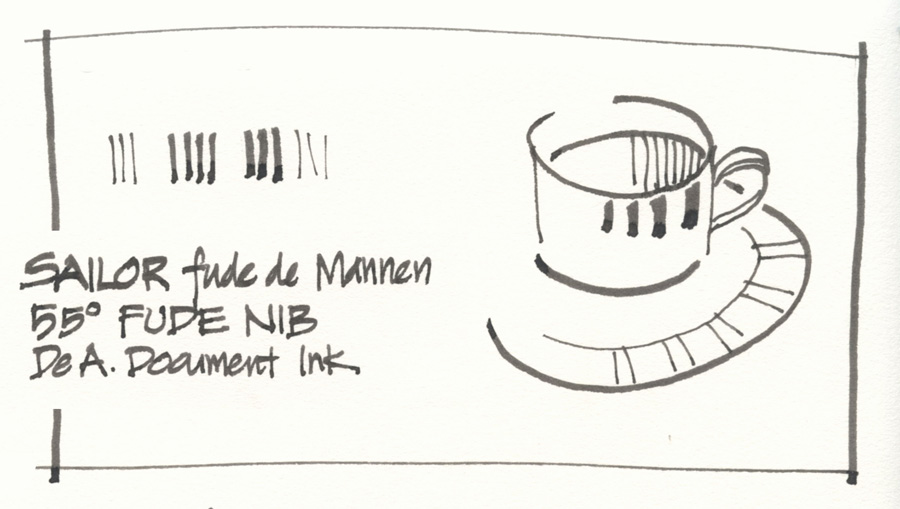
The Sailor pen is much lighter in weight and has a lovely long barrel. Not only for the reasons of comfort, but I feel that a lighter pen makes my strokes looser! This is the main reason why I use Sailor over Hero or Duke.
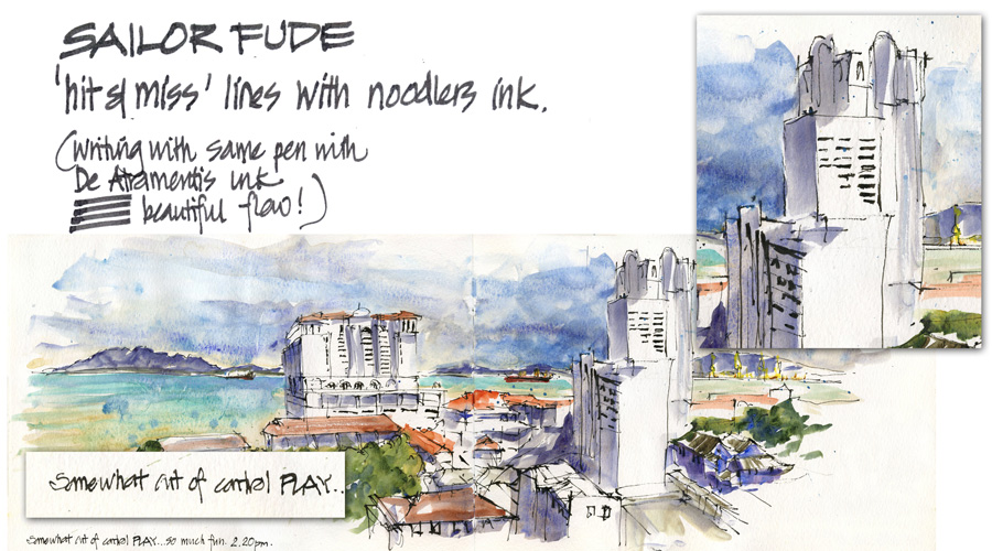
The Sailor pens don’t seem to be as smooth or have as good a flow of ink as the Hero/Duke pens. Parka in the above review demonstrates this, and honestly I had real trouble getting my Green Sailor to work initially. I was using Noodlers Bulletproof Ink at the time and decided to just bite the bullet and start using the pen even though it was not giving me consistent lines. I ended up liking these expressive hit and miss lines a lot as you can see in the above Penang sketch (click on image to enlarge). However once I replaced the Noodlers with De Atramentis Document ink the pen just started flowing beautifully – it was amazing what a difference the ink made! I have subsequently acquired a few more sailor pens and they have worked perfectly for day one filled with De Atramentis.
There is a controlled flow of ink through the feed resulting in lines with a lot of shading and dark beading at the end of every stroke- ie. black ink is more translucent – the lines dry quickly! This is not a big deal for me – in fact I LOVE variation in ink as it makes the lines alive and more expressive.
The nib is more sharply bent than the Hero and Duke pens – does this affect the flow and the quality of the line?
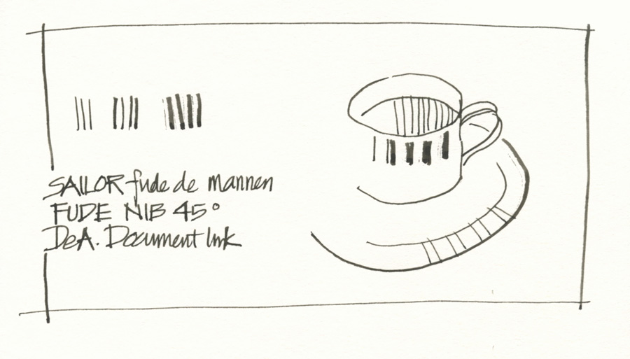
Sailor has the option of a 45 degree nib which produces finer lines. To date I have prefer working with the 55 degree – but I am going to revisit the 45 degrees in the next month or so to see investigate further how the different angle affects my options. My initial thought is that it will help to make the ‘normal’ line in fude sketches less heavy… but more about that later!
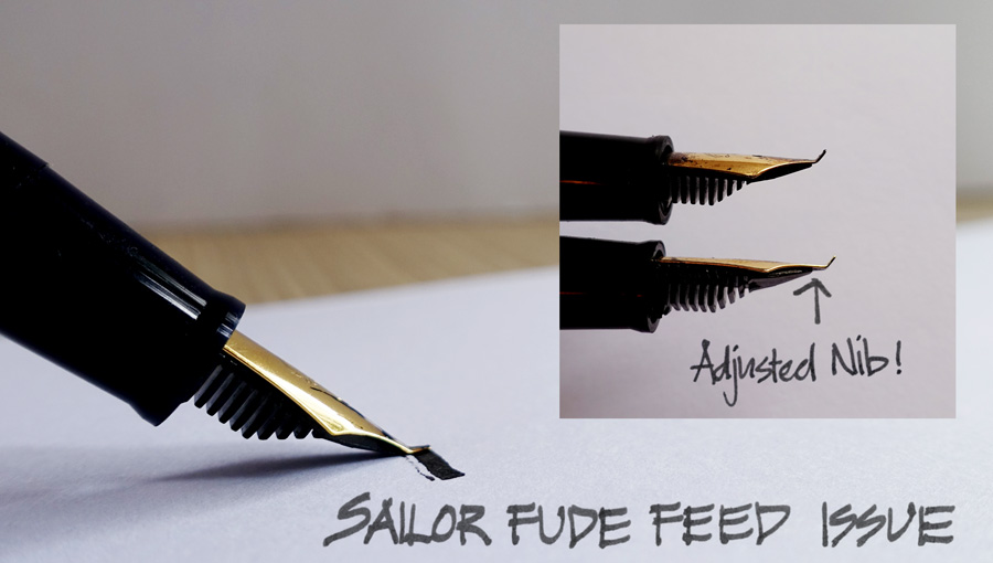
The feed is positioned close to the bend in the nib which means if you use the pen at a shallow angle you might get an extra line from the feed. This is very annoying, but I rarely notice it when I am sketching with the 55 degree nib – it seems to be more of an issue with the 45 degree and mainly only when I am doing test drawings or writing. Yesterday I decided to pull the nib and feed out and adjust the position of the feed so that this doesn’t happen but there might be an impact on the flow- so I will keep you posted.
So in summary, on paper the Sailor pens don’t look as good as the Hero or Dukes… but honestly they work great for me and I just love my Green Sailor! The Duke 209 is probably the best option – but I am very keen to hear other people’s recommendations! I know that a lot of my Asian USK friend know a lot more on this topic than I do… but I hope what I know from my own personal experience has been of some use.
As well there are a lot of other fancy nibs that I could explore (including the $3600AUD King of Pens that I played with earlier in the year – no, only joking!) but the ones I have included are the most popular amongst my sketching friends. Of course I have a list of a few more pens to test next year!
This series has become somewhat more involved that I initially planned – like any Liz-project! In fact, preparing these posts has become akin to what I do for my online SketchingNow courses. I have spent a lot of time thinking about pens and lines and trying to dig deeper to really understand line variations a better. It has been so much fun!
A few personal ‘takeaways’
So to finish up I just want to share a few thoughts that have really crystallized for me while preparing this series, and a few things that I want to explore further in my own work in 2016.
- Oh! A new appreciation of how much I love the flow of ink on the paper (I haven’t mentioned this since Part 2)
- Related to the liquid nature of the ink, I have been reminded of how little pressure I have to apply to get a line – just touch the page and let the ink flow!
- Clarification of two kinds of line variation (variation of one stroke in relation to the next vs variation within the stroke itself) has made me realise that I have been focusing more on the first kind, so now want to become more serious about the second. This ties in with the wonderful ideas I gleaned from Melanie Reim’s workshop in Singapore. I really want to explore calligraphy strokes more.
- I have reminded myself of how much variation you can get in a standard ‘basic’ pen nib – am I really getting the most of out my White Joy?
- I want to continue using my flex nibs and add the ability to adjust pressure as I draw each stroke into my repertoire.
- Fude nibs are still my favourite ‘expressive’ nibs but I want to adjust the pen angle more when I draw, to get more variation within each stroke and give the 45 degree nib a serious workout!
- And finally, I seriously want to look after my pens better. I have realised how much better they work after a clean (what a surprise) so I want to work on a realistic clean strategy.
Anyway, I feel as if I have just laid the foundation for more future explorations into the wonderful world of fountain pen sketching! Thank you all so much for following along with me and I would love to hear what next you would like to know!
And my final word of advice for you all:
Don’t worry about buying the ‘perfect’ pen – just pick up one you have (give it a good clean if it needs it) and start using it!
Let the ink start flowing and start building a relationship with it. Learn to love your pen because when your pen becomes an extension of you, your work can start to flow out of you more freely.
Once you have a fountain pen you will have to start drawing with it!
If you would like to learn the fundamentals and the start urban sketching please check out my Foundations online course.
Subscribe to my mailing list for my monthly newsletters for first news of new courses and face to face workshops in Australia (and overseas!)


43 Comments
wonderful series. i'm going to pull out my parallel pens again. thanks!
hope you get more out of your current pens … and take it easy when you do the ordering – hey?
what me passionate about fountain pens???? why do you say that?
Have fun testing the pen you have – really that is the message I want to send across but somehow I just end up tempting people to buy buy buy!
thanks Stacey – have fun!
oh no – how could I have forgotten about the folded pen hack!!!! thanks I have just updated the post!
and yes, I am dreaming of a gold fude….
so glad you enjoyed it. I am working on a fun encore right now as I am sad it is over!
thanks Beth!!!
HI Larry- yes I have a Profit- it was the first Sailor I owned. I mentioned it in the text but for reason didn't photograph it initially. When I get a chance I will include a photo of it as it has a much more normal design!
Yes… getting that vertical orientation is a little wierd – my perfect nib would be narrow width at 55 degrees, max width at 45, fine line at 70… now what would that look like???
Thanks for a great series, Liz. Wonderful information, and your thoughtful comments and thorough analysis are greatly appreciated! Cheers! (Now I have to go find a couple of new nibs….)
Thanks for the wonderful series Liz. Makes me want to try using my Lamy Joy again. I haven't learn to love it. After your post on cleaning I watched the video, cleaned, refilled with fresh ink and still it doesn't do it for me. I love using the Pentel brush pen. Love the way the ink flows out of it whereas the Lamy seems so scratchy.Is it possible to simply have a bad nib? I want to experience the joy I see in others using pens but don't really want to go out and buy another if I get the same result.
Fabulous series, Liz — I'm sad that it's over! It was like watching a fave TV show! 🙂 Our hands have very much the same preferences and habits — despite my desire to experiment with everything, the fude is probably my overall favorite nib for line variation as well as intuitive operation. And since you mentioned it 😉 — yes, my gold Sailor Naginata fude (http://tina-koyama.blogspot.com/2015/04/the-grail-has-landed-sailor-naginata.html) is my favorite of all — so much smoother and solid-feeling than the standard Sailor fude. But even so, the green Sailor fude like yours makes me perfectly happy, too — much more so than any Duke or Hero I've tried, which have all had flow and even leakage issues that I've never had with Sailors. Your ink experience is very interesting, too. The main waterproof ink I use is Platinum Carbon Black, and I've never had any flow issues with it in any pen. (I've used Super 5 and DeAtramentis Document only sporadically, and occasionally had flow issues with both.)
I was very interested in your mention of the Pilot Parallel, which I've been using a lot lately — in a modified version! And what timing, because in a day or two I will have a post done on my latest modified Parallel. Stay tuned! I'll drop you another comment later with a link.
Thanks again for a terrific series! It is bookmarked for much future reference!
– Tina
Thank you very much for this wonderful series. I learned a lot about using the two fountain pens I own – Lamy Safari and Platinum Carbon Desk – and about new ones which I will soon order.
Thanks for taking the time to research and test the pens you mentioned in this series and for sharing the info with such passion (yes, it's undeniable). I am now so into sketching with a fountain pen, however, I am not going stress too much about getting the "perfect" pen. Instead, I'm going to test the regular old writing fountain pens I have and see what they do.
This has been a great series, Liz, and will serve as a "go read this" group of posts that the rest of us can use. Thanks for all the hard work required to produce it.
Have you seen the Sailor "profit" fude pens? They are more conventional in form and include a clip and the cap posts. These things really turn me off to the "mannen" pens you show. Like you, I prefer the Sailor fudes and the "profit" version has the same 55-degree nib but I can clip it into my bag. I wish I used my more often but I have never adapted to the near vertical pen orientation required to get thin lines.
Thanks Liz for your "all you every needed to know about sketching with a fountain pen" posts…very informative. I may have to invest in a new Sailor Fude pen (dropped mine on holiday off an English castle wall whilst changing sketching position….the 30 metre drop didn't do the nib any favours…..lucky I dropped the pen not myself)! The Lamy safari combined with ink filled waterbrush are still my favourite kit…..I guess the best pen is what ever you have in your hand right now….even a humble ballpoint.
Merry Christmas and A Happy sketching New Year
Here's my post about my modified 6mm Parallel! Will look forward to further reports on yours, if you decide to hack it.
http://tina-koyama.blogspot.com/2015/12/fun-with-modified-6mm-parallel.html
Great series, Liz! Now, what I don't get is the love everyone seems to have about Lamy's pens. I got one recently, I like the style, I had no problem with the strange grip, but what I can't understand is why everyone talks great about a pen that leaks so much with every ink I tried. I though it was just my pen, but as I see in your photos and photos of other Lamy users, everyone has a ink spotted pen when it is a Lamy.
My other pens, even cheap Varsity ones, Pilot Petit, $10 supermarket Waterman, a nice Parker, 03 Preppy, the great Metropolitan, none has this problem. Every time I get my Lamy, it has ink around the nib and almost overtime, around the body near the feed. Is it just me?
I fell in love with fountain pens in 7th grade (well, maybe it was a little later) when I started at a Catholic school and we had to write in Italic fountain pens. I vowed to take a calligraphy class after college and did, with a guy named Julian Waters–yes, it was a then-young (20-something) THE Julian Waters! Alas, he quit teaching through the extension service and I didn't have a car to get to his studio for further classes (would've been 2+ hours on the bus each way). Anyway, what I love about your reviews is that you explain why these are the best for YOU–like a good cooking magazine that explains what their definition of the perfect chocolate cake is, you can decide if that is *your* perfect chocolate cake, or if you like something a little different. Then you can tweak the recipe (or in this case use the reviews and comments) to find your own perfect cake/pen. Thank you!
Hi Liz
Thanks for an informative series.
My most used pen is a platinum preppy which I converted to an eyedropper.
The only negative I can see is that it only takes propriety nibs which also goes for the Lamy.
Hi Liz
Thanks for an informative series.
My most used pen is a platinum preppy which I converted to an eyedropper.
The only negative I can see is that it only takes propriety nibs which also goes for the Lamy.
Thank you, Liz, what a terrific series! Fountain pen lust is again in full force. My favorites are the Falcon (high end) and the Platinum Carbon (low end but great!) thanks to Marc Taro Holmes's Travel Sketching course on Craftsy. I just ordered my first fude pen, the Sailor DE calligraphy pen with the 55 degree nib. It's green; is the the pen you call the Green Sailor? Can't wait to try it. I'll also have to pull the Pilot Parallel pen from the drawer and give it another go, now that I have some idea of how to use it. As usual I learned so much and have been so inspired by your posts. Thank you for sharing so much knowledge and for all the work that goes into the posts!
Thanks for all of this info about fountain pens…I was going to buy the lamy joy and I was looking through my pen collection and turns out I already have one in black with the 1.1 nib!!! I also have a fude pen..it is a duke 209.. Yes it is a little slippery. I also bought a hero fude and the plastic insert in the cap pulled out, they sent me another and the same thing is happening with this one…
Loved your interview with Goulet pens BTW…
I am in San Francisco..
Thank you so much for this Liz – I had bought a Sailor Fude pen and couldn’t understand why the ink didn’t seem to be flowing and thought I just didn’t have the knack. Reading this however, I thought I would give it a try with the ink converter filled with some Platinum Carbon ink – now it’s like a different pen! Must be something to do with the flow of the Sailor cartridges being too slow. Thanks for the great information here!
Hi Liz! Just ordered my first fountain pen (Lamy Safari – dark lilac!) and would like to know how you travel with ink? What do you think about the Visconti ink pot for refilling while traveling? Do your inks travel in checked baggage or as carry on? Thanks so much!
Oh ah. I love the dark lilac one. I address this in my fountain pen sketching series. And yes I love my Visconti inkpot but you don’t need it.
Thanks so much for sharing this “fountain pen 101”. Amazing posts! I have never sketched with fountain pen before. But I really, really love your style/kind of drawing. I’m definitely going to buy one. I just have one question: I’m really interested in getting the fude nib pen as I love how expressive it could get. But for a first timer like me, should I get the fude nib pen, or should I just go with the standard nib one first? Note: I’m an amateur and I draw just for pleasure once in a while, mostly with marker and brushpen.
thanks Iwan – I do think that it is best to use a normal nib first and train your hand not to twist too much and then progress to a fude nib which requires more complex angles
Thanks Liz! =)
Hi Liz, thank you for all the information you present on your sites. I am interested in your fountain pen opinions as I am also left handed, which can present challenges. But more importantly we have the same way of holding a pen so I am hoping what works for you will also work for me ????
Hi Wendy. The only advice I can really give is to go to a pen shop and try a few pens out. But I have no problems at all due to my leftie-ness
Hi Liz,
I have a question, Please: Will the lamy joy pen take carbon waterproof Ink without clogging?
I’m looking for an alternative to using a dip pen. I’d greatly appreciate your help.
many thanks,
Paul V
Hi Paul,
I have been told (by a retailer)that Lamy only recommend De Atramentis ink but many people I know use Platinum Carbon ink in a lamy pen. Of course you need to make sure that you don’t leave you pen lying around unused and you clean it regularly
Thank you for your keen insight, Liz.
Keep up your beautiful work!
Paul V
Hi Liz,
Very interesting article, thank you! I’m new to the fountain pen world and well written articles like this help me getting through it.
I have a question, and your answer would be extremely helpful:
I bought a Duke 209 pen for sketching and it’ll arrive soon. I’m looking for some economic waterproof cartridges just to start sketching and seeing if it does for me. I read another article you wrote in which you suggested “Platinum carbon pen ink cartridges”, and I’m interested in buying them. So my question is: do Platinum cartridges fit my Duke pen?
Have you ever tried to use them on your Duke 209?
Thank you for your attention,
Francesco
I’m not sure as I haven’t used my duke for ages. And I’m overseas at the moment so can’t check.
Thank you for your quick answer anyways.
I’m from Italy and saw on Instagram your recent sketches of my native region: I really appreciate them! Have a nice weekend.
Hi Liz!
Thank you for all that information. I just bought a fude pen, and was wondering which converter it fits? I don’t like the ink so much it came with, so I’d like to replace it.
Thank you,
Lisa.
Lisa – Sailor has one… or you can just replace the ink in the cartridge
HI Liz,
An artist friend in Ireland recommended your site…and I’m so delighted to find your post on the Fude nibs. I recently purchased the green Sailor Fude nib fountain pen and LOVE the variety of lines it produces. However, i’ve struggled to find a waterproof ink that will work with the pen. Noodlers Bulletproof ink is only waterproof on my marker paper. On all of my watercolor papers the Noodlers smears when I go over it with watercolor. You mention DeAtrementis Document ink. Is that ink waterproof on all papers? I’m currently using the Sailor Fude as a dip pen into India Ink (with an empty converter) since i want waterproof lines. If De Atrementis Document ink is really waterproof that would be perfect!
By the way, the Duke 209 is making it’s way to me from China. I’m looking forward to trying and comparing it to the Sailor.
Thanks for such a great site!
Joana
Hi Joana – yes De Atramentis is waterproof!
Liz, I noticed elsewhere in your blog that you use De Atramentis Urban Grey in your Sailor Fude 55. I was thinking that because I have a black brush pen, it would be good to have the grey as an alternative. Do you also use black in your fude?
Hi Barbara, I use black and urban grey in my fudes… I’ve also had dark blue and green in them,
Liz,
If you are still responding to this thread, I have a quick question. In your photo, I see you are left handed. How do you keep the ink from smearing when you write and draw?
Elaine
NEWSLETTER
Subscribe for first notification of workshop + online classes and more.