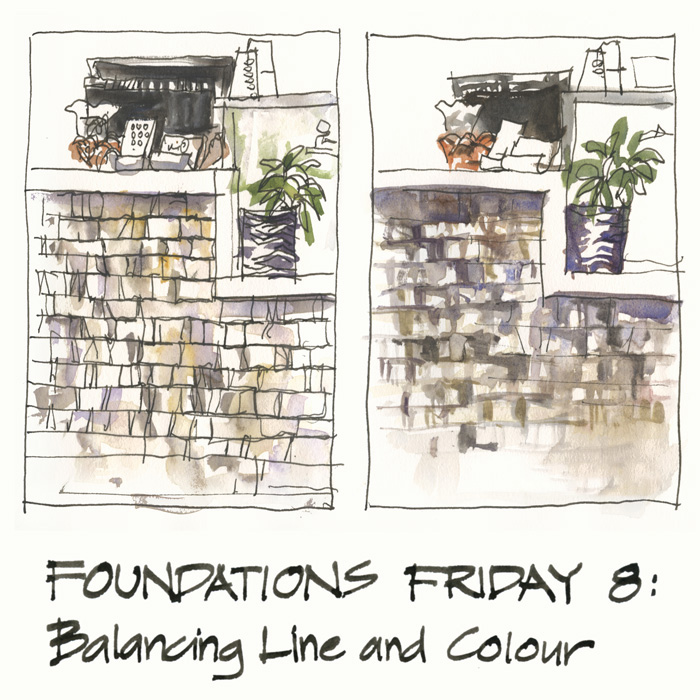
Ah! finally I have a bit of clear space to get back to my Foundations Friday series – revisiting the lessons from my SketchingNow Foundations online course. The great benefit of a online course is that you can work through it at your own pace, but the danger is that life gets in the way and you never finish viewing the content, let alone getting around to doing the exercises. Life has indeed gotten in the way for me in the last month or so, BUT I am now back on track.
This week I am looking at Balancing Line and Colour which is a topic that I am really interested in. In fact this Foundations Lesson was the inspiration for my second course SketchingNow Edges where I looked at some of the key issues in a lot more detail. There is still plenty of stuff in this Foundations lesson though!
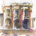
All I wanted to do this week was to explore some ideas while sketching two versions of the counter at my local cafe. I didn’t want to do a ‘proper sketch’ but instead just wanted to do two small studies. There is an interesting texture caused by light hitting the stonework.
I was particularly interested in two concepts – the time required for each technique and how dominate the texture was in the finished sketch. Both are in the context of fast sketches – of course – and not careful realistic renderings!
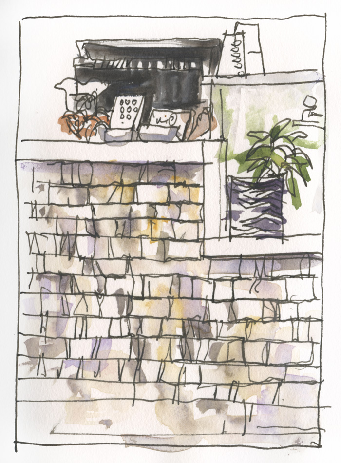
The first option was to draw everything in ink first. At the time I thought it was tedious drawing all those lines and was thinking that I might run out of time for the paint. But when I got my paint out, I only needed a few loose washes and brushstrokes and the sketch was done!
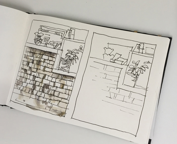
The second sketch had only minimal lines – here is a photo of it before I started painting so you can see how few lines I drew!
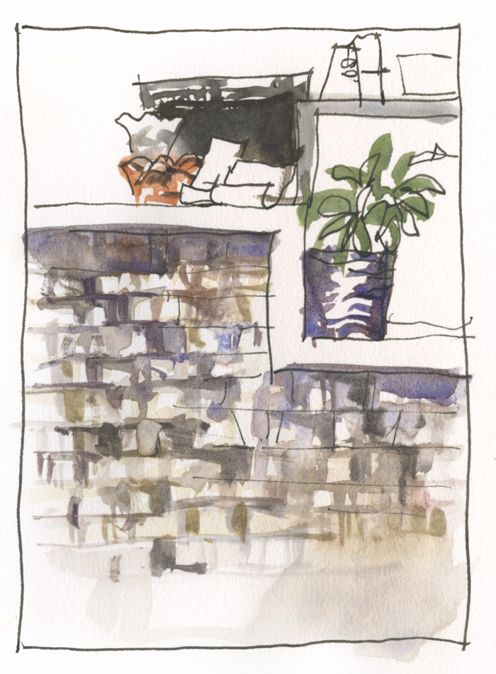
Although I started painting much sooner than in the first version, the painting component took a lot longer because I had to layer my paint and wait for the first wash to dry so that I could achieve some crisp edges with the darker strokes.
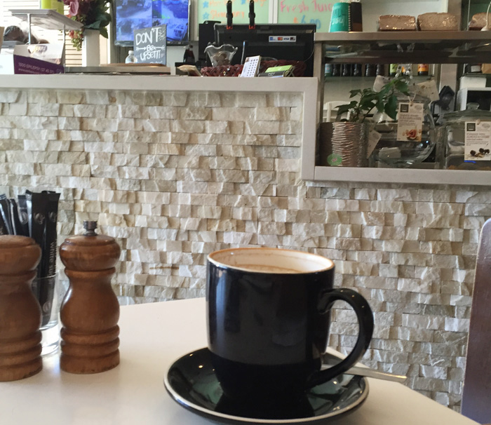
There are quite a few more issues that were raised by doing this little exercise – such as making a decision about how important the texture is to the overall composition and if I had drawn a more interesting scene, like my photo with my coffee mug in the foreground, I am sure that I would that have changed my approach to the texture.
Ah! always so many ideas to explore whenever you start sketching! So much more than just achieving accuracy – though that is important!
These additional considerations (how to decide what you should do in ink and what in colour) are what I explore in SketchingNow Edges and I can tell you now that I will be very shortly starting a new blog series called ‘Exploring Edges’….so stay tuned for that!
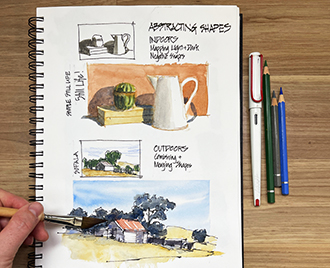
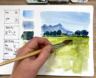
Both SketchingNow Foundations and SketchingNow Edges online courses are available now for enrolment- they are both Self Directed courses so you can start today and work at your own pace.
I would love to hear from you… which or the two approaches would you use? Or would it be somewhere in between?


8 Comments
Hi Liz,
After looking at both of your sketches, and then the photo, I think the better composition would have been to include the objects in the photo.
Here’s why: The darker colours of the foreground objects would have helped accentuate the texture of the wall. The blue/black of the cup would bring out the shadows while enhancing the few brick outlines. The walnut brown of the salt and pepper shakers would have brought out the oranges in the wall while the creamy table top would have set up the entire wall tone/colour. Because the wall has so many variations in texture, this approach may have worked to reduce the use of line to define the stonework.
Just a thought.
Cheers!
Hi michael. Yes I agree with your comment however the photo was taken with my phone at table top level so it was not a view that I could see from my seated position. As I said these weren’t proper sketches more ‘texture studies’ to explore two ways of treating the texture. But the really interesting thing is that composing a scene with something in the foreground would have given more direction to the way I handled the sketch. Thanks for your thoughts – great discussion.
I’d use method 2, here’s why: even though it is longer, I do like the effect better. But more importantly, one of my big considerations with a quick study is how much time i have to make it: either because I need to leave pretty soon or ( not for this subject but for many I sketch) or the subject of my study- a car, a person – may leave soon, and often a mix of line and color leave me with the most information in the least time even if my sketch doesn’t get as far i layering as your sketch #2 did.
Hi Suhita. Yes I am with option 2 as well ( get some paint down quicker so you are recording more information) but many people get sucked into drawing detailed texture with pen and never get around to paint. There is also the tonal impact of all those ink lines which is another related topic.
Probably the least helpful comment would be – it depends! But I actually feel it does depend – on time, mood, purpose and a bunch of other factors. Clearly, right or wrong is not the point here but what is appropriate. Sometimes I have a clear aim and if I adjust my method to the aim I generally get there within my own skill set. Other times I just see how the mood takes me and the results seem to be more mixed – sometimes really pleasing and other times a let down. I guess the lesson for me is to treat success and failure with equal respect if I am experimenting/just not sure what I want!!!
Hey Hugo… Your comment is very helpful!!! I totally agree… It does depend on many factors. In a way that was the point of this post… To highlight some of the variables and that there is never a formula answer.
I tend to work with option 2 and use my rigger brush and watercolour for the linework at the end. It’s like how you put your washes down and then tighten it just enough with ink… For me, it’s quicker and I can leave it impressionistic or add more details to balance the sketch out if I need. It’s easier for me to add more detail than to remove. I tell people it’s like starting off out of focus and just giving the viewer enough detail to pick out what it is. Fun topic!
thanks Asuka! Really excellent point about adding the detail at the end. That is one of the big traps with the ink – you add too much detail in the middle stage and it is easy to overdo it.
Thanks too for the reminder of using a rigger (and a thicker mix of paint!) at the end. I have one n my kit that I have been wanted to try out for drawing at the beginning (a new idea!) but I should just start using it more traditionally for details at the end of the sketch. I love the way that John Lovett uses a rigger to tighten his paintings
NEWSLETTER
Subscribe for first notification of workshop + online classes and more.