After last week’s struggle with a viewfinder I was excited to get onto the topic of the next lesson in my SketchingNow Foundations Course. I had one of those big light bulb moments this week which was a combination of doing the thumbnails below, meeting with some architects and then a private message from a sketching friend. It was a re-affirmation rather than a brand new idea… but I am jumping ahead of myself already!
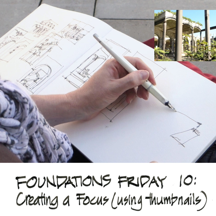
In Foundations Lesson 10 we look at how to find a focus for our sketch by thinking about what aspect of a scene we like the most. To help with this I explain how we can use a series of thumbnails to explore different options – different stories. While filming the outside demo for this lesson something very special happened. I was at the Reservoir Gardens in Paddington and my intention was to do three different options. But instead, I got caught up in the process and proceeded to draw 9 thumbnails one after each other, and each one telling a completely different story – refer to the top image. The exploration (of the scene) and discovery (of the different stories) were totally exhilarating.
Thumbnails are often used to strengthen composition and do value studies, but my use of them in this instance was a step before both of those. Simply finding a story, designing a narrative. Once a story has been chosen then a further series of thumbnails could be used to compose the sketch in a way that strengthens this story.
I have a hot and cold relationship to thumbnails and my light bulb moment this week was achieving clarity about why I rarely use them myself. As I mentioned on Monday, thumbnails are bread and butter to me as an architect. When I am design sketching, what I am doing, in essence, is one thumbnail after the other, exploring multiple views in rapid succession.
These kinds of thumbnails are all about discovery.

What I am trying to do when I sketch on location is to replicate the flow I feel when I design sketch. So…
Discovery is a huge part of sketching for me - perhaps the most important part.
When I design as an architect the solution comes out while I am sketching. If I keep drawing and testing ideas, the design will come. I am trusting that the process, the very act of drawing, will generate the result that I need. More about this topic here on a newly set up section on my blog.
And so when I sketch, I am composing as I go, trusting that if I keep going it will be ok in the end. It mightn’t be a masterpiece, but it will be a wonderful record of my discovery process.
For me a sketch is my first response, it is the way I record my exploration of my subject. When I carefully plan the sketch beforehand, doing a traditional thumbnail to resolve the composition and the value shapes, I can lose a lot of the joy and excitement. And as a result I often make a mess of the ‘finished work’.
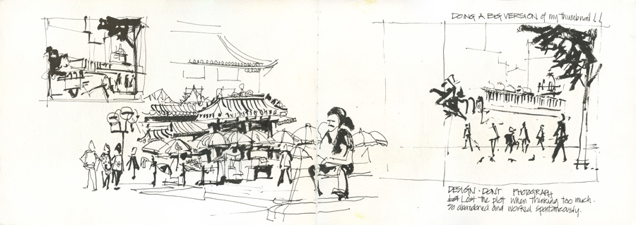
This is exactly what happened in Melanie Reim’s workshop in Singapore. I was very happy with the thumbnail (top left) but when I tried to do the bigger sketch (on the right side) I lost it completely. Hmm, I also lost my focus as the trike disappeared! When I just worked spontaneously (middle sketch) I was able to recapture the feeling of the initial thumbnail.
Please don’t think I am dismissing thumbnails… I am certainly not. In some ways I wish I could plan more carefully using thumbnails and then end up with a more designed, beautifully composed watercolour painting. But on the other hand I thrive on the feeling of living dangerously. Next week I will be sharing the approach that I typically use.
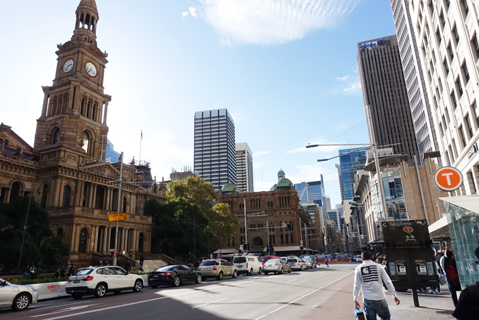
But to get back to Foundations Lesson 10, I do love doing scrappy thumbnails exploring ideas of what I could say in my sketch. This is particularly the case in very complex scenes. On Wednesday I had 15 minutes before going to a meeting and paused at one of the busiest intersections in Sydney, where you can see both the Queen Victoria Building (QVB) and the Sydney Town Hall.
I did these three rapid thumbnails, each with a completely different story. They are thinking drawings, simply exploring my initial idea and like my architects design sketching, the ideas formed as I was drawing. If I wanted to make these into a sketch (and wanted to plan it beforehand) I would have done a few more thumbnails to resolve the composition and values.
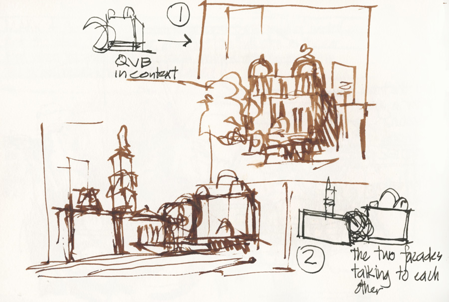
The first was simply a zoomed in composition on the QVB with a limited amount of the surroundings – just enough to supply some context.
In the second when I started I was thinking of a panoramic view but while drawing I noticed the way the two grand facades where talking to each other and how the trees separated them. So this is what I would develop further in my next round of thumbnails.
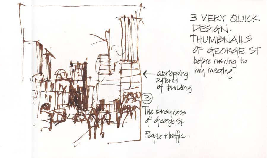
The third was more about looking down George St focusing on the busyness of the street (people and cars) and the overlapping patterns of the buildings. Although the QVB was included in this view, its role was secondary and I probably would crop it further and make this into a more vertical composition.
I didn’t have time to do a sketch, but this process was a lot of fun.
So before I wrap up this post, I just want to clarify that although I don’t do thumbnails when I sketch, I think they are an incredible tool for improving the design of sketches.
They make you focus on what you are trying to say, and will help map out all the major value shapes. I use them all the time when I teach as I love helping others design their sketches – it’s the architect in me coming out!
A lot of people struggle with the concept of thumbnails and they end up drawing a tiny detailed sketch of the whole scene. I know that I often take my architectural skills for granted – skills which enable me to do these type of analytical drawings with ease – but I think the important thing to remember that that are more of a thinking diagram than a preliminary version of your sketch. You only need to do enough to resolve the design but at the same time need to make sure that they are adding value (that you are thinking hard and nutting out issues as you are drawing them).
My use (or non-use) of thumbnails when I am sketching has a lot to do with my own personal definition of a sketch being quick and spontaneous. Urban Sketchers has certainly meant that the traditional idea of a sketch (an quick initial response of a scene in preparation for a larger more serious painting) has become a lot more sophisticated, with people sometimes spending hours on their sketch. There is a huge range of work included under the definition of ‘sketch’ and mine (nearly always under 20 minutes and often only 5 minutes) are certainly at the quick end of the scale. The time that you invest in your sketch is a major factor in determining how essential thumbnails are. So if your sketch takes an hour or more, doing a few thumbnails certainly makes a lot of sense.
But regardless of whether you use them or not, I always recommend that before you start, you ask yourself what is the part of your scene that appeals to you the most, and then have this in your mind constantly as you work.
I would love to hear from you:
- What do you think about thumbnails?
- How often you do you use them?
- When do you use, and when do you go straight into the sketch?
- Do you struggle with them and include far too much detail in them?

11 Comments
I never “plan” a sketch other than to look at the subject and give a bit of thought to where the boundaries of my sketch will cross the landscape. Like you, too much planning would eliminate the dynamic nature of location sketching for me.
But I do thumbnails, mostly to work on visual imagination. It’s become clear to me that building a graphic vocabulary that one can pull out of one’s brain is useful even when you’re drawing things you can see, particularly if your subject moves as you have to rely upon visual memory then. But hey, you have to rely upon visual memory every time you look down at your paper to draw something 🙂
So sometimes I’ll draw a bunch of boxes while watching TV and just start drawing ‘scenes’, a tree here, a building there, maybe a person walking. Lots of fun and I think useful in evaluating shape relationships in scenes. — Larry
thanks for your comments Larry – yes I think building up a graphic vocabulary is a great point! Hmm, some food for thought as it relates to some other ideas kicking around in my head at the moment
I hate viewfinders, and never use them. Thankfully I never bought one and so, no waste of $$ there.
Thumbnails I rarely use in sketching; they are like doodling or thinking if I am designing a building.
Being a fellow architect, I start most sketches in pencil (not a dirty word but a lovely tool) and so, I tend to find the basic lines on my paper. I have that graphic vocabulary built in — how can one not with the training we’ve gotten in Uni? Sometimes I erase, sometimes I don’t.
I don’t worry too much about putting in too much detail or not. I’ve been sketching so long it is second nature to me, especially in pencil, no pressure.
I agree with Larry that the only time it gets a bit crazy is when a part of the sketch MOVES — be it boat, cow, car or person….
Hi Kate- thanks for your comments….and you can mention pencil here on my blog anytime! I agree it is a lovely tool!
Liz, I’ve been thinking a lot on this post. Because our training as architects, we are used to drawing a gazillion small concept sketches. We think in plan, elevation, section and perspective fluidly, jumping from one view to the other. All is part of that exploration process, trying to find the best design solution. For some weird reason, we draw in our travel sketchbooks with a completely different approach. Apparently we tend to think these should be illustration books full of high quality presentation sketches. I know a few gifted architects who have the patience, discipline and talent to produce fantastic compositions on location. Their sketchbooks look very planned and perfectly drafted. And I admire them and love to look through the pages. Some other artists do value and composition sketches and they create these amazing compositions. And I applaud them.
However, none of us is equal. I enjoy sketching fast and spontaneously, what I call ad lib. I feel the first lines have a fantastic feel that cannot be replicated. Most times those first sketches are out of proportion, wrong perspective, terrible placement on the sheet, etc. But these have an energy that speaks volumes. My design sketches have so many iterations, all in one page. The top sheet on my desk has 5 axos, one front view and one side view, all crammed in one 8 1/2” x 11” paper. Go ahead and google “architect process sketches” and the vast majority are these fast, small sketches which are all part of finding a solution to a design problem.
When sketching on location, the problem is slightly different. All the stories are right there in front of you. If we use the “thumbnail” sketches to discover the story rather than to nail it, the spread could look fantastic. Liz, if you had sketched the most important story (to you) bigger than all the thumbnails, but still part of the whole spread, you would’ve had one of the most compelling compositions ever. It’s recording the way you see the space, the objects, the buildings, the people, the landscape. The sketches you’ve shared tell a great story.
This may be the key element we are looking for. I’ll start doing this and will share with you all along. Thanks for a great food for thought!
Hey Luis – thanks for your great thoughts. I am still thinking through your comments but something that has really struck me is that as architects we think in multiple views at the one time. We sketch plan, section, axo… so it is a much more dynamic way of working than a painter who is deliberately flattening a view and abstracting it into shapes. Also I realised watching a video demo last night in which (coincidentally) the artist was talking about the importance of thumbnails, and noticed the that the frame was the starting point. When I do my thumbnails I start with my subject and let the image evolve and then draw a frame around it. Lots of interesting thoughts here!
I have no architectural training so feel out in left field but I agree with Luis’s comments about the first iteration being the most dynamic and one that contains an energy that can’t be easily replicated. On the other hand, practice makes better if not perfect so I guess it depends what you are after. If a thumbnail is going well, I tend to keep adding details to it and it loses the whole feeling of being a thumbnail; it becomes a little sketch. I posted a note near my computer saying less is more … hope that helps me STOP when I should. Meantime, so enjoying the blogs and lessons and looking forward to September’s course! Thanks for all you do. And PS I found one of your blogs that mentions the kind of dagger brushes you use and while I couldn’t get sable I did get something that works both 1/2 and 3/8 and hopefully they will help me loosen up!!!
thanks carol – I also like the first lines and sometimes work up a thumbnail a little and leave it at that.
Enjoy your dagger!
Hi Liz,
Yes thumbnails…..I like the idea of them; but Im not very successful personally with them! For commissioned reportage I find I even go out and check views but don’t sketch the views as thumbnails, I use a camera. That said, I am always talking about thumbnails but few times have I actually used them successfully! I think its partly to do with being disciplined -Im approaching them like a finished piece rather than a means to an end! Enough said!
Has anyone used the Value Viewer app for Iphone? It uses the camera to produce a half tone image with a grid – i think it was created for plein air painting. There is no version for Android, so I’ve never tried it.
I haven’t used it… I might refer to a photo of the scene towards the end of the process (helps me compare values) but doesn’t feel right to rely on it at the beginning. But of course I am biased!!
But I would love to hear if anyone else has used it.
NEWSLETTER
Subscribe for first notification of workshop + online classes and more.