 Thanks to everyone who made a suggestion recently either here on the blog or on Instagram.
A few comments before sharing the options:
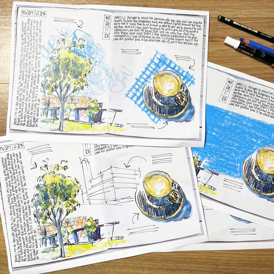
- These are rough mockups done on printouts of the pages and to make it easy I added colour with Neocolor crayon – but my intention is to finish the pages with watercolour!
- Some of the suggestions included ideas that had nothing to do with my life (or what I actually did on the days I created these pages) and as my sketchbook is a diary it feels a little odd to add a random object on my page. I’ve included one of these suggestions below and I’ve worked out a way that I could include the new object that would fit with my narrative approach to my sketchbook.
- I need to add some text to these pages in order to document the things that happened on those days – so the options of not adding anything or not adding any more text are not viable in this particular instance. You will see in all the options below that I have added some more notes.
- It feels a little odd not to have an incomplete page in my sketchbook from last week but it’s fun to share this process with you! 🙂
Okay… here are the options. I would love to hear your feedback on which you prefer.
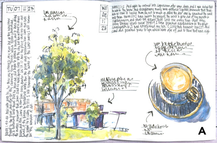
Option A
Just add some scattered notes.
If I was in a rush to finish this spread I would probably just do this and then make sure that there was a lot of colour on the next spread to balance the white space here.
But as I wrote last week, I feel as if this spread should have something more in it…
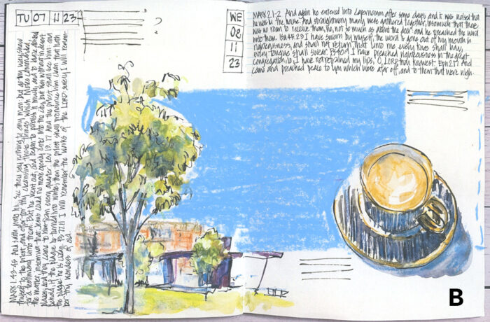
Option B
A sky that becomes a colour block (an element from my Sketchbook Design course).
The exact size of this colour block is to be determined – it might look better to extend to the right end and be narrower. I would also have to consider whether to add a little more background to the Village Green sketch so that the sky shape makes sense to the scene.
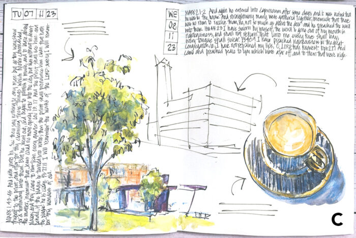
Option C
If I wanted to maintain the feeling of white space I could add a ‘secondary sketch’ (another concept from Sketchbook Design).
This line drawing would be one of the examples I used during the Buildings livestream that I hosted on that Tuesday. So it’s a image that relates directly to my day and in fact records what I was working on.
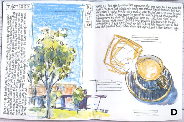
Option D
There were a number of ideas to add another object next to the coffee sketch and the most common suggestion was a pastry!
As I didn’t eat a pastry on this particular day it would be strange just to add to my page. However, if I was to go and buy a pastry, sketch it and then add a note that this was done on a separate occasion as requested by others it would be ‘okay’. Yes, I have some ‘ sketchbook rules’ but as they are just general principles there is always a way to get around them.:-)
I also decided to add a sky to the left page. Initially, I tried to draw a border around it but decided that a sky worked better.
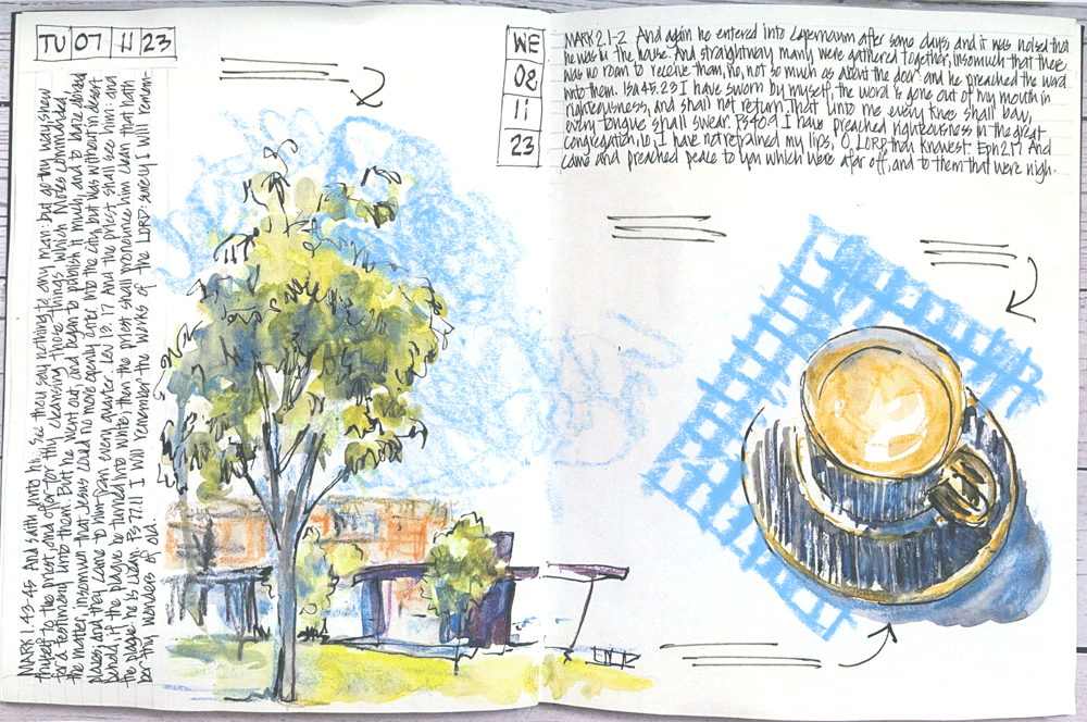
Option E
Another suggestion was to add a napkin under the saucer.
As I have some blue checked napkins I could draw that from life and then tie it in with an organic-shaped sky on the left page.
There were other great ideas too (thanks again!) – but these five were the ones that made the most sense for my own sketchbook practice.
Final Thoughts
I don’t normally spend this amount of time finishing off a page! 🙂
I usually spend a few moments thinking about it and then just go for it. I don’t do any mockups or thumbnails but simply start. However I typically ‘design on the fly’ and often adjust my idea as I work – reassessing the balance of everything on the page at each step.
All these concepts and much more are explained in detail inside my Sketchbook Design course. Sketchbook Design is available as a self-paced course so you can start whenever it suits you and work through the lessons at your own pace. So if you want to improve your pages and fall in love with your sketchbook find out more here.
As I mentioned last week, I love the process of designing my pages and it’s the main reason why I become so attached to my sketchbook pages. It gives me freedom when I’m sketching – I don’t have any pressure to produce a great sketch because I know that I can achieve a pleasing spread during this design process. It also is a great way to be constantly refining my compositional skills!
But to get back to the problem at hand – please let me know in the comment section below which of these options you prefer.


19 Comments
E is first choice. C is second choice. Whichever, your work is a thing of beauty! ?
Hi Liz, I like the idea of a your option C. A line drawing of a building gives the page depth . This could be combined with your organic sky in option E, and continuing a little of the blue behind the building.
It strikes me that combining Option A (notes!) written in that gorgeous sky blue that ties the two sketches together would be lovely!
Notes—maybe a prayer of gratitude or thanksgiving!
(As I stop to give thanks for you!!!)
; D
Lois
For sure you need something in the middle, Liz! A napkin is a napkin, but a building is so much more special! Record something from our Livestream!
Sandie
I’m big on the diary aspects of the sketchbook myself, so my pick would be the building since it is what you did that day! The blue napkin is pretty, and makes a nice color block, so that would be my distant second choice.
I like option E the best, first because to me, it feels like you and what you’d put in one of your sketches. I also like it because compositionally it’s balanced. The sky looks nice being variable and not too big. The checked napkin under the teacup is just the right size and pattern size. The blue balances with the blue of the sky. Very nice to me as the viewer.
Option B is my choice. It is a creative, thus lively way to make a sky that connects the tree to the rest of the spread.
“E” is good. A simple pattern to utilize more negitive (white) space. Or….. just go minimistic! Add a spoon 🙂
Option E is my preference!
Jill : repeating the blue as in the sky with the napkin links the sketch together E definitely .
I like Option C as the visual of the building added in ties in with the structure in the Lindfield Green. And it also reflects what you actually did that day which I agree with you is a good principle of keeping a daily sketchbook.
Finally Liz, any thoughts yet on what courses will be Group Run Throughs or Live next year? I know you’ve got a Live Watercolour planned for early in the year. But I’m keen to do Sketchbook Design with a group, either as a Run Through or as Live.
“:)” indeed, Liz! Claudia N expresses my thoughts quite well. C would be my choice if it had some emotional significance, but E appeals to me with its soft edged blue sky and the blue of the napkin ,which grounds the cup and saucer. Thank you, Liz for the most recent Livestream. Your thinking out loud is so very helpful to me, so instructive. Thanks
Napkin…E… with a smudgy sky. It completes the page and color ties both sides together.
Liz what about naming the “type of tree that” frames the the building? sketch a closeup of the bark, leaves, insect or bird life or sounds that will all fade with time so why not jog your memory in times to come, they will be precious at a later date. D or E sky
I concur with Lois Courtright! Had same thought..wish for self to have these conundrums!
First choice is D and E after.
A or C
E and maybe bring the clouds further onto the facing page in order to better merge the two images so it becomes more of a collage for the day.
Thanks for all the comments everyone! I’ll have to finish the page someday! Lol!
NEWSLETTER
Subscribe for first notification of workshop + online classes and more.