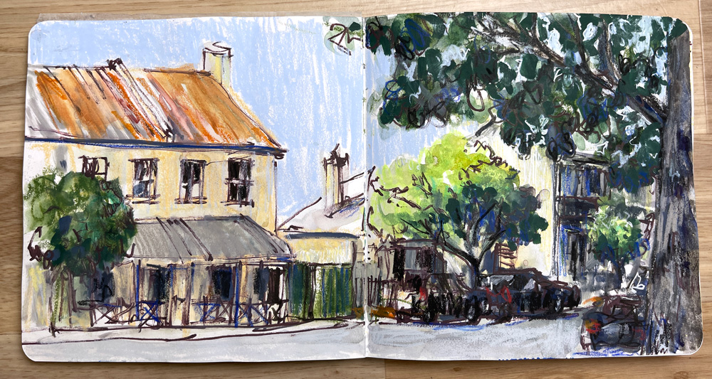
As mentioned last week, my Sketching Adventure Community on Patreon has been exploring the theme of Going to the Edge this month – and it’s been so much fun!
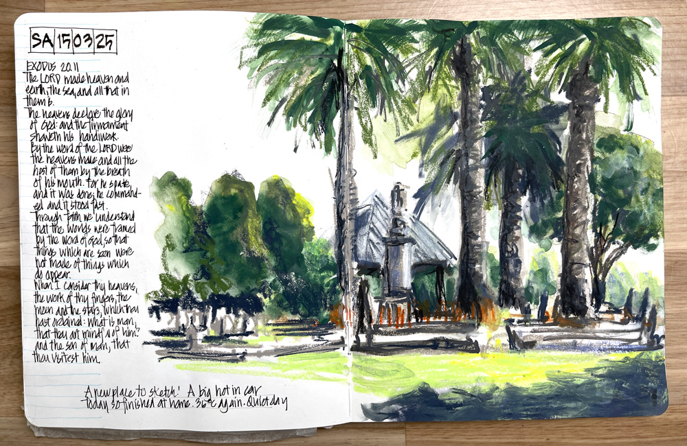
The idea of devoting a whole month to this theme came at the end of last year when I did a full double-page spread in an A4 sketchbook at Lane Cove National Park – see here. I love seeing sketchbooks filled with work that covers every inch of the page and so I wanted to try that myself.
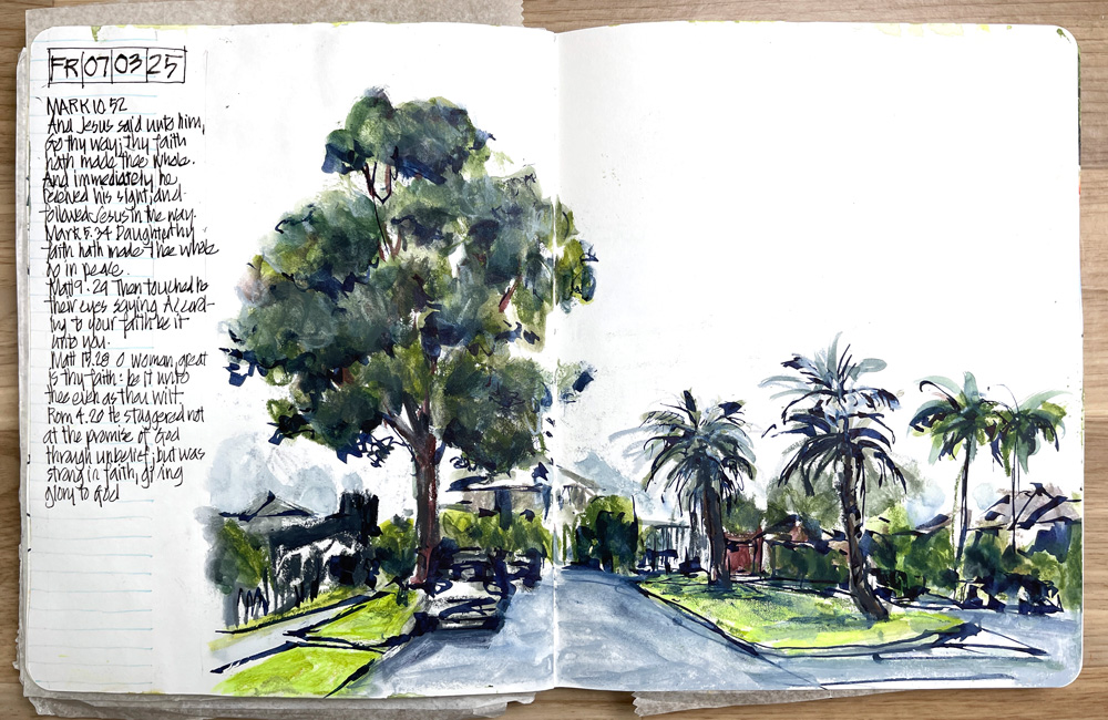
I also wanted to also explore ways of going to the edge while still maintaining a generous amount of white space on the page.
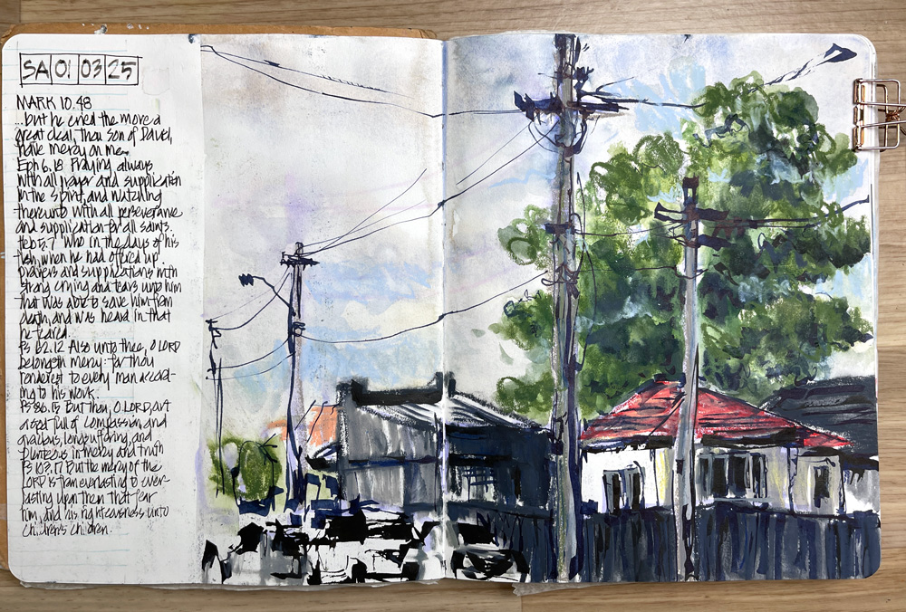
I initially found going to the edge harder than I expected, as having a lot of white space is a big part of the way that I work (‘working out from a focus’ – the concept we are currently looking at inside my Foundations course). I discovered that I often go close to the edge but rarely intentionally add colour right to the edge of the page.
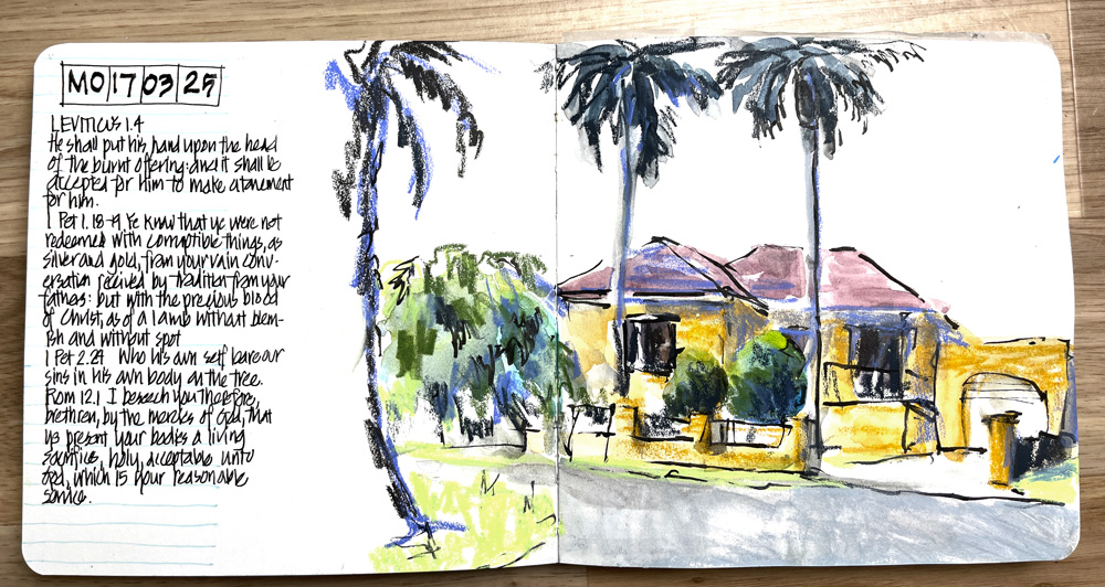
Mid-month, I moved to a smaller sketchbook (I had 4 options, and I’m thankful for the community’s help choosing which one to use), and that has made going to the edge much easier.

It’s also been absolutely amazing to see all the work shared in the community in the past week and to see how others interpret the theme and are experiencing the same things I’ve been exploring.
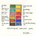
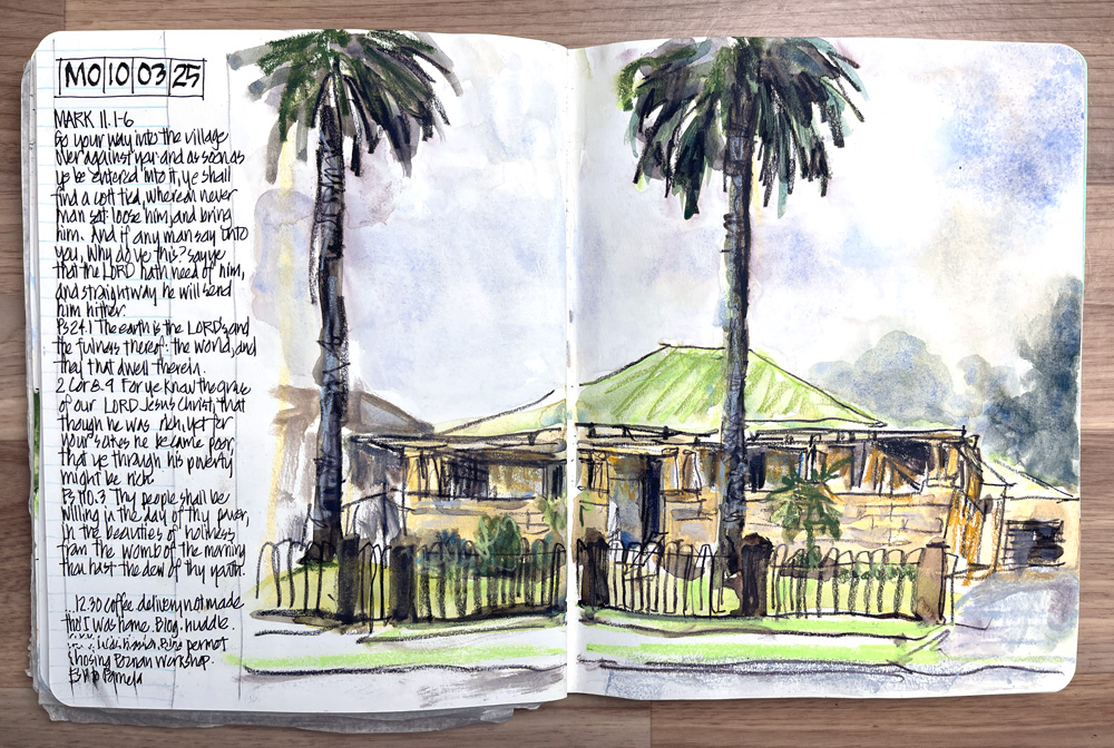 I’ve been continuing to use different media this month, but watercolour is definitely coming back. I’ve got a new palette that I’m using, which I will talk about in our monthly call later this week. It’s a new tin containing both my favourites plus new colours! Thanks to the suggestions from the community, I’m exploring some new options!
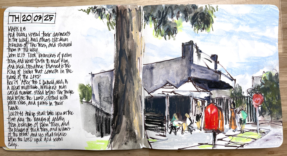
Taking breaks from watercolour and trying something completely different is the best way I know to keep my work fresh. I find it easy to get into a rut with watercolour, mixing the same hues over and over. So, changing the media and using pastel opaque hues helps me find new ways to explore texture and complex colour.
So this month I’ve used four kinds of colour:
- Gansai Tambi paints
- Posca Acrylic Markers
- Neocolor II water-soluble crayons
- Watercolour (with some new colours!)
And in terms of drawing lines, I’ve used:
- Fude de Mannen pen – in both Black and Fog Grey De Atramentis document ink
- Parallel Pilot Pen- in both Black and Fog Grey De Atramentis document ink
- Inktense Pencil in Bark
- Dark Indigo Albrecht Durer watercolour pencil
- Poscas (I’m loving the expressive lines I can get with a dry and slightly scruffy marker tip).
I’m really looking forward to our monthly livestream call this Friday morning (Sydney time), where I can go through all my work and share more about my material decisions and discoveries.
This new Sketching Adventure Community on Patreon has already become a very special place to share my everyday sketches and experiments. It’s a wonderful, supportive place for others to share their personal work, and I love the inspiration that comes as we explore a theme together for a whole month. Anyone can join it at any time! Find out more here.


6 Comments
It’s interesting to see how much stronger your colours are at the moment – much darker than the usual Liz palette
Hi Rachael – I had done a few sketches with big dark shadow shapes lately but it might also be the contrast in these recent photos? I don’t feel as if my work is darker generally.
Hi Liz,
I attended a session of yours at 2014 Syposium in Singapore and remember sketching on the grass at the Art Museum. I dabble at urban sketching travel sketching and food sketching, mainly ink and wash.
Ah nice. 2014 feels like a lifetime ago! A fun time for sure
It is wonderful how immersive a sketch that goes to the edge feels when looking at these! Gorgeous sketches , and the mixed media gives you such interesting textures and effects.
Yes indeed – thanks Jamie!
NEWSLETTER
Subscribe for first notification of workshop + online classes and more.