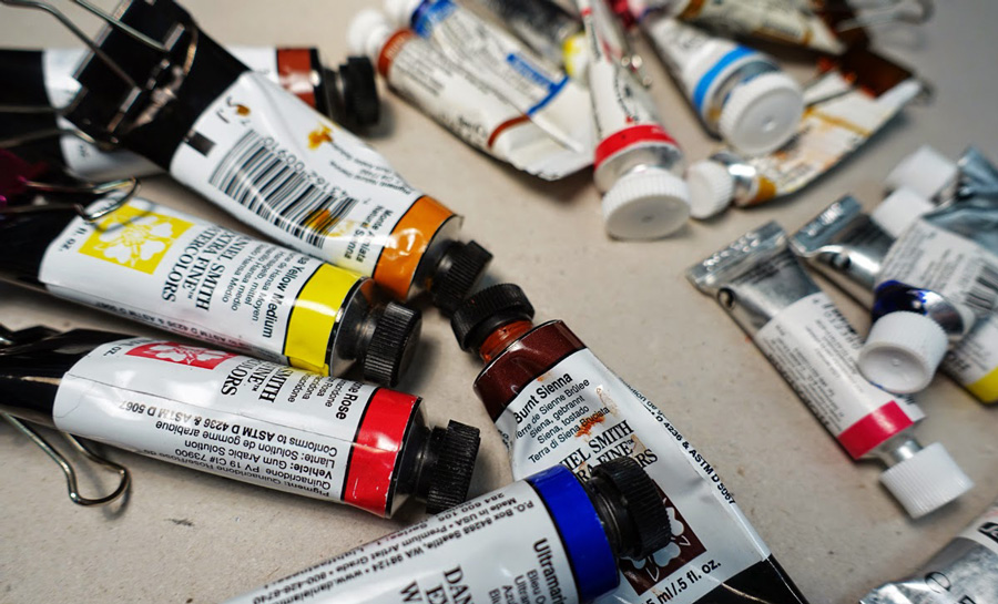
Today I spent a number of hours playing with paint and working out my best watercolour recommendations for my Foundations class. I will share the findings here on the blog for everyone’s benefit soon – I am preparing my preferred selection of 6 basic colours (Daniel Smith) plus Winsor & Newton and Schmincke alternatives. It is somewhat tragic that I can almost make up a mini palette in the 3 brands of paint. These were all hanging on my paint wall unit.
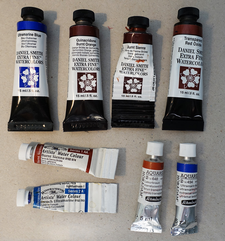
But the main fun today was testing and revisiting THE mix – the most used and therefore most important for me – Burnt Sienna and Ultramarine Blue. It is the mix that I spend the most time looking for a perfect solution (a previous occasion) – perhaps because I have a very specific goal and am very sensitive to slight variations. With my architectural sketching preference getting the right warm grey, neutral grey, muted blue and muted brown mixes is a big deal.
I have been wanting to do this exercise since I got home from Brazil primarily because I wanted to revisit Daniel Smith Quinacridone Burnt Orange QBO. It is a colour that I love and previously used extensively but in the last 18 months have not included it in my palette (except in my premix Steels Grey). One day in Rio Stephanie Bower was sharing her palette with us and mentioned QBO – well it got me thinking. You might not care for all the details… but it has to do with the blues I am using. These days it is DS Ultramarine.

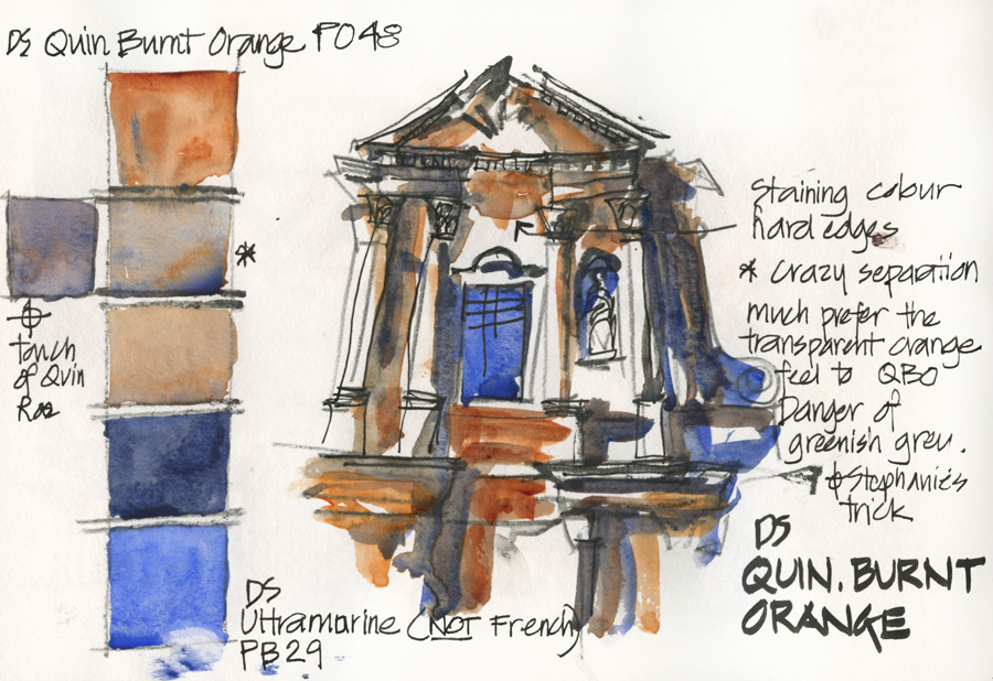
Daniel Smith: Quinacridone Burnt Orange (and DS Ultramarine Blue)
So – here is the test page. In crazy Liz-style I don’t do neat mixes, I draw a Baroque facade as the basis of my review! The rationale behind that is that it gives me a better feel for the colour and more variations in the way the paint reacts unexpectedly on the page. Silly me used a watersoluble pencil for the outlines in this one so it is a little unclear in areas.
I was reasonably pleased with this result. I do like a more earth orange ‘burnt sienna’ but the grey mix is a little green – a touch of Quin Rose fixes that though (this is something Stephanie mentioned)
Now for the alternatives:
I wish to stress that it is a very personal preference. You might prefer a different one to me. Also the colour of the local materials – stone, brick, trees, soil etc might mean that one colour is more useful for where you live. Any single choice has to be considered in light of all the other paints in your palette.

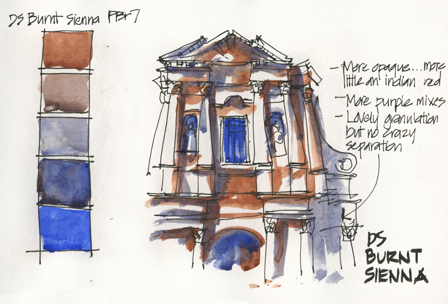
Daniel Smith: Burnt Sienna (and DS Ultramarine Blue)
- This is the colour that my very good friend Jane Blundell uses – her ‘Janes Grey’.
- It is a great pigment for beginners to use and does mix lovely greys. I find it a little purple – but then again I am more a blue girl than a purple girl. And the washes are sometimes a little flat.
- The main reason why I don’t have this in my personal palette is because I find the colour a little too red – like Indian red – and it is semi-transparent. I prefer a more transparent orange burnt sienna (this is mainly due to the fact that I cut my teeth using the Winsor and Newton BS – more about that later.)

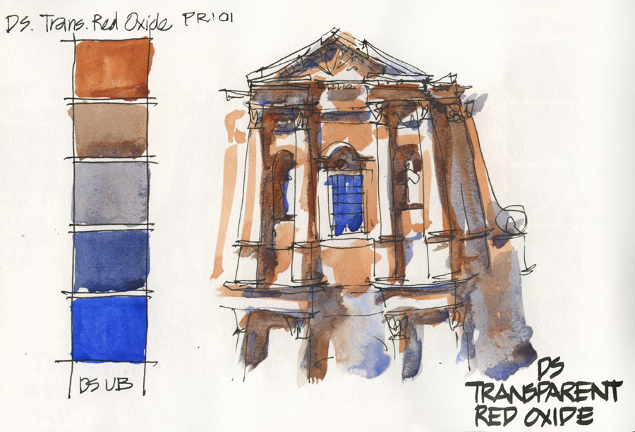
Daniel Smith: Transparent Red Oxide (and DS Ultramarine Blue)
- I LOVE this colour. This is the one that is in my palette. It is transparent and a lovely intense earth orange colour.
- However it is a crazy reactive pigment (disperses rapidly) – it is hard to get even washes with TRO. But it is this very unpredictableness that I love so much about TRO. I work in a bold way and never (will hardly ever) have an intention of putting down an even wash!
- It does give me the right hue for the grey mixes I want.
- BTW my interest in drawing that Baroque facade is starting to wain now.
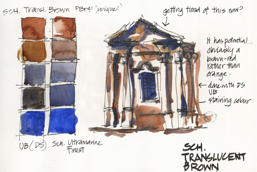
Schmincke: Translucent Brown
- This is a new colour to test – one that I discovered on my paint wall today! (I have had a collection of Schmincke paints to test hanging there for months!)
- (Note: The Schmincke Burnt Sienna is not a single pigment and contains black so is not recommended)
- This pigment was quite promising. I used it with DS Ultramarine and then did a second colour swatch strip with SCH Ultramarine Finest – I was dropping in some water deliberately so the backruns were not a surprise to me.
- My interest in drawing that Baroque facade was at a very low ebb by now – what a silly idea as a test subject matter!

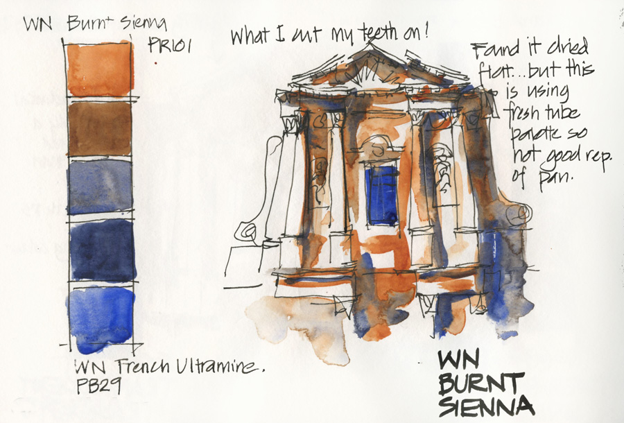
Winsor & Newton: Burnt Sienna (and WN French Ultramarine)
- Last but not least… this is the exact combination I used for years and years.
- It was the benchmark for what I was looking for.
- But why did I feel like I needed to look for an alternative? Well, I found a lot of my sketches looked very flat (eg. those from my time in Rome in 2010)
I was pleasantly surprised today with this test but I think that the major reason for the vibrant colour was using fresh paint from the tube. Pan paint or dried tube paint in a pan would definitely be flatter as it’s harder to get the same amount of pigment in my washes. It’s a lovely orange earth colour and a good mix and one that I would recommend especially as it is so readily available to most people. I still prefer the DS TRO though (can you follow my abbreviations? – I have tried to restrain myself with my TRO, QBO, BS etc and also not quote pigments!)
Of course …NOW I would love to do a yellow earth exercise with raw siennas/ yellow ochres. My favourite paint is Daniel Smith Monte Amiata Raw Sienna – nothing comes close to it in my opinion… but I will leave that for another day!



11 Comments
thanks – I do hope it helps
My pleasure!!! the last time I tested WN BS with Chris it WAS really quite flat but today I was surprised. Fresh tube paint is completely different. I find DS re-wet better than WN but maybe if you properly pre-wet a pan/tube in a pan it will improve. Of course I am using a lot juicier mixes these days
I hope that being close to DS means that you get them cheaper!
I am getting excited too and look forward to seeing your wet winter setup!
thanks Debbie – looking forward to it too! Japan trip sounds amazing. Yes take a pan of both colours- not much extra wieght!
I love how you work out your art in your journal pages and share them. I know this helps many!
Thanks for doing this Liz. I admire your patience! I recently switched back to WN Burnt Sienna because I found that other brands just weren't as rich looking. Same for Ultramarine. I love the DS Quin colours but for the old classics like BS and Ultramarine I found that WN did the best job.
I love these pages. I am becoming a Daniel Smith fan. I live in Oregon so Daniel Smith is just above me. I am starting to get excited about your workshop. I am all signed up. However, have just realized you are approaching summer while we are approaching our winter and the rainy season. I will need to devise a rain setup for sketching!
Thank you Liz for these very thorough and thoughtful comparisons! I am so looking forward to your Foundations class! Also choosing a palette for a trip to Japan in November- think fall foliage and amazing city and country scenes! I am probably going to take both TRO and QBO- can't decide!
Lately it seems DS are a better buy than WN. Every so often DS offer free shipping over $50. DS have decided to stop selling non DS products and by the end of the month will only sell DS products. Winter set-up, I have the gloves and rain outfit…just need to work on something to hold or stand a golf umbrella or the like. My husband does a lot to support my sketching but will not hold an umbrella!
This is what I needed! I love this article and the tests you did for the color combination!!!
I love the QBO separation. Here in Tasmania, building have aged with many colours often in old walls. I think it has more life than the BS
NEWSLETTER
Subscribe for first notification of workshop + online classes and more.