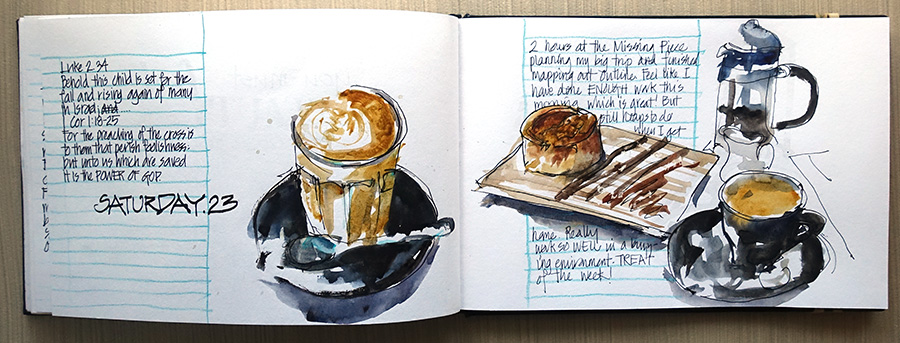
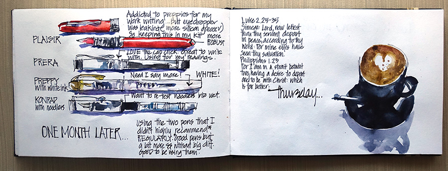
Another week, and another collection of latte sketches. I am really wanting to broaden my subject range but I am struggling to find time to sketch apart from my cafe visits – and things are about to get even busier from next week. Putting this post together has prompted me to decide that for this coming week I am going to put all my latte sketches on the one double page spread – I think that will help prevent the coffee from taking over my sketchbook.
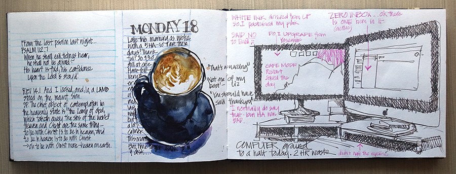
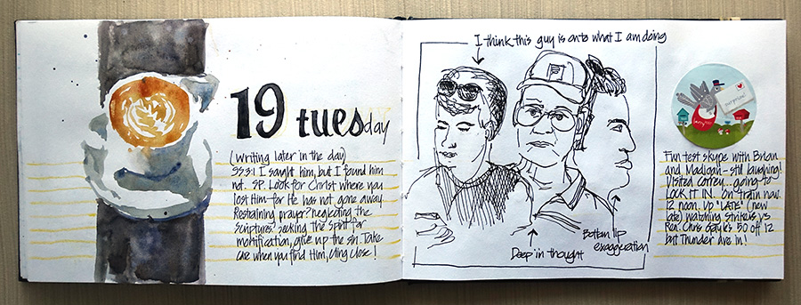
But despite the repetition, last week I was playing with text as prompted by a great lesson on Sketchbook Skool Expressing. It is small shifts like this that remind me that each week IS different… and while on the topic of unique events, I hope I don’t have a computer problem like I did last Monday as a regular occurrence!
A few thoughts in regard to my hand lettering experiments:
- To date my sketchbooks have been full of two kinds of writing: general text grouped into blocks often with visible guidelines and headings using a fude nib pen.
- Neat handwriting is a big deal for me. I rarely regret taking a huge risk and doing a rushed sketch, but I always regret rushed and messy handwriting.
- I enjoyed so much added some collage numbers to my pages during December that I have been wanting to incorporate some more variety into my book – including drawing fonts!
- I decided to throw caution to the wind and abandon guidelines for my headings last week – and not really happy with the result! If no guidelines I think it is better to go totally free form and random rather than trying a neater style and hoping for the best. I really dislike text that is warped or not straight (it is the architect in me).
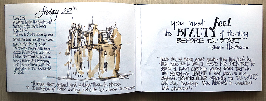
- I have no desire to do carefully laid out text pages (like my Hawthorne quote page) in my sketchbook. It was great to try this but I want something that is quick and spontaneous to match the tone of my books.
- Last week confirmed that I much prefer vertical type than italic and sloped characters – mainly because vertical is so much easier to achieve quickly.
- I want to get a few fonts in my arsenal so I can add more interesting headings on the go.
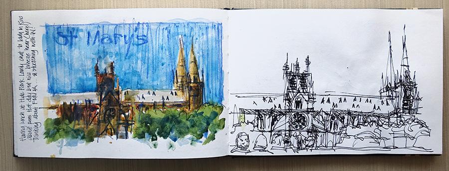
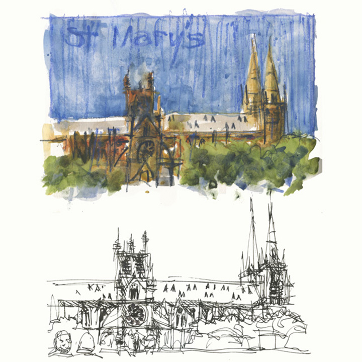
And – oh! I forgot to mention: Above are my two very quick sketches of St Mary’s Cathedral while I was having my lunch in Hyde Park – a shape-based and a volume-based version. More about volumes in the next installment of my Foundations Friday series.
Anyway here are all my pages from last week as they are:


Click on any image to see them larger.
Finally in regard to subject matter:
So does anyone have a challenge for me to sketch in the coming week?
What would you like to see me sketch more of?
I have to mix it up a bit don’t I?
But it needs to be something that I can sketch without a lot of effort during the week.

NEWSLETTER
Subscribe for first notification of workshop + online classes and more.