Last month I went to a Daniel Smith event here in Sydney and met John Cogley, the owner of Daniel Smith. He talked about pigments, the process of making paints, how to read a colour chart and many other things. It was a great presentation and afterwards a lot of tubes of paint were opened for people to test.
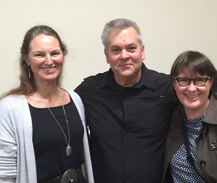
I ended up talking rather than tempting myself with new colours, so I can’t show you any new colour swatches. It was so wonderful to meet John and also Luke Senior from Senior Arts (finally!) who took this photo. Jane Blundell was there as well.
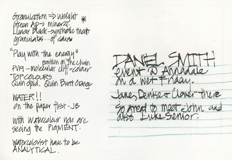
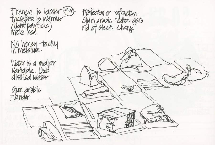
Here are my notes from the event and a few photos.

I spent hours (days, weeks?) poring over colour charts (and the Handprint site) a number of years ago but haven’t really looked at one for ages. So it was great to remind myself of how much fun it is, and how much I need to refresh my memory about the characteristics of my own babies (the colours that I use in my daily palette). Getting to know your own paints is so important to understanding why your washes look murky or flat.
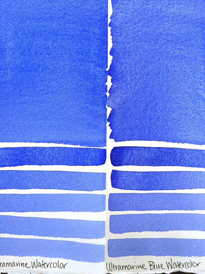
There were lots of gorgeous paint-outs like these. Oh! so many wonderful colours. Here are the two Ultramarines. I use Ultramarine Blue (on the right), not French Ultramarine (on the left) as Ultarmarine Blue mixes better greens.
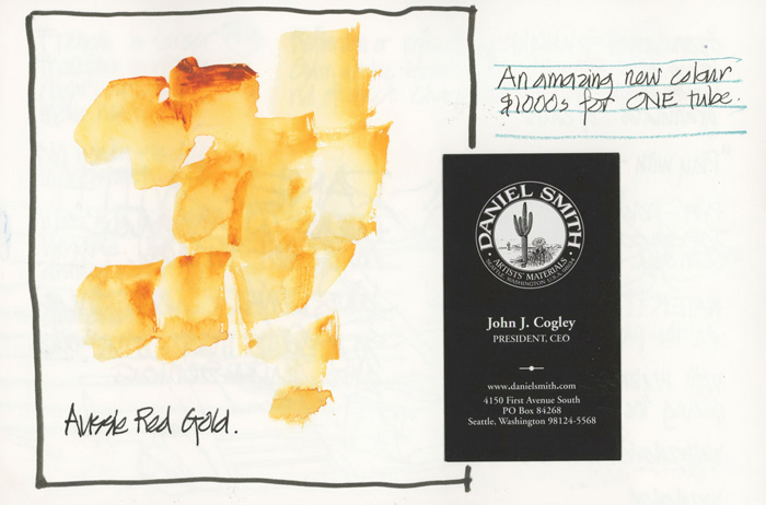
Here is a very exclusive colour of which they only made one tube because it is so expensive to produce.
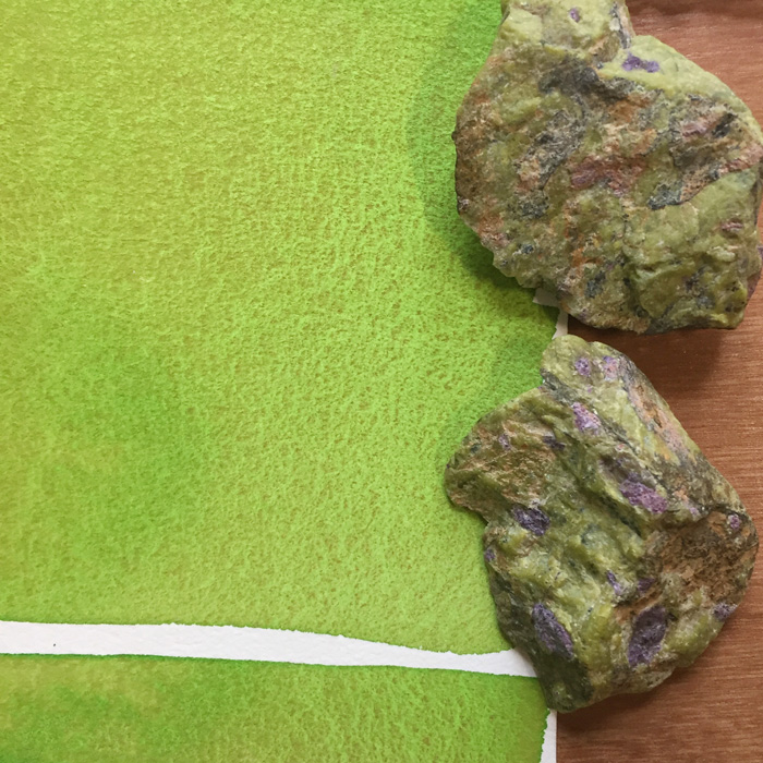
There were a number of new ideas to explore as a result of this event, not the least to revisit some old colours such as Serpentine!
Question: I know colour (and in particular watercolour) is a big topic, and it’s one which a lot of people struggle with. I certainly want to start producing some content on the topic so I would love to hear about your particular challenges and what you would like to learn.



25 Comments
I am always surprised to see “straight from the tube” greens in a palette where there are also different yellows and blues. What advantages do you see in having a half pan of Sap green (or other) instead of another colour? Also plse explain how you mix your nice ochre/earth yellow hues. Thx.
Hi Patrick, I used to not have any greens in my palette… but am enjoying sap green. Will definitely write an article about this topic. And the earth yellows too!
I was wondering this very thing too, what colors/brands do you use to make the ochre/earth yellows in your journals… have I missed where you have written this since this post by the above person? The ochre I use -W&N is too yellow/gold, and not enough brown like your color…
Liked you post on John Lovett and his work. Really good website for information. I love learning!!!
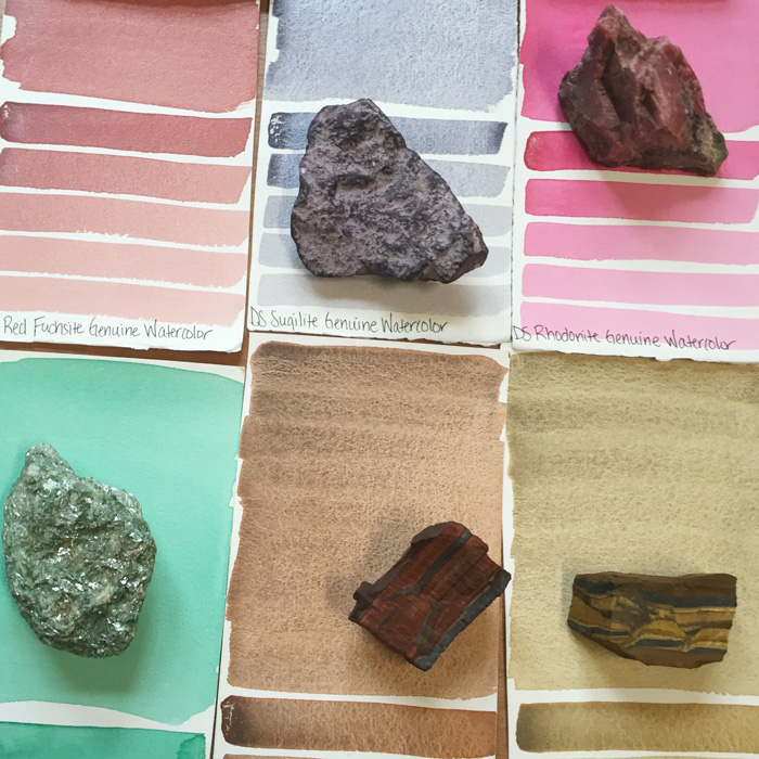
Liz, what did you think of the Genuines? I’ve recently picked up a few since i love the notion that they are pure stone/minerals. I find they have a stand alone ethereal quality.
Thanks for your post.
Hi Patricia… I love a lot of the genuines but like a lot of things dont really need to be tempted. I am very happy with my standard 16-20 colours.
I’m very interested in knowing more about your notes. “Honey” an M. Graham reference? Distilled water? I agree on being analytical. Why bother, eh? Who was it that said “An unexamined palette is not worth carrying?”
Thanks for sharing.
Hi Liz,
I’m also very interested in learning more about your notes, could you elaborate on them. I’ve been doing a lot of work trying to understand granulation, analytically varying papers, type of washes, mixes, water – just bought a jug of distilled water, etc. Any additional pointers would be great, I’ve been searching and don’t find much and often contradictory info which I’ve figured out is because granulation depends on the details!
Thanks for the info!
John
Hi tara – refer to separate comment on distilled water. THe honey comment does apply to M Graham. I have never really used them as they never set enough for me in Sydney weather
Hi Liz,
Excellent post! Lucky girl – What a treat this event must have been! 🙂
I struggle with picking out a good mixing, clear, correct Yellow. The ones I gravitate to (seem to mostly be Cads) are too opaque. Do you have a favorite translucent yellow in your palette?
I also would like to understand how you mix your ochre/earth yellow hues.
thanks Dena – requests noted!
Great post Liz. Questions? I’ve got one I ask myself regularly. How can I get interested in color? Every time I add paint to my sketches it’s as an afterthought and while it’s obvious to me that I need to understand them better, I haven’t been able to kick my butt hard enough to do so (grin). — Larry
Hi Larry, interesting comment and question. Will enjoy thinking about that!
What a great post, Liz! I love anything and everything you write about color. Recently I’ve been playing with my colors and really trying to get to know them, so this is especially timely!
I’ve been using tap water—I guess I should bump up to distilled? Does this make a HUGE difference? (I’m sure it makes some difference, since it was noted in the presentation, but I’m wondering how big of a difference…and in what ways?)
Hi Emily – great that you are playing with your paints. See separate note about distilled water… no, I am not going to start using it!
With limited time and money, the learning curve of getting seriously into watercolor seems too steep. You did a great job of enthusing me all over again about ink pens. The entry level cost is lower and the potential impact on my sketchbook satisfyingly measurable. Yes, I’ve taken in-person (though poorly taught) watercolor courses, have supplies, but enough to realize how much more there is to learn. (A Liz Steel entry level to watercolor course would be wonderful.)
Oooh, Michelle, I love that entry level course idea!!!!
thanks Michelle… I am seriously thinking along those lines. No promises as I have a LOT of projects on the background, but right now, I am really trying to nut out the main issues and needs.
Ok – the comment about distilled water is if you want to limit the variables. However, I think distilled water would not produce as much granulation. I haven’t tried it yet… not sure I care too much as I like the uncontrollable aspects of watercolour.
As for granulation – there are just SO much variables that I think it is hard to make definitive statements. The JB(Jane Blundell from the back of the room) note: water first (and drop in colour) is the best way to get the most granulation.
I will be exploring some of these things for myself later when things settle down…and of course will share with you all. So stay tuned.
No free samples then… :>(
hmm, yes! we got a bag with some samples, but for me it was secondary to the other concepts. And no need to make people get caught up with stuff 😀
THANK YOU Liz!
Distilled water! This explains a lot. I was making some Cobalt blue pale a few weeks ago and used Paris tap(full of chalk) instead of distilled watwr as I used to do. It’s been 4 years since I made watercolor paints…Plus I’ve been using tap for my painting. Another big No No. I will cease and desist henceforth thanks to yr post. Evian will be my go-to since I’m not sure how to find distilled water here…
Mille merci!
FYI as far as I understand, distilled water is mostly mineral-free so very good for inside your iron. Also good for painting if your water is loaded with minerals as Paris l’eau is…lots of white chalky residue on my sink and glasses.
I don’t think it effects paint granulation at all IMHO.
thanks Carol … yes, the water in Paris must have a big factor – so many minerals in it. We will all have to test distilled water for ourselves and report back!
Interesting note – “Watercolorist have to be ANALYTICAL” – could you elaborate on that?
My tap water is filled with minerals. I have not noticed that it has affected my paintings but I have wondered about it. It would be interesting to know more about distilled water vs tap water.
NEWSLETTER
Subscribe for first notification of workshop + online classes and more.