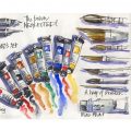
During the recent first cohort of my Travel Sketching course I got many questions about my watercolour palette. So, it’s time to do an update!
The previous ‘Current Palette’ article contained all the details (with numerous updates), but a few things had been tweaked, so it was time for a new layout sketch.
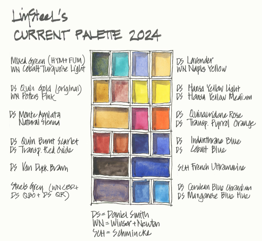
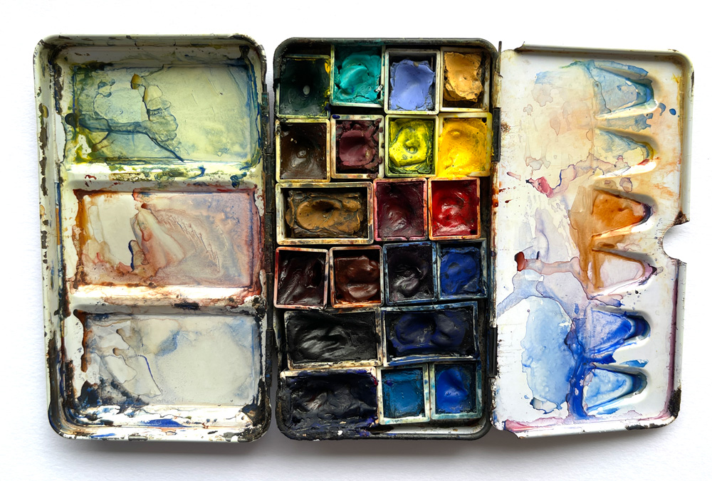
What’s in my palette?
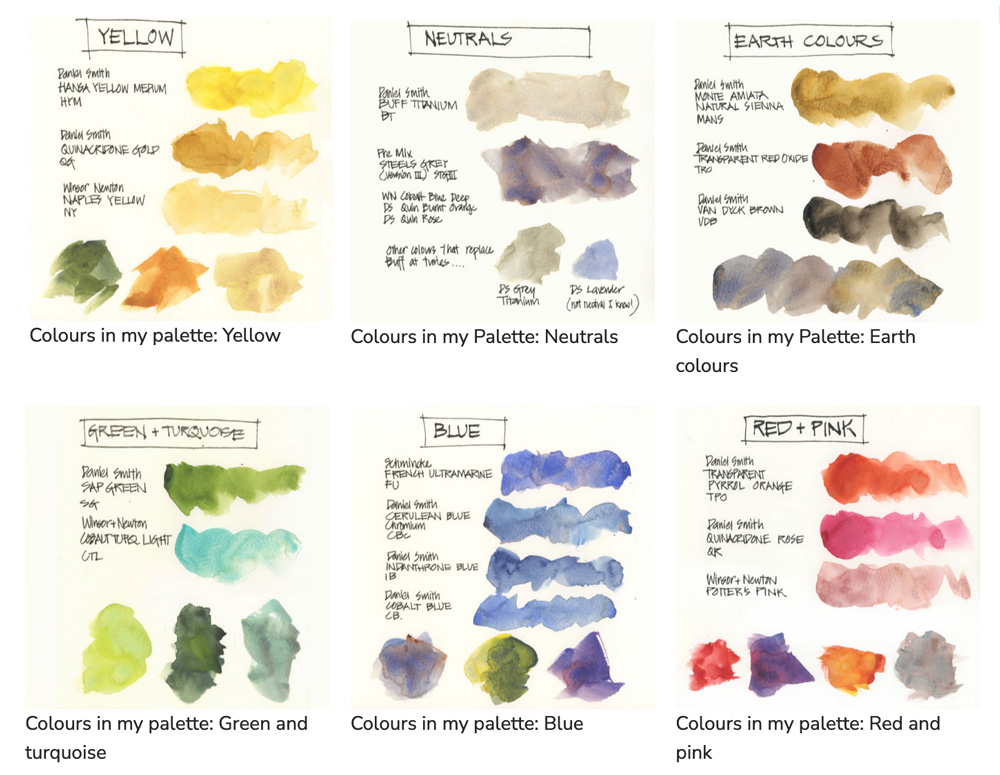
DS Lavender PW6, PV15, PB29 (or DS Buff Titanium PW6)
WN Naples Yellow PW 6, PBr 24
DS Hansa Yellow Light PY3
DS Hansa Yellow Medium PY97
DS Transparent Pyrrol Orange PO71
DS Quinacridone Rose PV19
DS Indanthrone Blue PB60
DS Cobalt Blue PB28
SCH French Ultramarine PB29
DS Cerulean Blue Chromium PB36
DS Manganese Blue Hue PB15
Mixed Green (a pre-mix of SCH French Ultramarine and DS Hansa Yellow Medium)
WN Cobalt Turquoise Light PG50
DS Quinacridone Gold PO49 (original)
WN Potters Pink PR233
DS Monte Amiata Natural Sienna PBr7
DS Quinacridone Burnt Scarlet PR206
DS Transparent Red Oxide PR101
DS Van Dyck Brown PBr7
Steels Grey (a pre-mix of WN Cobalt Deep Blue PB74, DS Quin Burnt Orange PO48 and DS Quin Rose PV19)
Notes:
Note 1: DS = Daniel Smith, WN = Winsor Newton, SCH = Schmincke
Note 2: I am listing them as I think of them – right column first and then left column (as I’m a leftie) – so I apologise if this list doesn’t relate to the way you are probably reading the above image!
Note 3: Cobalt paints have toxicity issues so please make sure you are aware of this. Check out this great section on the Handprint site about the topic.
Note 4: I periodically swap out Lavender for Buff Titanium – neither paint is essential to my palette. Find out why I don’t need Buff here.
More Colours
Over the past five years, I have added a few more colours to my palette (DS Hansa Yellow Light, DS Manganese Blue Hue, and DS Quinacridone Burnt Scarlet), mainly because I want a variety of pigment types in my palette.
- Since splitting Hansa Yellow Medium into two half pans (one for greens, one for oranges—see here for more), I decided to swap one of them for Hansa Yellow Light. I haven’t decided whether this is a permanent change, but it makes sense.
- Why DS Manganese Blue Hue? See more here.
- Why DS Quinacridone Burnt Scarlet? See more here.
My pre-mixed colours
To achieve these pre-mixed colours, I squeeze a little of each colour in a pan and then stir with a toothpick or skewer. The exact ratio varies each time (and I’m okay with that).
Steels Grey: Mostly WN Cobalt Deep Blue with a little DS Quin Burnt Orange and a touch of DS Quin Rose. I’m aiming for a greyish blue with a hint of warmth – too much QBO and the mix is brown, too much QR and the mix is purple. Note: You can get a similar mix with any Burnt Sienna colour and any Ultramarine (you do not need to use CDB or QBO). See more about Steel’s Grey here.
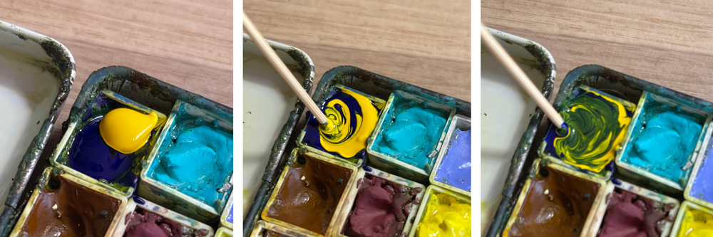
Mixed Green: This mix is approximately 50:50 of SCH French Ultramarine and DS Hansa Yellow Medium (sometimes 40:60 and other times 60:40 as shown in the above photo). I used to use DS Sap Green, but this mix is SO much better!
More details about my colour choices
For more info on why I have chosen these particular colours please check out my Colours In my Palette series. It will answer all your questions!
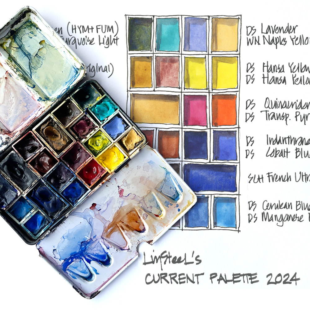
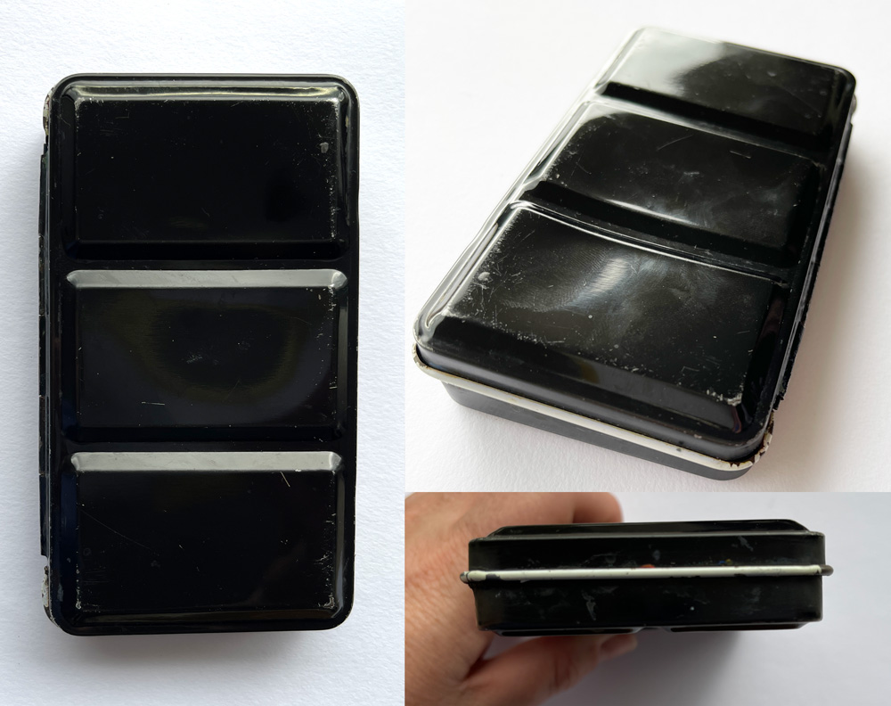
Watercolour Tin
I am using a 12 half-pan metal tin with three mixing areas in the lid. I remove the metal clips and can fit in 12 full pans (see this article for more). This version is made by the Australian brand Derivan but Schmincke also make a version.
It is the perfect size for me, small but with plenty of room for paint and mixing. I prefer a tin with 3 mixing wells in the lid.
Related articles:
- Setting up my palette
- Mixing in my palette (and why I prefer 3 wells in the lid)
 Further Reading
Other articles to check out:
- My watercolour section – with lots of things to consider when choosing your colours
- Recommended minimum palette of 6 colours
- A basic 12 colour palette
- Putting together my palette for a big trip
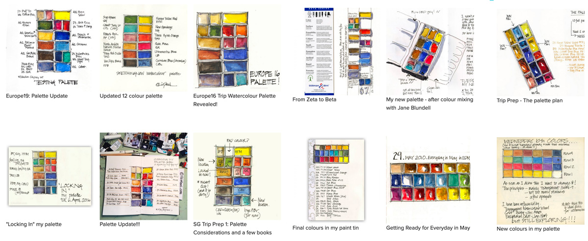
An archive of my previous ‘current palettes’ can be found here.
Start using your watercolour palette!
Don’t get bogged down looking for the perfect selection of watercolour paints. Instead, start using the paints you already have and spend time really getting to know them.
If you want to master the basics of watercolour I have an online course on this exact topic!
Create vibrant and lively watercolour sketches by learning how to control your water, create watercolour magic and know when to layer or work wet-in-wet.
Find out more about my Watercolour Course
What have I missed?
Please let me know if you have any questions in the comment section below. (If you are reading this via email, please click on the article title link below and add a comment on my blog. Thanks!)
PS: This article took a long time to put together (even though I was modifying the last version), so I now know why it took me 4 years to update! 🙂 It feels good to have done it now and it was interesting to realise that the layout of my palette had changed a bit since 2020.
PPS. This article is now easily accessed by clicking on the palette in the blog sidebar.


21 Comments
Hi Liz,
I can imagine that it took you a lot of time to make these choices…thanks for sharing!!
I myself am quite careful with my dagger brushes and half pans, since you use half pans, I wonder how long a (3/8?) dagger brush lasts for you?
Hi Bep Son – as I pick up paint sideways daggers don’t lose their edge anywhere near as often as round brushes lose their points. Just today I replaced a 1/2 inch that I’ve been using since July 2019! If I needed a fine edge I just flattened it with my hand. I actually prefer to use them when the razor edge is worn a little.
Oh that’s great to hear!! Thanks to you I can’t live without my dagger brushes. Thanks Liz, also for the Travel Sketching course; I’m still doing it and find it very inspiring!!
So glad you enjoyed the course! makes me super happy to read that!!!!!
And just for the record, full pans are so much nicer to use. I’m a little sad to have gone done to so many half pans… but I’m not going to carry a bigger palette. Ah! decisions are so hard!
Hi Liz. Wonderful article, especially with all the informative links. One small correction that I think you meant to say? You are using a 12 FULL pan palette with THREE mixing areas.
Thanks Maggie, yes the two mixing areas was incorrect, and the 12 half pan description was misleading. It is in fact called a 12 half pan tin as it comes with metai clips. I remove these and this enables me to fit in twice the capacity – 12 full pans or even 24 half pans if I use the smaller type half pans. I’ve amended the article to be more accurate. thanks again
Hi Liz, thanks for sharing, such a useful article. And inspiring me to sign in to the Foundations course again and make sketching a regular activity!
My pleasure Anne – enjoy Foundations!
For Australians (and probably Jackson’s UK customers in other countries), there’s another source for watercolour palette tins with three mixing wells in the lid: https://www.jacksonsart.com/en-au/jackson-s-empty-metal-watercolour-box-holds-12-half-pans-or-6-full-pans
These are superior to both the Derivan and the Schmincke models because, unlike those two, the rails on the palette tray insert are spaced to allow a third row of pans down the middle. So up to 21 half pans (definitely 18) are possible while retaining all the advantages of the insert tray: it can be lifted out for easy clean up and swapping of pans.
Other nice features: the inner fold-out mixing area has a rolled lip rather than a sharp edge, which is safer and makes for fewer spills, and the insert tray has two tabs that make for easy lifting out when needed.
Thanks for sharing Yvonne
Thanks, Liz!
I recently added a second yellow pan to my travel palette, initially thinking I’d keep one clean and the other dirty. However, after reading your blog, I realized there’s a much more practical approach. Your suggestion of using one yellow specifically for blue mixes and another for red mixes makes so much more sense! It’s a great way to maintain color clarity and expand mixing possibilities. I appreciate your insightful advice on palette organization.
Hi Clare – glad its helpful!
I’ve read that you recommend Bruce MacAvoys site “Handprint”. I’ve found it to be a ggod source for trying to keep pigment information straight. The site is not completely positive about PY3 as maybe you’ve read.
Handprint says: ”Hansa yellow light PY3 is a marginally lightfast, semitransparent, moderately staining, very light valued, intense green yellow pigment, offered by almost 50 pigment manufacturers worldwide. The average CIECAM J,a,b values for hansa yellow light (PY3) are: 88, -12, 72
The ASTM (1999) rates its lightfastness in watercolors as “very good” (II), but my 2004 tests suggest this may be true of some paints but is not true for all. The full strength color in most brands began to darken (brown) slightly after about 6 weeks to two months of sunlight exposure (BWS 6); in some brands this discoloration was significant. Frequently the tints faded noticeably.”
So I was wondering whether you have done any lighfastness tests with Daniel Smith Hansa Yellow Light. I realize that maybe using it just for sketching might be a different case altogether. Really find your site interesting and very helpful. I do mostly studio painting now but would like to do more Plein Aire. Thanks so much.
Hi Carol,
Thanks for looking up HYL for me – I hadn’t done that and just assume that it would be ok! I generally choose lightfast colours but as all my work is done in sketchbooks I don’t stress about it too much. Having said that I might but HYM back in this spot when this colour runs out.
Hi Liz,
Yes, trying to choose colors for my palette has been difficult. I find that I am constantly replacing less used colors with new ones I’d like to try. I guess this is the way to do it.
I had a question about the DS Monte Amiata Natural Sienna…is there anything I can do to prevent it from shrinking in the pan? Other colors shrink a little, but not as much as this one.
Had a great time during the Travel Sketching class. Thanks for that!
Hi Marsha – I’m glad you enjoyed Travel Sketching.
The shrinkage is not something I worry about – in fact I’ve never really been conscious of it until now (believe it or not!) – I think because I use it in a full pan.
If it bothered me I would just fill up the cracks with more paint.
Good to know. Thanks.
It’s always a joy to see sketches of your palette!
Thanks to your example, I’ve sketched my palettes as well and have been delighted with the results!! So easy and so much funnnnn!
Thank you Liz!
Thanks Lois!
The lavender intrigues me! It’s a beautiful shade, but I found that when mixing with it, it worked like a blue. Since you have so many blues, I’m curious how you are currently using the lavender? As a straight color, and not mixing with it, or do you find you mix with it more? I laughed when I saw lavender in your neutrals, being surprised, “oh she puts it with her neutrals,” but then you comment right there, not a neutral. This gave me a giggle and is so much what I love about living sketchbook pages! They capture such small moments, or thoughts!
Hi Jamie – I don’t use it much – mainly for muted greys. Its a fad colour and not essential.
NEWSLETTER
Subscribe for first notification of workshop + online classes and more.