The goal of this series of articles is NOT to suggest that you run out and buy every colour which I use. Instead my hope is that by sharing my own thought process and preferences you’ll be able to think through your own palette and personal colour needs. We all have different favourite colours, different favourite subject matters and live in different parts of the world, so our palettes should be different too!
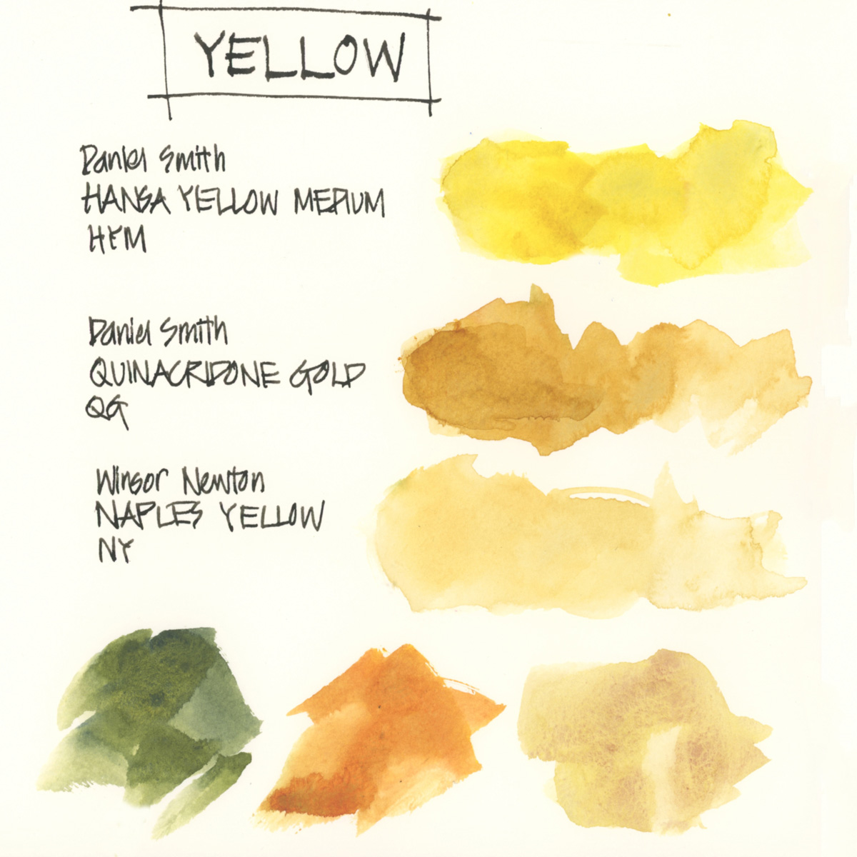
So first up is YELLOW and straight away I have a quirky selection!
A standard split primary would be to have a lemon(cool) yellow and a deep (warm) yellow (such as New Gamboge or Hansa Yellow Medium). The rationale between splitting our primary colours (yellow, red and blue) into two versions – a warm and a cool – is so that we can achieve more vibrant mixes. In the case of yellow, the theory is that a lemon makes better green and a deep yellow makes a better orange.
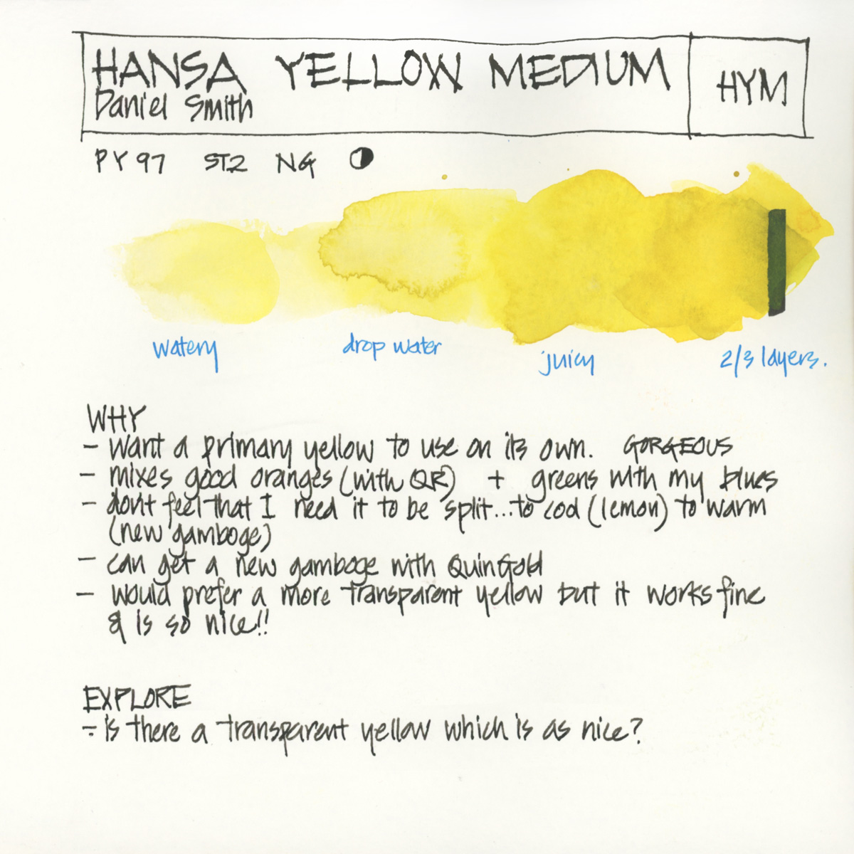
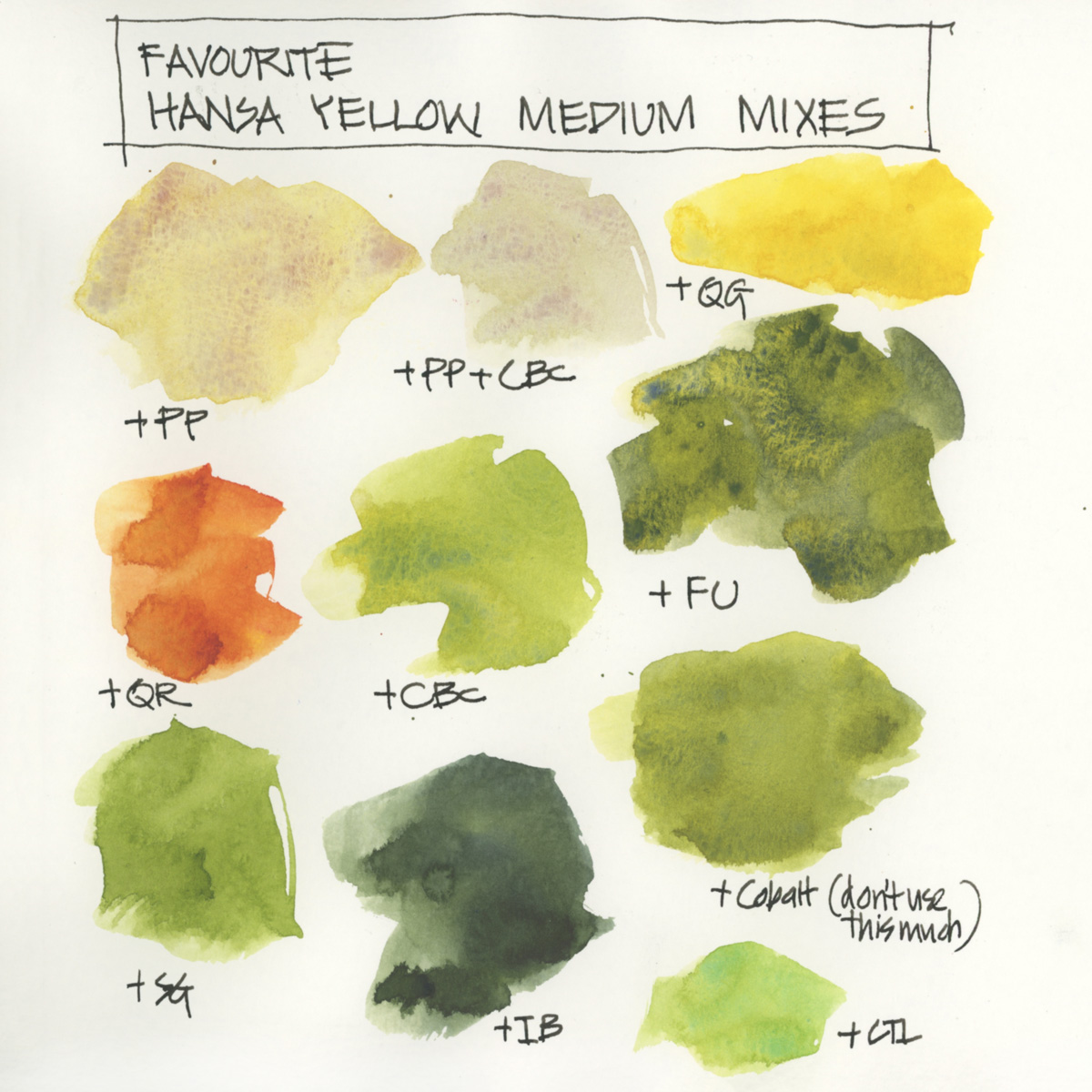
But when I use a yellow, I normally want a middle yellow (a primary yellow) and DS Hansa Yellow Medium fits that bill perfectly. I’m happy with the greens and the oranges that it makes, so I don’t feel as if I need to split my yellow into a cool and warm version and if I did, I would have to mix them together to get a primary yellow. (Note: I’ve recently split my Hansa Yellow Medium into two half pans to keep the pan clean, but that’s a totally different matter! See more here.)
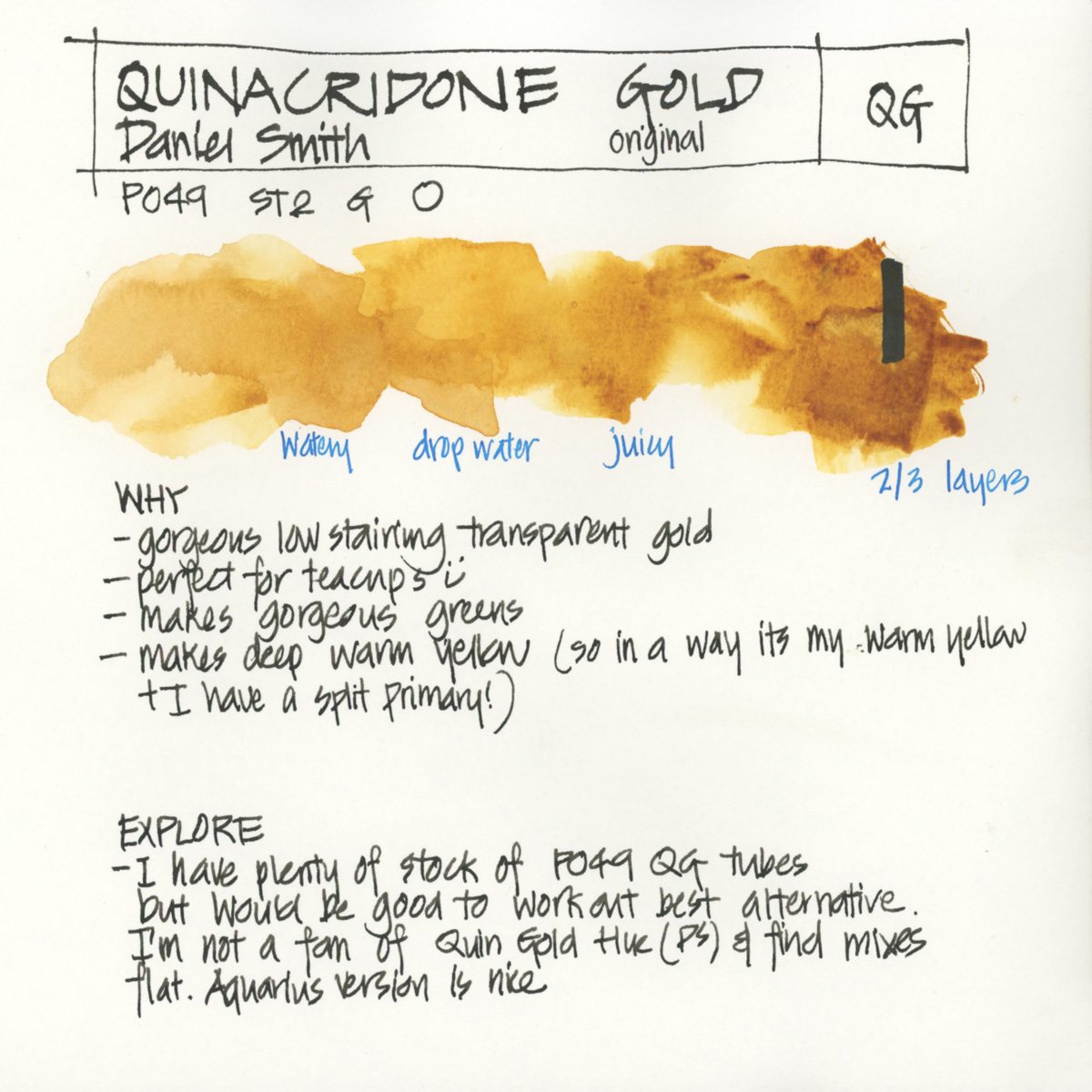
In an expanded palette I would have DS New Gamboge as it is such a gorgeous colour and reminds me of Lisbon and pasteis de natas. (Is that a crazy reason to like a colour??) But my great friend, Jane Blundell, pointed out to me that I could easily mix a New Gamboge colour using DS Quinacridone Gold. So in a way Quin Gold has become my warm yellow. (Note: Shortly after first meeting Jane in 2013 (more about that here) we had a palette session and she introduced me to a lot of Daniel Smith colours which are still an important part of my palette today – see here. Thanks Jane!)
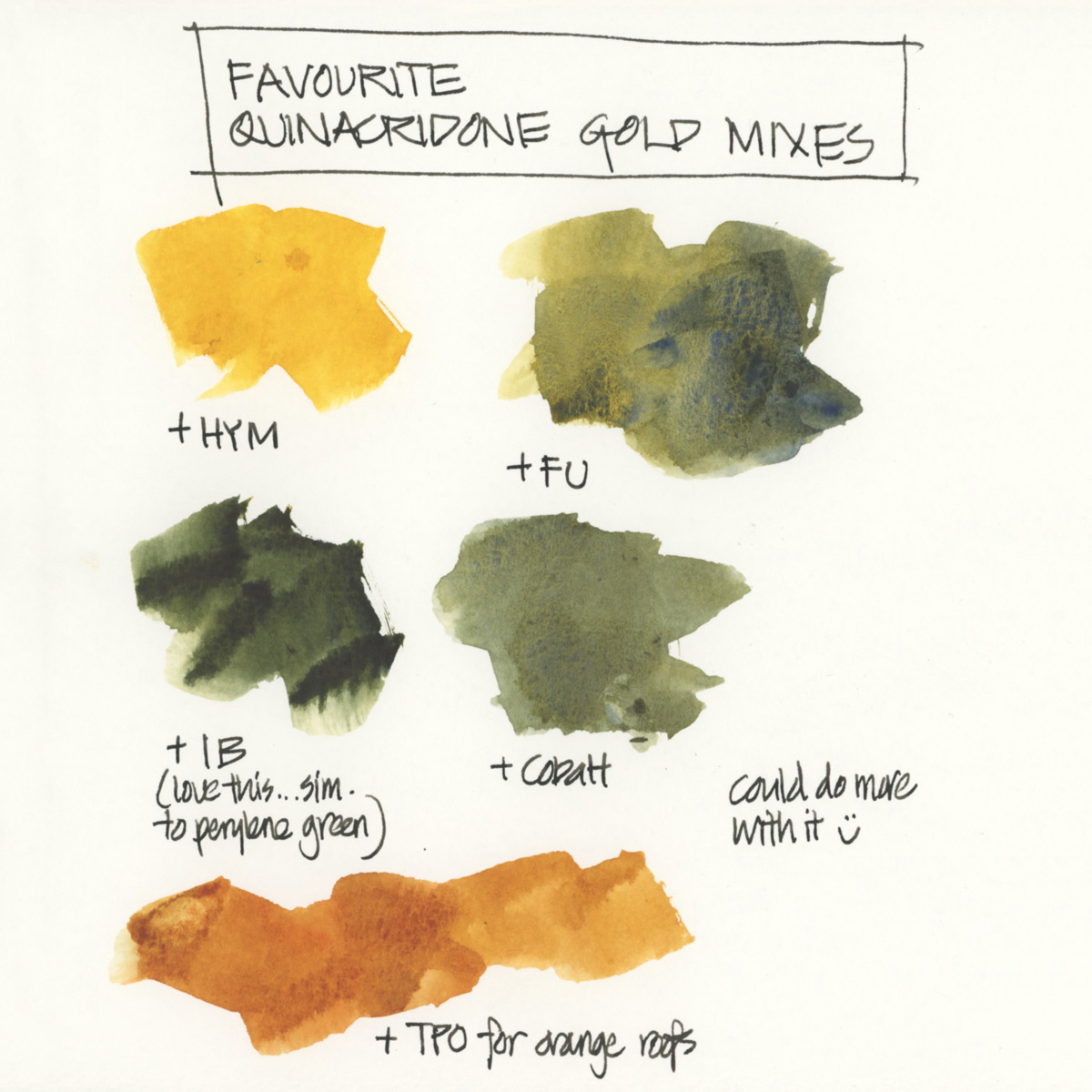
As for DS Quinacridone Gold – it’s a colour which I love and is essential to me due to all my tea cup sketching. I know that I can mix an alternative with Hansa Yellow Medium and Transparent Red Oxide, but it just doesn’t work for me as well. Quin Gold also makes beautiful greens which are perfect for Australia. (Note: I still have plenty of stock of the original Quin Gold which is sadly no longer available. The new version of Quin Gold is not the same and when I run out (in many years time) I’m not sure what I will do.)
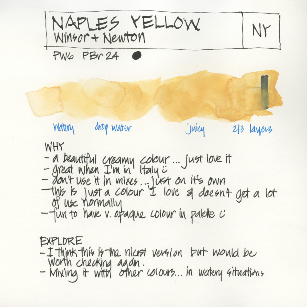
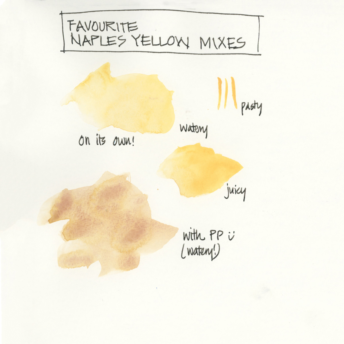
The third yellow is WN Naples Yellow and it’s in my palette just because I like it!
DS Monte Amiata Natural Sienna is another yellow but I will discuss that in the earth colours article.
Enough preamble about yellow… here are the individual pages for each colour with additional notes.
Hansa Yellow Medium (Daniel Smith)
Quincridone Yellow (Daniel Smith)
Naples Yellow (Winsor Newton)
Full Palette – Further Reading
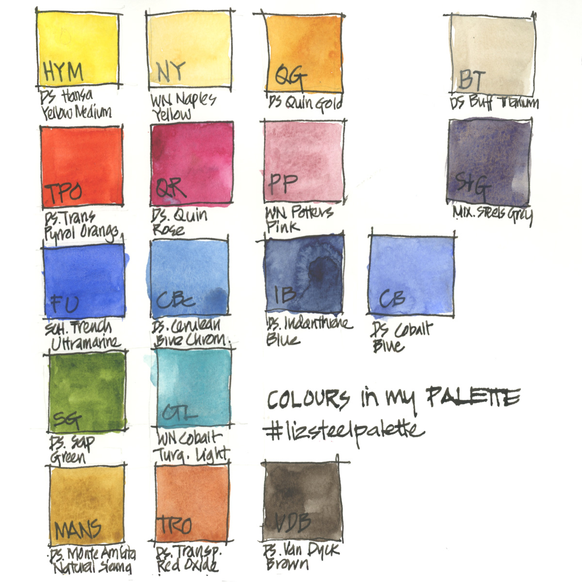
Just for reference… here is my complete palette with the abbreviations I use for the other colours.
More…
- The general principles behind my palette selection
- All my palette articles
- My SketchingNow Watercolour course – Learn how to increase your control of water, how to decide when to layer/glaze and when to work wet-in-wet, how to create vibrant colours with a limited palette, how to be more confident with your use of colour and much more!
So what yellows do you have in your palette? and why are they there?
Thank you in advance to anyone who takes to the time to share in the comment section – it really makes this article more valuable for other readers. Plus I always LOVE reading about other people’s WHY’s



22 Comments
Great series, Liz!
I really love Schmincke transparent yellow (PY150) as my go-to yellow, it’s almost lemon yellow when watered down, and has an golden/ochre undertone when used in layers, and it’s transparent so great for mixing. For me it’s a great all-purpose yellow. I only have Quin Gold in my bigger palette, but I find I only use it regularly in phases, so it’s not in my small field kit.
Thanks for sharing Julia!!! PY150 is a popular pigment… I will have to revisit it!
Naples Yellow is a recent add to my palette too. I’ve discovered that Naples Yellow in a watery mix with Quin. Magenta or Quin. Violet makes a beautiful sand color.
By the way, I love this series!
Hi Liz,
This is an interesting series. One pigment I recently included in my palette was Nickel Azo yellow. This pigment (PY150) is warm like Quinacridone Gold, but a bit less red. Love the color explosion on the paper when use it wet into wet.
Hi Mayela – yes PY150 is a popular yellow. I need to revisit it. I find the explosion a big annoying at times!
Thanks Cheryl – I will try that combo out! Last year I was mixing it with lavender (very watery wash) for a crazy neutral which broke all the rules
I like Winsor & Newton Turner’s Yellow (PY216) better than Naples Yellow. Turner’s yellow is opaque, but less chalky and slightly richer in color. Sometimes I use it to mix opaque green, and in this case it does much better than Naples yellow.
Finally someone who also loves Turner’s Yellow!! I use it from time to time and really like the opacity and the beautiful hue.
Hi Cora – I know nothing about Turner’s Yellow – so now I have to look it up. thanks for sharing!!!! I have a dot card somewhere…..
Great article, and I like the point you make about not needing a warm and cool yellow if you’ve got Hansa Medium. But I’m still a big fan of Nickel Azo Yellow (PY 150) for it’s luminous transparent glow. Nothing else mixes those bright spring greens quite as well. It’s one of the most common ingredients in DS convenience colors, including their substitute for Quinacridone Gold, Sap Green and many others. Try it when you run out of the original Quin. Gold.
Hi Laurie! Ah yes PY150 strikes again. I really need to revisit it as I find its presence in Sap Green rather annoying. Maybe on its own its fine – ie. an explosion of yellow is much nicer than an explosion of green!
Always love discussing pigments with you – you are one of my special pigment buddies!!!
Hey Liz, I absolutely love this series you’re doing! As for my yellows, I use Transparent Yellow by Schmincke because it gives me really vibrant greens when mixed with turquoise or cyan blue; I also use Bismuth Yellow by WN (which I think they have discontinued) because it is semi-opaque and cold and is great for greens as well as oranges; and I use Titanium Gold Ochre by Schmincke which is sort of like NY; it contains titanium white and makes the most amazing subtle greens. TY is the most recent addition to my palette and it’s the one I care least about. But I still use it a lot. Strange, huh? Greetings from Germany! xx
Hi Antje – thanks for sharing. A selection of colours I am unfamiliar with…so I’m curious now!!!!
I’ve been wanting to add Naples Yellow to my palette as an extra, fun yellow (I have DV Hansa Yellow Medium PY74 and DV Nickel Yellow Azo PY150, as well as DS Rich Green Gold PY129), but I’m really curious about why you prefer Naples Yellow vs Naples Yellow Deep. It’s cool that the NY is premixed with the white, but I figured then that NYD would give you more options… However I have always like the look of work I’ve seen with NY and haven’t seen much with the NYD. Thanks for any info/prefernces you can pass on!
Hi Phoebe – thanks for the suggestion I will have a look at NYD. As for NY… I don’t really need it to do a lot – it’s fun to have a colour that you only really use at times and mostly on it’s own. I makes it special.
A great series! Thank you so much.
I’m glad you enjoy it Barbara… I’m only warming up!!!
Such a informative series. I’m new to watercolor, so enjoying your descriptions and swatches. Thank you!
My pleasure Kristina – all the best for your watercolour journey – it’s exciting to be at the beginning!
I’ve never used watercolour before but this series is so so so gorgeous!
I recently put together a CMY palette for a commissioned project (the client wishes to print cards on a copier, hence the CMY) — I chose DS lemon yellow (PY175) because it is very transparent. Not as versatile for me as Hansa yellow medium, but maybe you’d like to give it a go?
I use Permanent Gamboge (PY97, PY83) by Art Spectrum and find it… well it’s my Swiss army yellow!
Watery through milky washes it’s pretty indistinct from lemon yellow. I like how it mixes too. And I only bought it because on sale and cheap and I had zero hope for it because “well I am doing this watercolour thing wrong so why not try the local tubes and specific local mixes from a local brand nobody seems to like?” It’s artist quality so I didn’t lose anything.
So *so* glad to be totally and utterly wrong… and I love the other tubes too. For Aussie scenes and aussie light it is just perfect, and so are the other tubes too!
I bought the Daniel Smith lemon yellow because I thought that’s what I had to do but thus far haven’t done more than swatch it out and colour chart it. Immediate reaction was ew. (DS is very expensive where I am so I imported a bunch of 5ml tubes with paper I couldn’t get here.) I really didn’t like many of the DS I got. At all.
Colour charts may be time consuming and frustrating (for dud paints) but I’m so glad I do them. Investing the time to see this stuff means I learn how my stuff works. I don’t have the patience for Jane Blundell’s level of swatch work but I’m still a beginner. If it’s not fun why do it.
NEWSLETTER
Subscribe for first notification of workshop + online classes and more.