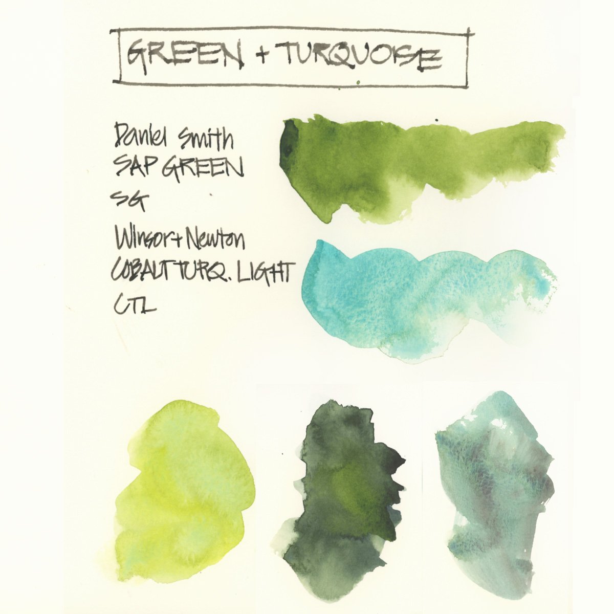
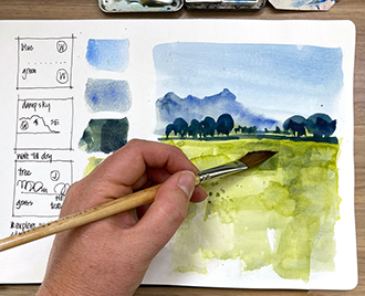
Today I’m just going to share two paints in my palette. My one green one and my favourite paint colour – light turquoise.
A few comments about green:
- Some artists argue that you shouldn’t have green in your palette as mixed greens (yellow and blue) are so much nicer. I used to hold to this position, but for the last 8 years or so, I’ve included a green for convenience – especially when I’m working fast. I just don’t always want to mix a green.
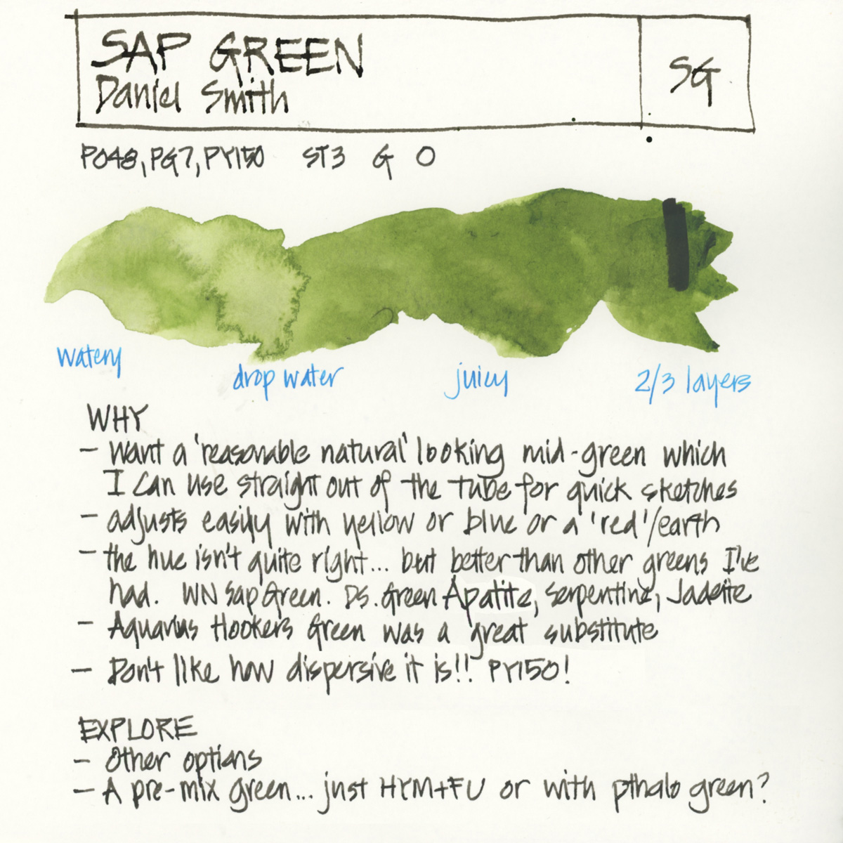
- As mentioned in my first article in this series because of this fast sketching, I want to be able to use my colours in their pure form. So I want a green that is okay to use on it’s own – a reasonably natural looking mid-green that is easy to modify to a lighter or darker version.
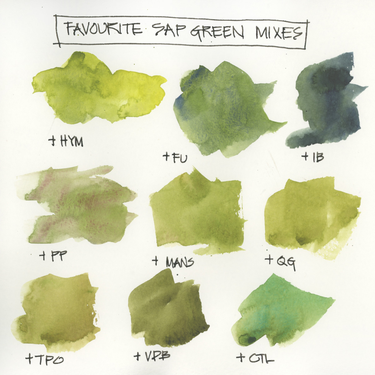
- Keeping my yellow clean was another part of the reason for having a dedicated green, but as I now split my yellow (see the yellow section for more about that) this is no longer as relevant and it’s easy to mix a nice green with Hansa Yellow Medium and French Ultramarine. So I am finding that I’m using Sap Green less these days.
- I’m not 100% convinced that Daniel Smith Sap Green is the best option but it’s the best I’ve found to date. The hue is okay (tube greens always seem to be a little artificial looking) but my major frustration with this paint is its dispersiveness caused by the PY150. Exploding sap green is sometimes nice, but often I have to carefully choose the order of my washes to avoid murky results (ie. when painting red flowers, I will paint the green leaves first as sap green going into the red isn’t pretty). So I’m open to new options.
- I enjoyed using Aquarius Hooker’s Green last year (I found it a good substitute for DS Sap Green) but it’s only available in a full pan, and I only ever have a half-pan of green in my palette.
- I know that Pthalo Green is a good green mixer, but as mentioned above, it will not become part of my sketching kit because I can’t use it on its own and find that it’s too strongly staining. I have experimented with using it in a pre-mix but never fully tested that.
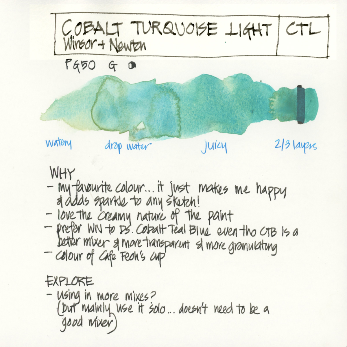
As for turquoise…
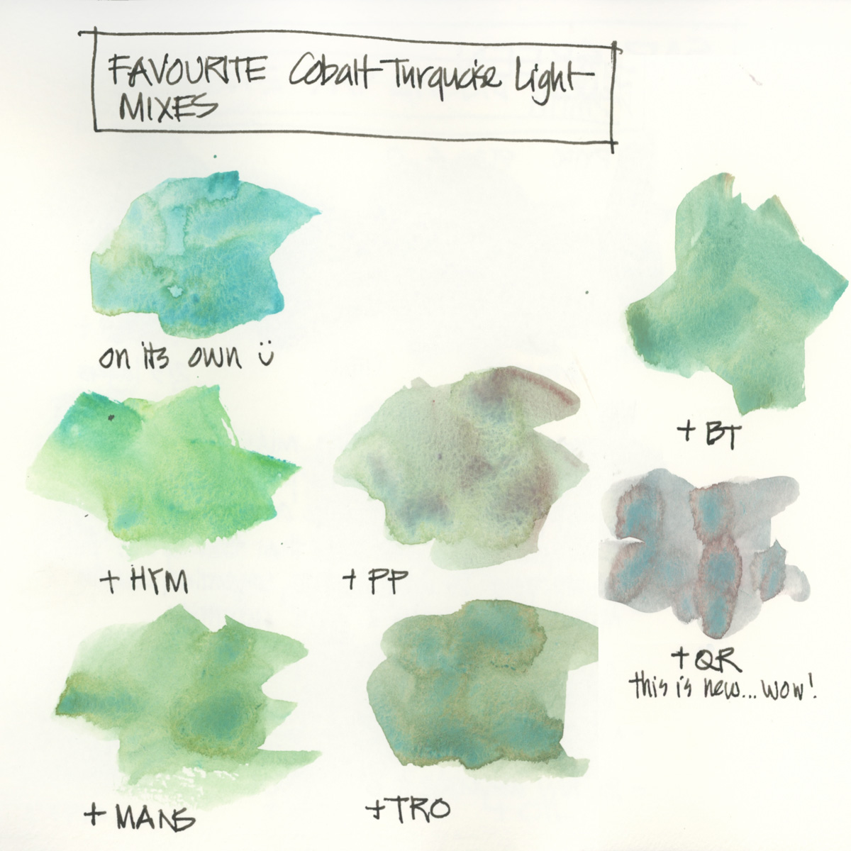
- It’s my favourite colour and I love the creamy opaque quality of the Winsor Newton version.
- Last year I explored DS Cobalt Teal Blue and some other turquoise pigments but came back to WN CTL! See here and here.
Sap Green (Daniel Smith)
Cobalt Turquoise Light (Winsor & Newton)
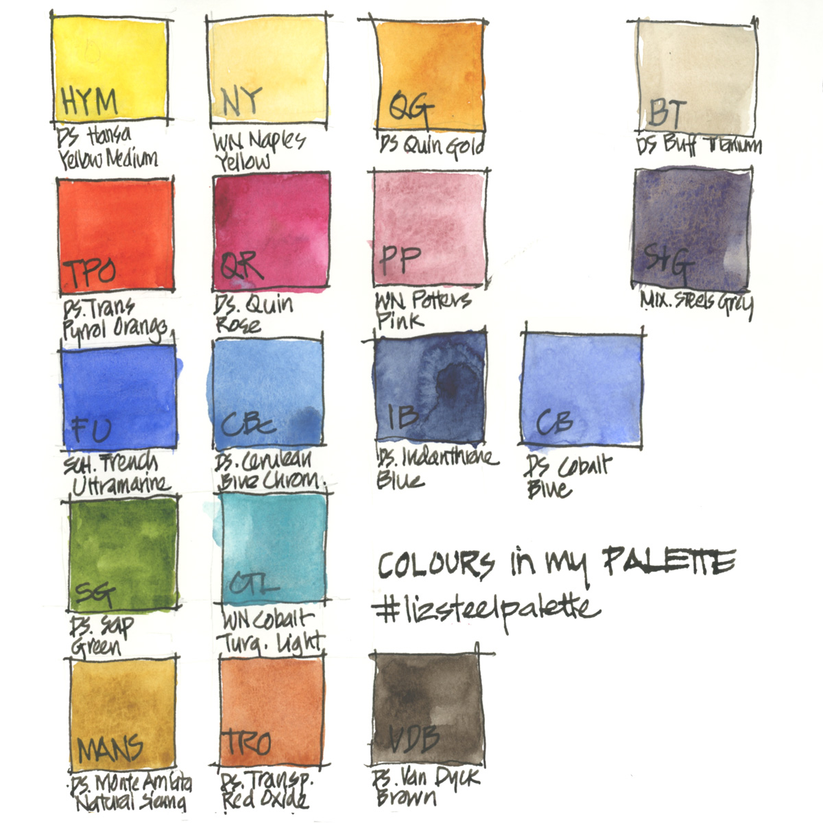
Full Palette – Further Reading
Just for reference… here is my complete palette with the abbreviations I use for the other colours.
More…
- The general principles behind my palette selection
- All my palette articles
- My SketchingNow Watercolour course – Learn how to increase your control of water, how to decide when to layer/glaze and when to work wet-in-wet, how to create vibrant colours with a limited palette, how to be more confident with your use of colour and much more! I also recently added a bonus lesson into the classroom all about pigment characteristics and how to practically get to know your paints better.
So what greens do you have in your palette? and why are they there?
Thank you in advance to anyone who takes to the time to share in the comment section – it really makes this article more valuable for other readers. Plus I always LOVE reading about other people’s WHY’s



16 Comments
I also have a sap green in my small palette. I’ve tried Schmincke (a bit intense) and W&N – I definitely like the hue of the latter better. The W&N sap green is made with PY110 – maybe less active than PY150? In my larger studio palette I also enjoy having Perylene Green for dark mixes.
Thanks for sharing Julia – I do want to revisit WN Sap green! And generally other brands are less aggressive that Daniel Smith paints
I use DS Green Apatite Genuine as my go to foliage green. It separates into lovely browns and greens and looks very natural. It’s my fav!
Also you should try Cobalt Turquise Light mixed with a dash of Quin Gold. It makes a wonderful copper patina.
Yes, thanks! I do use that sometimes… but often I make my copper more turquoise just as it makes me happy 🙂
Thanks Sarah! That’s a great pigment and one that I used to use – it’s in my bigger studio palette.
DS Serpentine because it is so gorgeous and does such interesting things with foliage…
If I have room, a second Primatek for fun, and these change a lot — Diopside is current.
Thanks for sharing Kate… it’s many years since I used it, but it is a gorgeous colour! Never tried Diopside(what a cool name)… adding it to my list to explore!!! 🙂
It’s always nice to read your thoughts on colour. I agree about turquoise. It does add sparkle to any sketch. I don’t use it much for mixing but I love it in its purest form.
As for Sap Green, it’s a love hate relationship. I put it in my palette, then take it out, then put it back in again : )
Hope you’re well.
xx
Shari
Hi Shari! thanks for sharing your relationship with Sap Green… 🙂 I totally understand!
DS Phthalo Yellow Green is a great “middle green”, a very clean and transparent green colour…easily turned more yellow or blue or dulled down if required (lovely with Indanthrone blue for dark foliage)
Hi Faye! hope you are going ok. Thanks for reminding my of Pthalo Green – yellow. I much prefer it to the blue shade. Will have to test it again. thanks!!!
Cobalt Turquoise Light is my favorite color too! I love it so much. I have recently gotten some excellent landscape greens from DS Fuchsite Genuine. So fun!
HI Jamie – isn’t CTL just so yummy! I haven’t tried DS Fuchsite Genuine- will have to have a look at it,
Myvtrick with Aquarius paintsbis that I warm it upnin microwave on the lowest setting for a minute and then slice it with a carpenter’s knife whenever I need to have it in a smaller pan. I find it more effortless and faster than waiting for the tube paints to dry…
Thanks for sharing Marta!
NEWSLETTER
Subscribe for first notification of workshop + online classes and more.