
MONDAY: I had a serious ‘play day’ with Jane Blundell. We have so much fun testing new art tools and talking pigments. I wanted to resolve what to put into two new palettes.
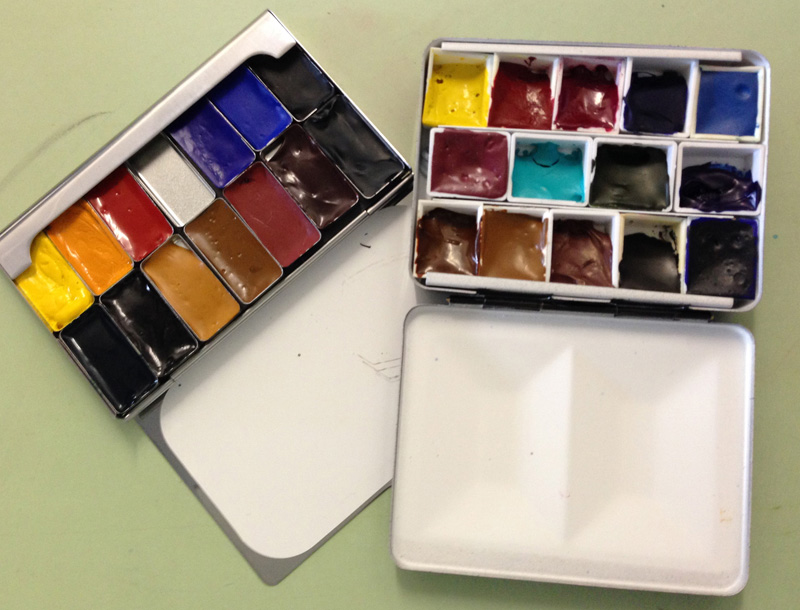
Can’t help it but new palettes get me excited once they are set up and ready to go – a small everyday kit and a pocket palette of extras.
The little one is a pocket palette by Art ToolKit.
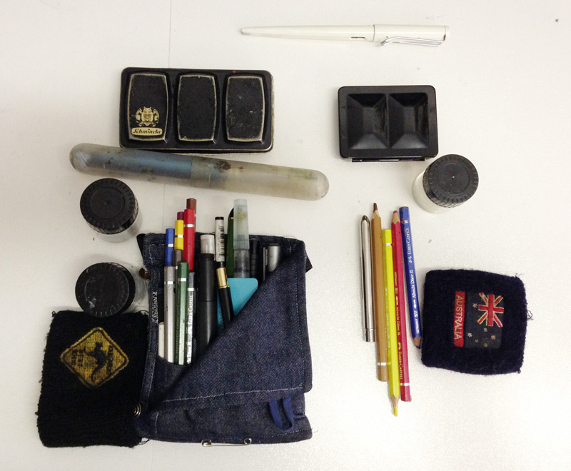
Reducing my daily kit from 550gm to 200gm is worth it. But will I be able to survive?
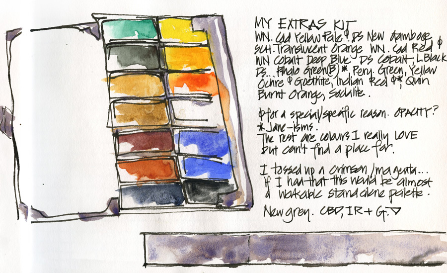
Well here are the colours in my pocket palette. This is an ‘extra’ colour palette. ie. I will take this out on serious painting days. I am excited to have some old friends back out on the streets with me..and so newer pigments that I don’t have as standards (due to their opacity and/or limited mixing eg. the cads)
The small metal palette seen earlier is simply a more lightweight version of my standard (14 instead of 16 colours) – I am going to have this small one in my bag every day (significantly lightening my load which is really needed at the moment!) and only put the full kit in on days that I expect to paint or sketch all day.
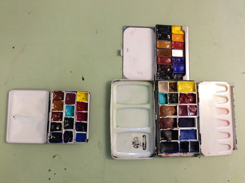
Just to clarify…I am using my lovely pocket palette as extra colours to be used on big sketching days in addition to my usual kit of 14 colours. they are mainly colours that I love and sometimes wish I had with me – or special use such as Cad yellow or red(which I need to buy to add to the kit). Just cleaned my everyday kit in preparation for my trip to Tasmania (for workshops) next week.
My minimal kit is the small metal box with 14 colours….so basically the same colours as my preferred kit… but a smaller version.
I am definitely not one for a colour diet as a permanent setup (I have just increased my standard kit to 28 colours!!! whoa!)
I am able to survive with only 3 colours but I think that the extra mixing that one needs to do and the additional clean water one needs doesn’t make it that useful for spontaneous sketching out on location.
Also watercolour for me is a LOT more than just mixing the right colour. The more you understand about the different pigment characteristics, the more you want to play with pigment and water and paper interaction (rather than just adding water-based colour to your page) …. and the more you want specific pigments for specific reasons. Going to a 3 colour triad means you miss out on granulation and fresh wet-in-wet mixing and other effects.. ie. for me that means missing out on a lot of fun!
And I just can’t cope with the washed-out effects of using a waterbrush… I wish I could use them and get the results….. but whenever I try I always wish I had used a sable brush There are times like inside a building when a waterbrush is the only option but that is different from limiting myself on a daily basis.
So anyway that means that any minimum kit for me is quite extensive. I sketch all the time so always want to be able to do a ‘serious’ attempt in my daily sketchbook.
Anyway that is my approach & I don’t expect many people to think the same way – but I love hearing about other people’s kits and just love the way we all do things differently.

6 Comments
Thanks for all the comments!
I find myself unable to think of what to sketch when I pull out the sketchbooks. And yet I visit your blog and see all of your sketchbook paintings and you are never at a loss! Amazing, Liz. Love seeing your palettes.
When I use my "travel sets," I take on the challenge of just using the colors that are included. This was a task the other day when I was trying to make a black (which wasn't in the tin)…using Payne's Gray, the darkest brown and blues…Seems I ended up with a dark, dark purple. Ah well.
I’ve pulled out my larger rehabbed Prang kit again and love playing with those additional pigments…thinking of adding at least one more… 🙂
I agree, a fresh palette is like a breath of fresh spring air. I loved/love ink/WC journaling and have been away from it for years- your journals pull me back -now renewed as I followed you for years!!
I now find myself starting again – I agree on mixing being a chore and using time and water, what basic permanent color set is most varied/transparent/fresh and bright for me to set up and get going?? Maybe 8-10 colors?? I would love your suggestions
What are the round mini palettes/containers called? I know that they are designed by an artist and it’s on the tip of my tongue and driving me mad, please help!
by Malcolm Carver http://www.carverstudio.com/online-store/
NEWSLETTER
Subscribe for first notification of workshop + online classes and more.